Jekyll2026-09-27T16:39:31+00:00https://john.hartnup.uk/feed.xml‘ERE I AM - JH!Somewhere to drop my thoughts.John HartnupThose AI posters, with real fonts2026-09-23T00:00:00+00:002026-09-23T00:00:00+00:00https://john.hartnup.uk/2026/09/23/poster-svgThose hundred poster prompts again.
A common observation is that it’s not using real fonts. An AI image model makes a bitmap image of what it thinks a poster should look like.
That has image has shapes that resemble letters, spelling out words. But unlike the words you’re reading out now, those shapes aren’t
built from a library of letter shapes (or more precisely, strict recipes for producing shapes) called a font. It’s as if the image
model is hand-drawing each letter from its memory of what that kind of typeface looks like.
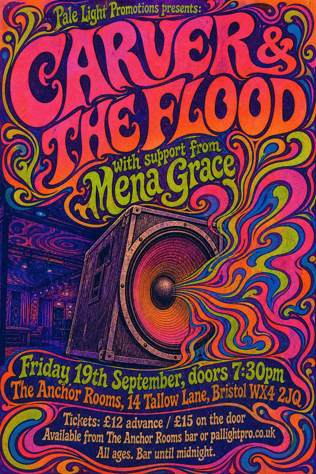
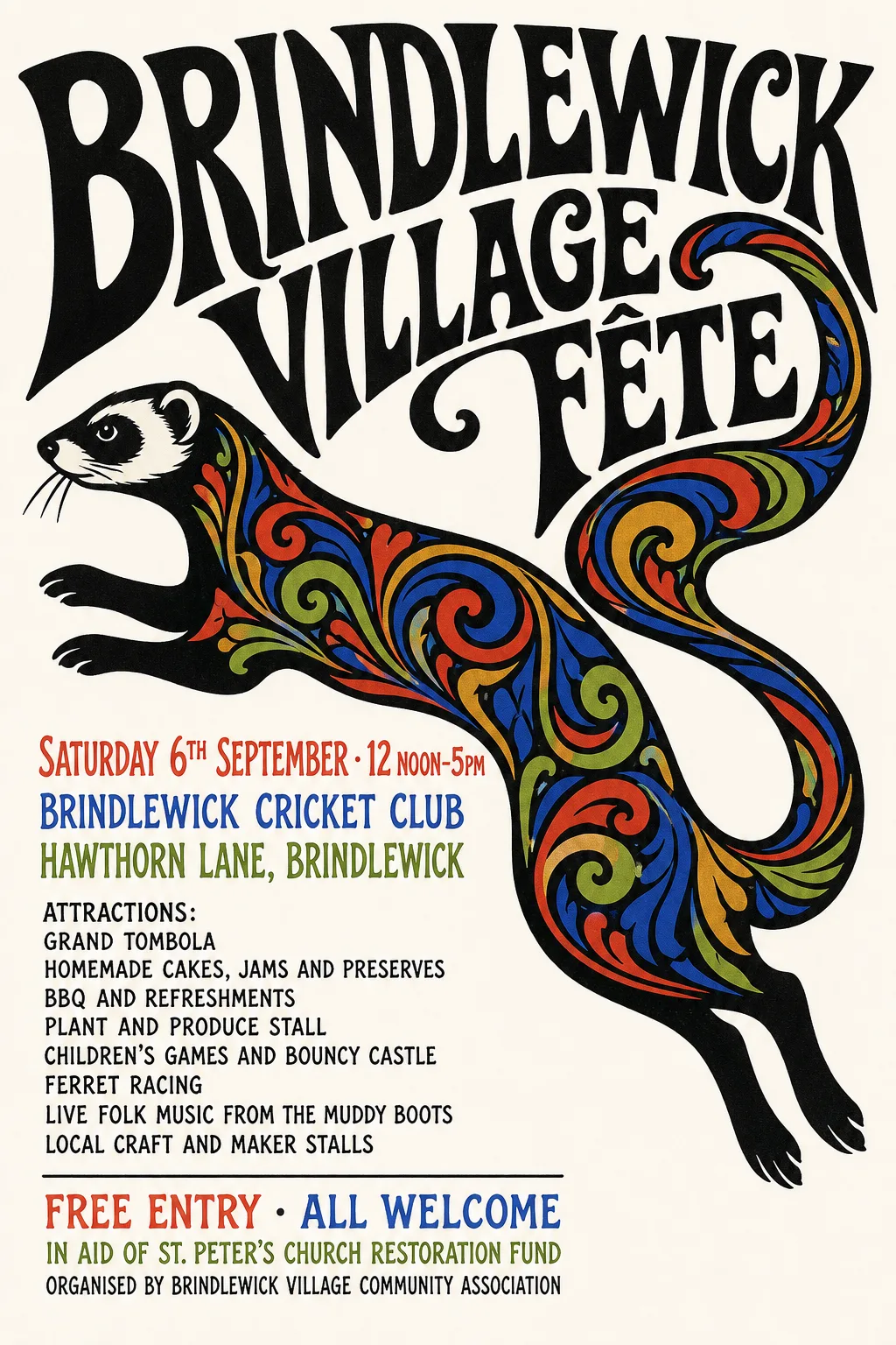
Sometimes that’s obviously appropriate. Psychedelic Sixties and Push Pin Studios clearly rely on letter forms that
a real designer would hand-draw.
Psychedelic SixtiesPush Pin Studios
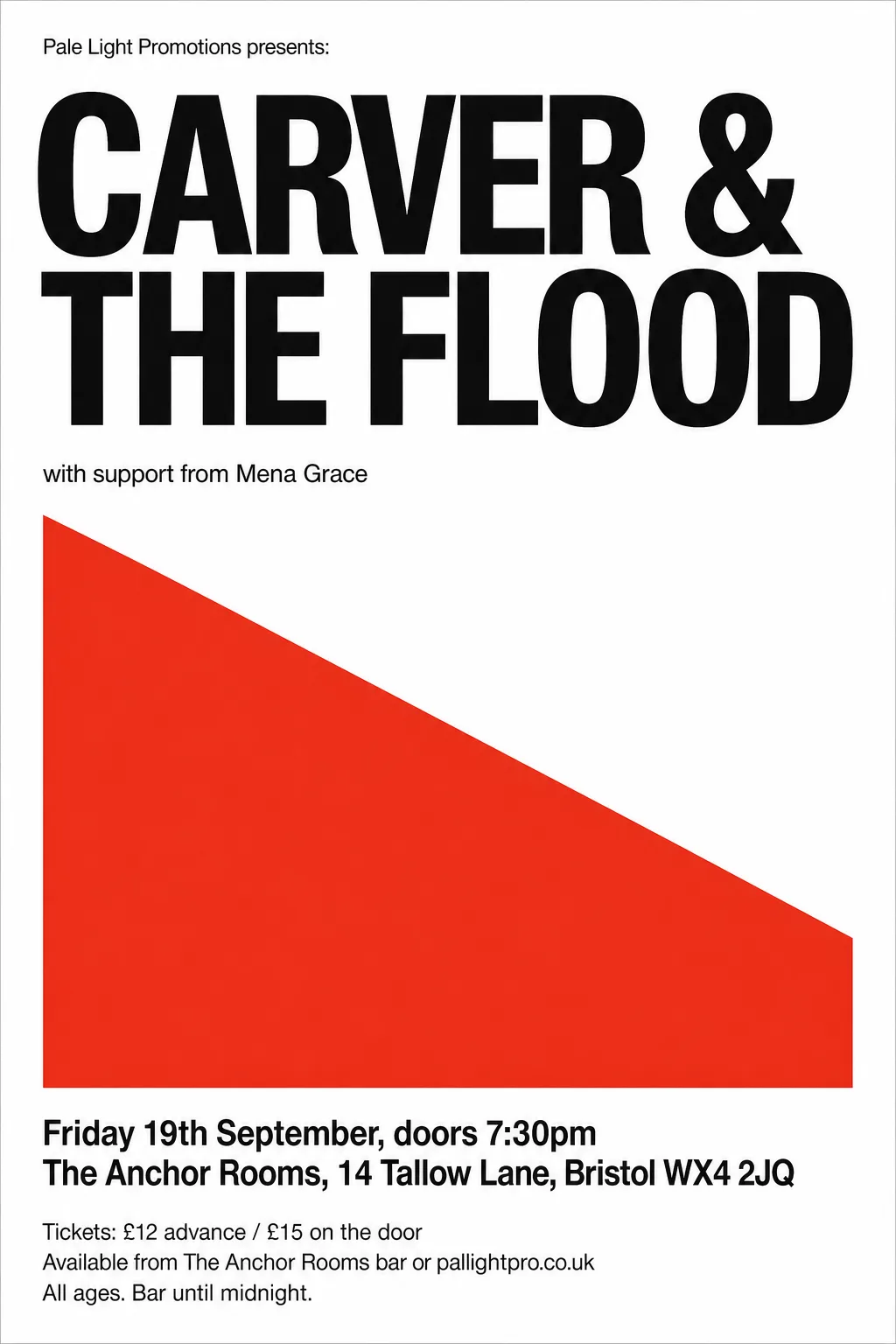
Other times it appears more likely that a real font would be the correct choice. Swiss / International Typographic Style would almost certainly use Helvetica,
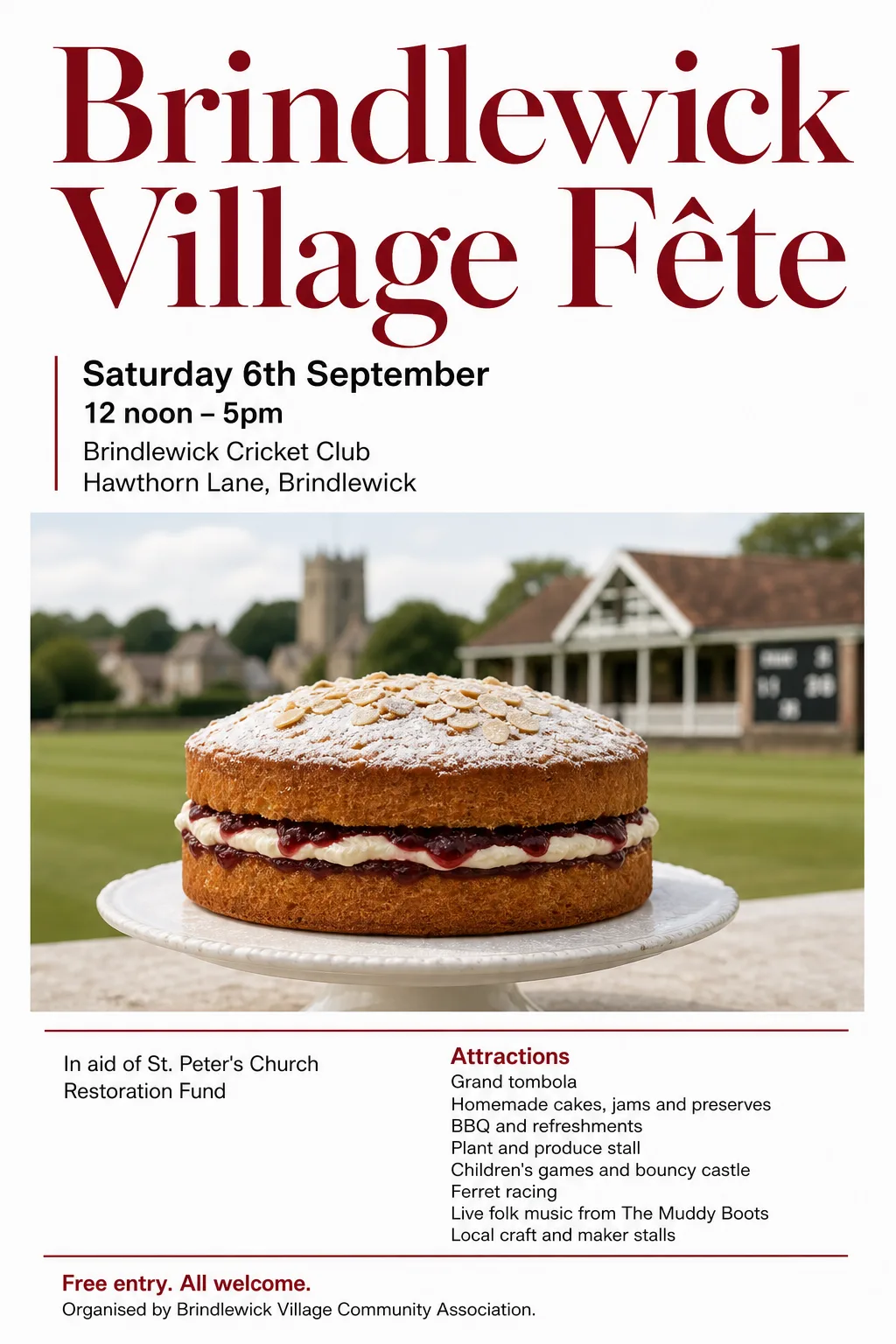
Contemporary Editorial looks like a mainstream serif font like Times Roman. In this case are we only using the model’s approximation
because it doesn’t have another way?
Swiss / International Typographic StyleContemporary Editorial
A designer friend observes: “I don’t recognise any of the fonts, they’re all approximations. One previously unseen font on a poster I could accept,
but 2-3 when they’re all fairly bland in any case still registers as a tell for me.”
As I’ve pointed out before, I don’t care about tells: fooling people that they’re not looking at AI is not a goal. But not triggering icky
feelings, is a goal. If some people are getting an uncanny-valley response because that’s not quite Helvetica, this is a problem.
(Notwithstanding, the same people get not-quite-Helvetica ick from Arial).
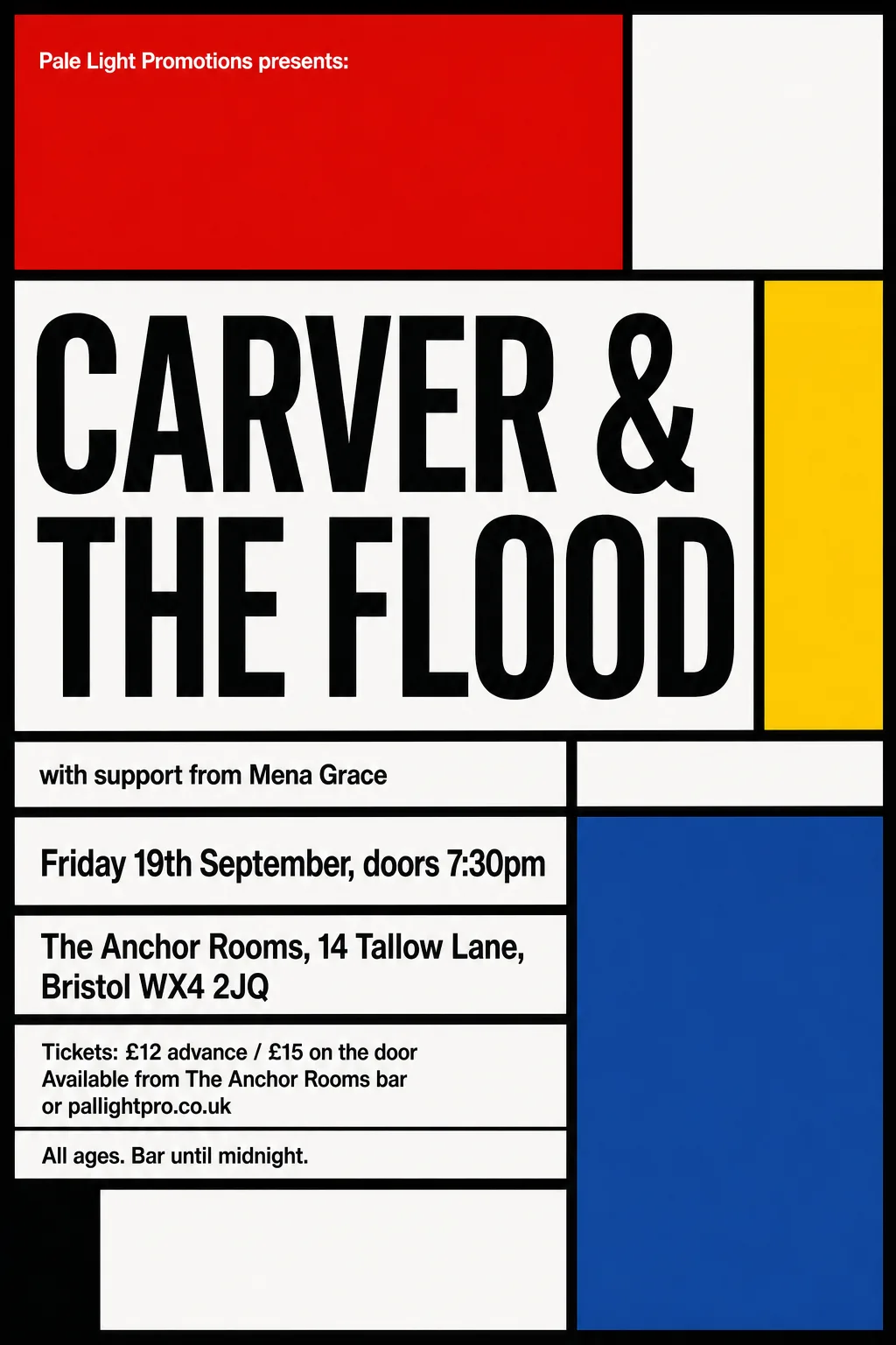
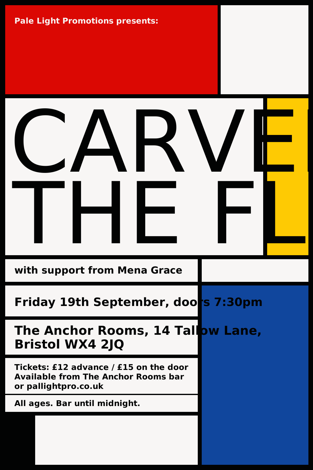
When it works, you get pretty close matches, and the knowledge that the type is as a type designer intended. Here’s the De Stijl gig, before and after:
De Stijl gig — originalDe Stijl gig — SVG rebuild
So that’s better, right?
Maybe sometimes, maybe not always, I’m not sure.
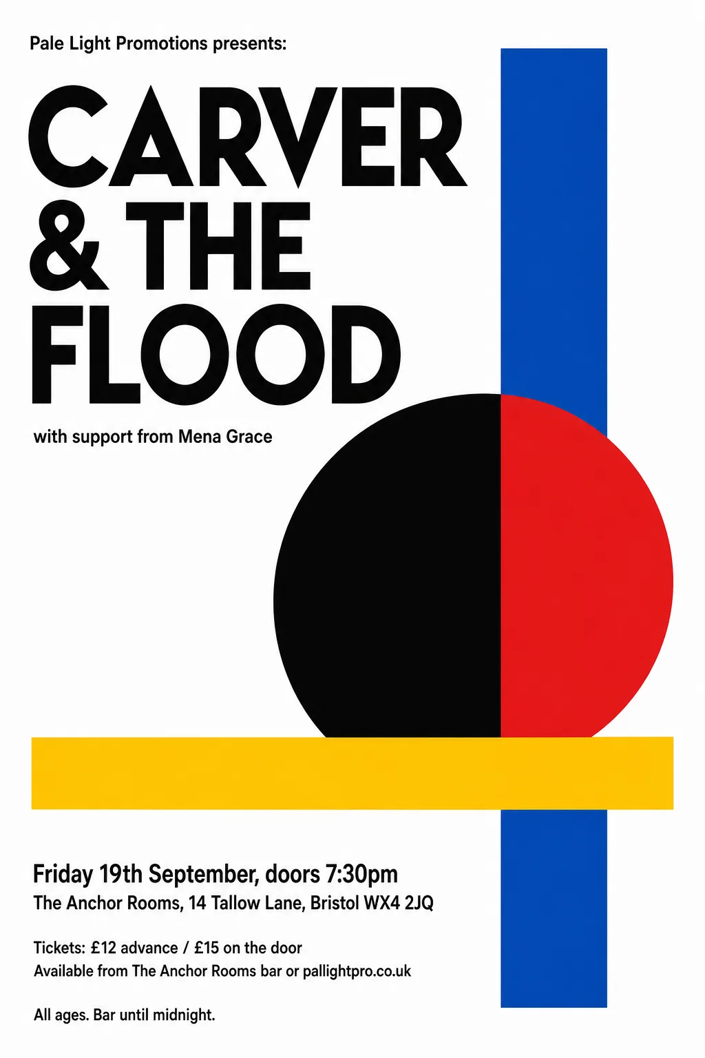
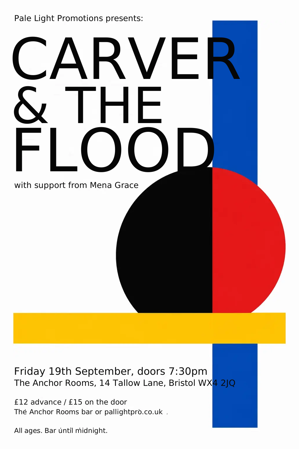
Look at the Bauhaus / Modernist gig, below. That pointy ‘V’ the model drew works really well for me. Perhaps if my convertor had found the right font,
the conversion would have a pointy V too. But that might not match other letters. And anyway, the point is that the AI model is free to decide that here,
in this one word, in this one position, a pointy V works.
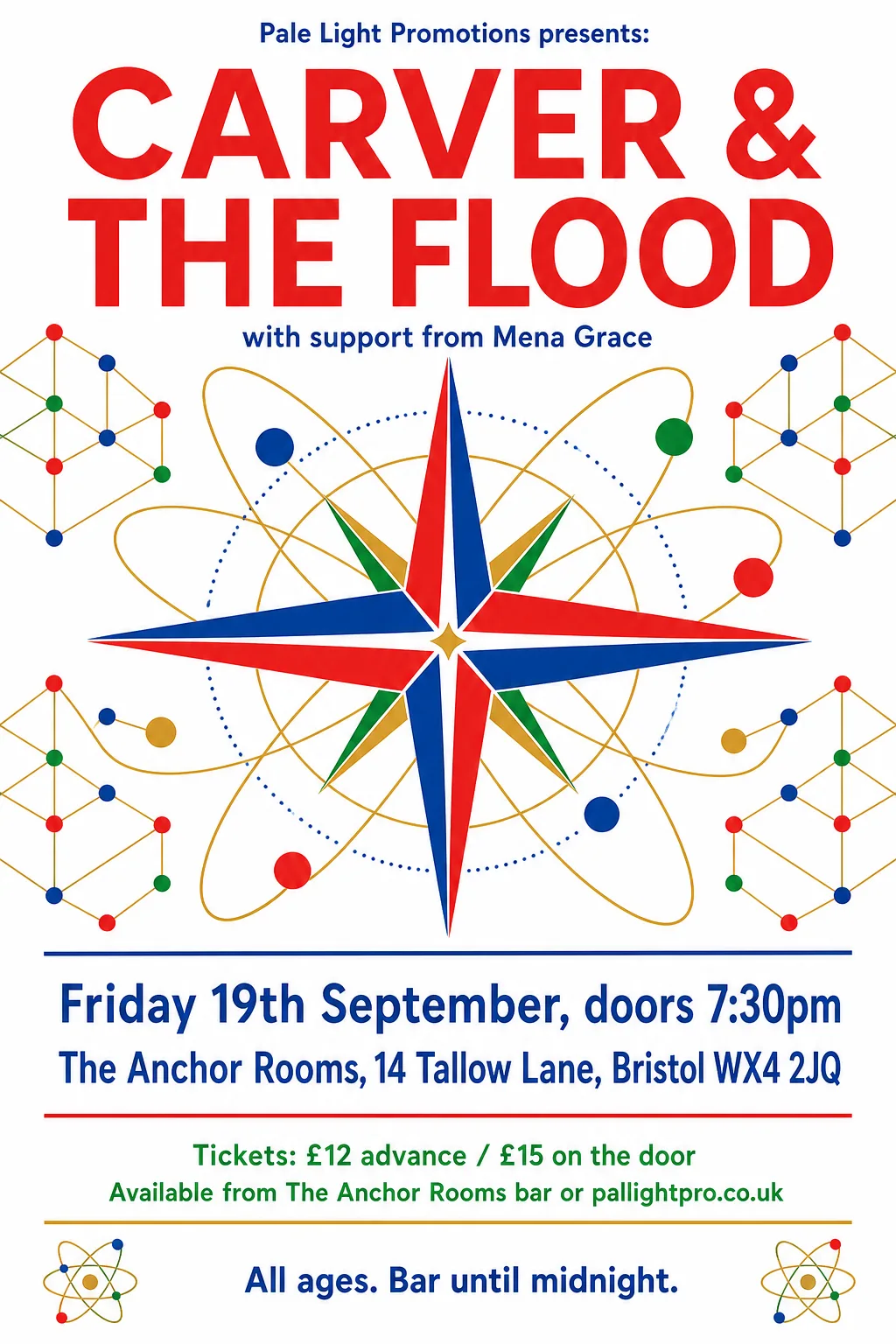
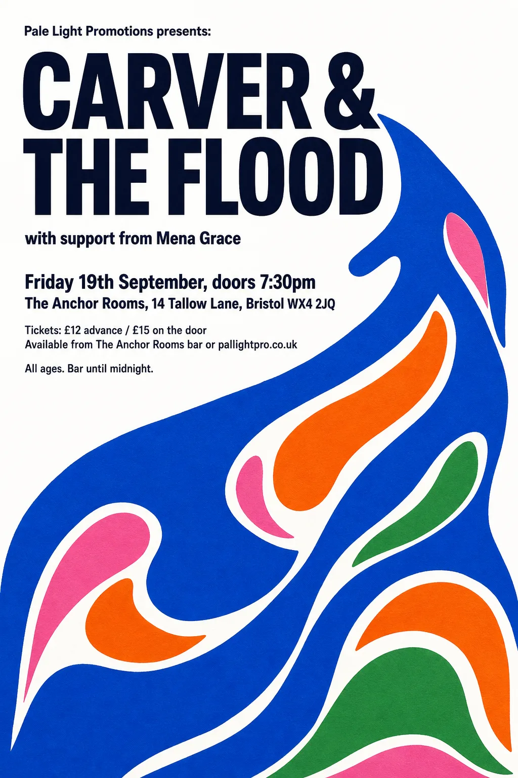
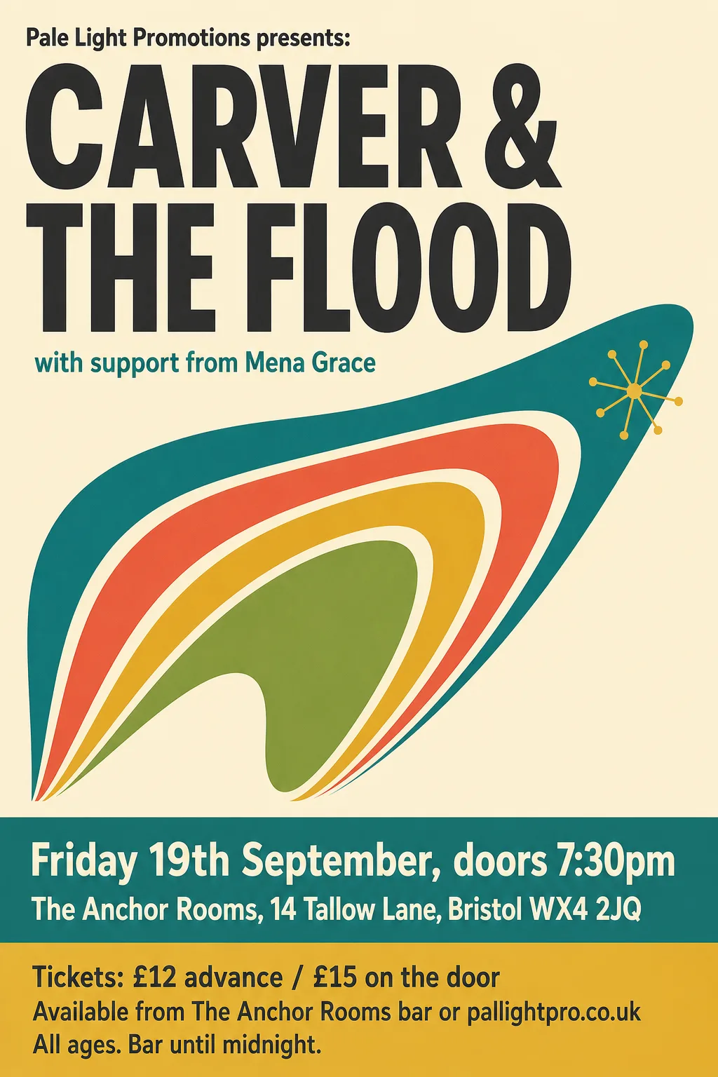
In other places, like the Festival of Britain gig below, the model-generated drawn text lines up just-so: “CARVER &” the same width as “THE FLOOD”. You
can achieve this with type by stretching or adjusting whitespace, but the model has achieved it in its drawing with quite a sophisticated combination of
both: drawing and spacing all the letters so that in combination they fit the space.
Festival of Britain gig — “CARVER &” sits the same width as “THE FLOOD”
And on that theme: one of the reasons to use fonts with a real text layout engine, is that the layout engine knows how to space letters just-so.
And that’s especially ideal when you’re typesetting blocks of text. But I’ve been learning that especially with big titles and logos, it’s not unusual
for a designer to nudge things around. You don’t get that for free.
The AI model has the freedom to:
invent letter forms that deviate from what the “font” would normally use
use different weights, widths, spacings, shapes according to context and space needs
… indeed it has no concept of not doing those things.
So myself, I’ve become quite attached to letting the model do this. A model with suitable training could become very, very good at it – I’m just using
general purpose models, though. Who knows whether OpenAI are training an image model in that direction?
I should mention the other reason to build posters in a vector format: editability. If you have a poster in a combination of bitmap objects and
vector elements, you can move things around, add or change words, and so on. That is not the focus of this blog post.
As ever, I am not a professional designer, nor even a well trained amateur. I can only speak for my own untrained eye.
]]>John HartnupBetter poster prompts2026-09-20T00:00:00+00:002026-09-20T00:00:00+00:00https://john.hartnup.uk/2026/09/20/poster-prompts-v2I’ve made a version 2 of my hundred poster prompts.
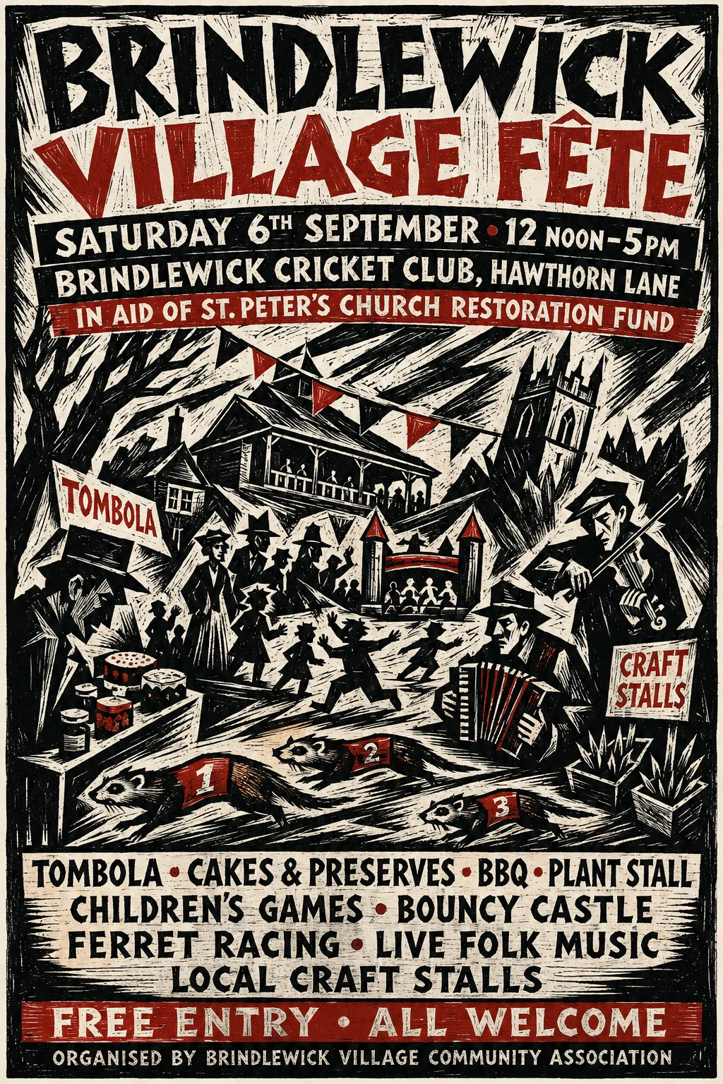
before
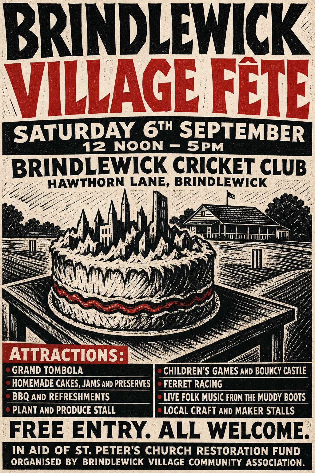
after
Expressionist Woodcut, the same fête, version 1 and version 2.
But having these examples made me fussier, and I
began to notice flaws.
Then, after essentially nobody had paid any attention to the page, I shared it on Hacker News - where lots of people commented, many of whom noticed the same flaws as I had:
The text layout was usually pretty good - it would
emphasise the headline, and put other details where
they belonged - but it could have been better.
The fete example highlighted a common AI problem -
if a word is in the prompt, it’ll put it in the image. So the image for the fete at the cricket ground for the village church restoration fund, would contain cricket, a church, fete tents, as well as imagery representing every attraction listed.
(By the way, you’d get a better poster by just listing fewer attractions – but our hypothetical client wants them all on the poster, so that would be cheating)
This was just one contributor to clutter. The model
often seems to want to fill every space with stuff.
The fictional band highlighted another problem:
AI had invented “Carver and the Flood” as the band,
playing a gig at “The Anchor”, so many of the posters
featured a woodworking tool, a lot of water, and an
anchor. Sometimes these were lovely images. But it’s
very literal - and for a real band, “The Flood” would
have ceased to be associated with water, in the fans’ minds, years ago.
The ferrets. My fictional fete had ferret racing as
an attraction. So many of the posters highlight ferrets.
This is understandable - it’s the most interesting thing about the event, so the model picks it out.
But you don’t want it every time. You want the user to have the opportunity to pick a try where the
ferret isn’t the star.
Often the model would invent logos. So the church repair fund suddenly has a crest. That’s not acceptable.
How version 2 was built
I put all these issues to the Claude chatbot, and it
suggested a number of ways to improve the prompt. This
went back and forth quite a lot, because it would come
up with rules that work for some styles but not others.
Eventually I had it write a handover, so I could move into Claude Code.
When I wrote v1, after assembling the code to produce the prompts, I spent a couple of evenings on the part-developed site, copy-pasting prompts into ChatGPT, saving the results to my project, as fast as the rate-limiter would allow me.
This time I paid for some OpenAI API credit, and automated it. All I intended to do was make the generation less laborious.
But as soon as Claude Code realised I had the API, it suggested doing an evaluation exercise. So that’s what we did.
Producing an image is two steps: the first is prompt expansion. We submit the prompt to a LLM, and it generates the text explaining what it’s going to do. You can review that before sending it to the image model.
So, to avoid spending too much money on image generation, we evaluated that first step. I was able to leave a lot of this to Claude Code. The criteria were pretty clear, so Claude could be the judge, Claude adjust the prompts, Claude could decide when to stop.
while results aren't quite right {
   amend prompt
   submit prompts
   judge results
}
I just had to keep an eye on spend. And to my surprise
it was iterating by making hundreds of requests, but costing me pennies. But we were having to firm up the prompt to tell the model things it should have worked out. Claude had picked five styles to test against, one for each way a poster can
decide what to draw, plus a deliberately awkward one:
Polish Poster School, where the event chooses the subject, so the ferret problem shows up here first
Art Nouveau, where the tradition insists on its own subject — a woman among flowers — whatever the event says
Suprematism, which is abstract, and should draw no subject at all
Factory Records, where the typography is the image
Madhubani, which fills every square centimetre, and would tell us whether the new rules about restraint had flattened a style that is supposed to be dense
Then we realised we were testing with gpt-5.4-mini - very cheap, but not very clever. Switching up to gpt-5.6-sol – what ChatGPT would use on Medium – started behaving much better, and we could remove many of the adjustments we’d made trying to make the mini model work.
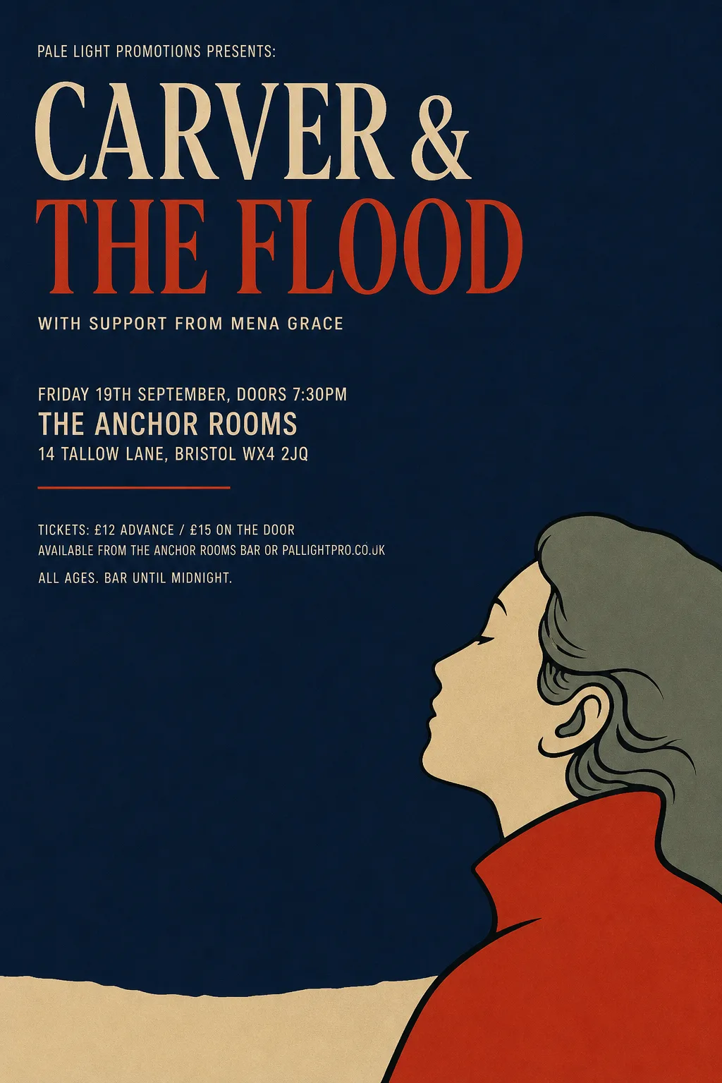
Japonisme — the gig, with no anchor, no flood and no chisel in sightCut Paper / Matisse — the same gig: a sweeping cut-paper current, not a literal flood
All this meant that with about $10 worth of tokens, we’d evaluated and improved our prompts until they met the goals.
The biggest sticking point was ferrets. I wanted it to choose a ferret about 20% of the time. It’s a
striking image, many users would choose it, but we want it to use other options when you retry. The
problem was that it’s unusual so the LLM finds it
compelling.
Where the subject comes from
For some styles, the event dictates the subject. A fete in Letterpress, gets some fete-related image.
For other styles, the style dictates the subject.
Art Nouveau is a woman with flowers. You can only
override that by asking.
Other styles are explicitly abstract.
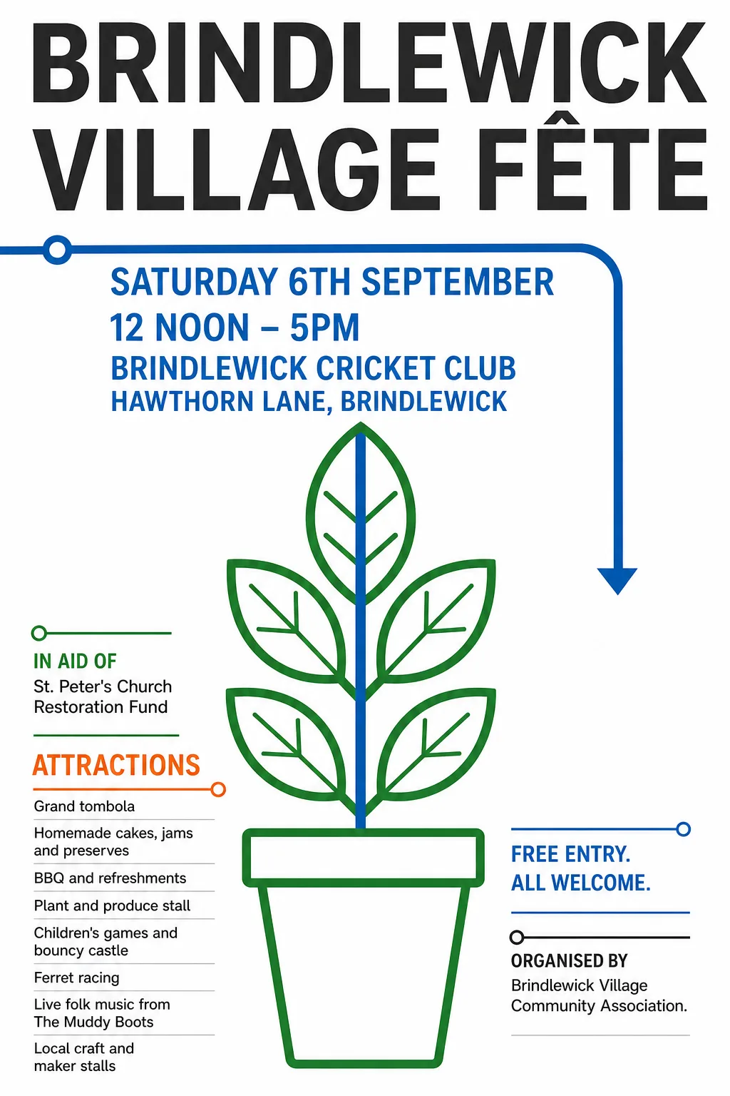
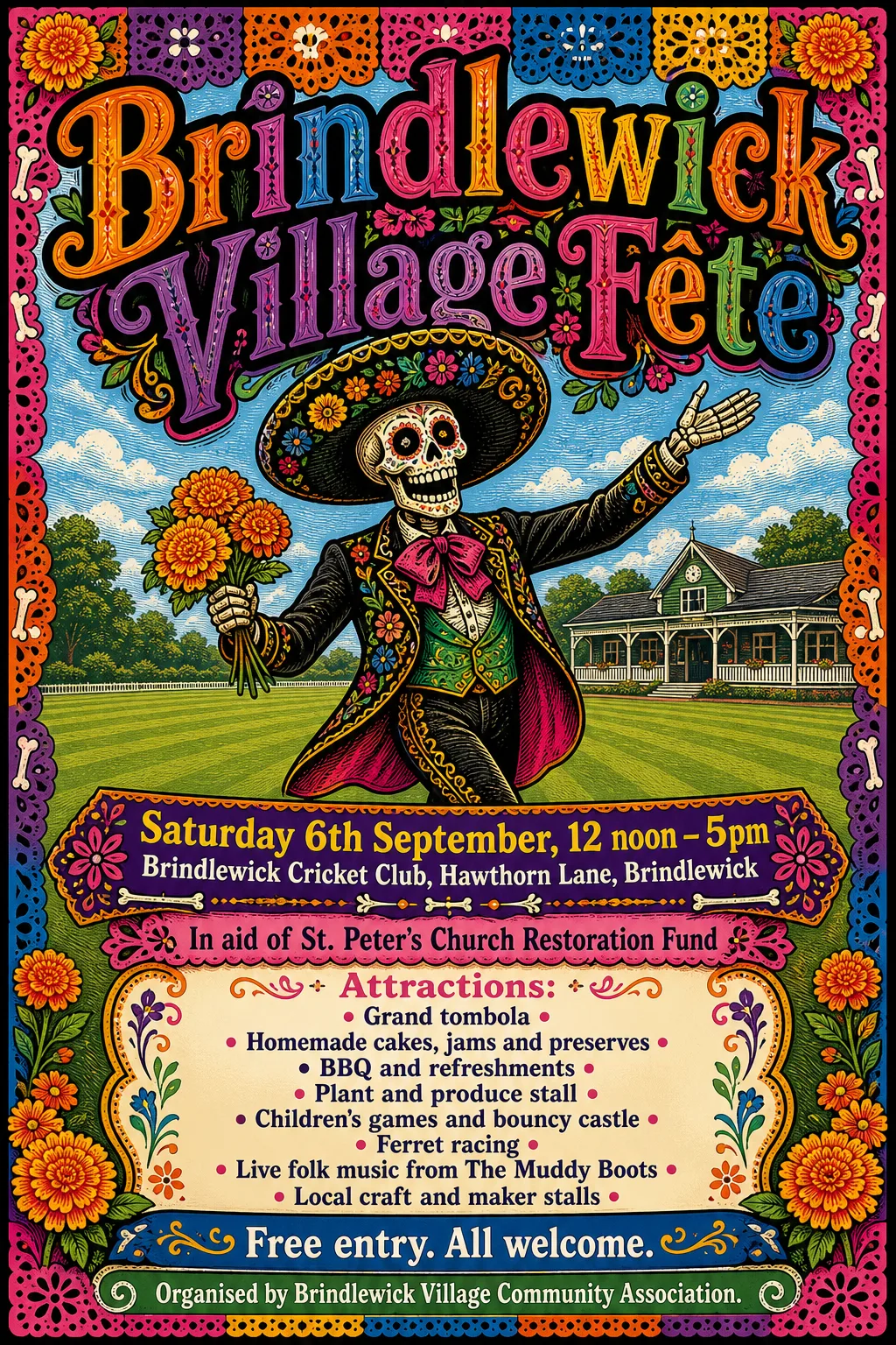
Wayfinding / Signage — the event chose the subject. It shortlisted a ferret, a cake and a potted plant, and took the quiet oneMexican Calavera — the style chose the subject; the event supplied the words and the cricket ground
Cost
This cost me $28 in OpenAI tokens. Around $10 in text-only evaluation runs, then another $18 doing multi-run image tests on four styles, followed by generating all 200 images.
Oh well.
Outcome
I think in general the posters are better. They’re more striking. The hierarchy of text is clearer. The subject matter is wrong less often.
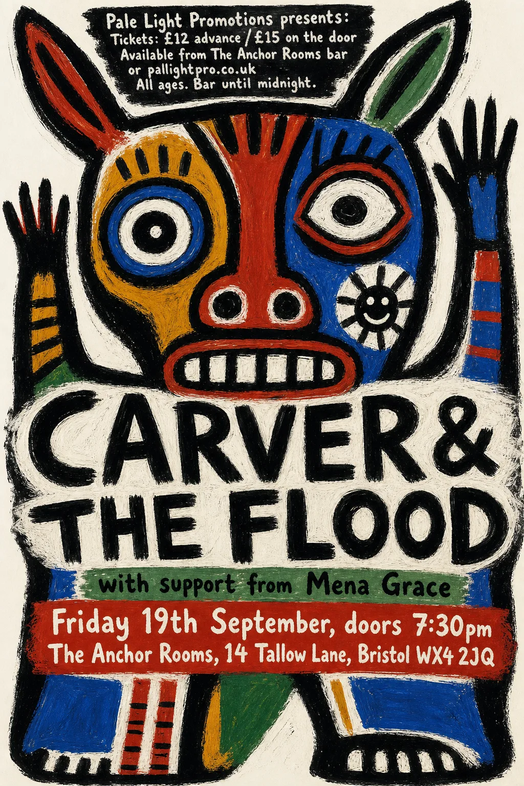
CoBrA — a mythic animal-mask figure, which is the tradition's own subject, not the event'sMid-century Modern Graphic — echoing “The Flood” without drawing one
You still need to tweak the prompt, or just roll the dice a few times. The website shows the first shot for each prompt, warts and all. A second try might have been better, or might have been worse.
The new prompts are way longer than V1, and perhaps take some control away from the user. Used as intended - copy-pasted into ChatGPT - it can of course be tweaked. But the audience that would tweak it is possibly an audience that doesn’t need the hand-holding these prompts do.
Ferrets?
It still chooses to use ferrets a lot of the time.
Well, the ferrets are good. But, by design now,
in ChatGPT it’s going to show the user what it’s
chosen, before producing the image. It offers a
shortlist of other subjects, and the user can ask
for any of the alternatives.
Other stuff
It’s been pointed out that you might be able to get better results by letting AI generate a code-based format like Postscript or SVG. Here it could lay out real fonts, give you elements you could adjust yourself. This is all true, and something that’s either already available in tools like Photoshop or Canva, or with a skill and a code agent.
But here we’re trying to demonstrate what a harried
PTA parent can achieve in a chatbot.
]]>John HartnupIntroducing the Kladde 26 Manifesto2026-09-17T00:00:00+00:002026-09-17T00:00:00+00:00https://john.hartnup.uk/2026/09/17/kladde-manifestoMy fiction section contains writing I produced with the help of AI. Or perhaps writing AI produced under my supervision.
Maybe I have poor taste, but I enjoy both the process and the outcomes - and not having authored them directly myself perhaps gives me a more detached position from which to decide that I think they’re good.
But I have done a lot of thinking about what I have and haven’t done. At first I thought of myself as the author, fooling myself into thinking that I had provided the inspiration, and the AI had merely saved some of the perspiration. Looking back at the logs, though, at times I was surprised at how many ideas had emerged from the AI, and at others I had forgotten what I myself had supplied or rejected or shaped.
I perceive a new landscape of issues, where humans collaborate with AI for creative works, among them:
A widespread visceral distaste for anything AI has touched.
That is, of course, allowed. But my own opinion is that this fails to recognise the good material AI can generate, while also failing to account for effects of the strong guiding hand of a human co-author, commissioning editor, director, producer – whatever you want to call it.
Humans seeking to pass off AI-assisted creations as their own work.
I feel this is both unethical and wasteful. It’s deceitful not to acknowledge AI’s role in the creation. While it’s often a good idea to clean up distracting AI tics from the language, it is wasted effort to try and deceive the reader into believing this is purely human writing.
A missing experience for readers.
It seems that readers (and viewers of art) like to imagine the author at work. When they read a sentence, they are thinking about what lived experience caused the author to use those words. Perhaps they imagine the author speaking directly to them, as they read.
Their assumptions may be false, but they are nonetheless part of the experience of reading. Believing that the entire text fell out of a language model in a matter of seconds, disrupts that experience. Learning later, that something you had imagined a human author writing, came from a machine, is the unpleasant experience of being conned. Yet when a piece is co-authored by a human and AI, there is a writing process that the reader may think about as they read.
Readers don’t know what they’re getting.
Without an honest, supplied provenance, how does a reader know whether they’re reading something wholly written by a human, wholly generated by an algorithm, or produced with some level of human curation by a human/machine centaur? That context can be important to the reader.
If your framing is where mine is, it can be thrilling to know that AI, rather than the human, came up with certain ideas. In Crab, it is the model that notices that letters scattered on the floor can be misconstrued as “EVAC”, and works that into the story. Amazing.
For these reasons I decided to adopt radical transparency. I’m reluctant to even call myself an author, though I still don’t know what word to adopt. Since I don’t really know what to call what I do, I just demonstrate it - you get near as dammit a complete transcript of the interactions that built the piece. My workings.
You can read any of my stories without reading the workings - but they are there to skim or read in depth, as an honest record of how much I did, and how much a language model did for me.
Then I thought I’d better explain myself. And I thought, who knows, perhaps other people would like to adopt this practice? So I wrote a manifesto. Not entirely as a joke.
I’ve taken inspiration from the Dogme 95 manifesto, hence the Danish name, though Kladde’s aims are quite different from Dogme’s “vow of chastity”. Dogme constrains what a director may create. Kladde allows you to create what you like, how you like – but you must disclose your methods. Kladde refers to the rough-book Danish schoolchildren use for preliminary rough-workings. Of course the Kladde manifesto comes with its own workings.
Lars von Trier didn’t stick to Dogme for all his films, and (at time of writing) one of my stories lacks workings. I’m trying.
If you want to join in, you are free to just get on with it. You can scrape the manifesto, link to it, or you can adopt the practices without referring to the document. I don’t care. If there’s enough interest I might even step up to a domain name. (update - I got that domain name!)
The workings of this post? I wrote it all by myself (though I admit to asking Claude for comments).
]]>John HartnupAI software development and backpressure2026-08-19T00:00:00+00:002026-08-19T00:00:00+00:00https://john.hartnup.uk/2026/08/19/backpressureI’ve been a professional software engineer for 30 years, and AI has changed
things a great deal in the last year or two.
One big thing is that we can now produce code that’s
probably fine, but has to be reviewed and tested, faster than we can
do that reviewing and testing. How do you deal with that?
My favourite LLM and I wrote an essay together, with animated diagrams, even,
explaining how one of the solutions to this is backpressure.
Or in plain language, slow down and stop swamping me.
]]>John HartnupAI-generated posters don’t have to be horrible2026-06-07T00:00:00+00:002026-06-07T00:00:00+00:00https://john.hartnup.uk/2026/06/07/ai-event-postersThe problem
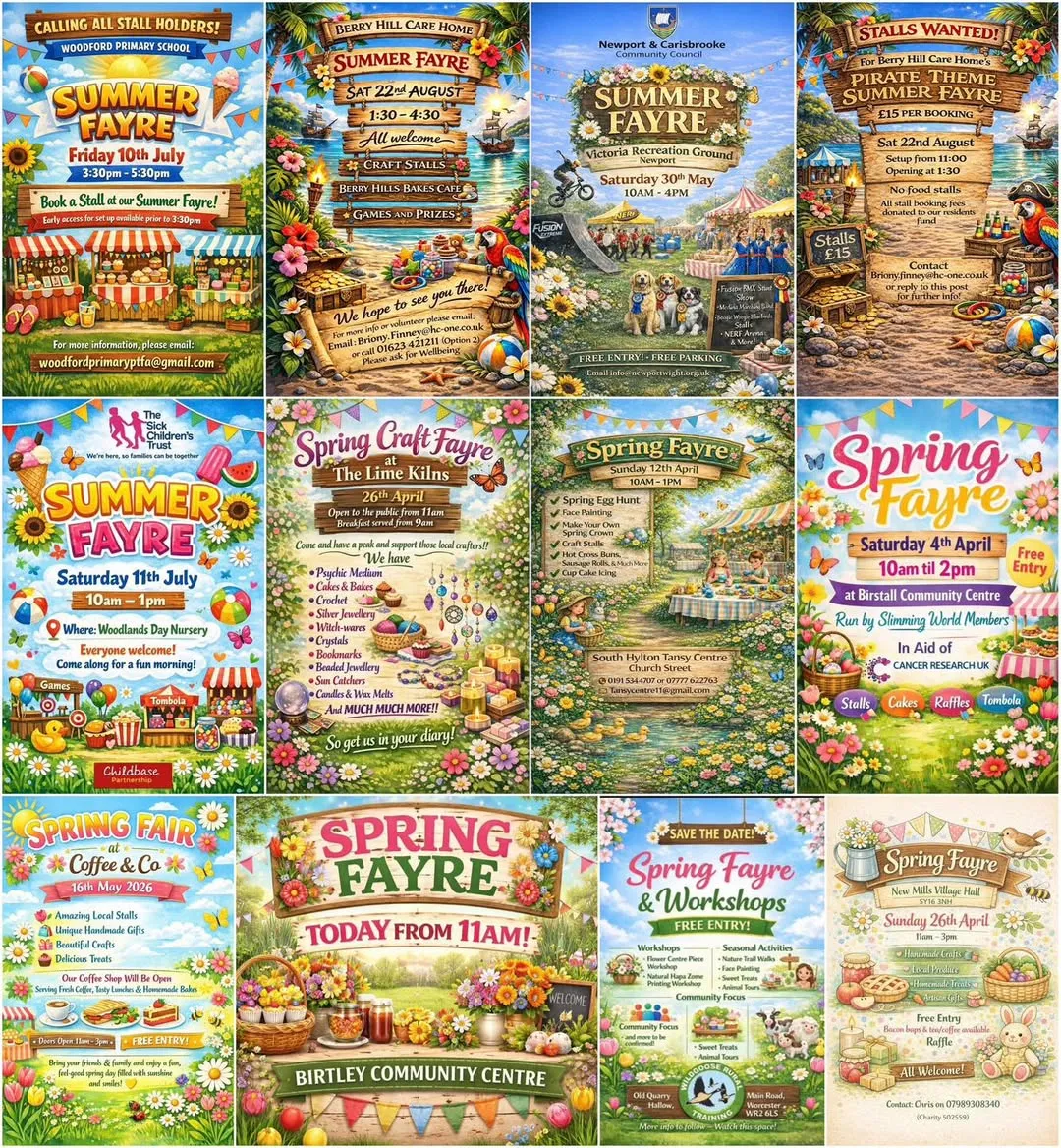
A collage of AI-generated village fayre posters found online
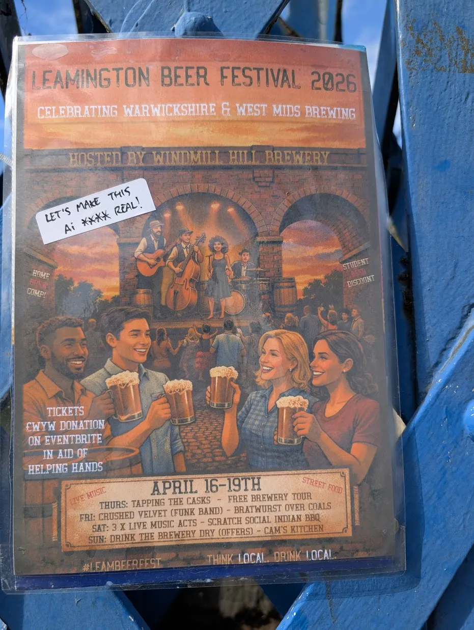
Here’s another I found in the wild. With apologies for picking on the
Leamington Beer Festival - they are by no means unique
Leamington Beer Festival 2026 — with commentary from a passer-by
The problem with these is not so much that they’re bad. They’re OK,
I don’t love them. The problem is that once you’ve seen that style 20 times
it starts to irritate just from the sheer repetition.
I knew that even ChatGPT was capable of a broader variety of styles than this,
so I set out to prove it.
I gave ChatGPT some invented event details and asked it to produce a poster.
Rather than go with the default look it would choose for a spring fayre,
I made a point of specifying what I thought was a different style:
Me:
Produce a poster for a spring fayre.
21 April - 11am to 3pm
Mill Beach Park, Honeyford
Free entry
Tombola
Cakes and drinks
Performance by a samba band and a dhol band.
Craft stalls
Circus Skills workshop
Go for a clean, unfussy, bright layout with a bold striking spring-themed
graphic. Avoid pastel/airbrush/oil style art or images of people.
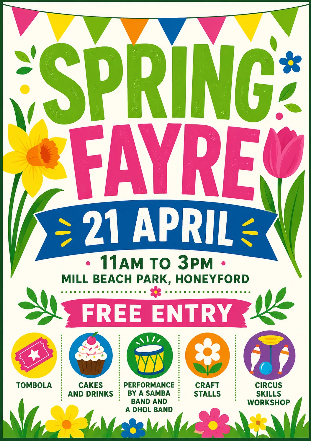
This is what came back.
First attempt — the default craft-fayre template
Not as successful as I hoped. To me it still feels like what I’m trying to
avoid.
I asked for something deliberately different.
Me:
Make another one using a completely different design aesthetic of your choice.
Treat the current one as a “what not to do” – not that there is anything
wrong with it, but we want ours to stand out from other posters that look
similar.
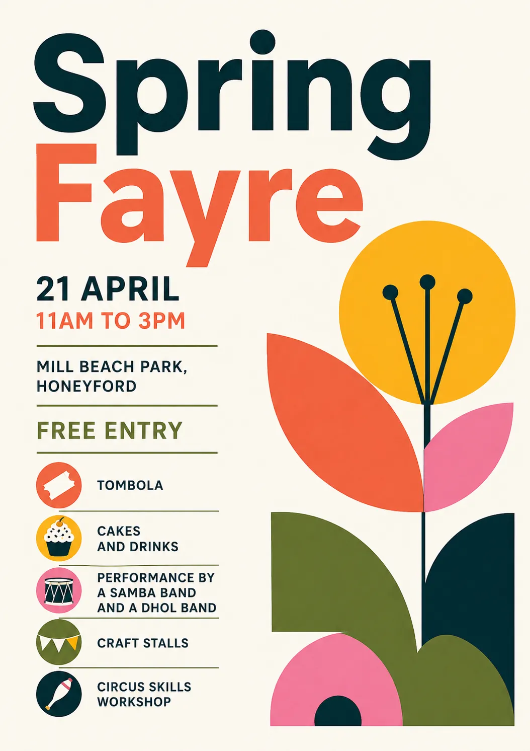
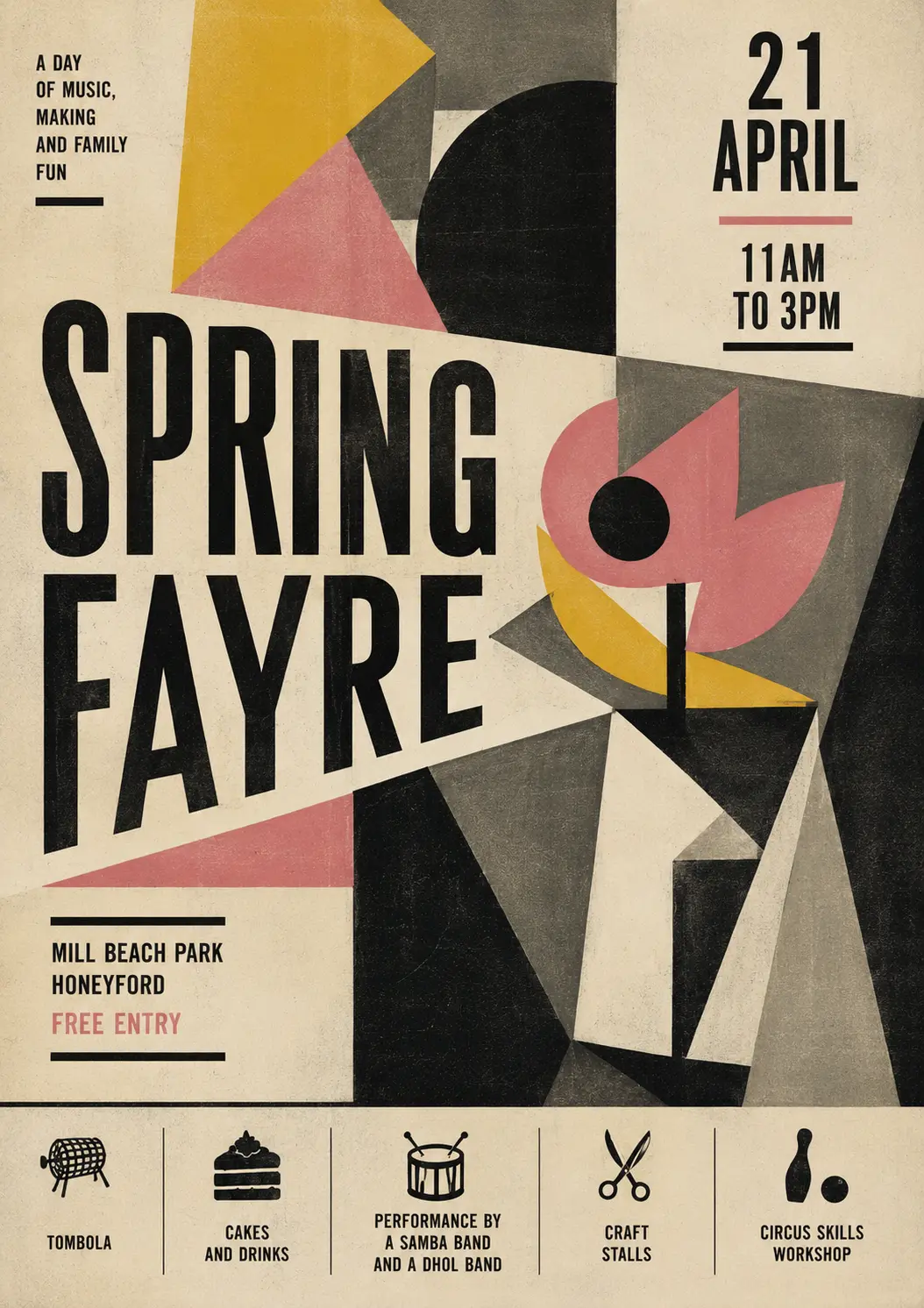
Second attempt — Bauhaus / geometric modernist
I think this is already much better. It stands out just be being different. I wondered what I would call this style if I wanted to ask for it again?
Me: What is this design style you’ve used called?
ChatGPT: This one is leaning into a modernist / Bauhaus-influenced graphic style, with a bit of contemporary “flat illustration” layered on top.
More specifically, you could describe it as:
Bauhaus / Modernist Poster Design
Rooted in the Bauhaus tradition (1920s–30s)
Strong emphasis on function over decoration
Asymmetrical layout with clear hierarchy
Bold, simple sans-serif typography
Limited, high-contrast colour palette
Geometric Minimalism
Built from basic shapes (circles, semicircles, rectangles)
The flower is abstracted into almost symbolic forms
Very little texture or shading — mostly flat colour
Swiss Style (International Typographic Style) influence
Clean grid-based alignment (even if loosely applied)
Information-first layout
Clear, legible structure
If you wanted a shorthand label for a designer or printer, you could call it:
“Bauhaus-inspired geometric minimalist poster”
If you’re trying to stand out, this direction works well because most local event posters default to:
bunting
hand-drawn florals
pastel palettes
“craft fair” aesthetics
Whereas this feels more like:
a gallery poster
a design museum flyer
or something you’d see in a well-curated café
If you want, I can push it further into a really distinctive niche (e.g. brutalist, risograph, 90s rave flyer, Japanese minimal, etc.).
Well, thanks GPT. I knew there was an endless array of design styles that it could produce. Instead of trying to dredge some names from my memory, I asked for suggestions.
It replied with a list of styles, some of which I’d never heard of, some
I recognised but couldn’t picture, some which were names I didn’t know for
styles I did.
Me: Give me a list of styles to choose from
ChatGPT: Here’s a deliberately varied menu—some safe-but-distinct, some quite left-field. I’ve kept each one concrete so you can imagine how your fayre poster would actually look.
🎨 Clean but Characterful
1. Bauhaus / Modernist
(What you just saw)
Geometric shapes, primary colours, strong type
Feels cultural / design-led rather than “craft fair”
2. Swiss Style
strict grid, lots of whitespace
Black/white + one accent colour
Very “information design”, almost institutional
3. Contemporary Editorial (Magazine-style)
Big headline, elegant serif + sans mix
Think weekend supplement or gallery leaflet
Could feel surprisingly premium for a fayre
🌿 Graphic & Illustrative (but not twee)
4. Risograph Print Style
Limited ink colours, slightly misregistered layers
Grainy textures, bold shapes
Feels handmade but designed, not crafty
5. Cut Paper / Collage (Matisse-inspired)
Inspired by Henri Matisse cut-outs
Organic shapes, bold colour blocks
Very striking from a distance
6. Botanical Scientific Illustration (Modernised)
Clean line drawings of plants, labelled or diagram-like
Monochrome + one highlight colour
Quietly distinctive, slightly academic
⚡ Bold / Unusual Directions
7. Brutalist Graphic Design
Raw, high-contrast, almost “ugly on purpose”
Heavy black blocks, stark type
Feels rebellious—very different from typical village posters
8. 90s Rave Flyer / Acid Graphics
Neon colours, warped type, energetic layout
Could echo the samba/dhol energy
Surprisingly effective if done with restraint
9. Memphis Design (80s Postmodern)
Playful shapes, squiggles, clashing colours
Inspired by Memphis Group
Fun but still graphic and bold
🧭 Quietly Distinct / Understated
10. Japanese Minimal Poster
Very restrained layout, lots of empty space
One strong graphic element
Elegant, calm, and unusual in this context
11. Monochrome + Single Accent (Ultra-minimal)
Black, white, and e.g. bright green or orange
Typography-led, almost no illustration
Relies on composition rather than decoration
12. Wayfinding / Signage Style
Looks like a park map or transport signage
Icons, arrows, structured layout
Functional but visually interesting
🎪 Slightly Playful but Still Clean
13. Modern Icon System
Everything represented as simple icons
Consistent stroke weight, grid-based
Feels like an app UI or transport system
14. Stamp / Letterpress Style (Modernised)
Bold inked shapes, slight imperfections
Limited palette, strong contrast
Suggests “event” without being twee
15. Festival Poster (Contemporary Indie)
Big central graphic + stacked lineup text
Borrow cues from music festivals
Works nicely given the bands
If you want a steer
Given your brief (“clean, unfussy, bold, no twee imagery”), the strongest stand-out options are:
Risograph
Cut paper / Matisse
Brutalist (toned down slightly)
Japanese minimal
Wayfinding / signage
If one of these clicks, I can generate a poster in that exact style—and push it properly, not just superficially.
Asking for specific aesthetics produced a variety of posters.
Now, I’m not claiming these don’t have a whiff of AI about them. I don’t think that’s really my goal - we can be honest that we’re using AI, we just don’t want it to have that look that everyone’s sick of.
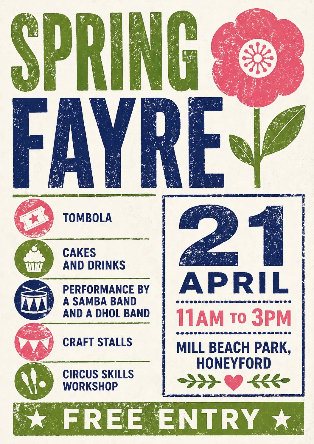
Me: Please give me Stamp / Letterpress Style (Modernised)
Stamp / letterpress style
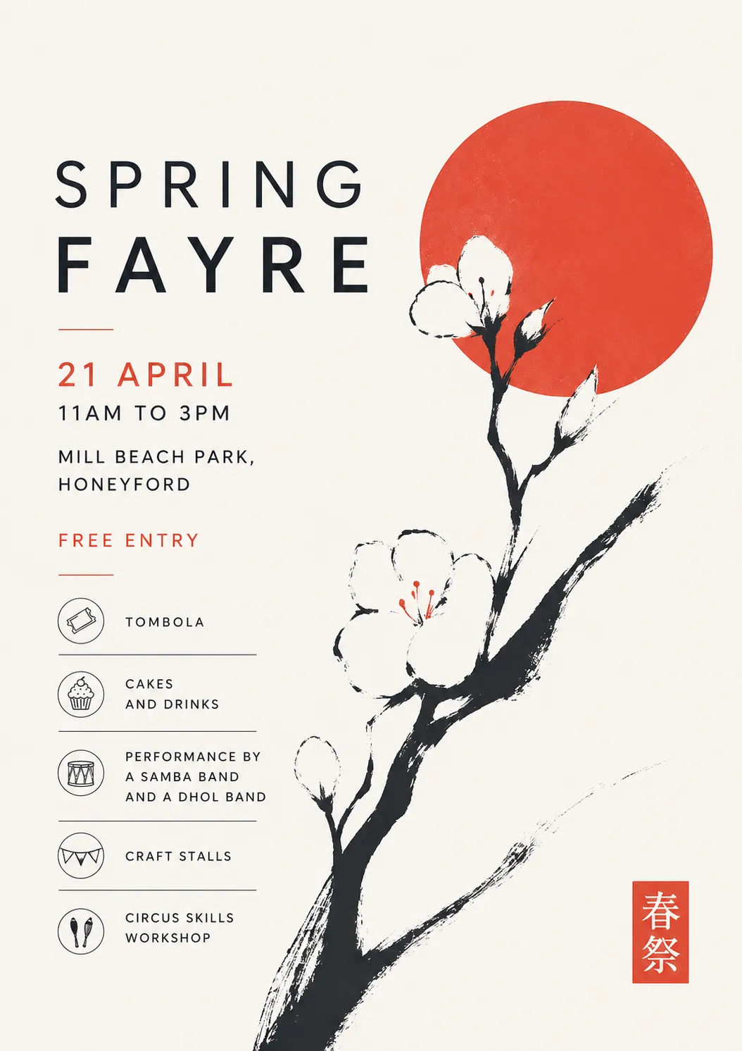
Me: and now please Japanese Minimal Poster
Japanese minimal
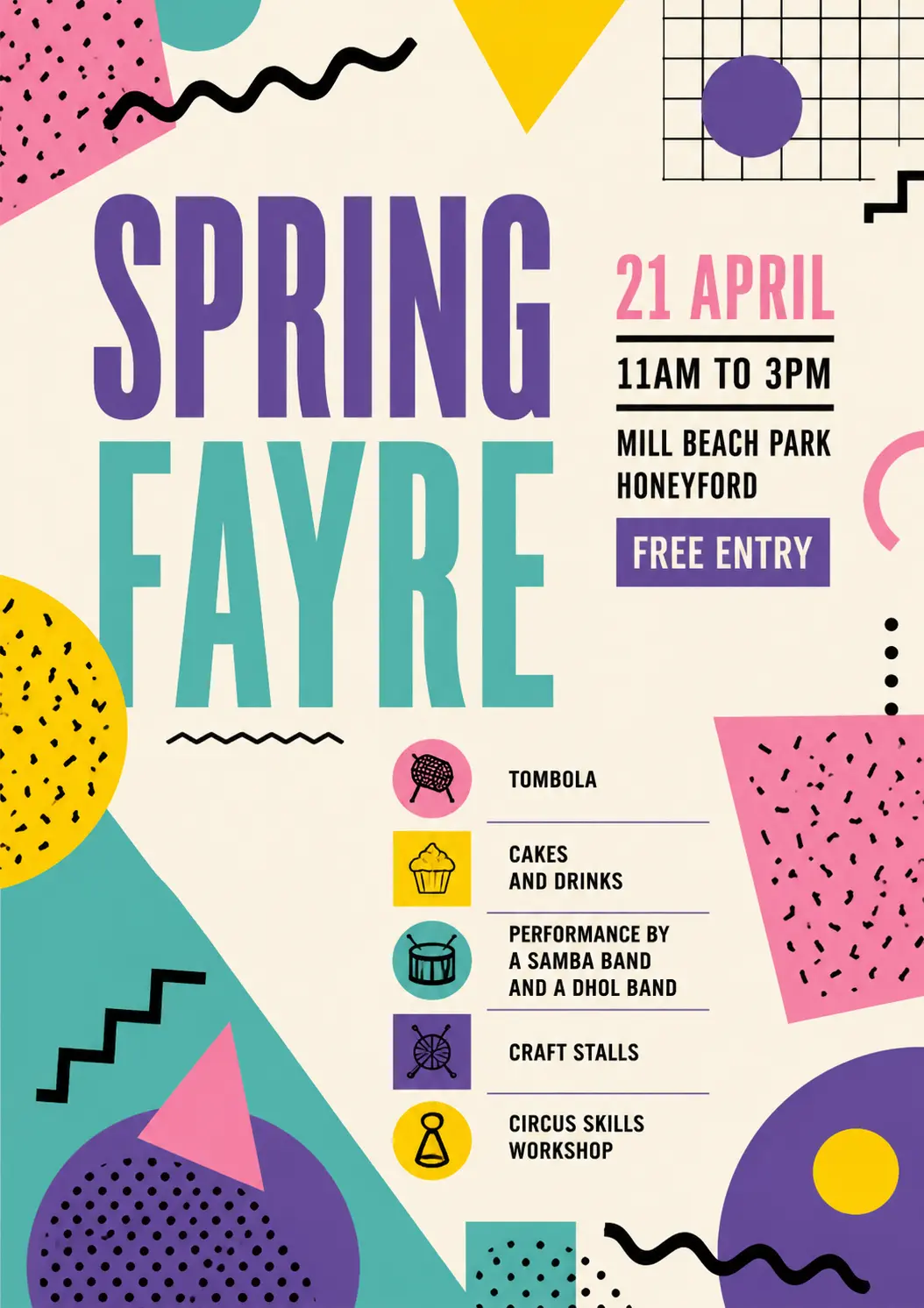
Me: Now do Memphis Design please
(I didn’t know what Memphis Group design was, but I recognised if when I saw it.
Memphis design
Then I got a bit silly. Designers Republic is a design agency famous for
record covers from the late 80s onwards.
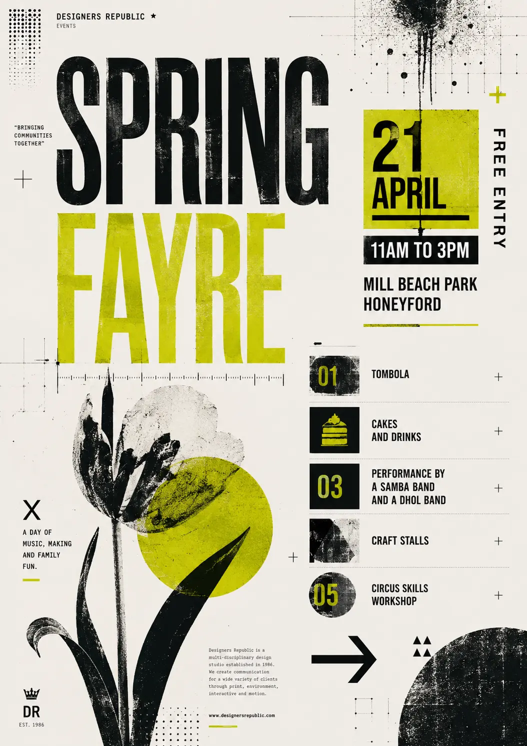
Me: And now in the style of Designers Republic
Designers Republic inspired
One note here is that along the way, the poster has acquired extra text
(“A day of music making and family fun”) – it’s decided that Designers
Republic would have thrown in some text of that kind, so it’s come up
with some words. Those words are now in the chat context, so they appear
in subsequent posters.
If you were working from scratch, you’d just ask for the style you want
in the first place, and avoid picking up trappings as you go.
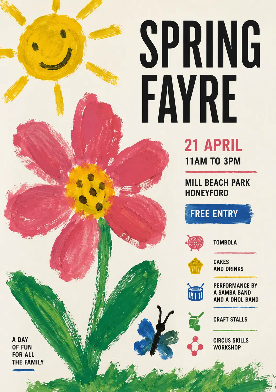
Me: Now as if a professional graphic designer has added typography to a poster paint drawing by his young child.
Child's poster paint + professional typography
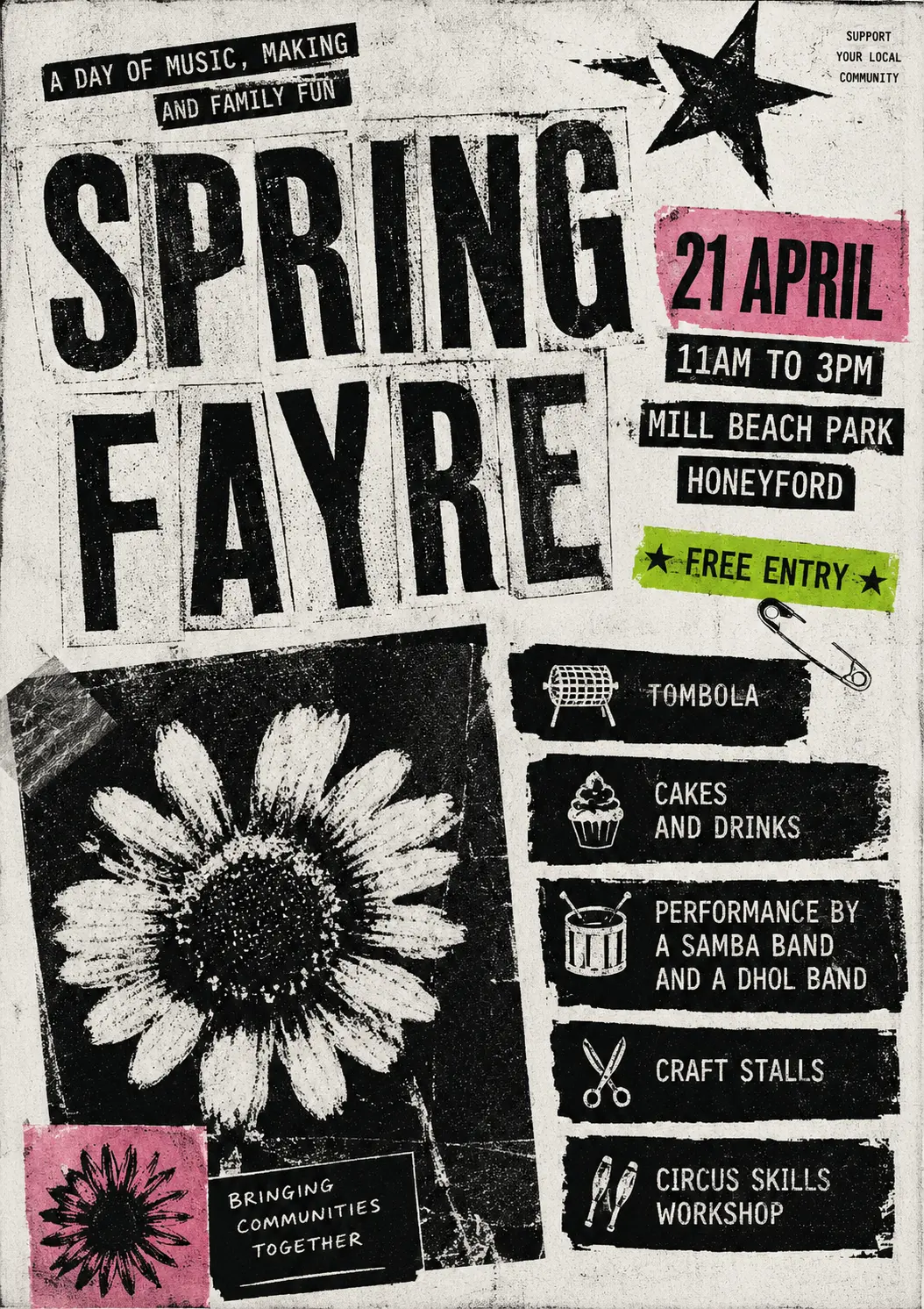
Me: Now with the aesthetic of a photocopied 1980 punk fanzine. But with some colour snuck in.
1980s punk fanzine
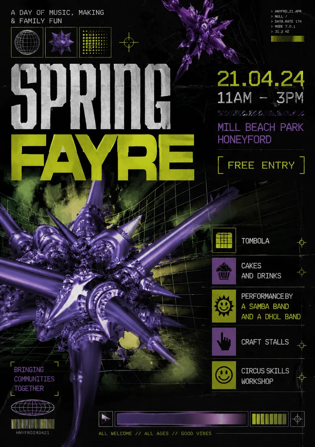
Me: Now please make one in the style of a 90s drum n bass gig flyer, with early 3D/fractal computer imagery
90s drum and bass flyer
Back to sensible ideas, naming an art style but asking for a poster
that movement might have used, seems like a strong tactic.
Me: Now in the style of a contemporary 40s poster for a cubist exhibition.
1940s cubist exhibition poster
So there we are. The sharp-eyed are still going to recognise these as
AI-generated, but they’re distinctive, and I think they’re not ugly.
So that’s the moral - you don’t have to make posters that look like everyone
else’s.
There’s a further step - you don’t have to ask AI for posters as images
that can’t be edited. Claude and Gemini can generate HTML, PNG, PDF,
where the text is real text, layers are real layers, you can change fonts,
move things around, edit the text – but that’s more than I want to talk about today.