Brutalist Graphic Design (1960s–present)
Raw, high-contrast, almost ugly on purpose — heavy black blocks and stark type that reject conventional polish.
Tone down slightly for family events — keep raw energy without illegibility
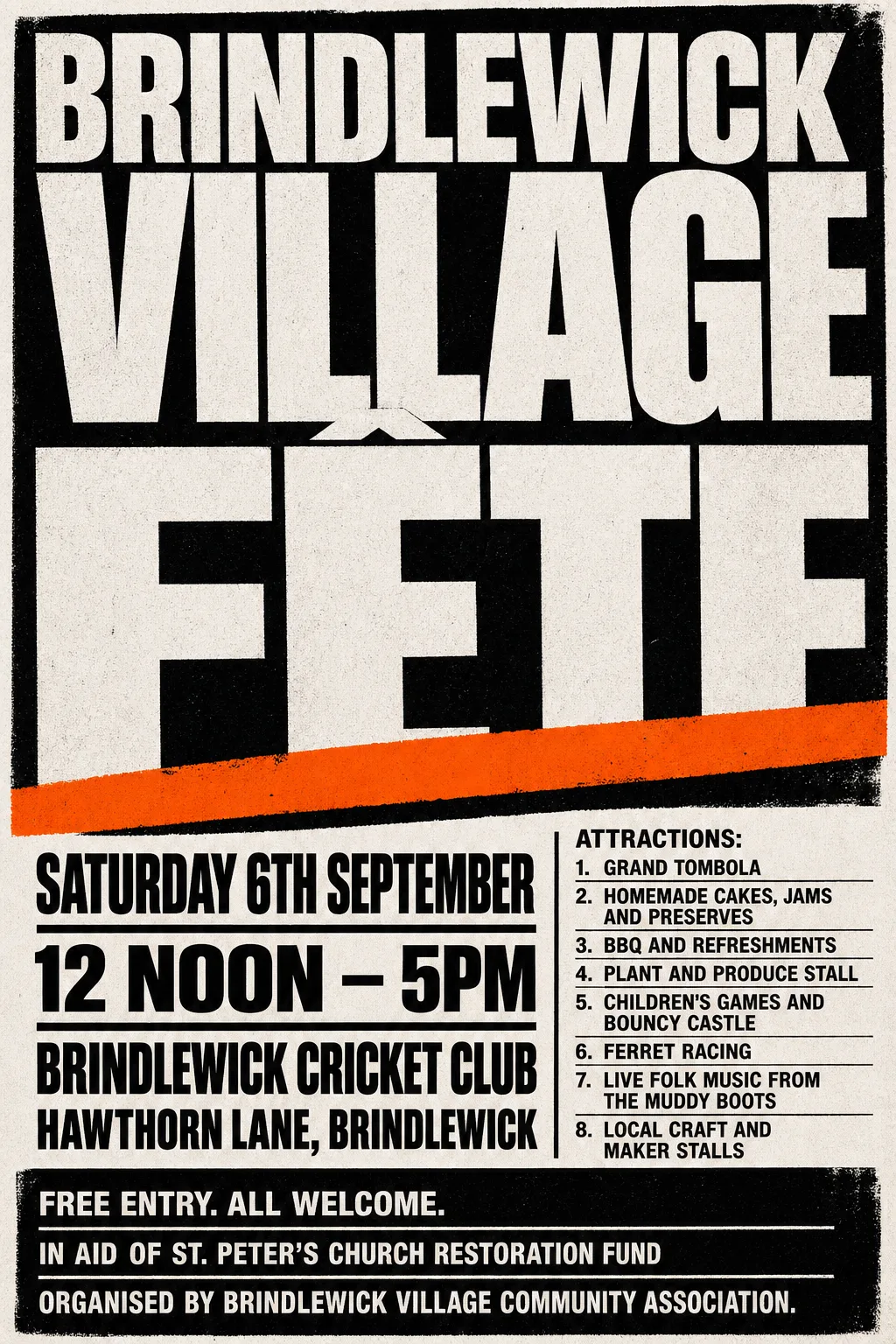
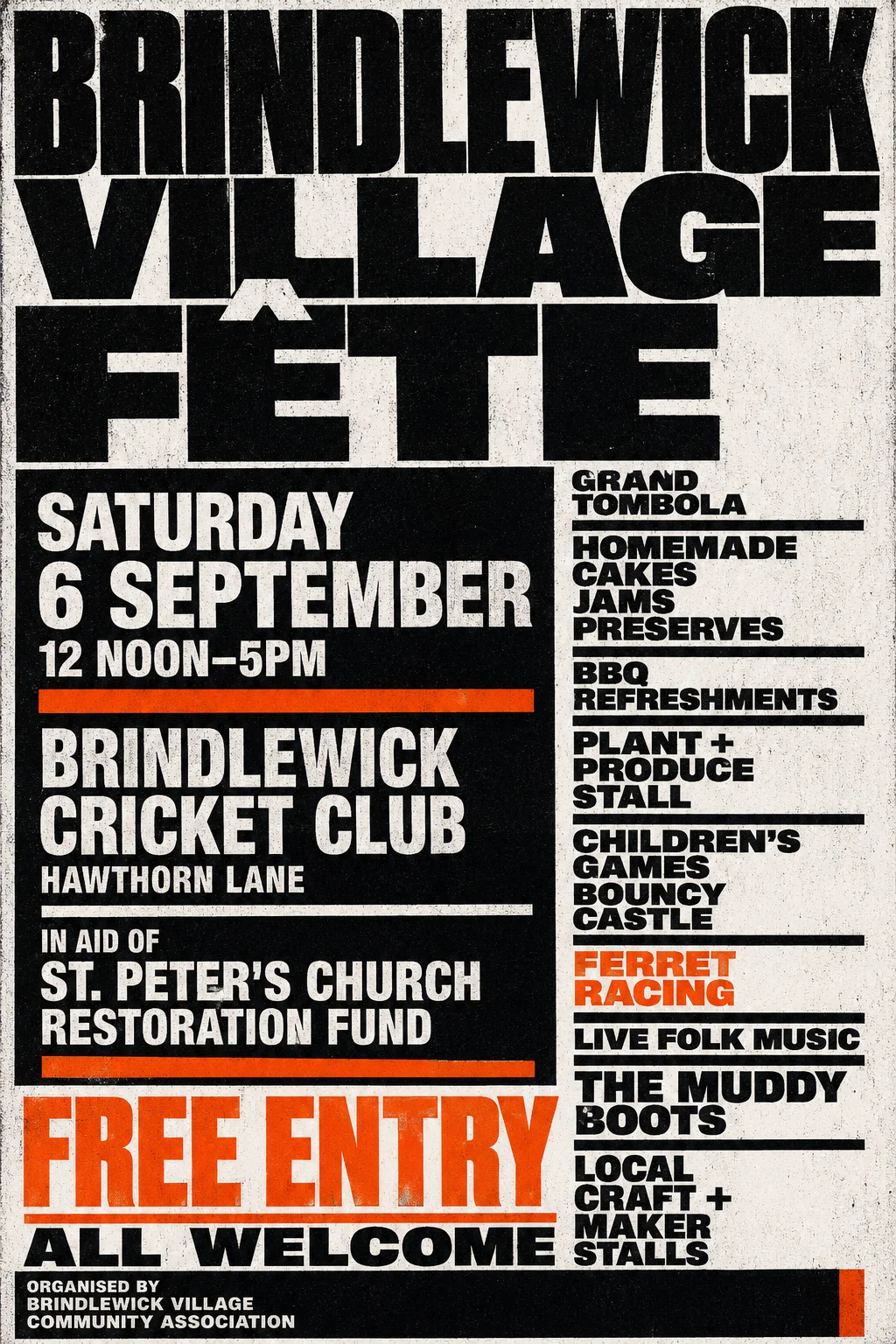
Fête poster
This time it settled on a stark black-and-cream typographic poster with an oversized title, condensed event details and an orange diagonal bar, without any illustrative scene. Another go would find a different shape for the same words.
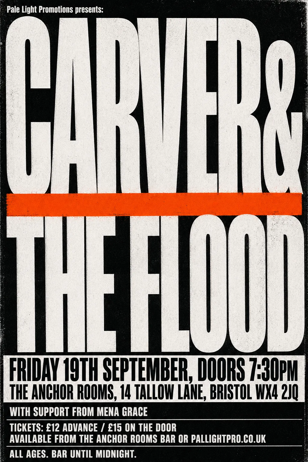
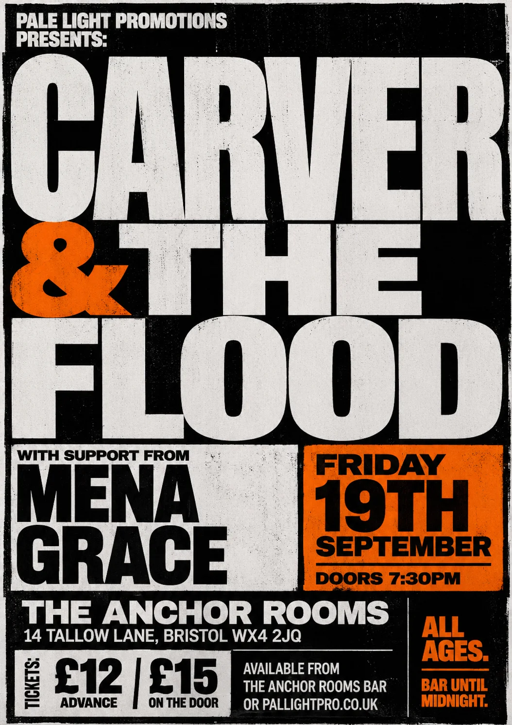
Gig poster
This time it landed on a stark black-and-white photocopy layout, with the band name in huge condensed type crossed by a single orange bar. Another go would find a different shape for the same words.