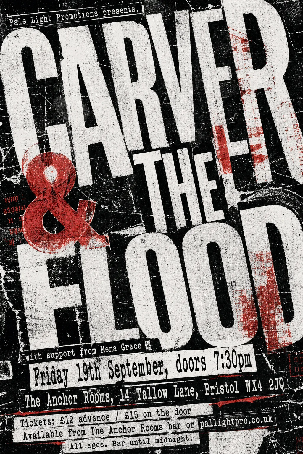
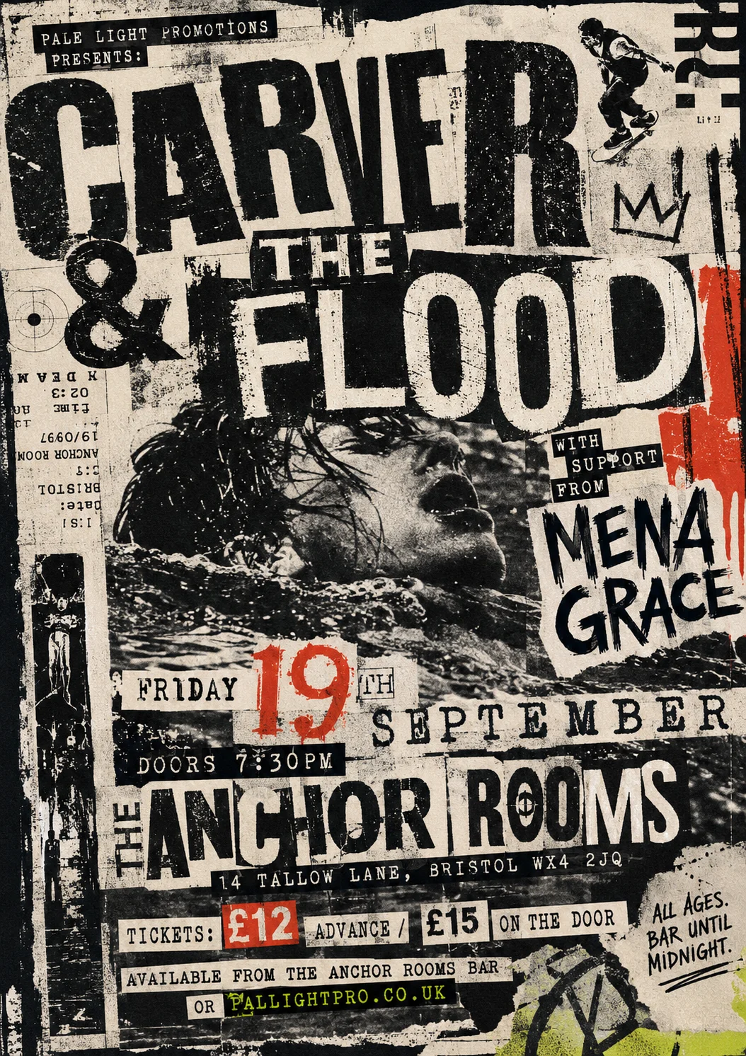
Grunge Typography (1990–1998)
David Carson at Beach Culture and Ray Gun magazine made illegibility a legitimate aesthetic position. Type is set in damaged, wrong, or distorted fonts; images are blurred, scratched, or printed over with text; the conventional hierarchy of headline and body is abandoned in favour of emotional rawness. Anti-design, but only possible because its practitioners knew exactly what they were destroying.
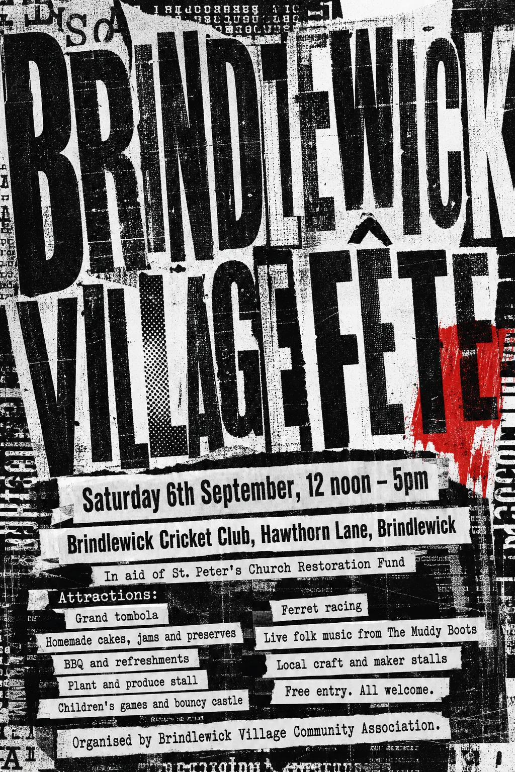
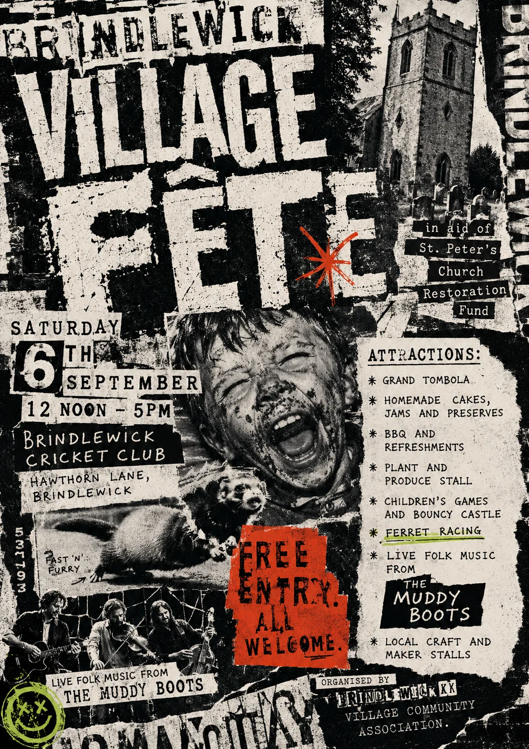
Fête poster
This time it chose an enormous, distressed black ‘BRINDLEWICK VILLAGE FÊTE’ title, torn-paper strips for the event details and attractions, and a single red overprint. The typography is the picture here, so another attempt would set the same words a different way.
Gig poster
This time it went with a huge, tightly cropped “CARVER & THE FLOOD” in distressed black, white and red photocopy layers, with the full event copy stacked below. The typography is the picture here, so another attempt would set the same words a different way.