Italian Futurist Typography (1909–1944)
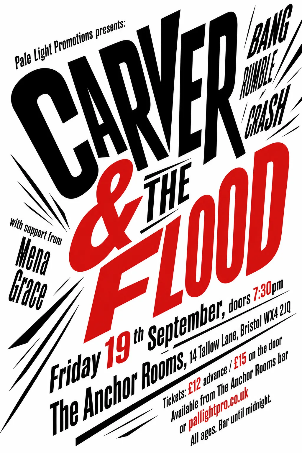
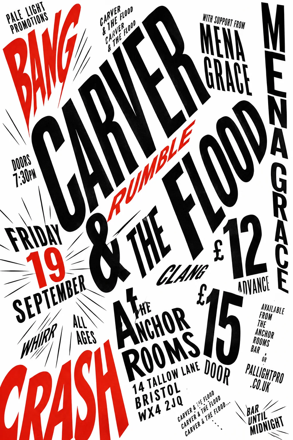
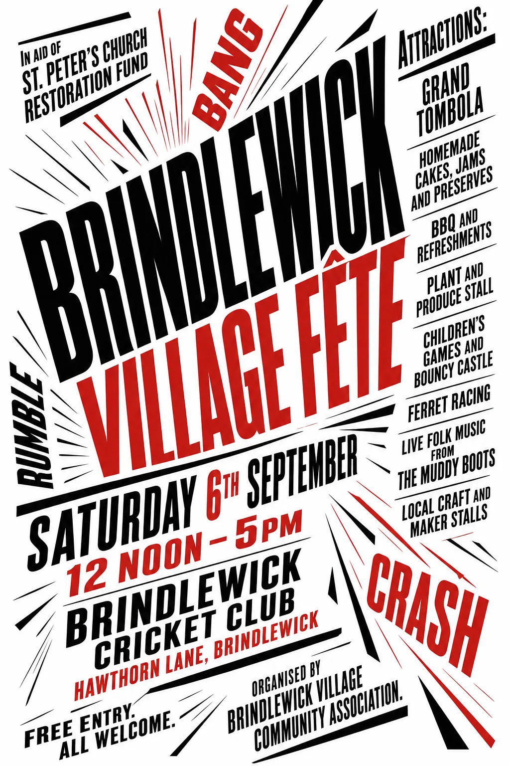
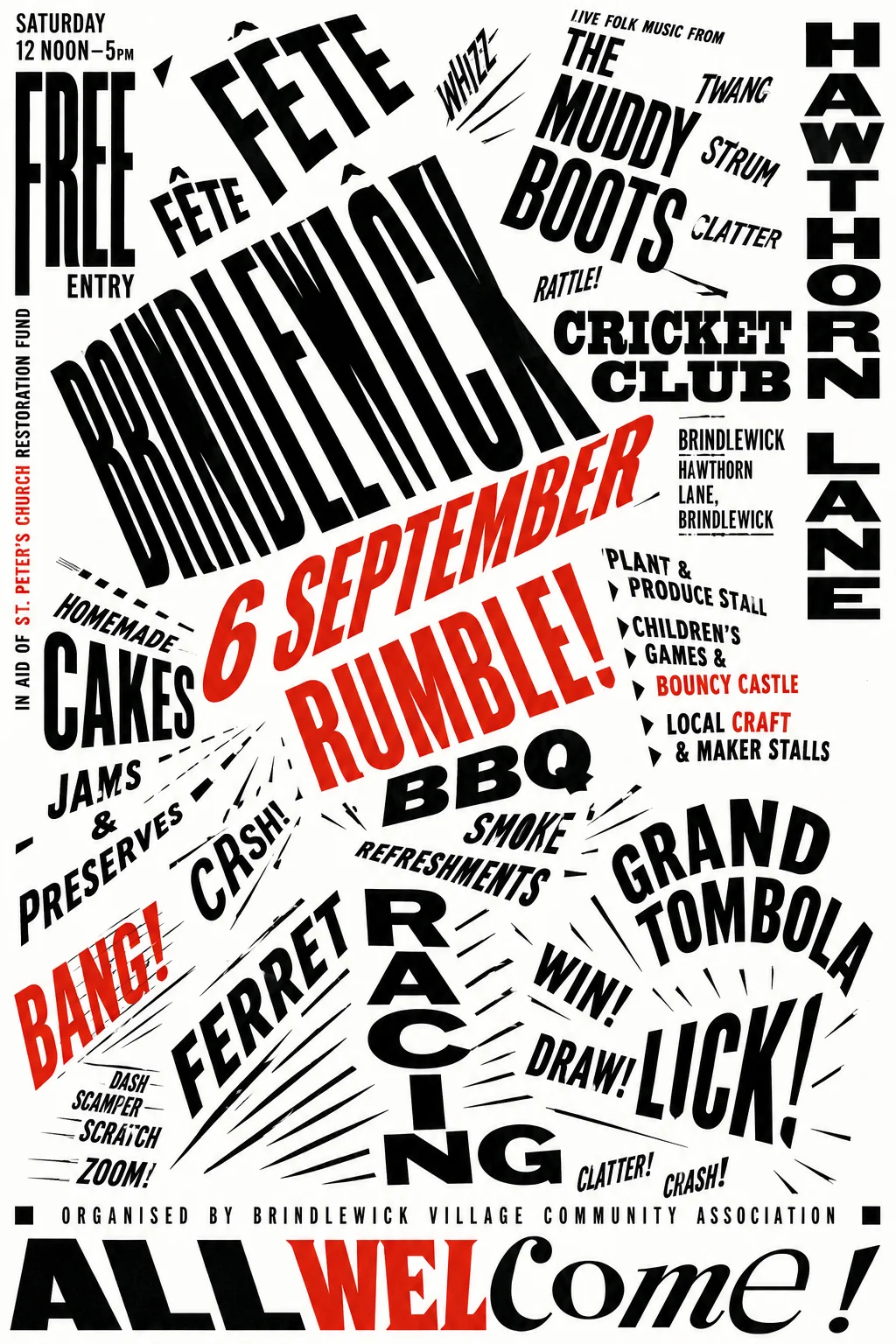
Marinetti's parole in libertà (words in freedom) treated the printed page as a battlefield where words move at different speeds. Text runs diagonally, vertically, in expanding or contracting sizes; onomatopoeia becomes visual sound; the white space around each word is part of the composition. This is distinct from Futurism as an art movement — here typography itself is the content, carrying velocity and noise in its physical arrangement.
Fête poster
This time it settled on a stark red-and-black typographic explosion, with the fête name stretched across the centre and BANG, RUMBLE and CRASH among radiating speed lines. Run it again and you would get a different typographic arrangement of the same information.
Gig poster
This time it landed on a sharply angled black-and-red typographic poster, with “CARVER & THE FLOOD” dominating the page and burst lines radiating around it. Run it again and you would get a different typographic arrangement of the same information.