Those AI posters, with real fonts
Those hundred poster prompts again.
A common observation is that it’s not using real fonts. An AI image model makes a bitmap image of what it thinks a poster should look like. That has image has shapes that resemble letters, spelling out words. But unlike the words you’re reading out now, those shapes aren’t built from a library of letter shapes (or more precisely, strict recipes for producing shapes) called a font. It’s as if the image model is hand-drawing each letter from its memory of what that kind of typeface looks like.
Sometimes that’s obviously appropriate. Psychedelic Sixties and Push Pin Studios clearly rely on letter forms that a real designer would hand-draw.
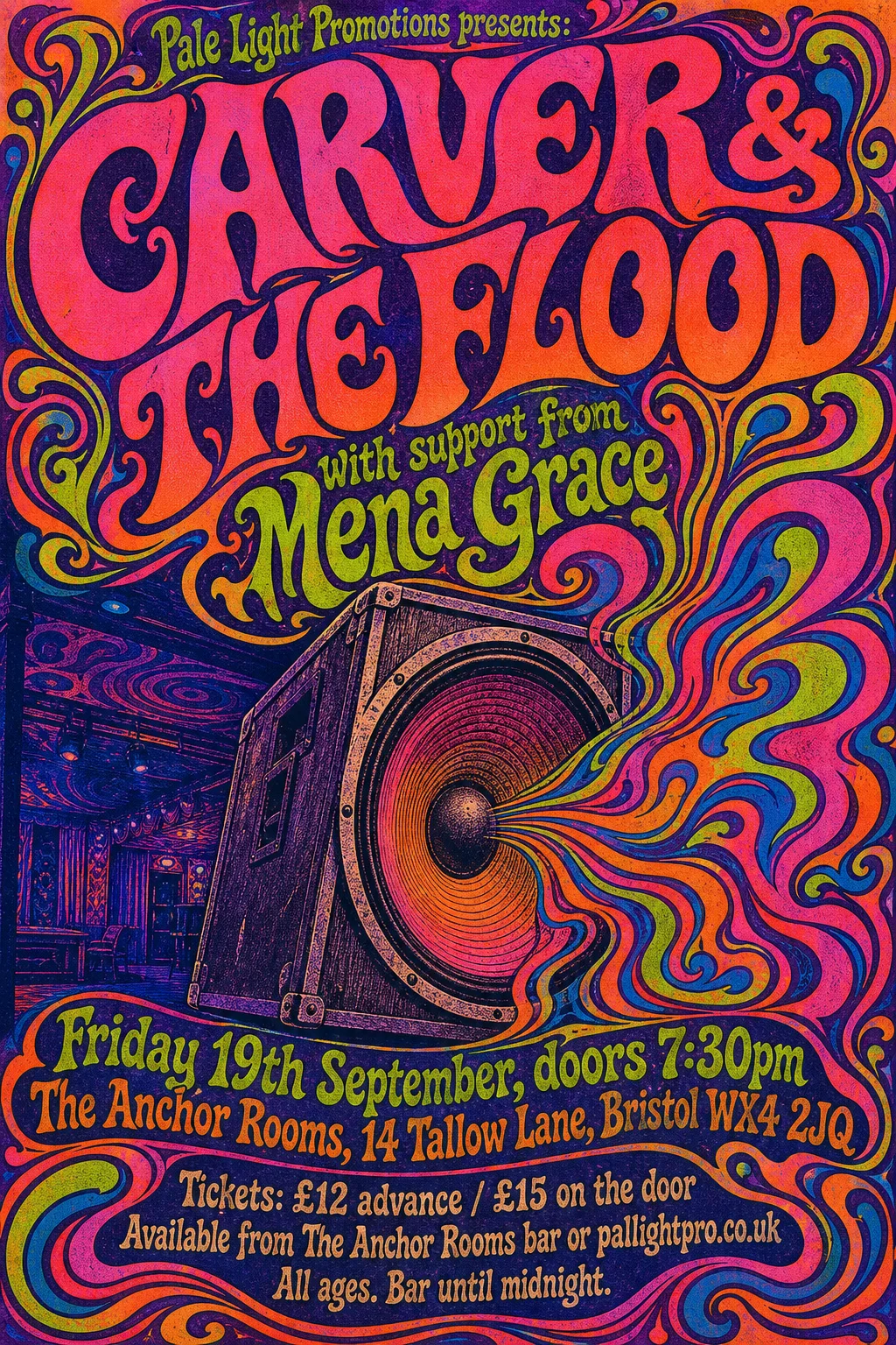
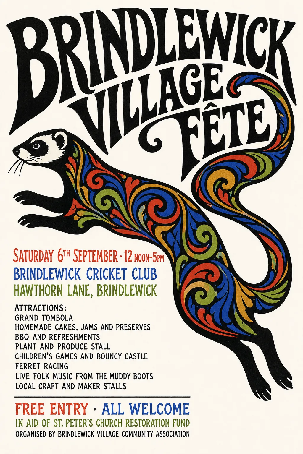
Other times it appears more likely that a real font would be the correct choice. Swiss / International Typographic Style would almost certainly use Helvetica, Contemporary Editorial looks like a mainstream serif font like Times Roman. In this case are we only using the model’s approximation because it doesn’t have another way?
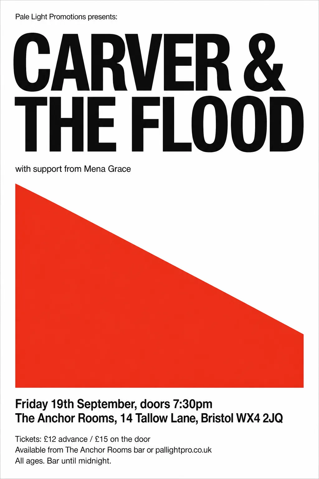
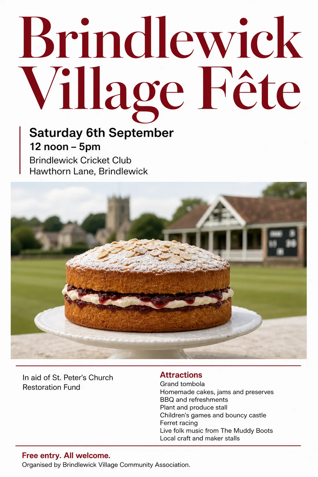
A designer friend observes: “I don’t recognise any of the fonts, they’re all approximations. One previously unseen font on a poster I could accept, but 2-3 when they’re all fairly bland in any case still registers as a tell for me.”
As I’ve pointed out before, I don’t care about tells: fooling people that they’re not looking at AI is not a goal. But not triggering icky feelings, is a goal. If some people are getting an uncanny-valley response because that’s not quite Helvetica, this is a problem. (Notwithstanding, the same people get not-quite-Helvetica ick from Arial).
So I thought I’d experiment by trying to convert some posters into a vector format. Cut out the graphical elements, find a font that matches the text, and reassemble it into an SVG file. The story of how that went, and all the results, is on its own page.
When it works, you get pretty close matches, and the knowledge that the type is as a type designer intended. Here’s the De Stijl gig, before and after:
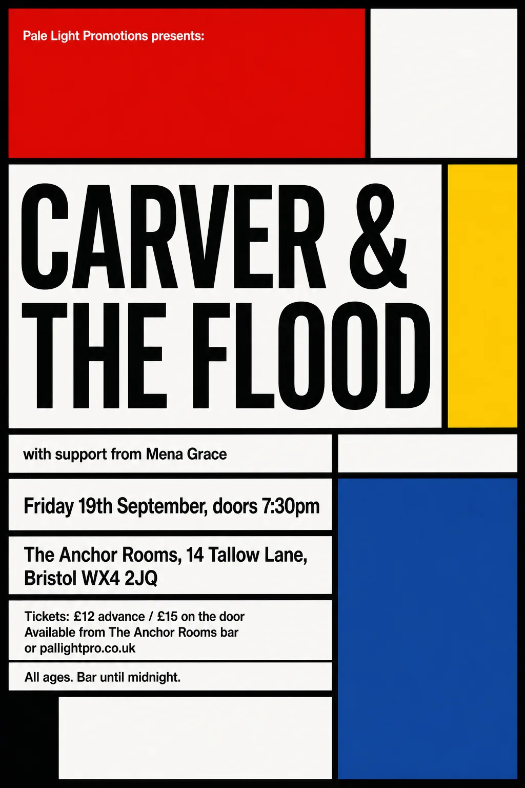
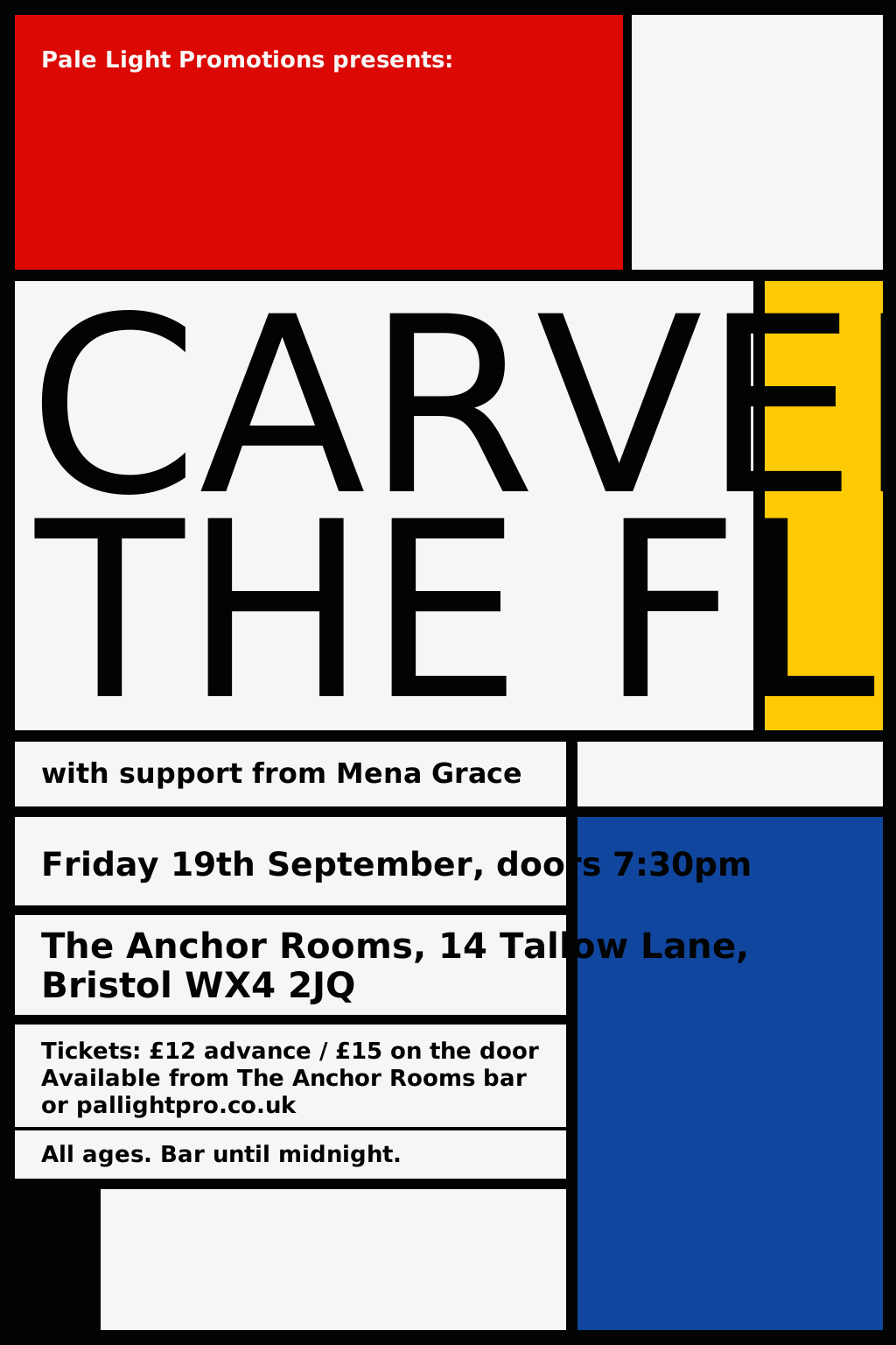
So that’s better, right?
Maybe sometimes, maybe not always, I’m not sure.
Look at the Bauhaus / Modernist gig, below. That pointy ‘V’ the model drew works really well for me. Perhaps if my convertor had found the right font, the conversion would have a pointy V too. But that might not match other letters. And anyway, the point is that the AI model is free to decide that here, in this one word, in this one position, a pointy V works.
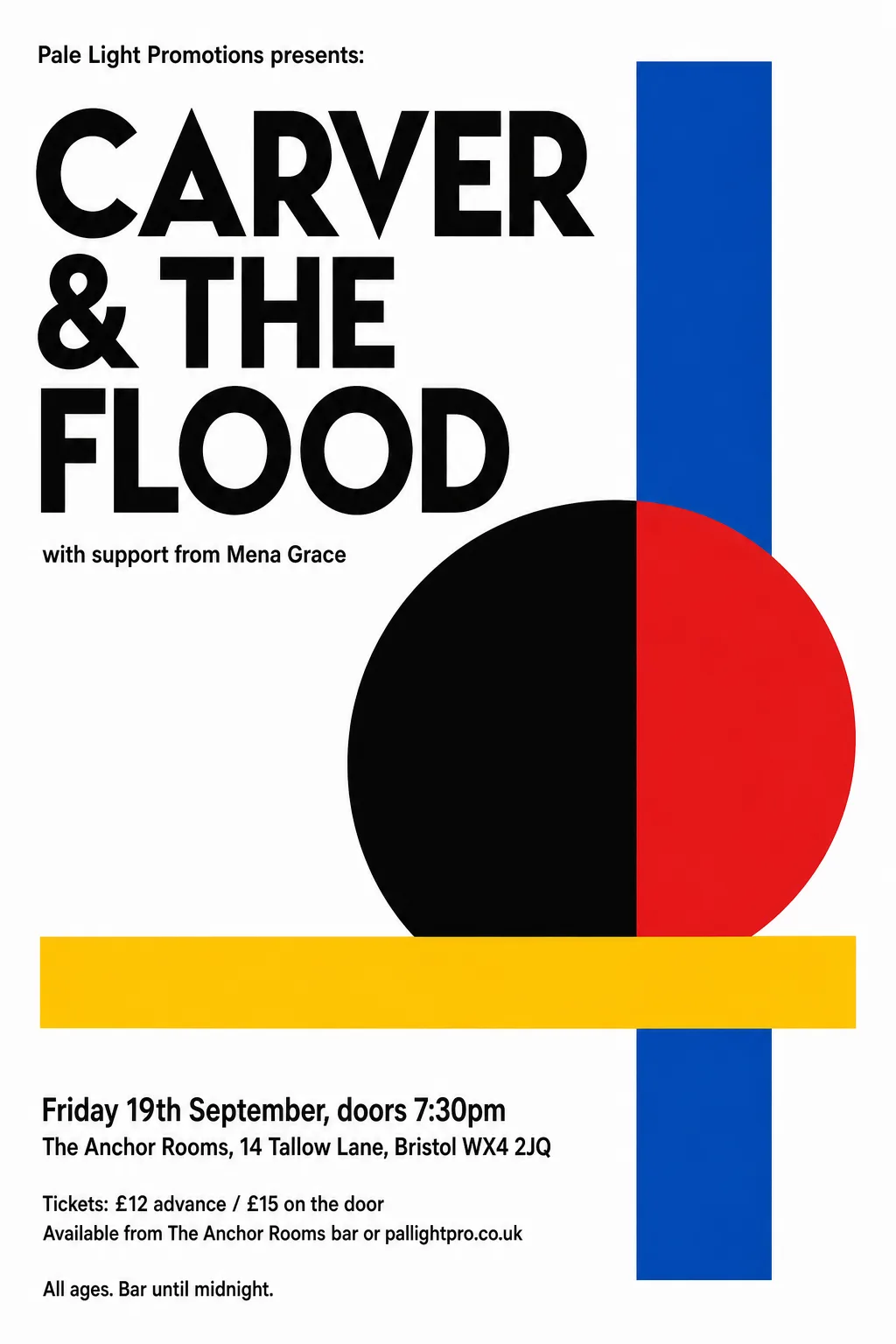
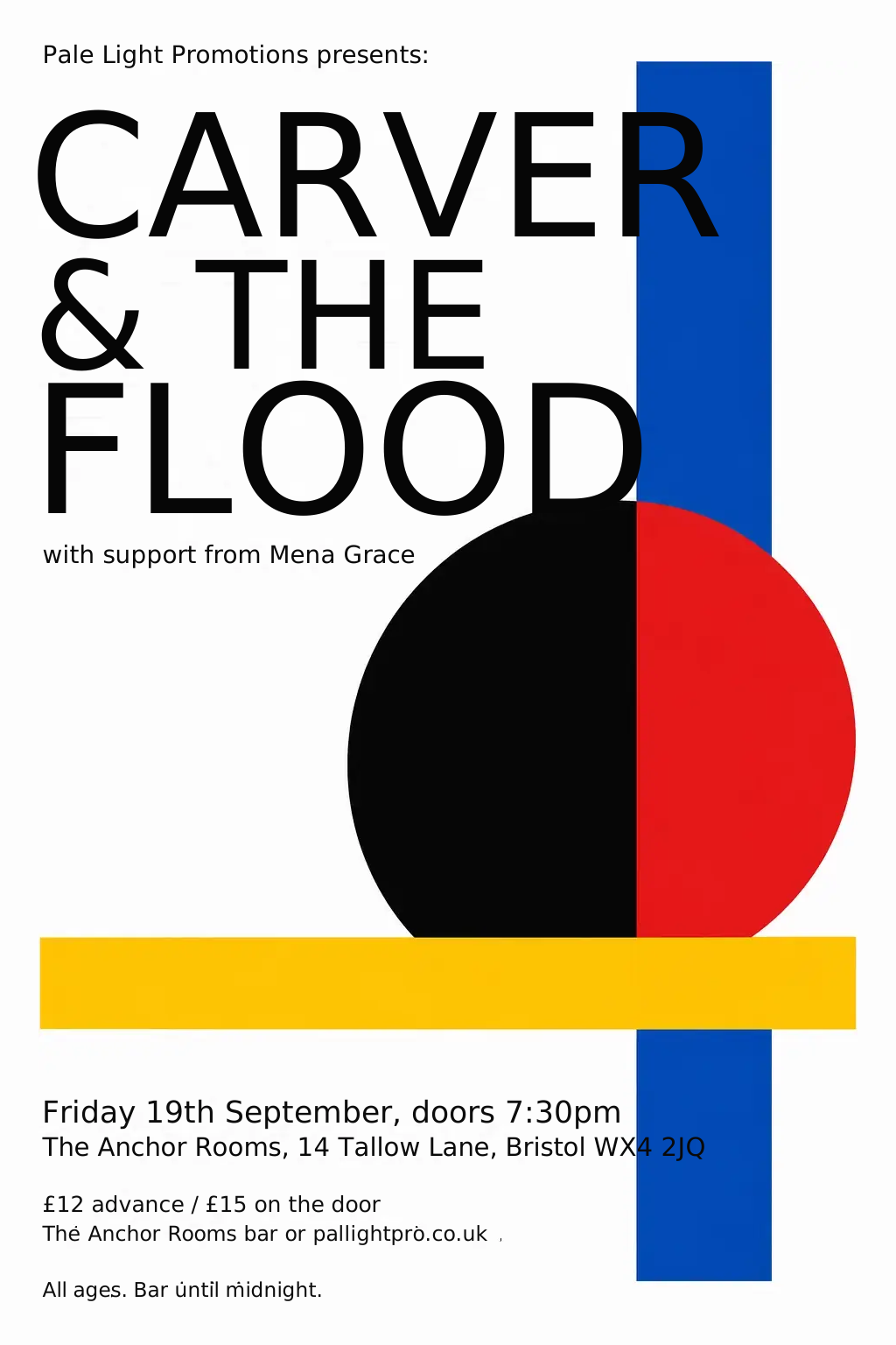
In other places, like the Festival of Britain gig below, the model-generated drawn text lines up just-so: “CARVER &” the same width as “THE FLOOD”. You can achieve this with type by stretching or adjusting whitespace, but the model has achieved it in its drawing with quite a sophisticated combination of both: drawing and spacing all the letters so that in combination they fit the space.
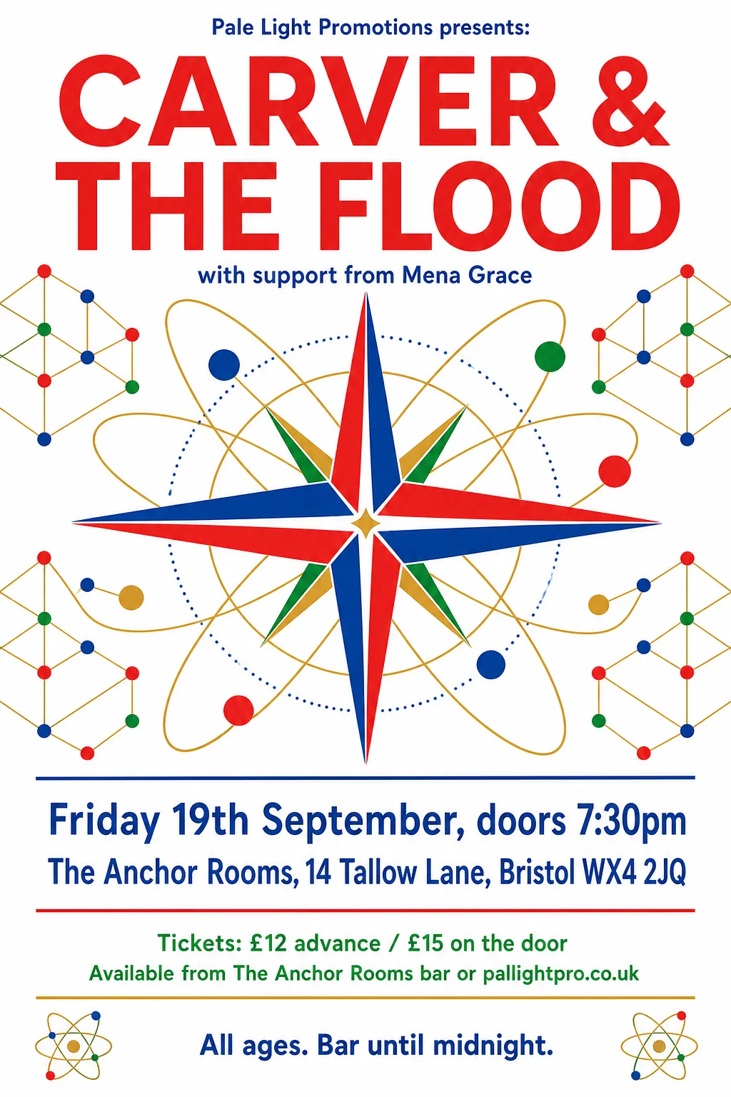
And on that theme: one of the reasons to use fonts with a real text layout engine, is that the layout engine knows how to space letters just-so. And that’s especially ideal when you’re typesetting blocks of text. But I’ve been learning that especially with big titles and logos, it’s not unusual for a designer to nudge things around. You don’t get that for free.
The AI model has the freedom to:
- invent letter forms that deviate from what the “font” would normally use
- use different weights, widths, spacings, shapes according to context and space needs
… indeed it has no concept of not doing those things.
So myself, I’ve become quite attached to letting the model do this. A model with suitable training could become very, very good at it – I’m just using general purpose models, though. Who knows whether OpenAI are training an image model in that direction?
I should mention the other reason to build posters in a vector format: editability. If you have a poster in a combination of bitmap objects and vector elements, you can move things around, add or change words, and so on. That is not the focus of this blog post.
As ever, I am not a professional designer, nor even a well trained amateur. I can only speak for my own untrained eye.