Poster Prompts as SVG
This is the outcome of running a vibe-coded agent skill on every V2 poster.
The motivation is, people would look at the posters and say:
- "Wouldn't it be better if it used a real typeface?" - so it benefits from the painstaking design that font designers put into typefaces
- "Wouldn't it be better if it were an editable vector file?" - so a human can change the text, move elements around, etc.
I casually asked Claude Code to convert a few, just so I could see whether I preferred the real typefaces. The goal here is to cut out the artwork, recreate that type, and assemble it back together. If the nature of the poster makes it impossible (hand-drawn text, detailed background, etc.), we abort early, explaining why. Redrawing artwork as vectors was not a goal, but Claude did it anyway when the images were simple.
Claude achieved this by writing ad-hoc Python code to locate artwork and text, find a best-fit typeface, and replace the text -- when it could. This consumed a lot of tokens, and I ran out that day. When my quota reset, I asked it to write the tools it would need to do this more efficiently. So we end up with deterministic tools that measure, which the LLM uses to rebuild the poster. As we converted more posters, Claude made changes to the tools on the fly. It is fully vibe coded, so I have no idea whether the code is good or bad. As you can see, it doesn't always get things right, but I have called this a stopping point.
Claude chose a palette of 300 fonts from Google Fonts, refusing to use license-encumbered fonts. It tries to pick a font close to the one that the AI image generation model invented for the poster, and does not always succeed. It also apparently doesn't take advantage of the layout engine's ability to centre text on a line.
Results fall into these categories:
- Skill abandoned early, correctly, with an explanation
- Skill abandoned early, maybe it should have tried harder
- Conversion done, looks OK
- Conversion done, obvious flaws, but the skill thinks it succeeded
- Conversion done, skill has acknowledged flaws, and explained why (alert icon top left corner)
- Conversion done, skill has acknowledged flaws, and explained why (alert icon top left corner), but flaw description is wrong
Well, the failures are failures. I'm sure there are pro tools that would do a better job.
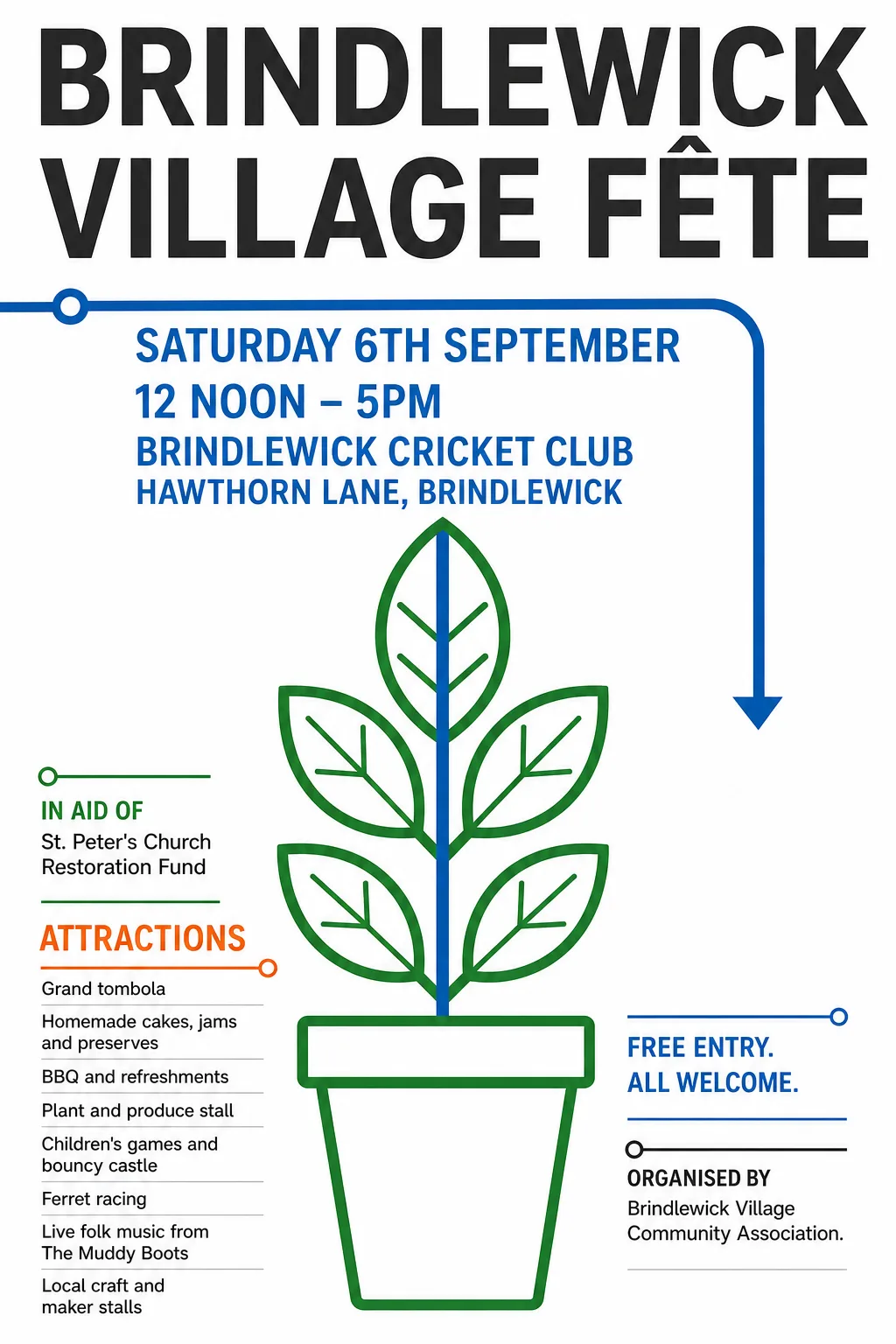
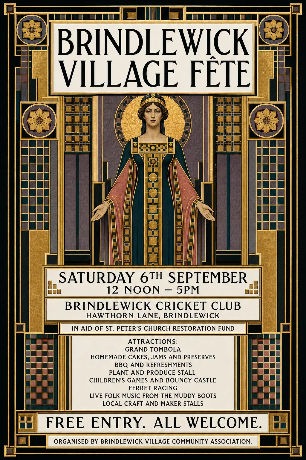
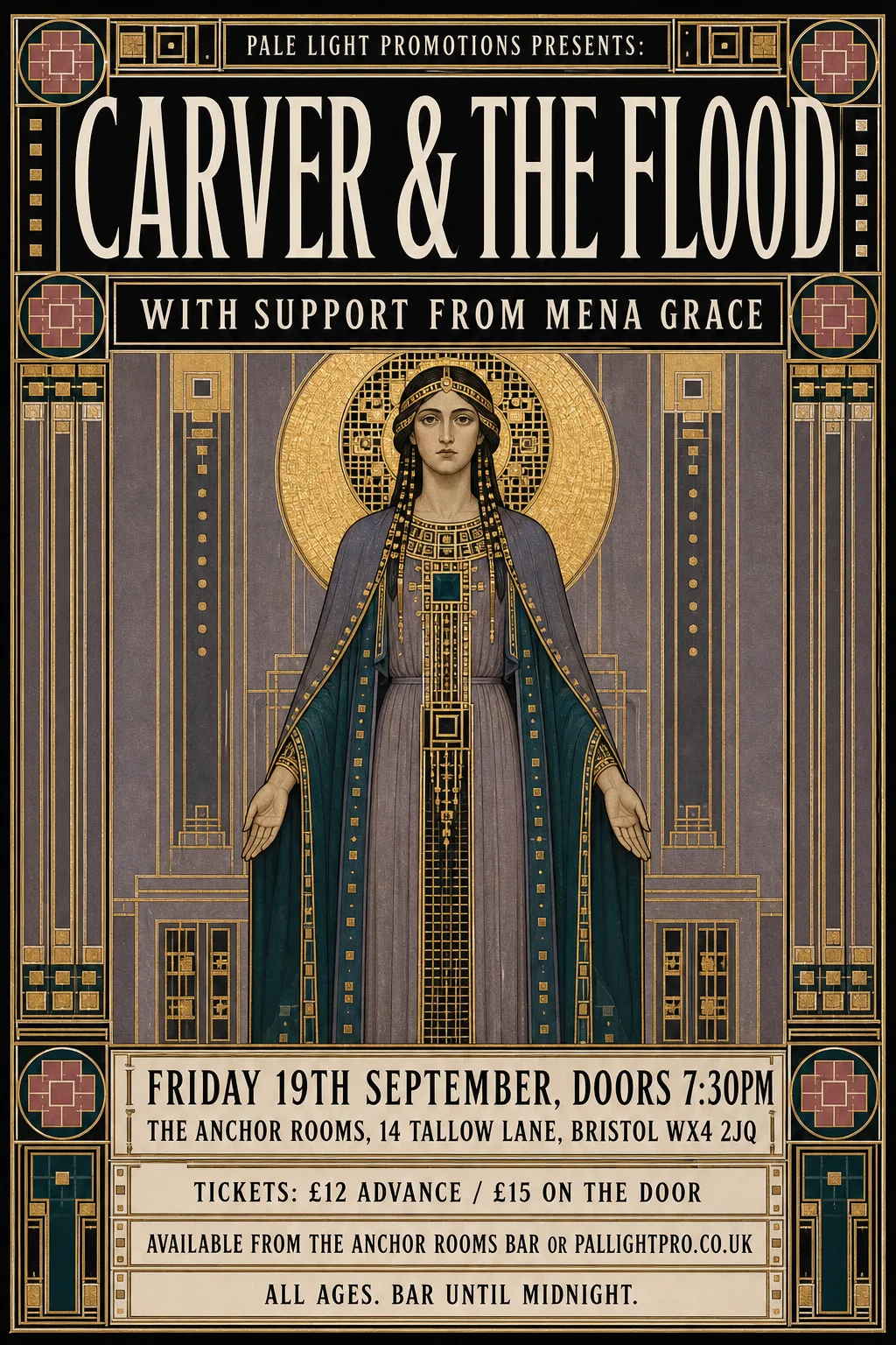
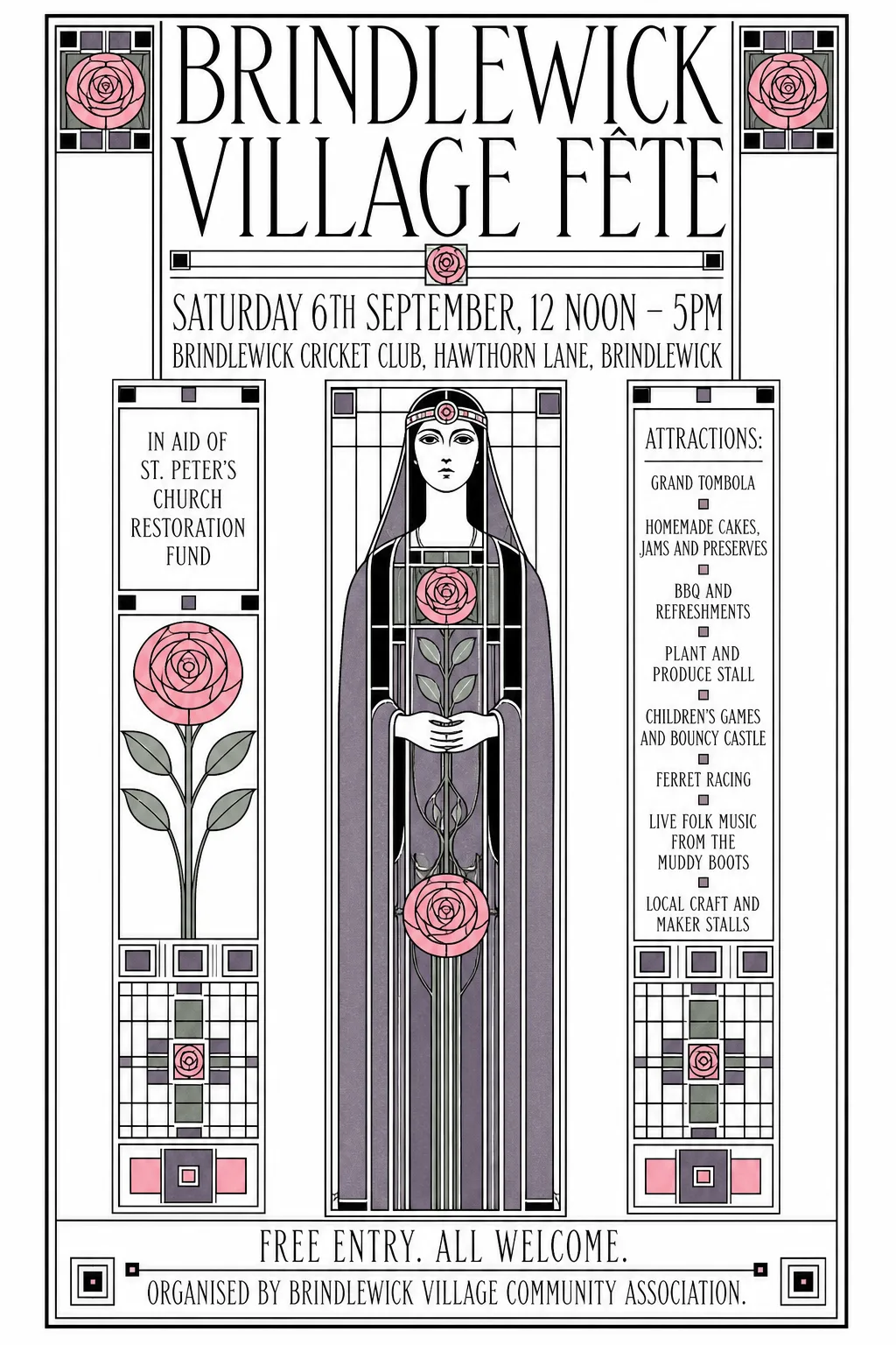
The "successes" are more interesting. Some of them have chosen a close-enough typeface, and positioned it well enough, that we can call it a like-for-like conversion. In those cases, the million pound question is: do I prefer the real type to the image-model drawn text?
I'm not sure I do. In most cases, I kind of like what the image model has done better - it's moulded to the shape of the poster, and the shape of the words. It could probably do a better job, with training - but I'm not the connoisseur to adjudicate on that. Maybe it's just that the SVG version doesn't use the font it ought to: in places that's obviously what's happened, it's used a sans where it should be a serif. In other places it's chosen something close-ish, and maybe the right font just doesn't exist.
I know real designers who get an uncanny-valley ick from seeing type that's almost, but not quite, a typeface they know. I also wonder whether a broader audience gets an unconscious sense of "you can always tell" AI ick from seeing text in that mode.
Anyway, scroll through and judge for yourself. Under each pair are notes the conversion recorded about itself: known faults, lettering it kept as the original's pixels and why, and the typefaces it chose.
Update
Since first writing this page, Claude and I made some improvements:
- Every typeface is now chosen by eye, in a review step, rather than left to the automated ranking, which too often picked the wrong kind of font (a slab where the original was a plain sans, a novelty face on a sober poster). I reviewed the results and sent back the ones I thought were weak.
- The choice is from the whole Google Fonts library, about 6,500 styles, not a palette of 300.
- Lettering no typeface can stand in for (hand-drawn, painted, chrome, neon, glitched) is kept as the original's pixels, and only the rest is reset. That rescued a dozen or so posters that had been abandoned.
- The layout is better: centred lines stay centred, wrapped lines keep their spacing, lines don't run into the artwork, and fewer ghosts of the original lettering are left behind.
- Each SVG records what happened in its conversion, which is where the notes under each pair come from.
The examples below all use these improvements. Of the 200 posters, 87 are now converted (4 of them with known faults, marked with the alert icon) and 113 are still "no SVG version".
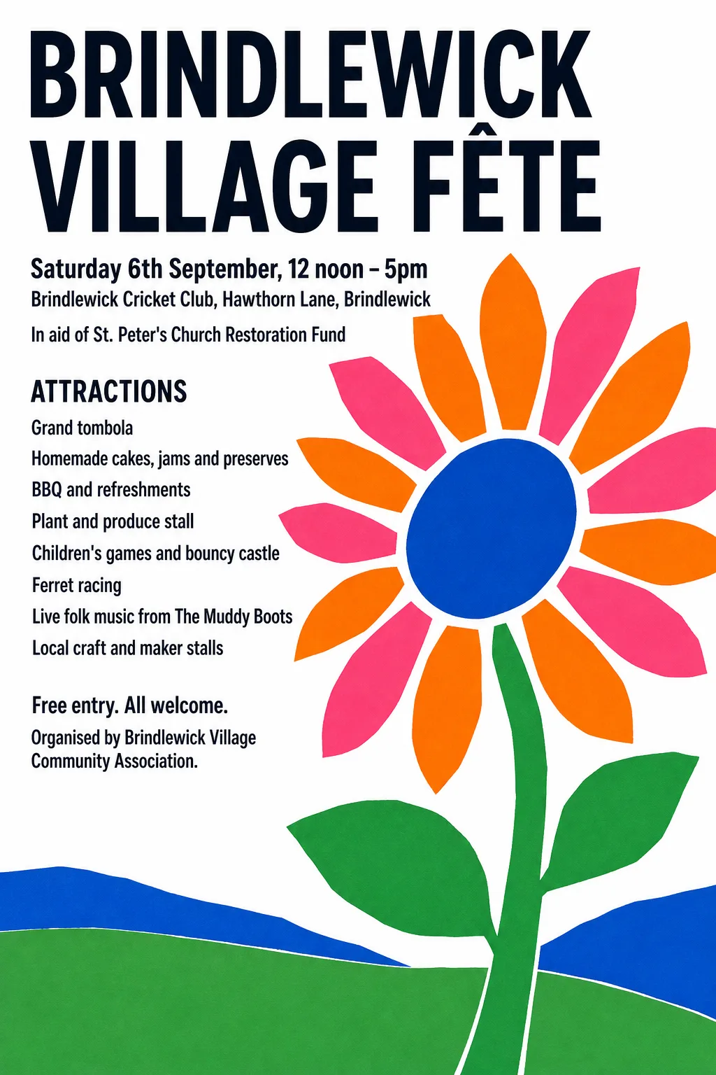
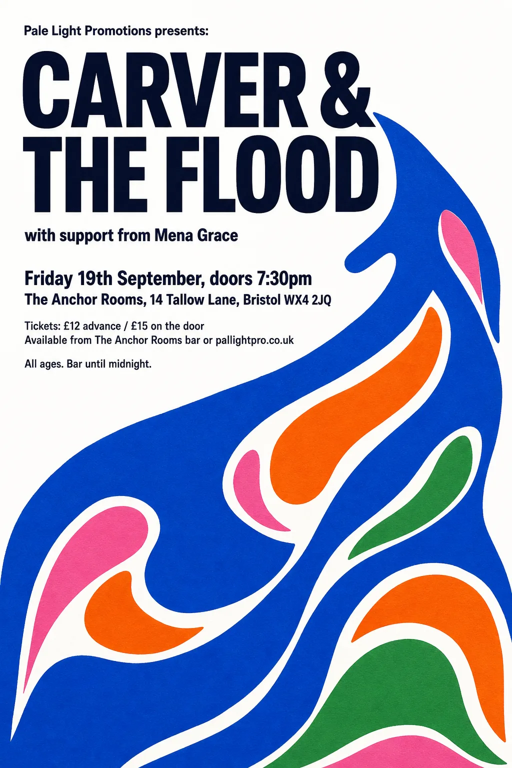
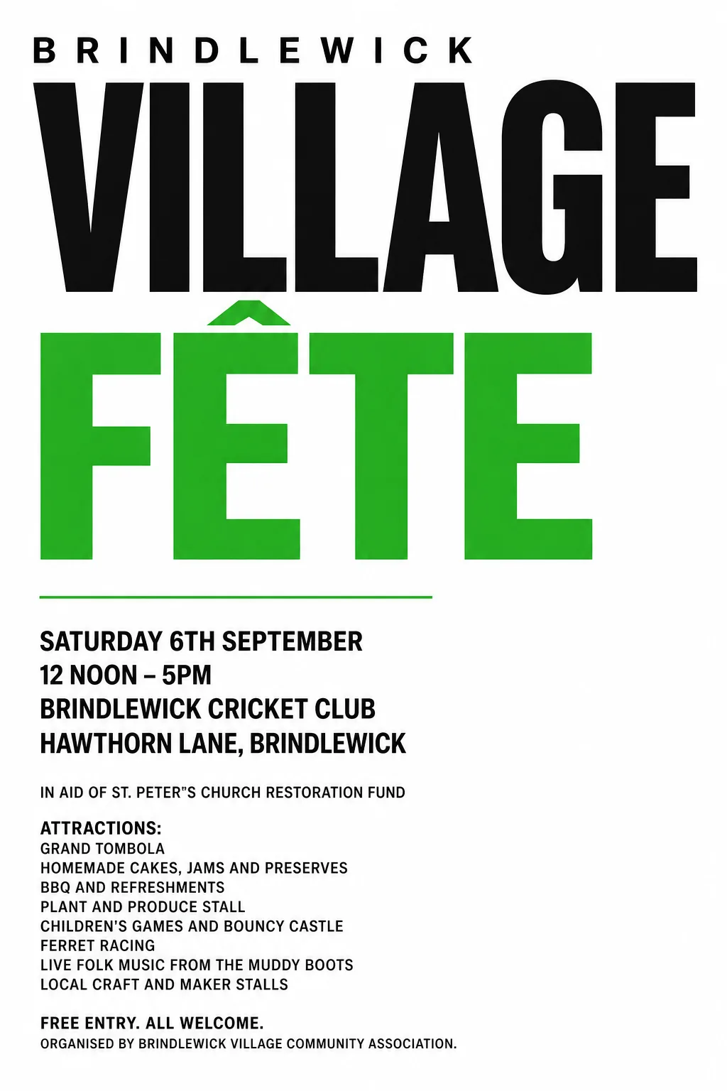
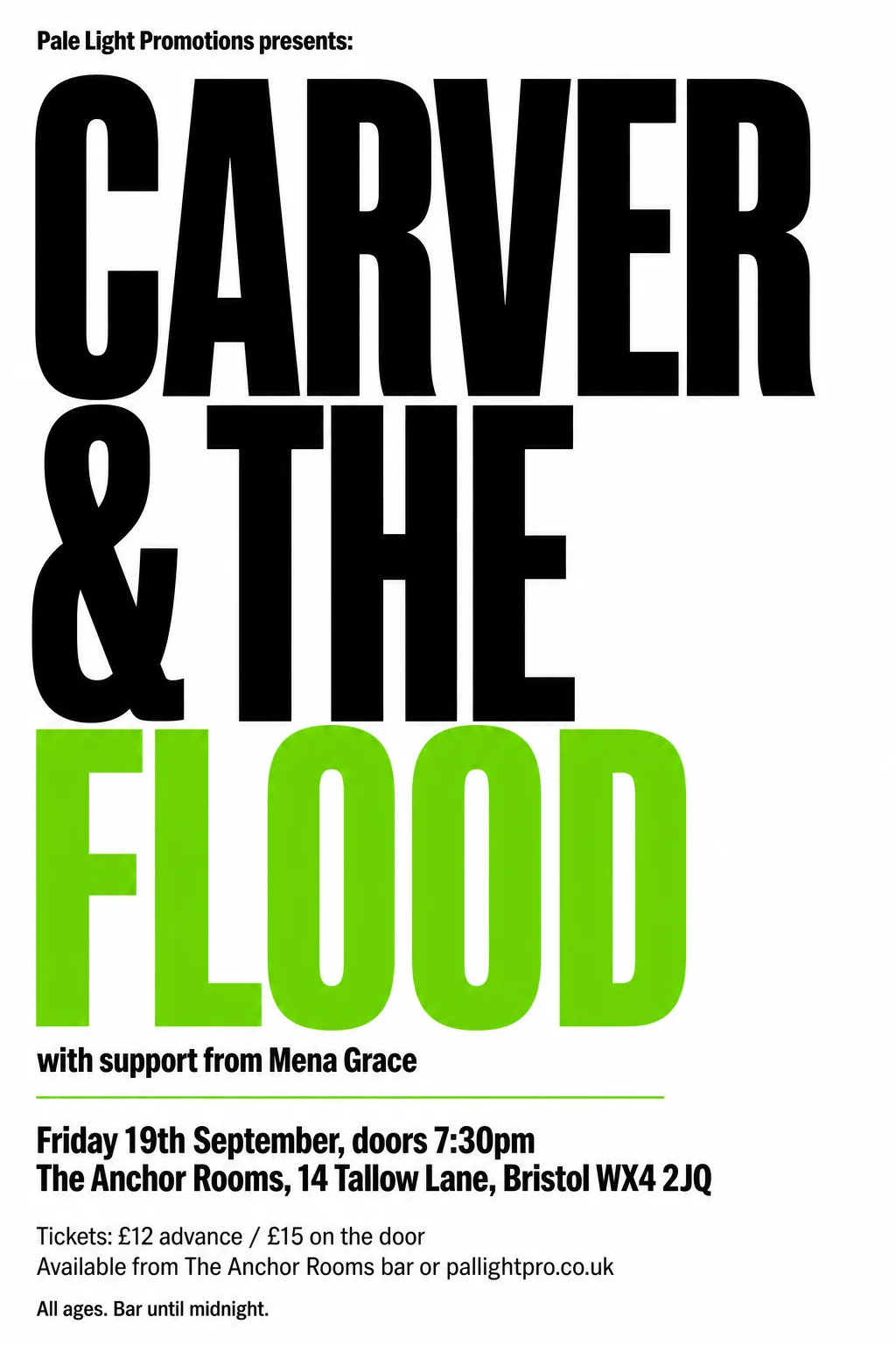
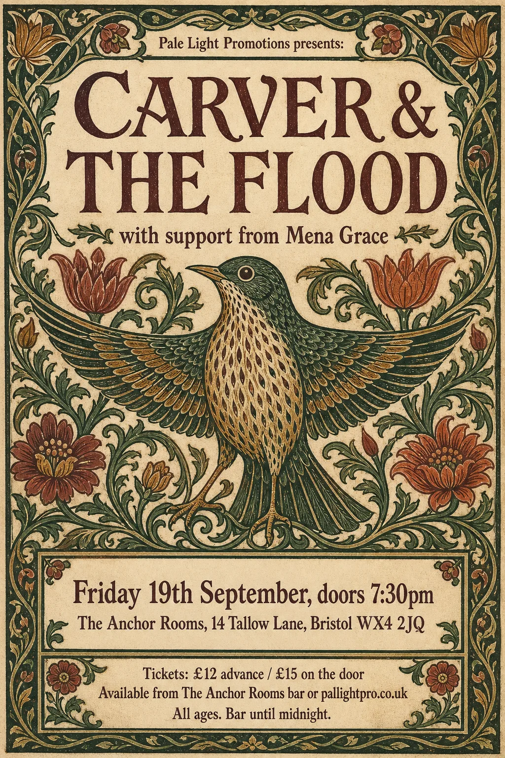
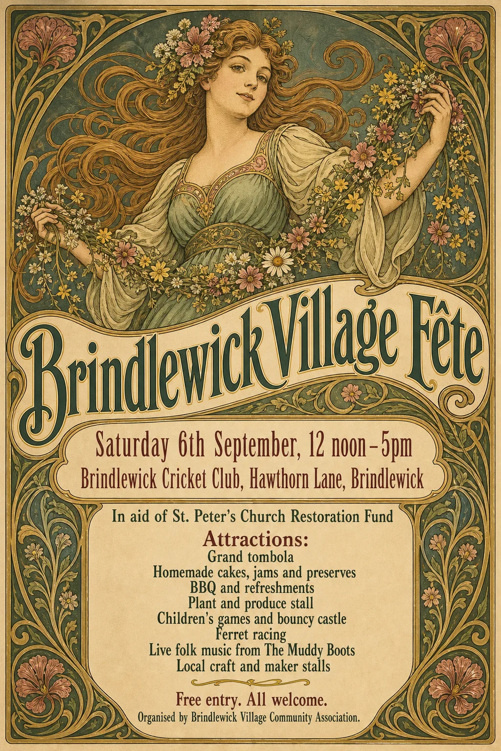
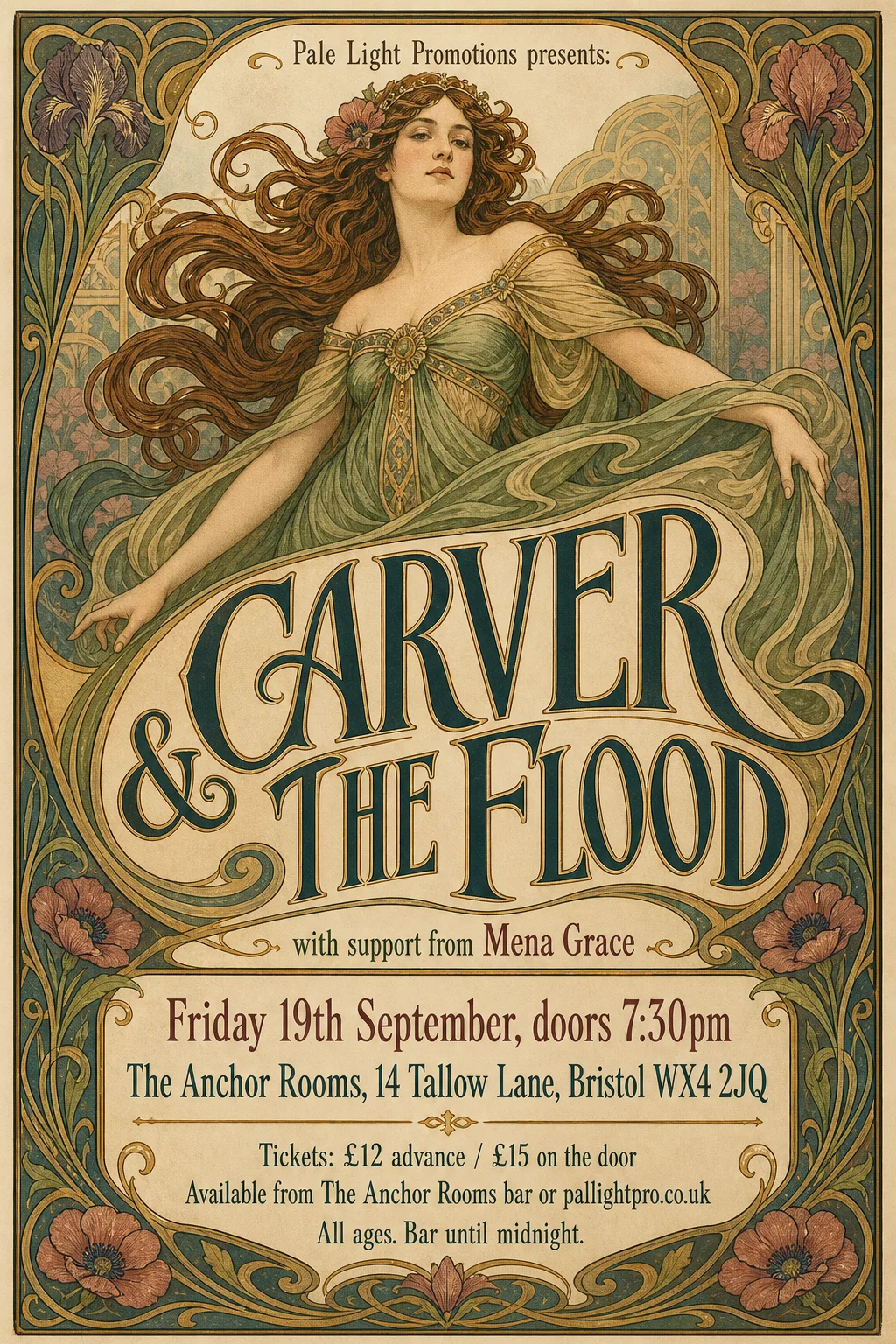
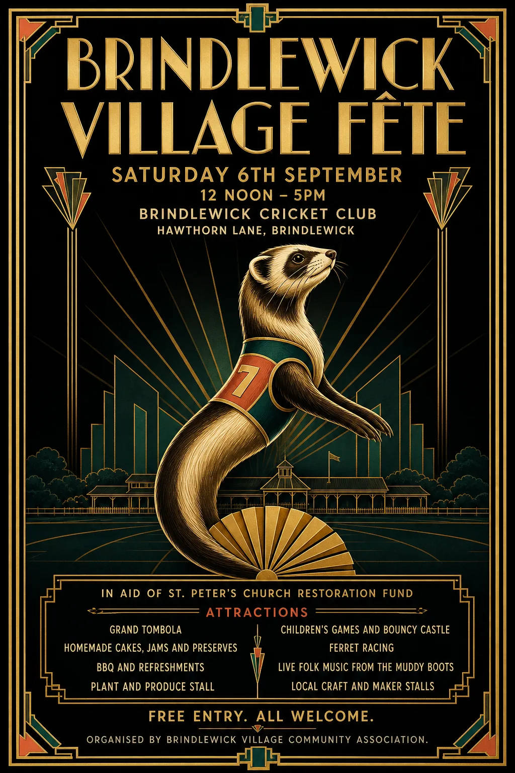
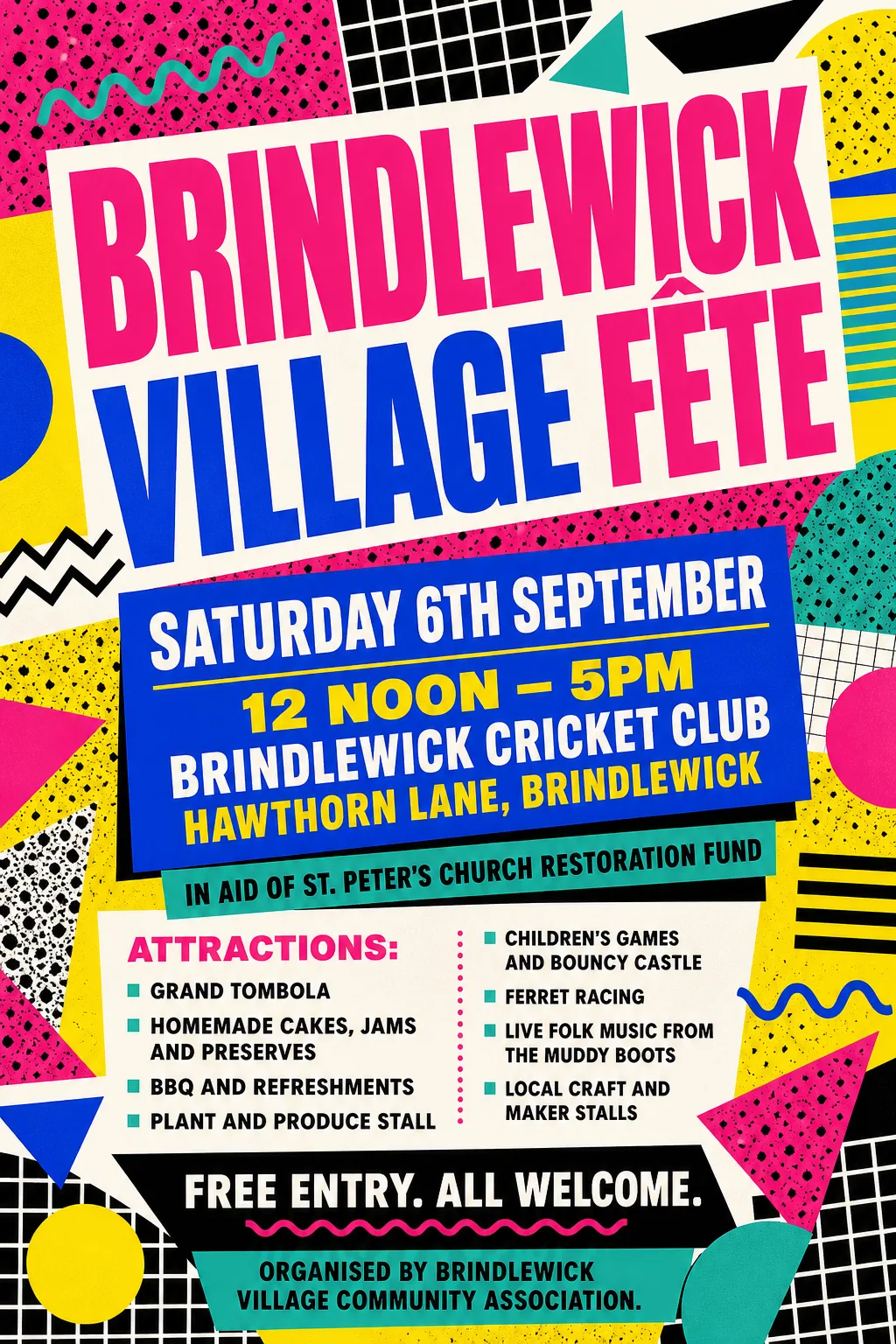
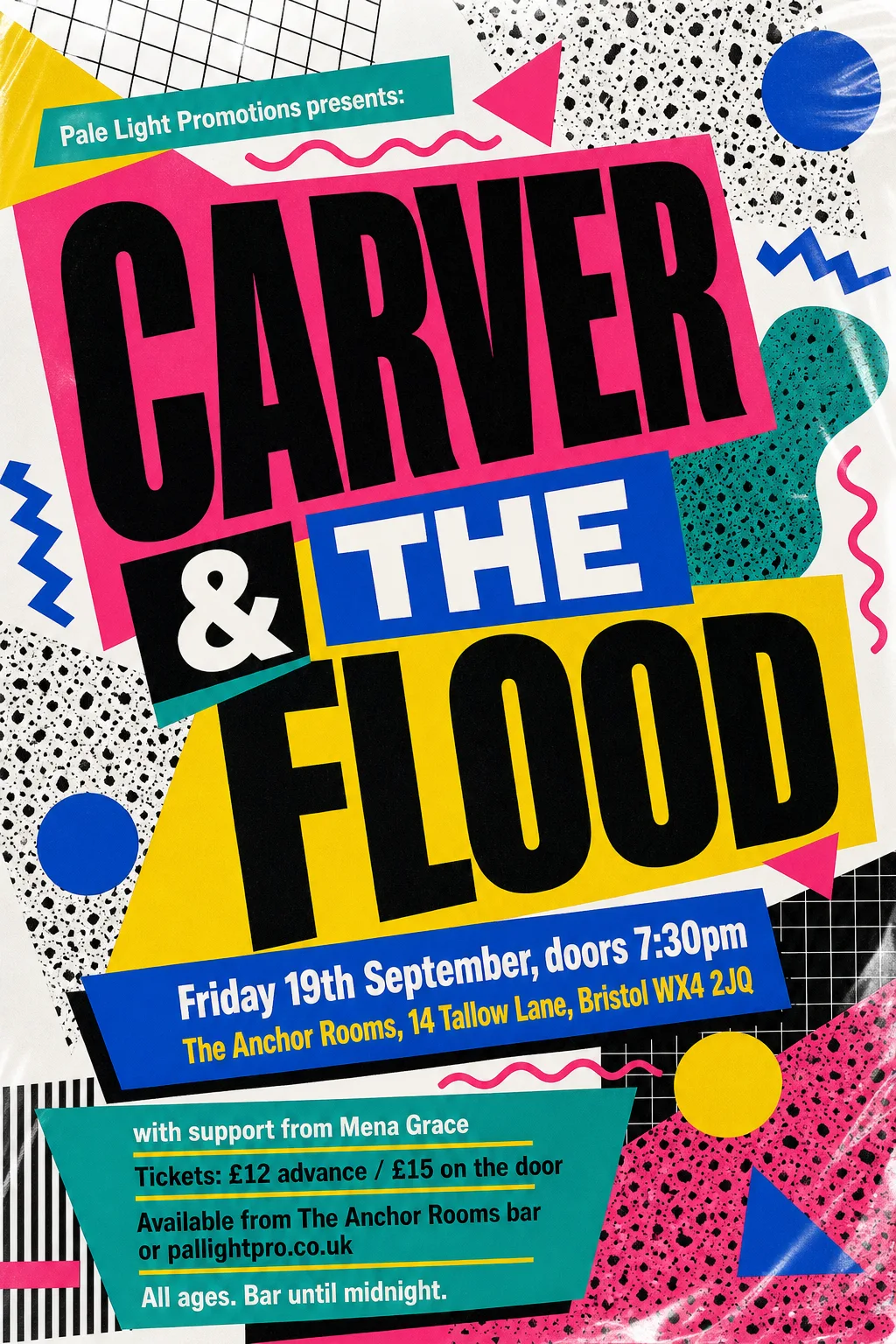
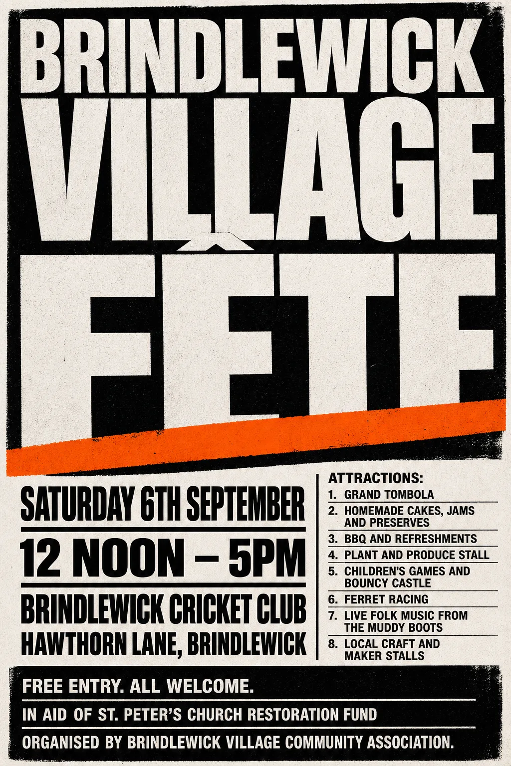
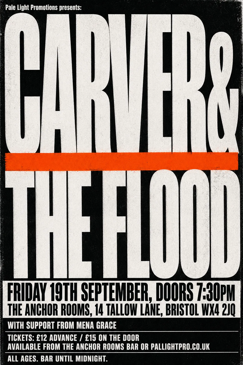
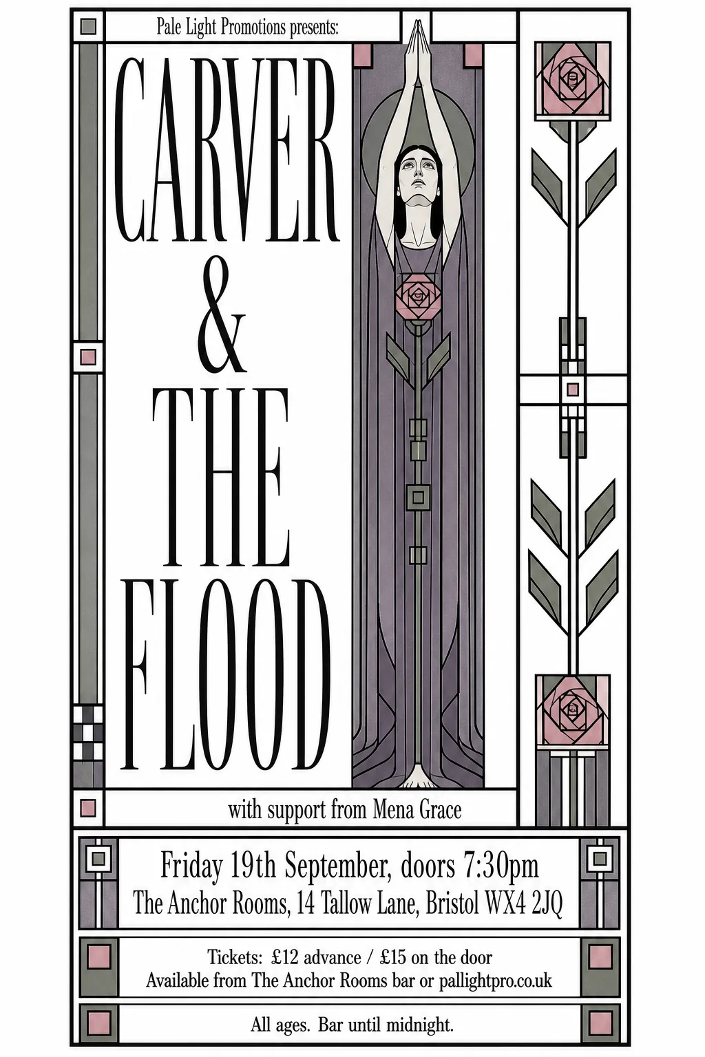
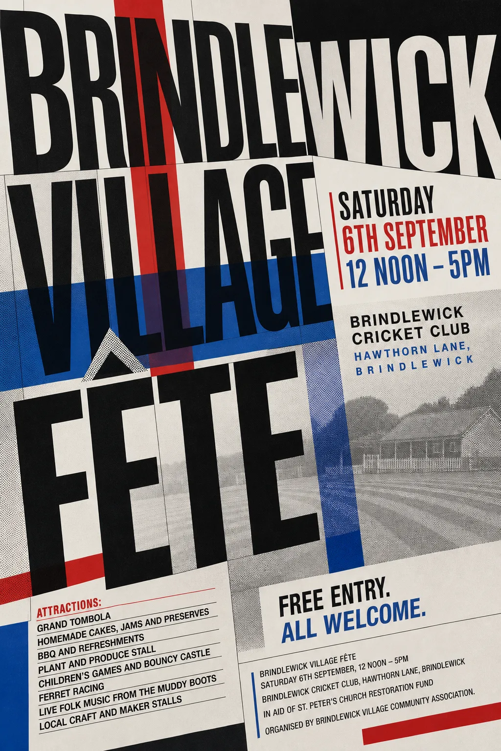
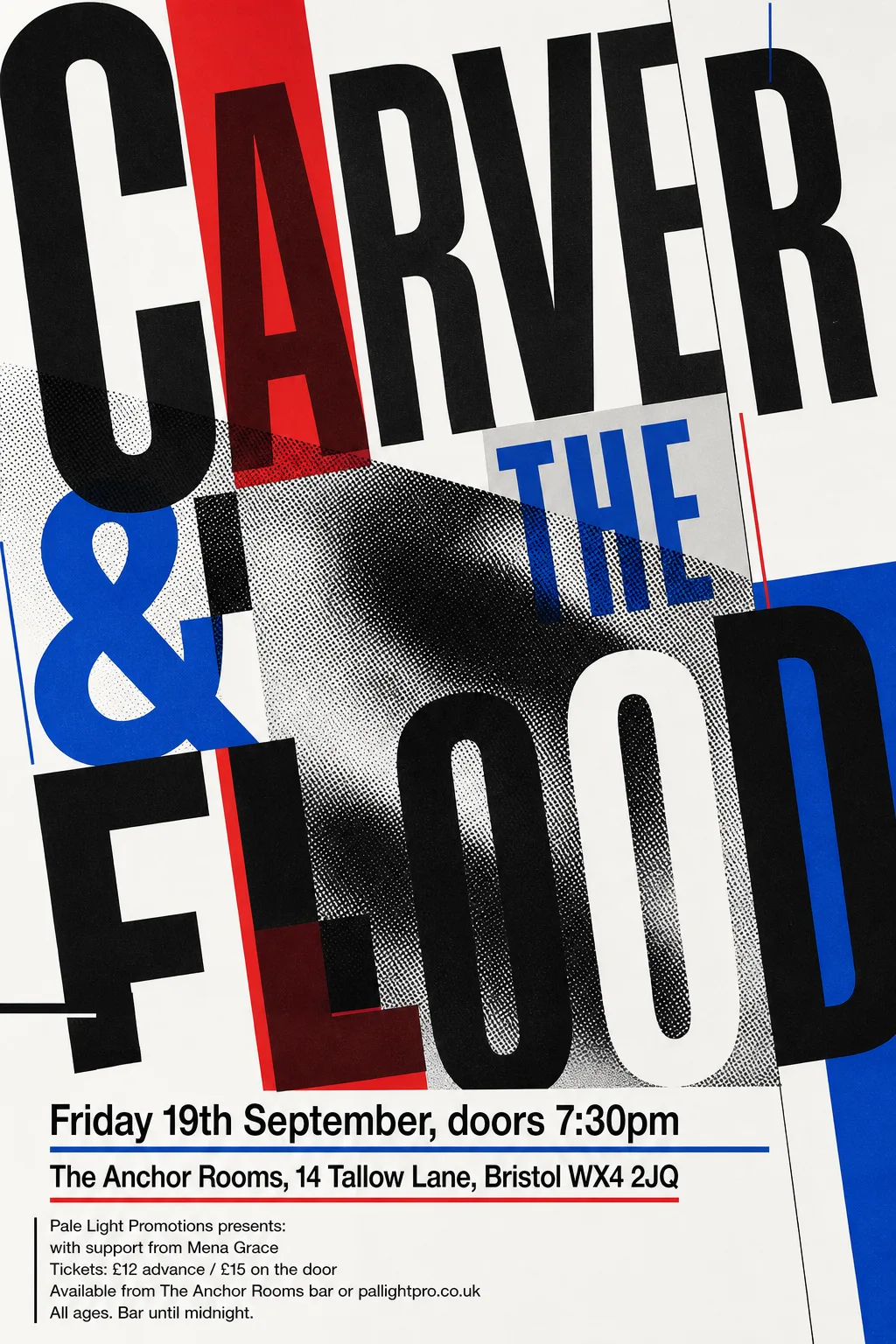
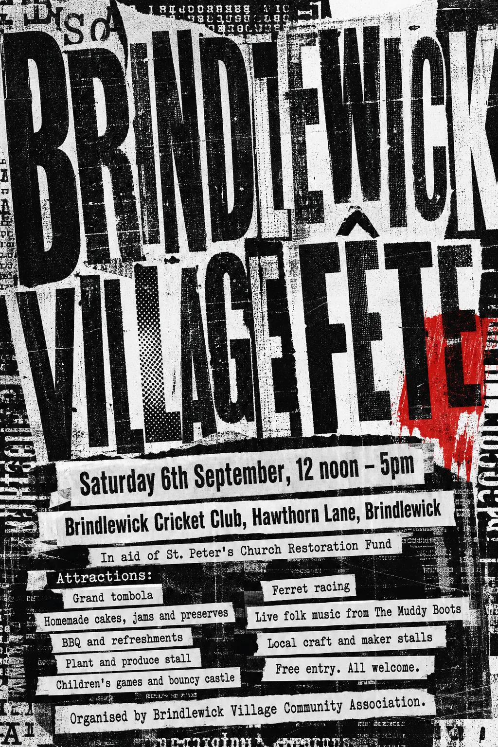
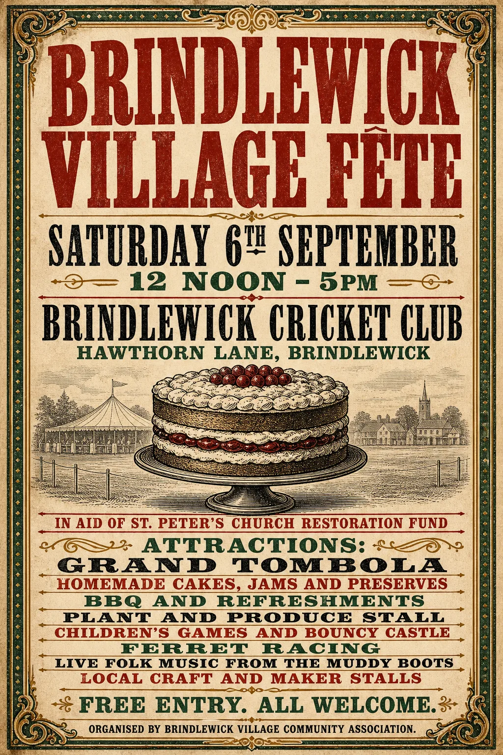
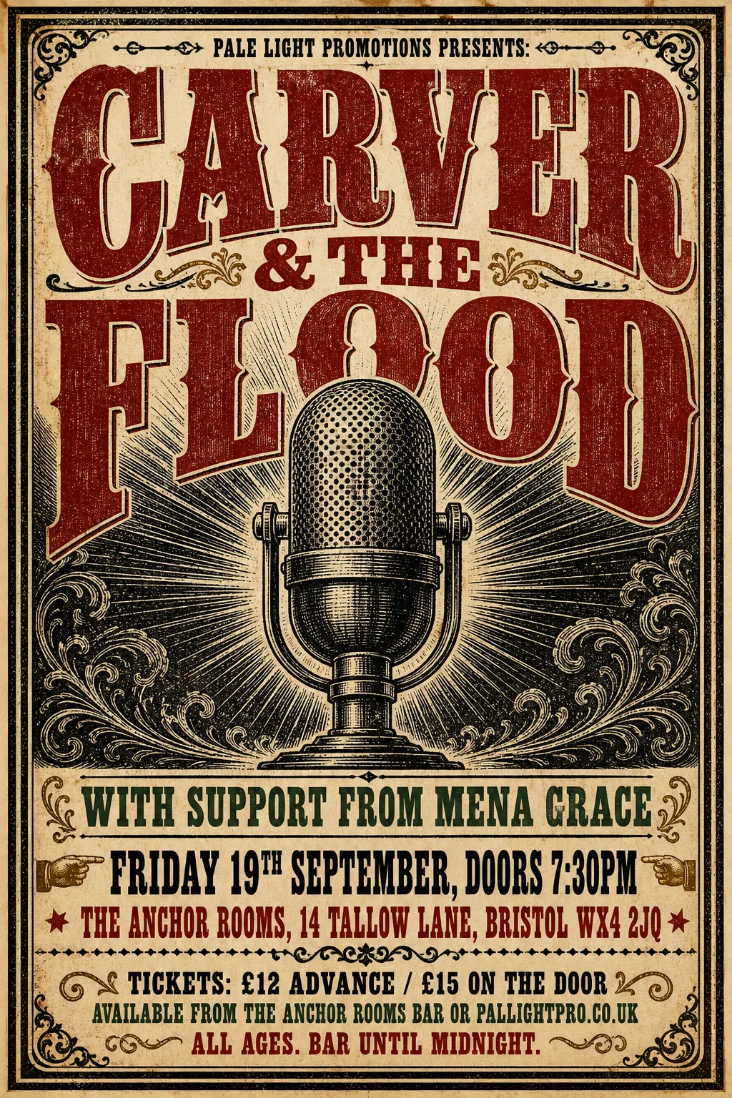
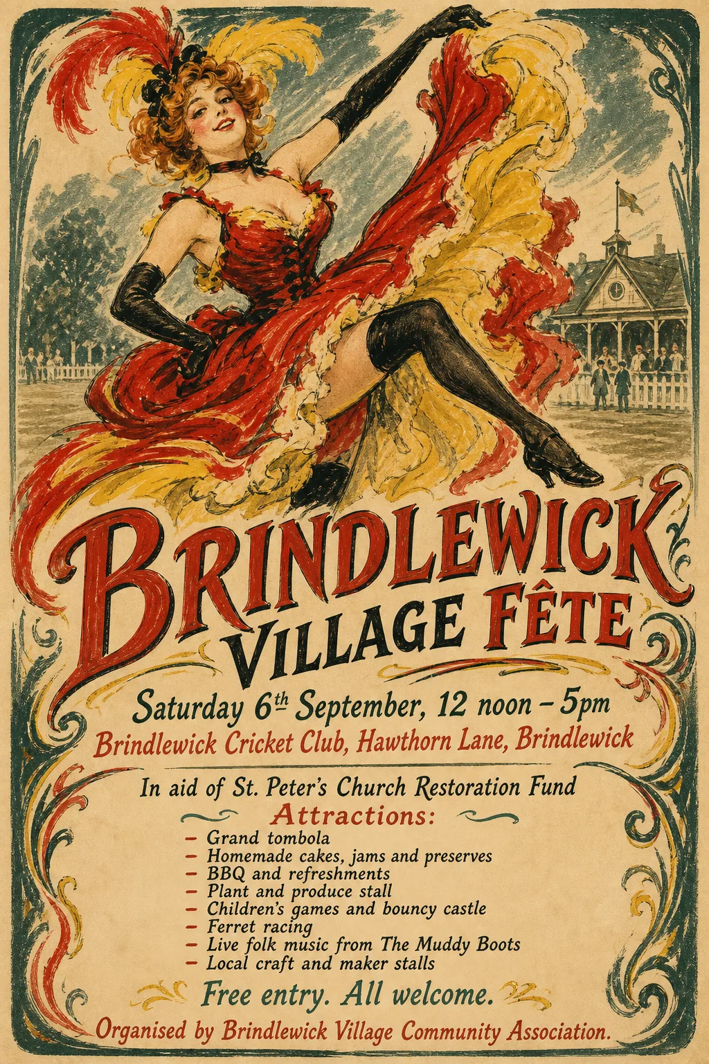
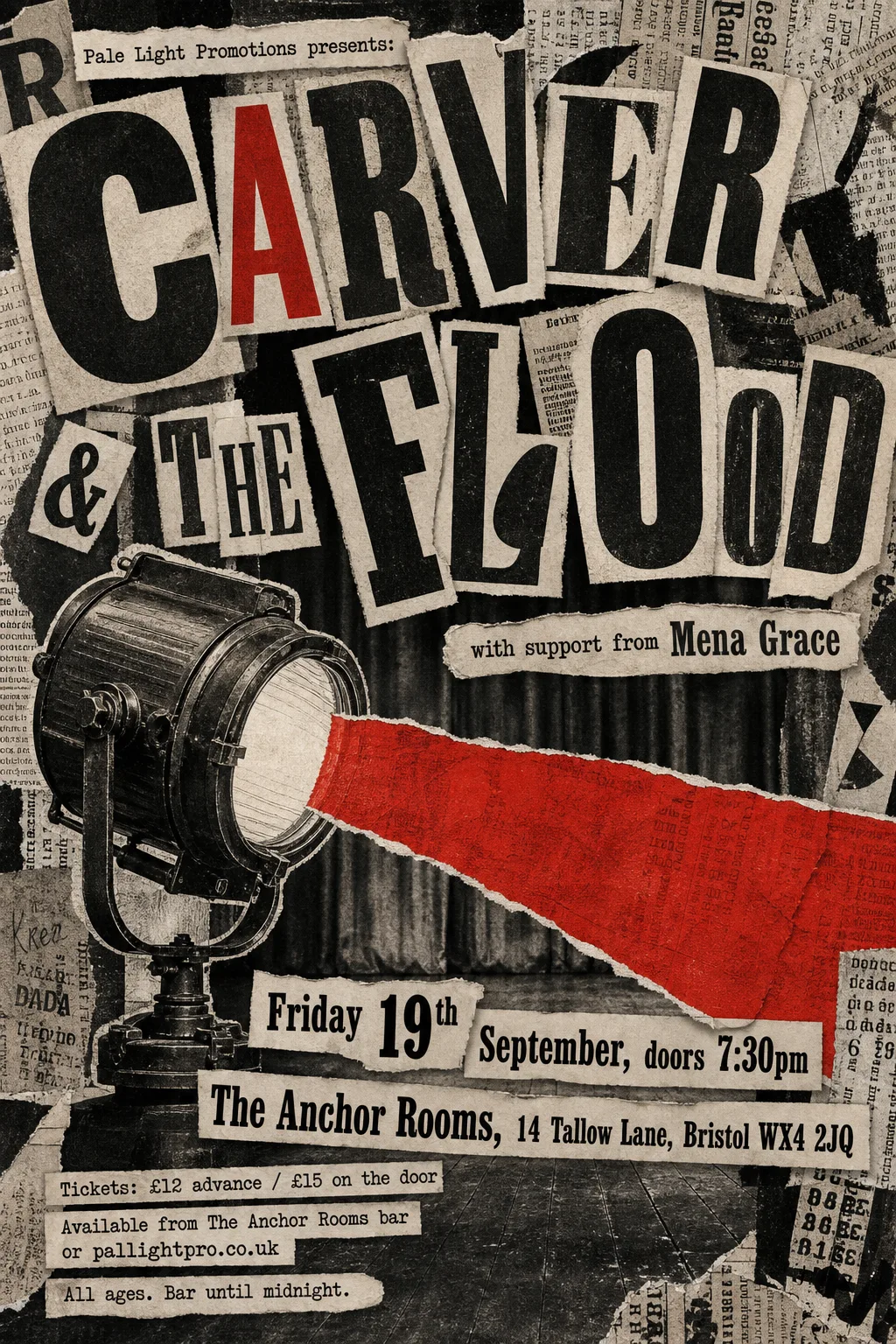
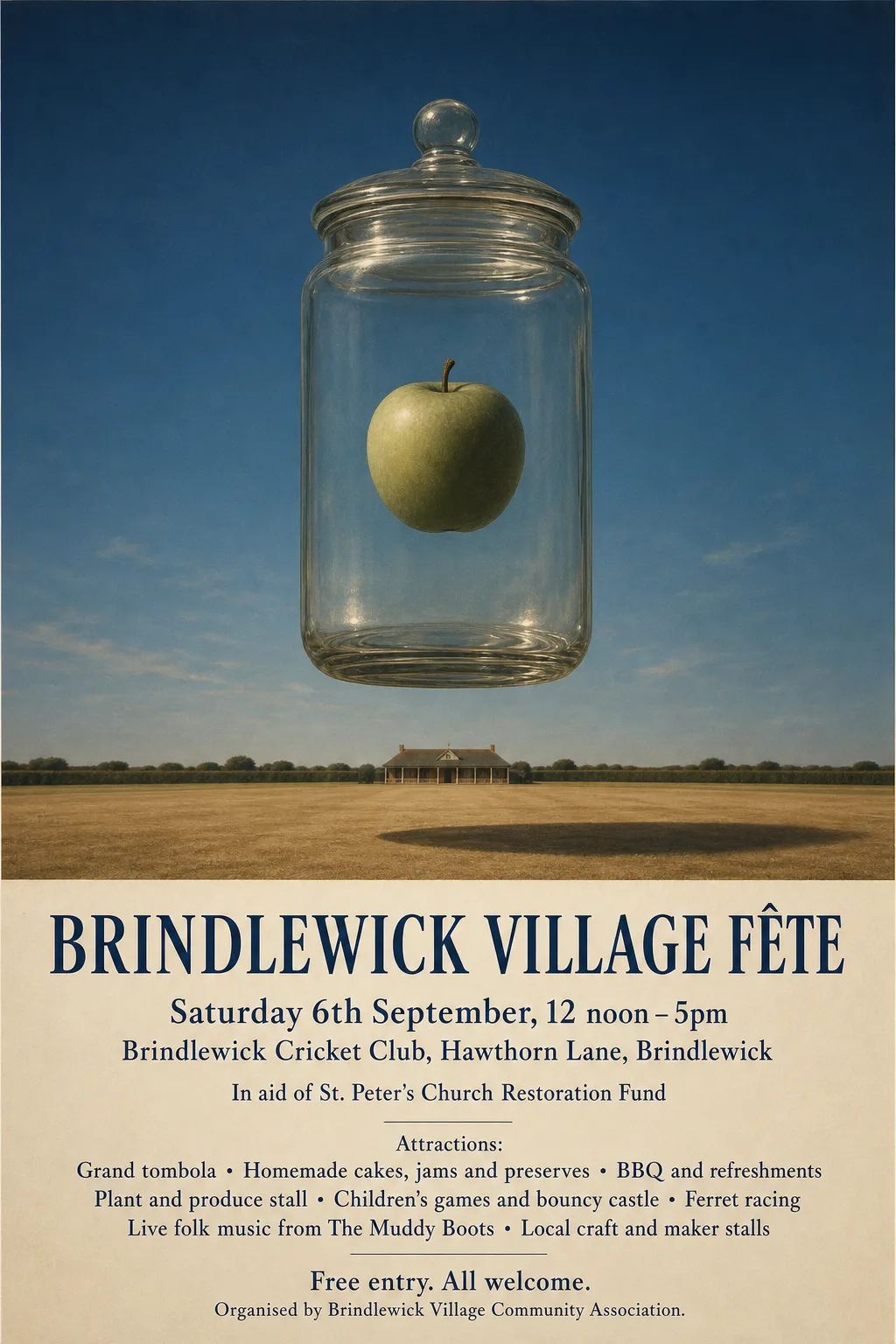
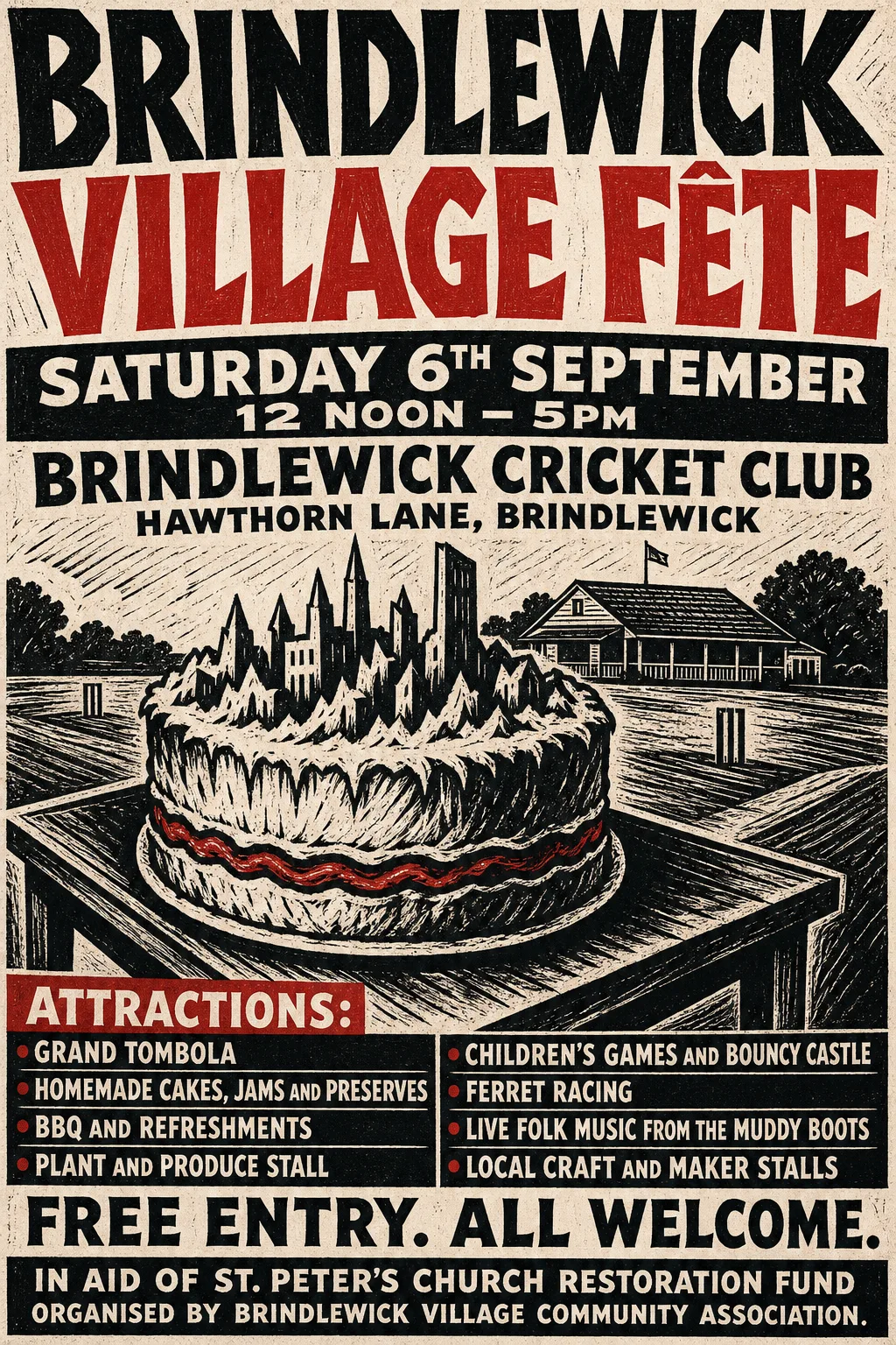
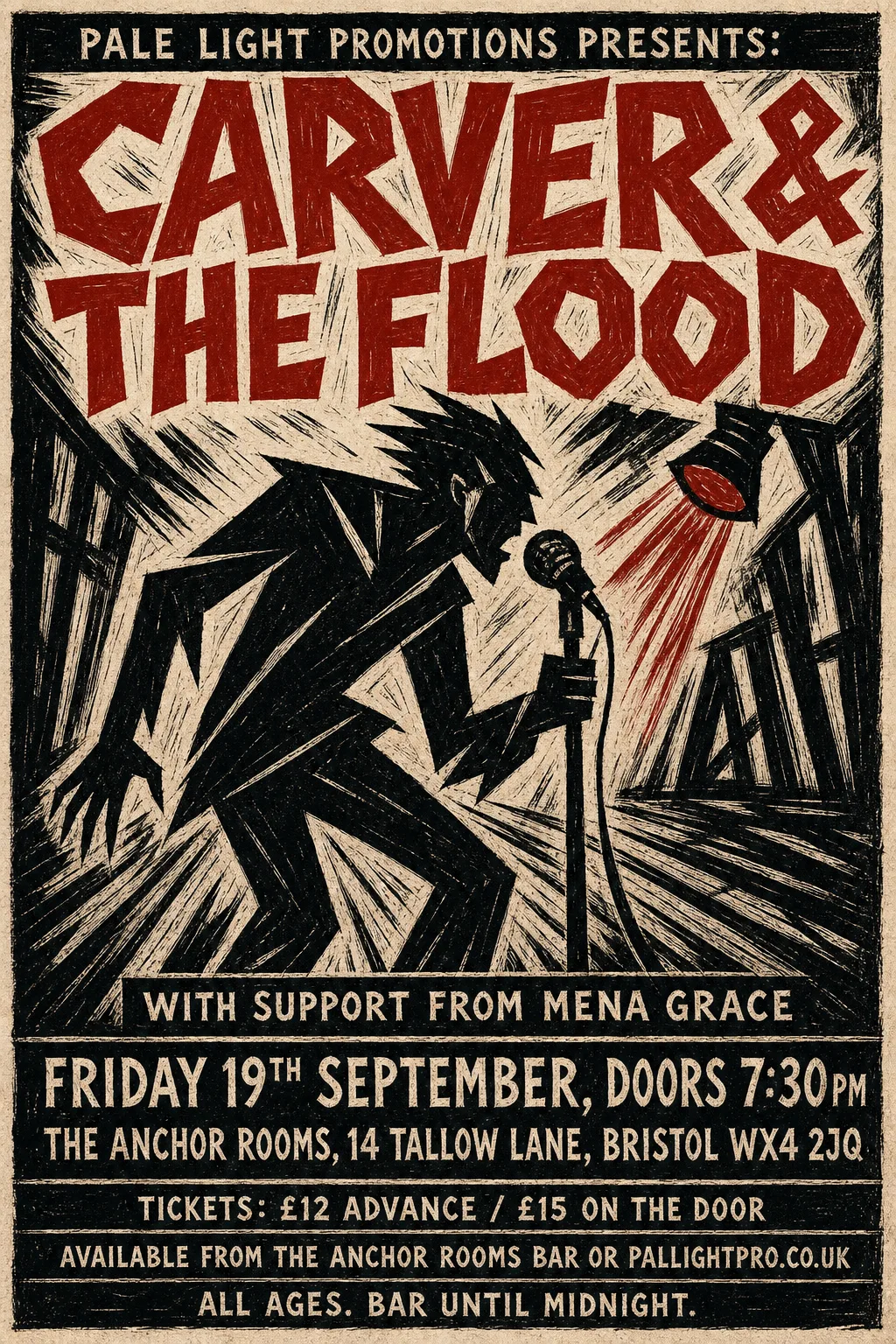
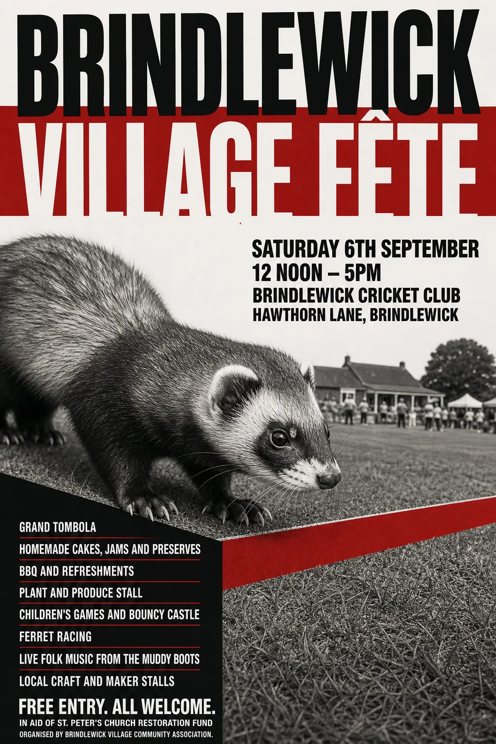
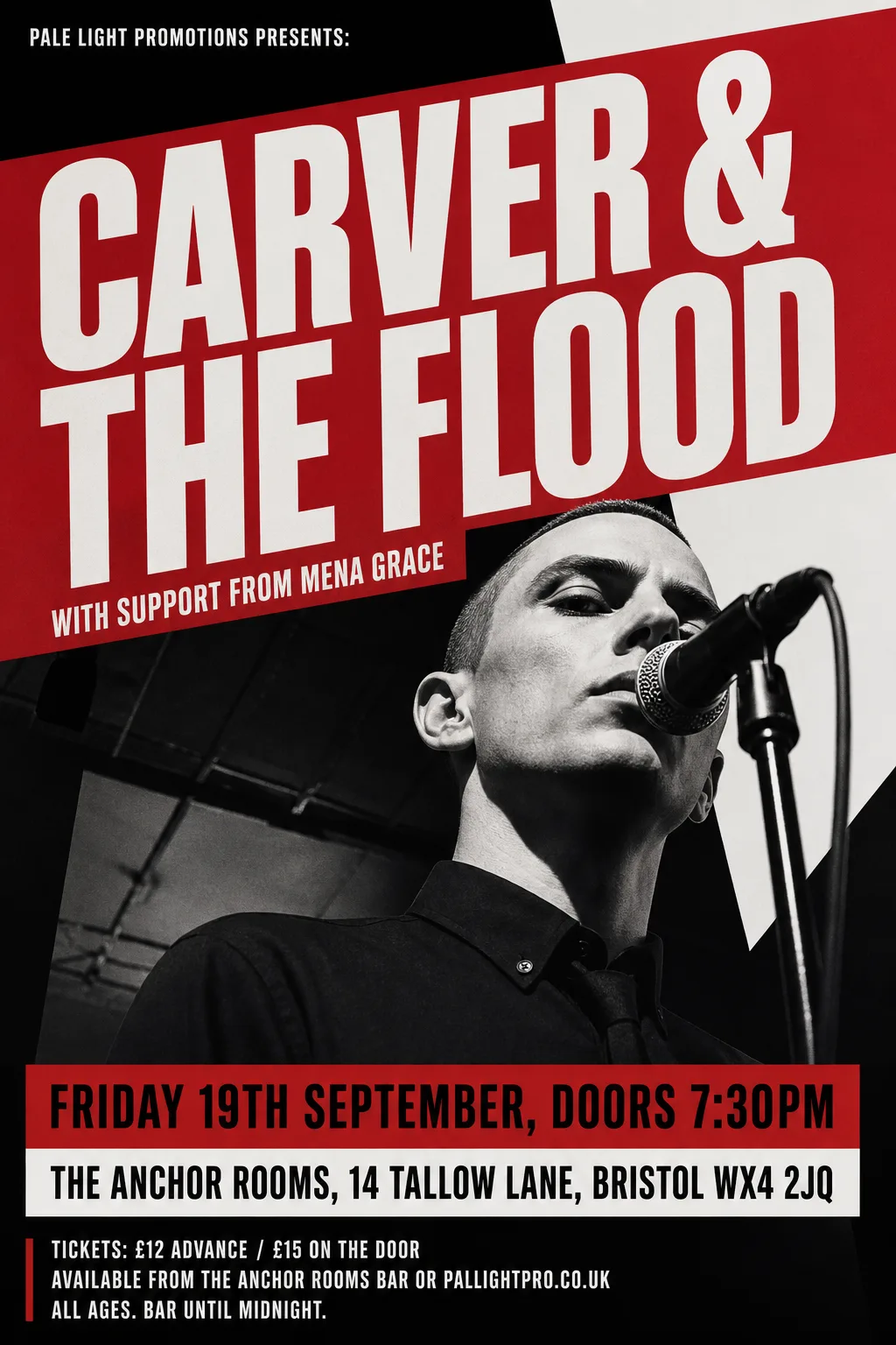
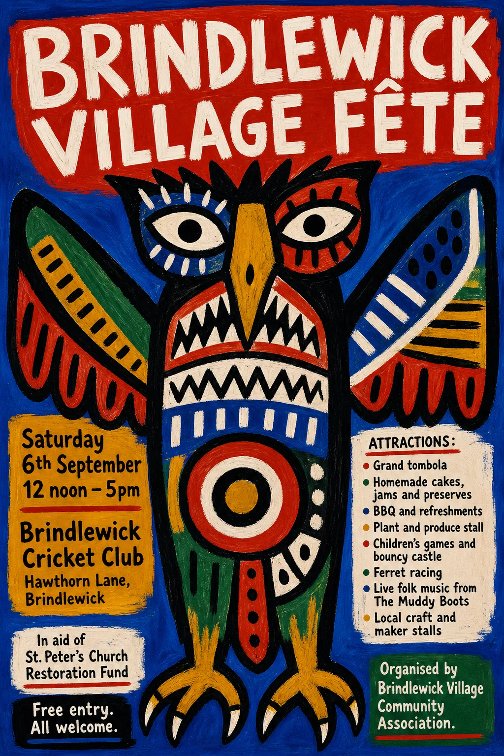
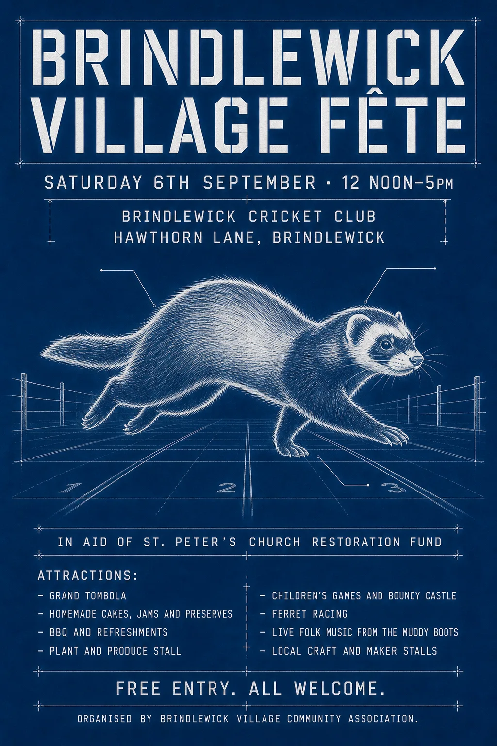
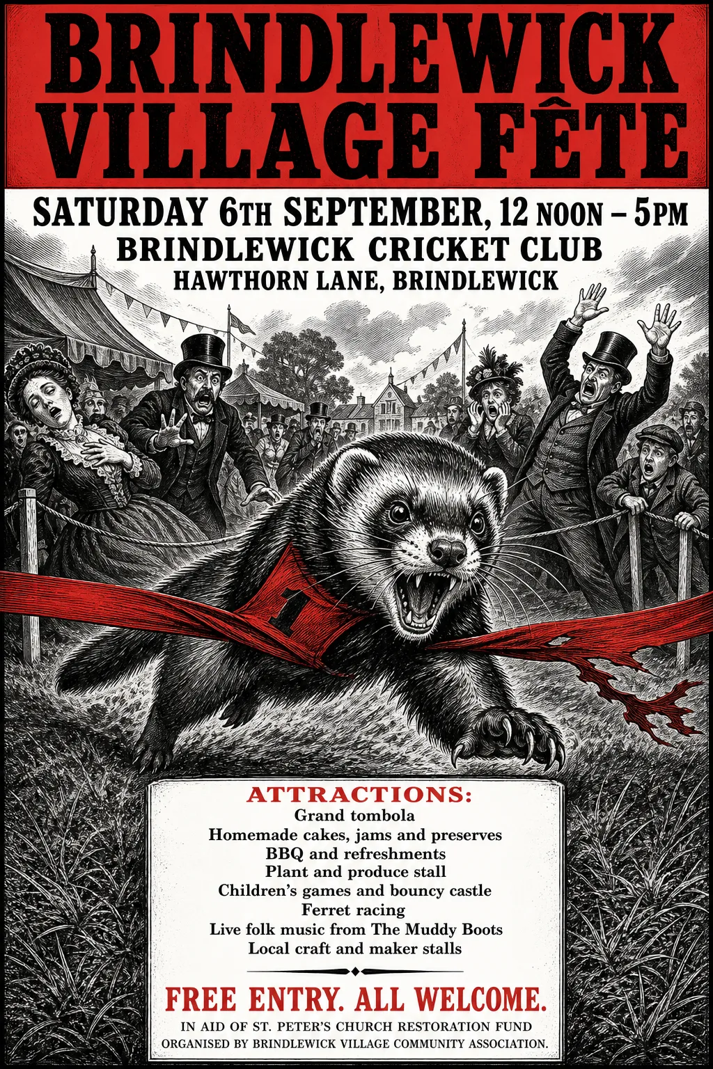
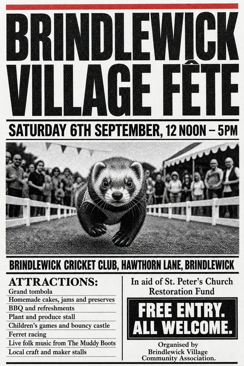
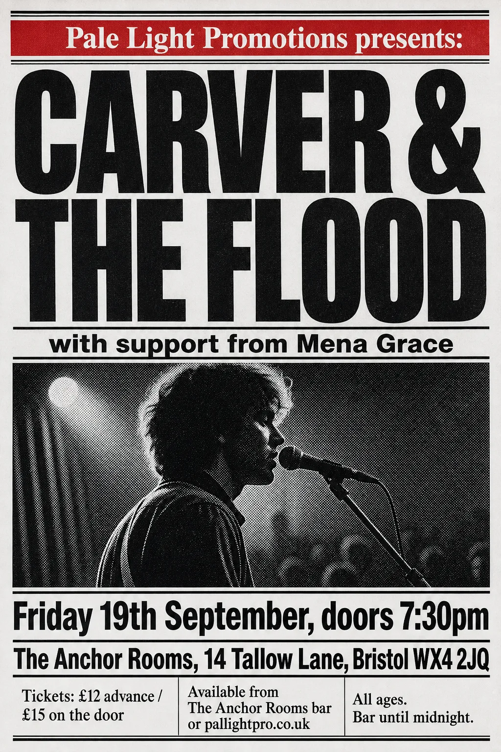
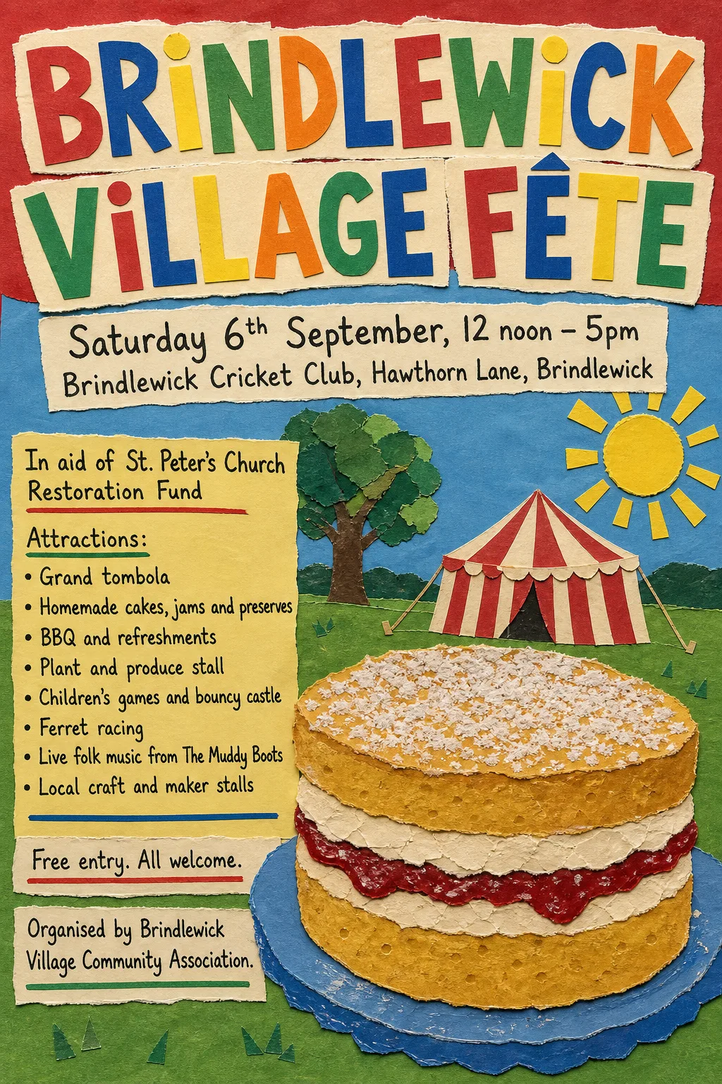
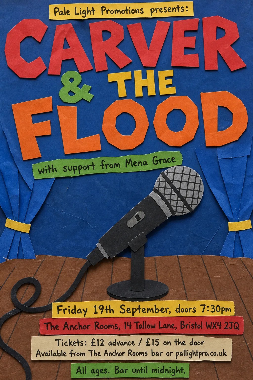
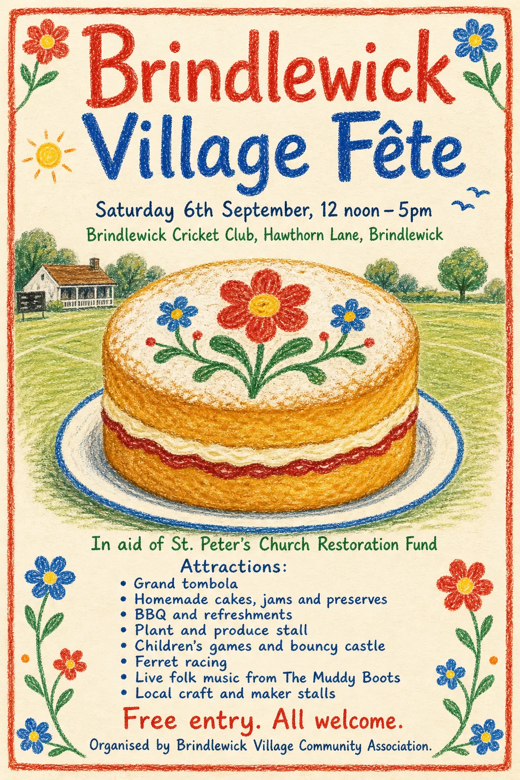
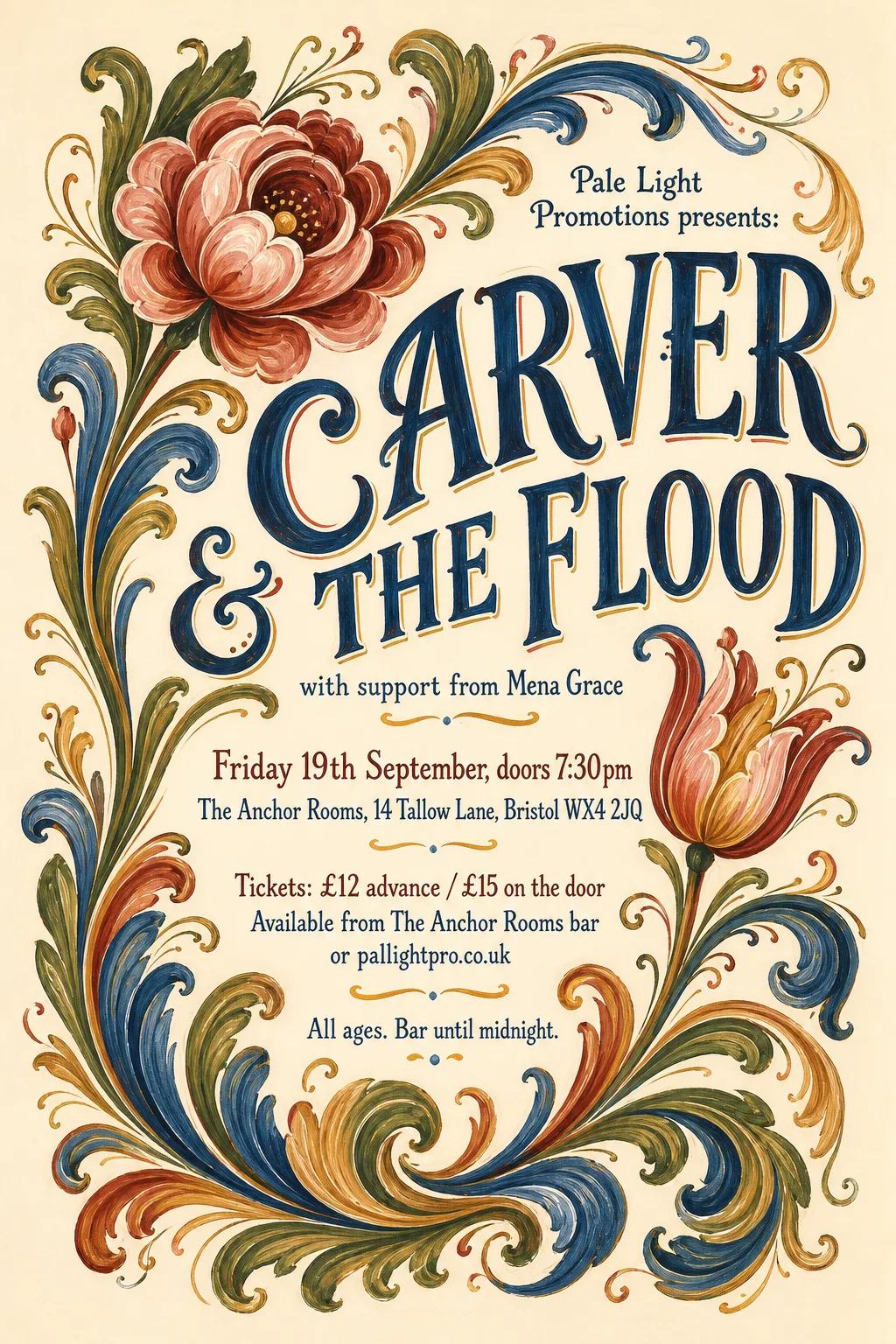
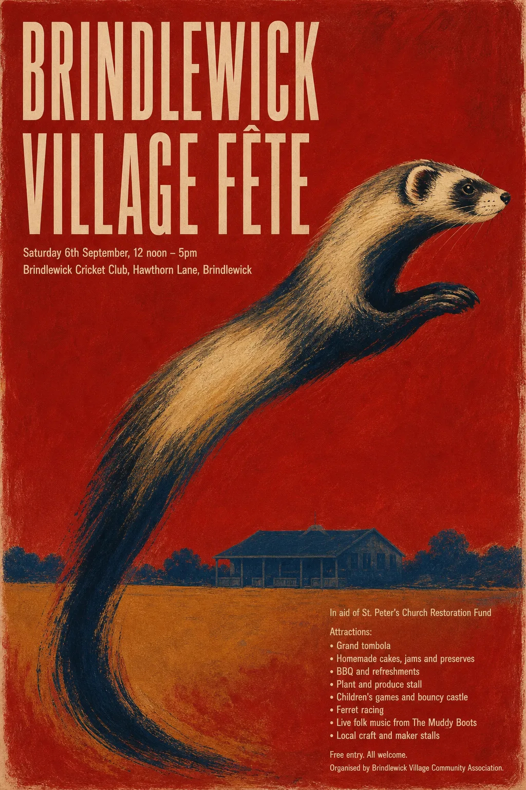
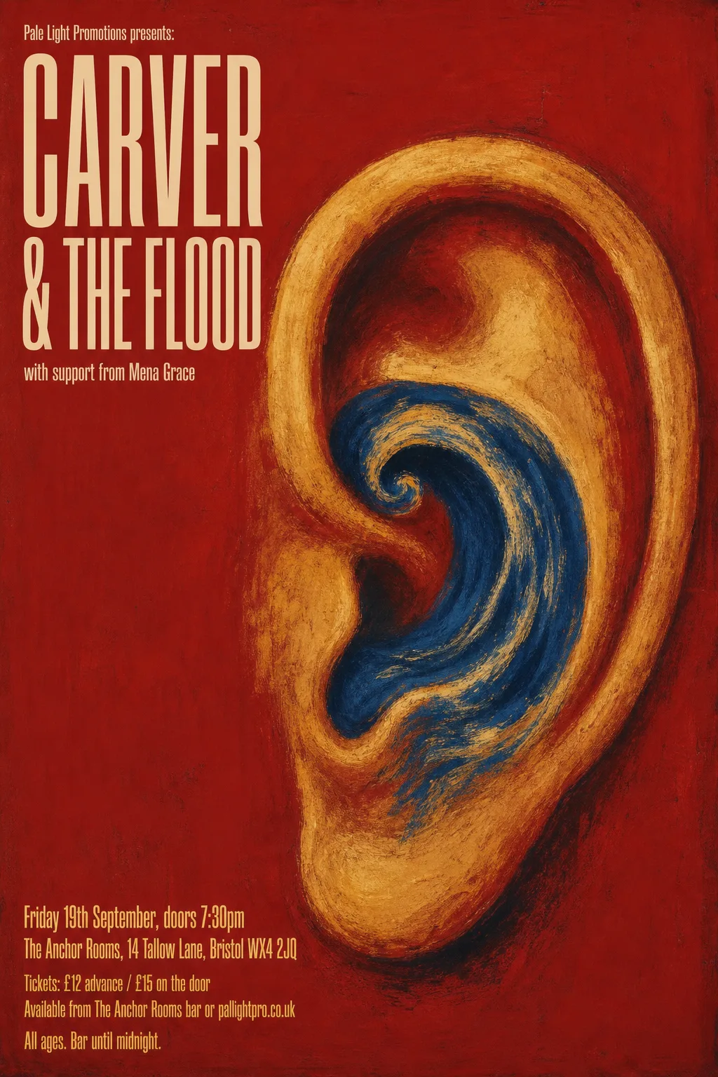
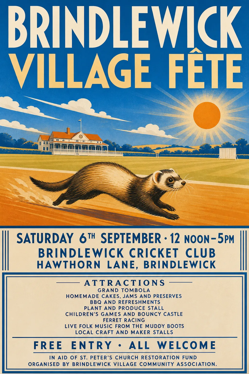
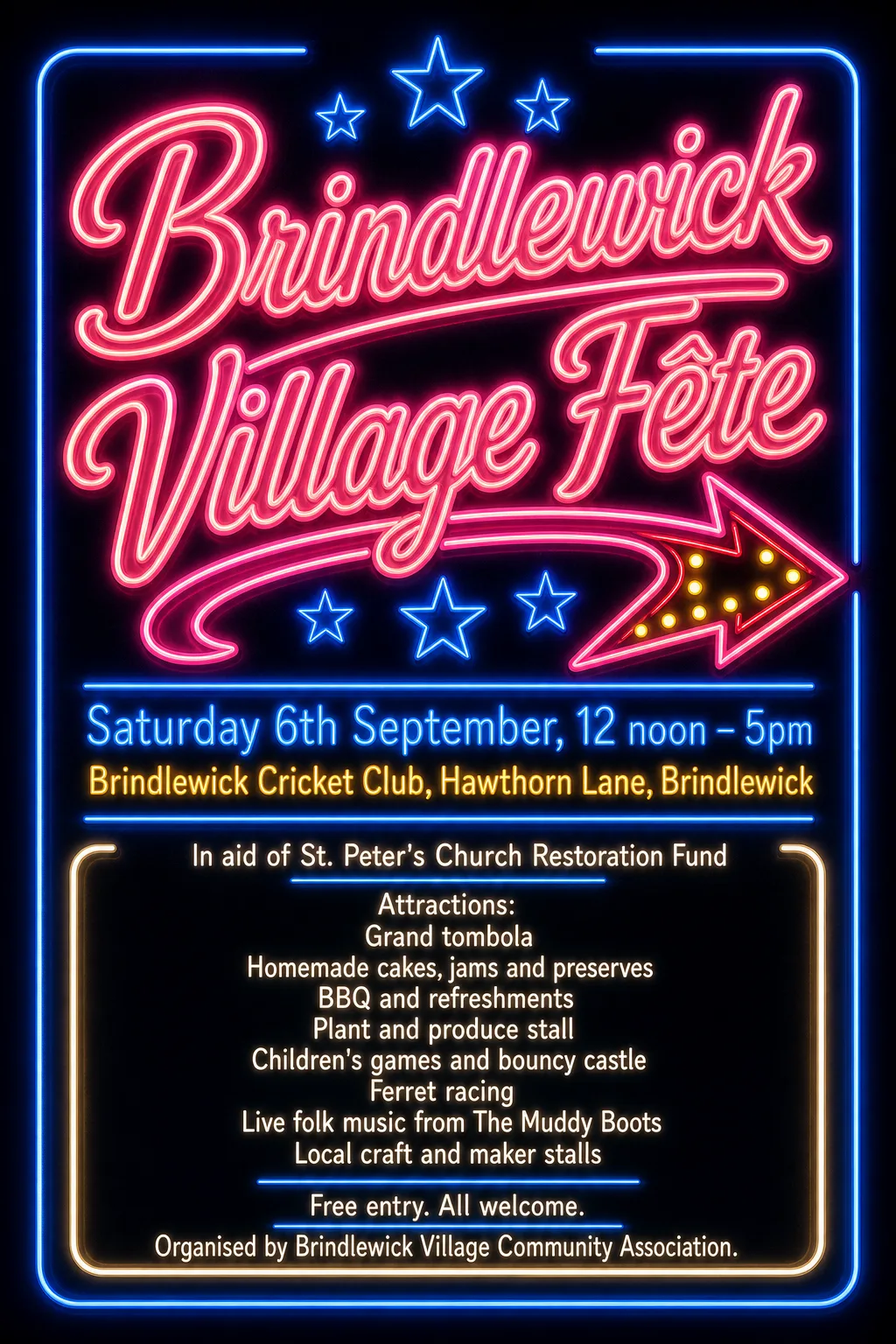
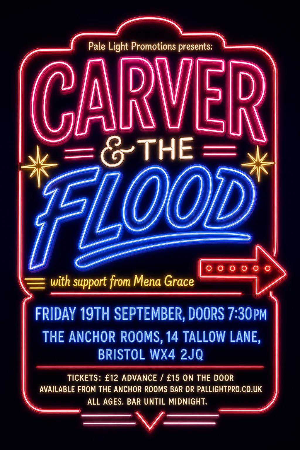
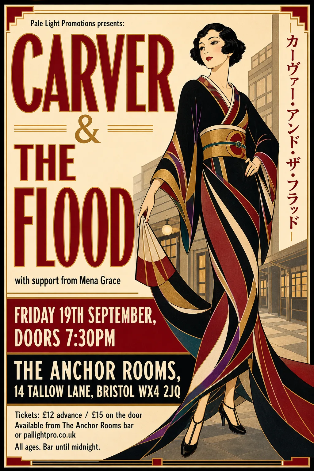
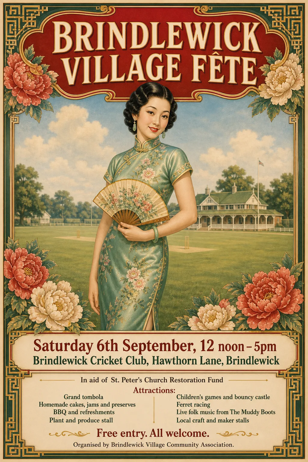
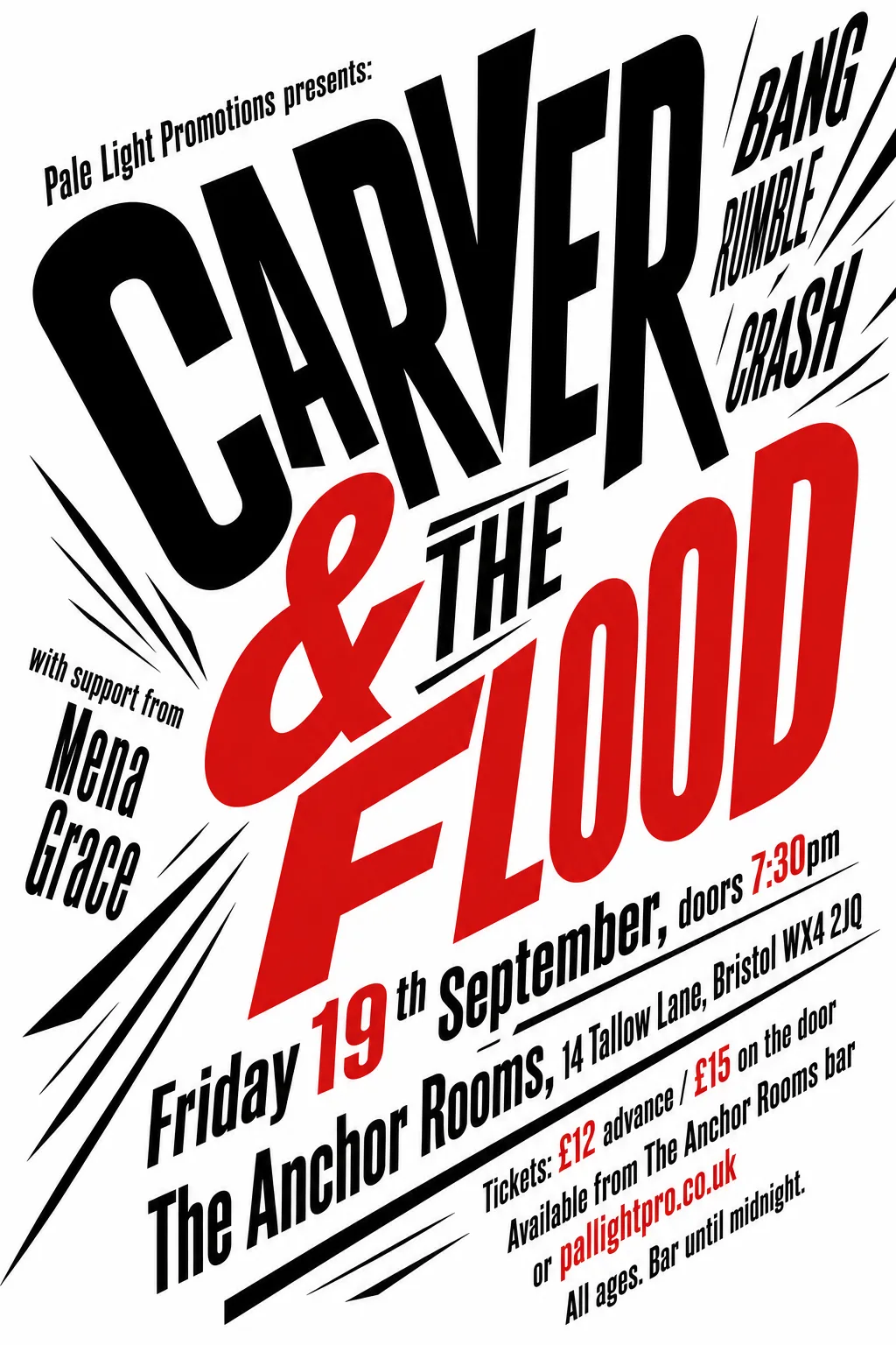
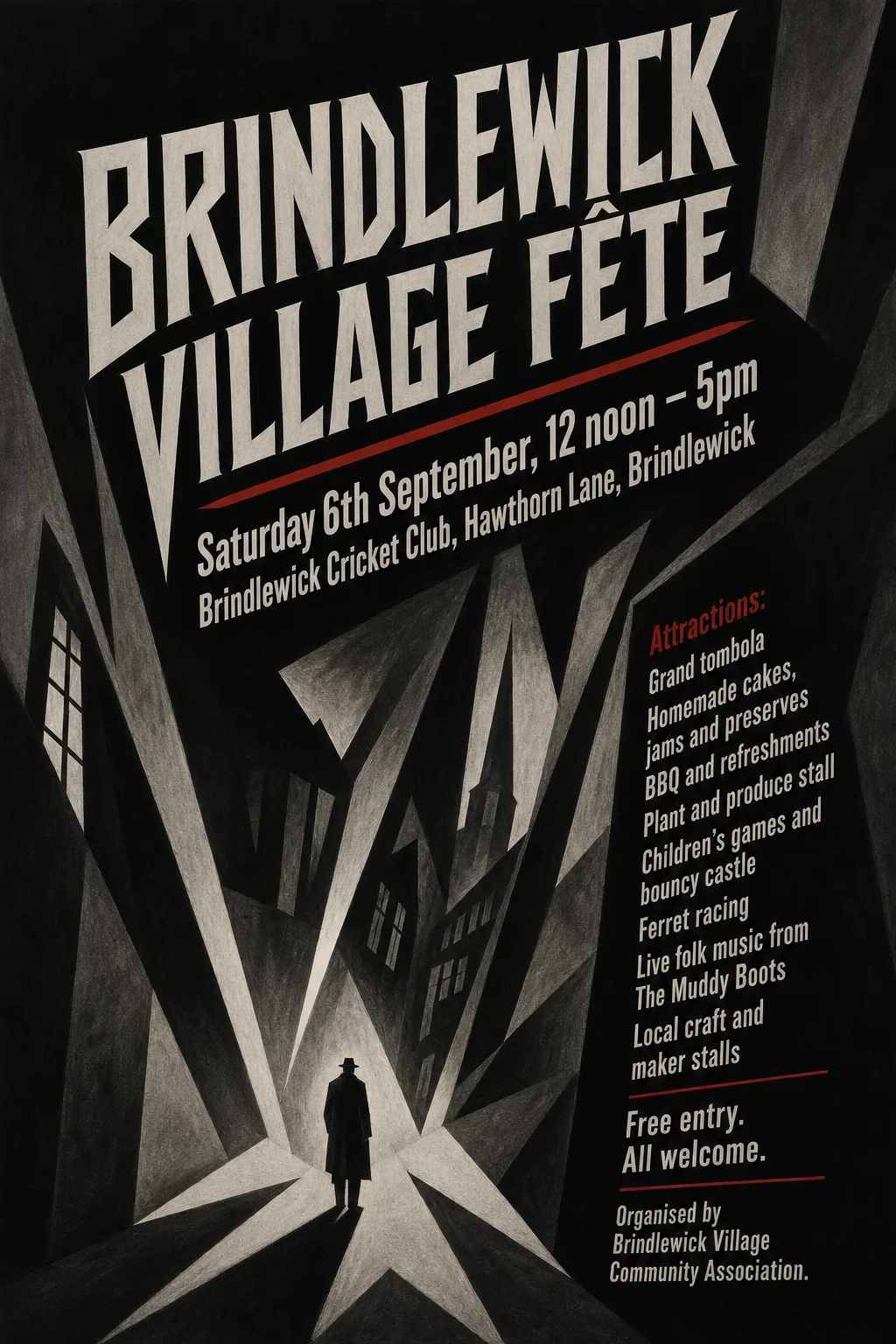
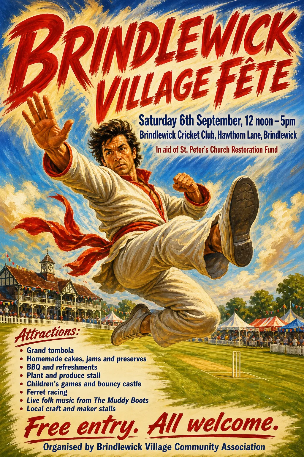
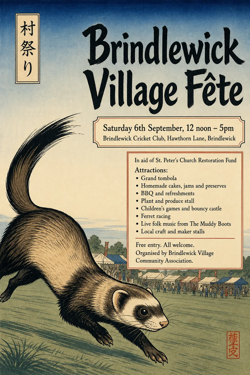
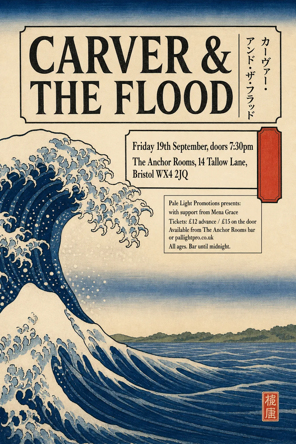
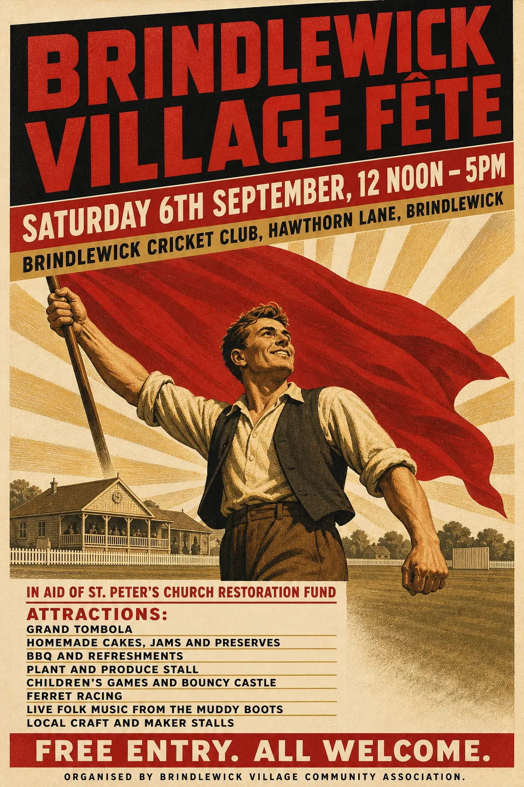
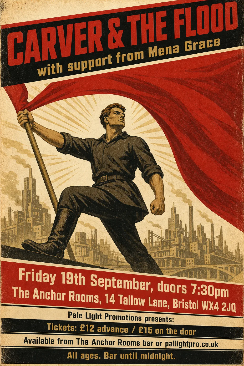
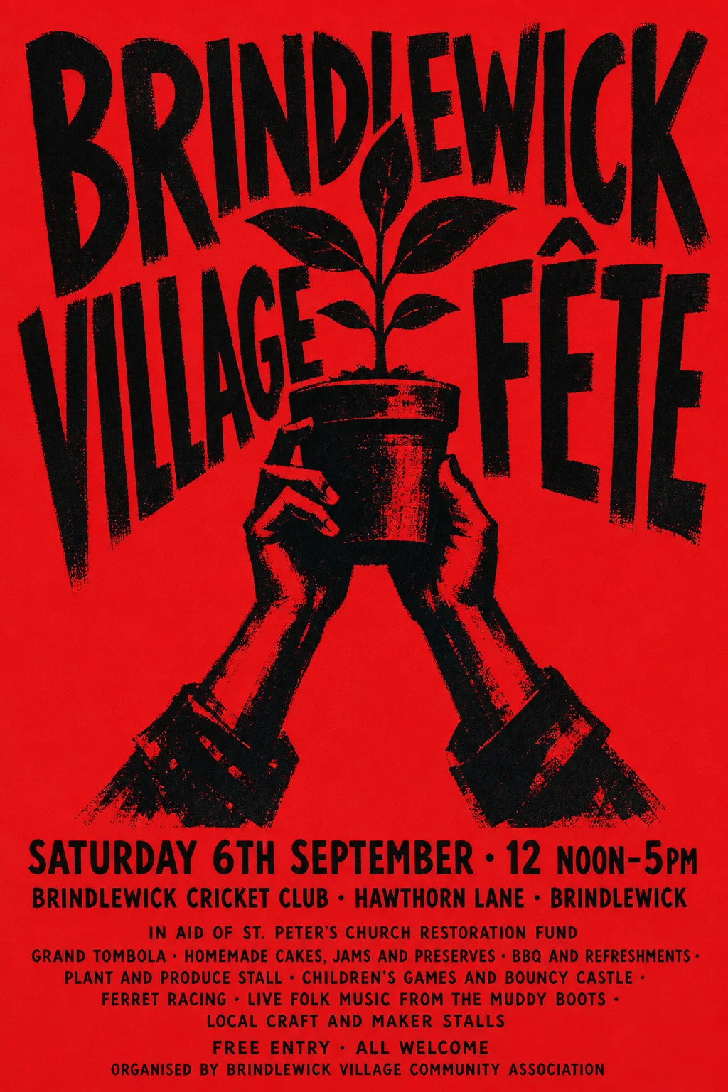
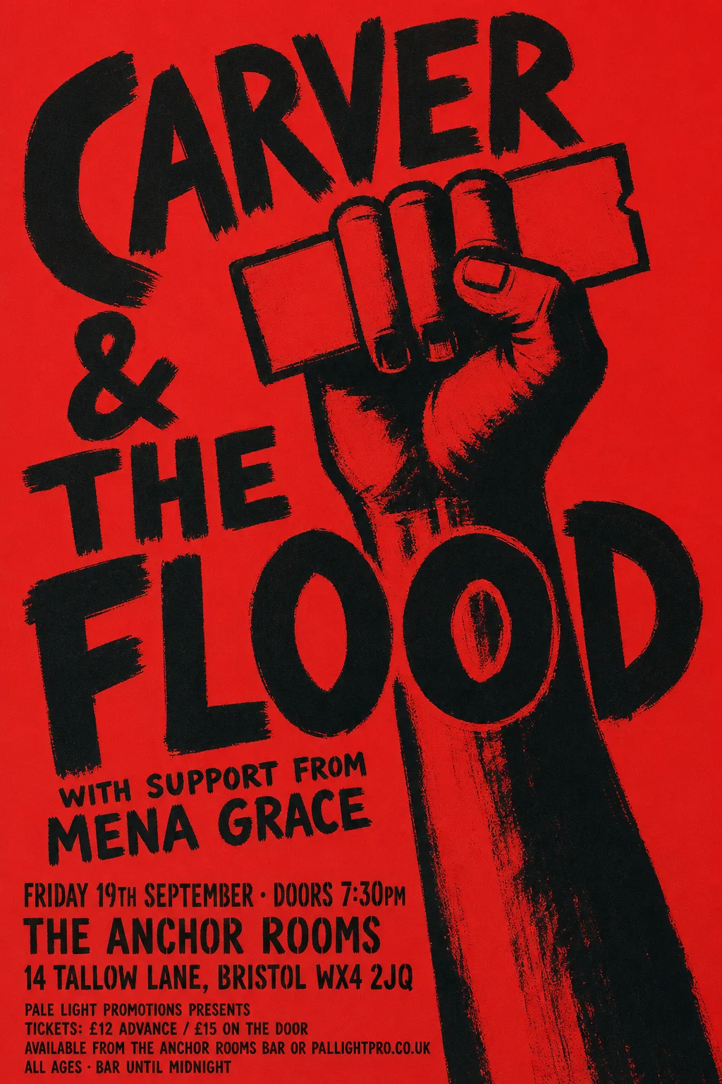
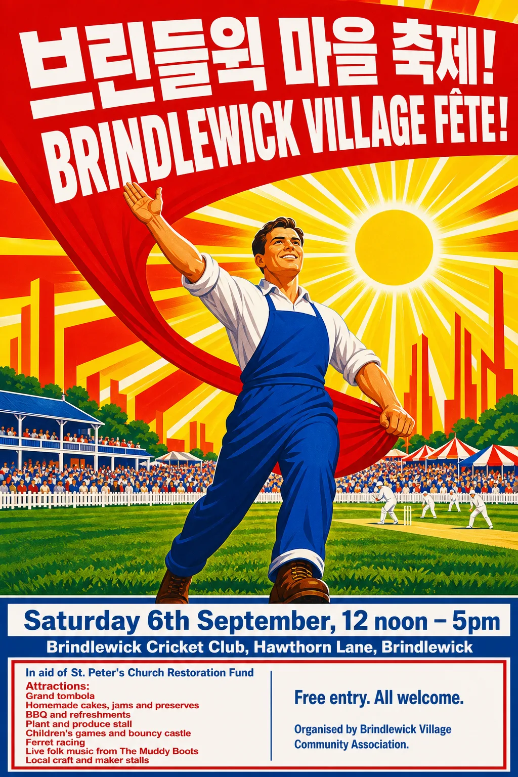
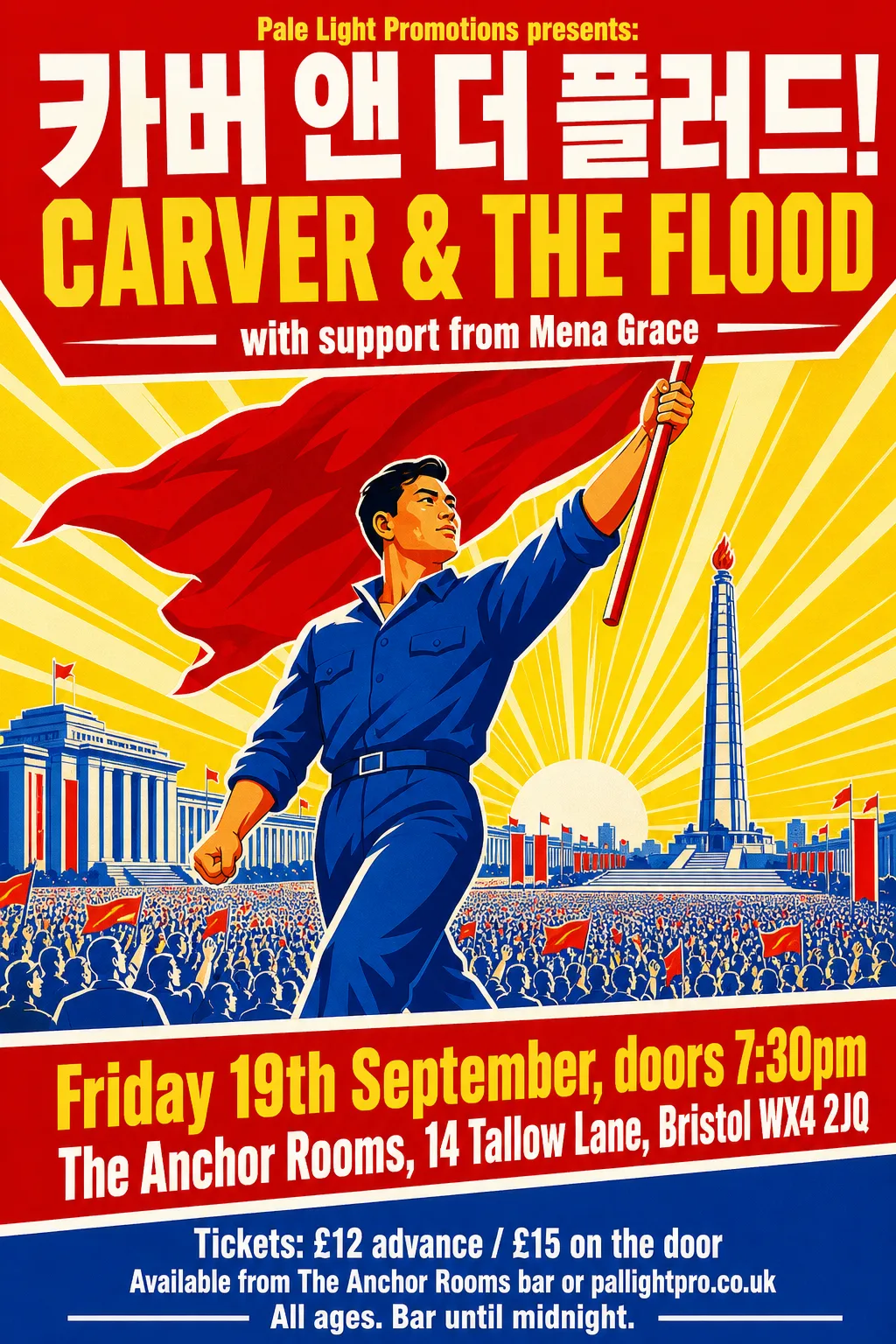
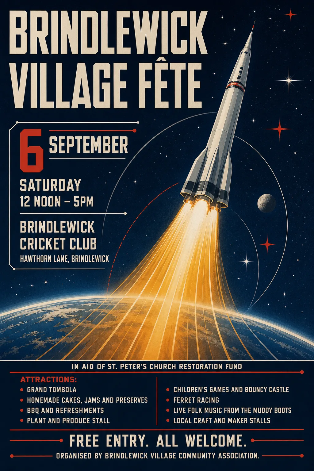
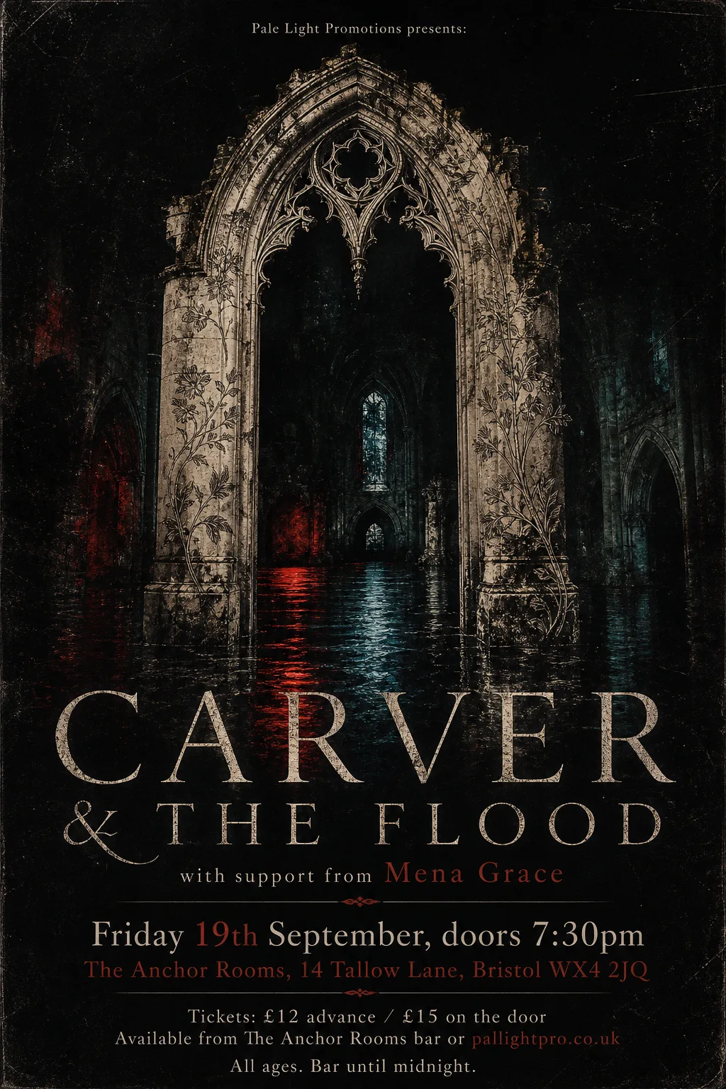
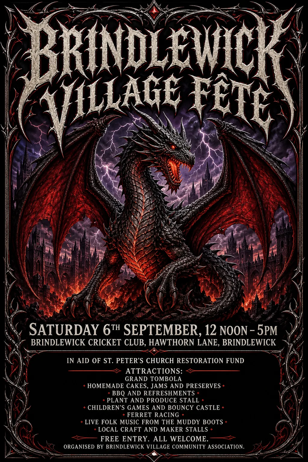
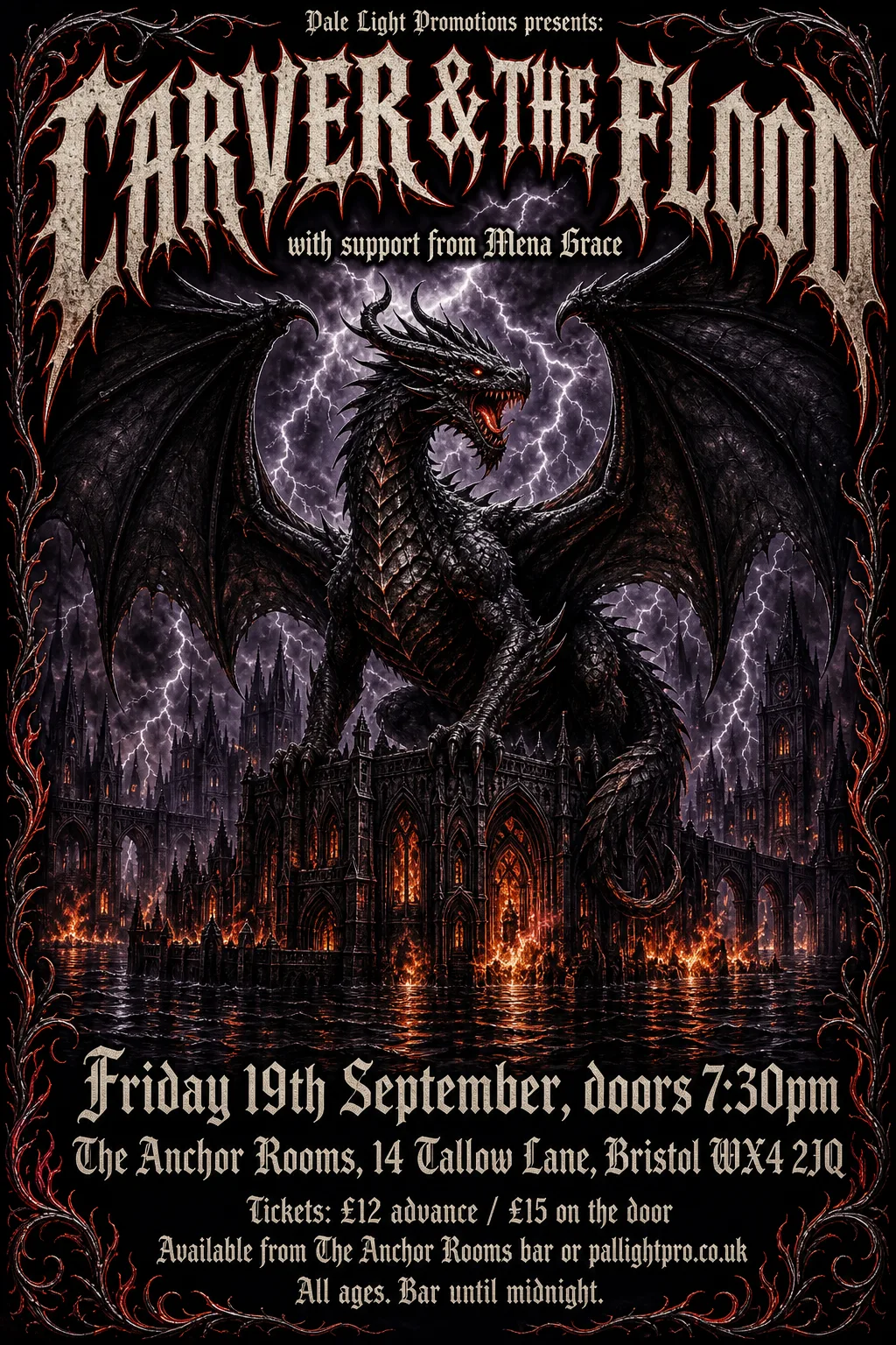
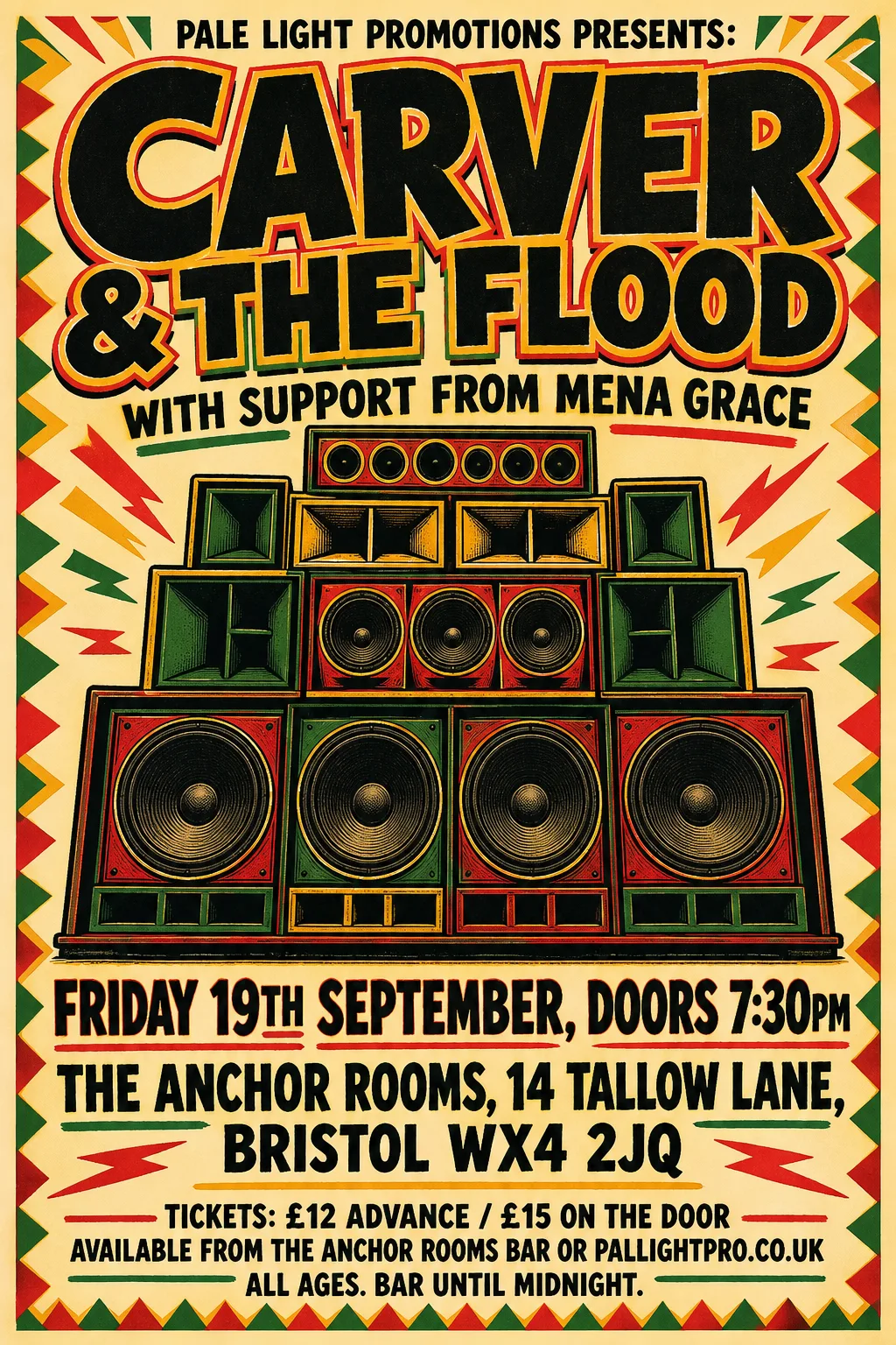
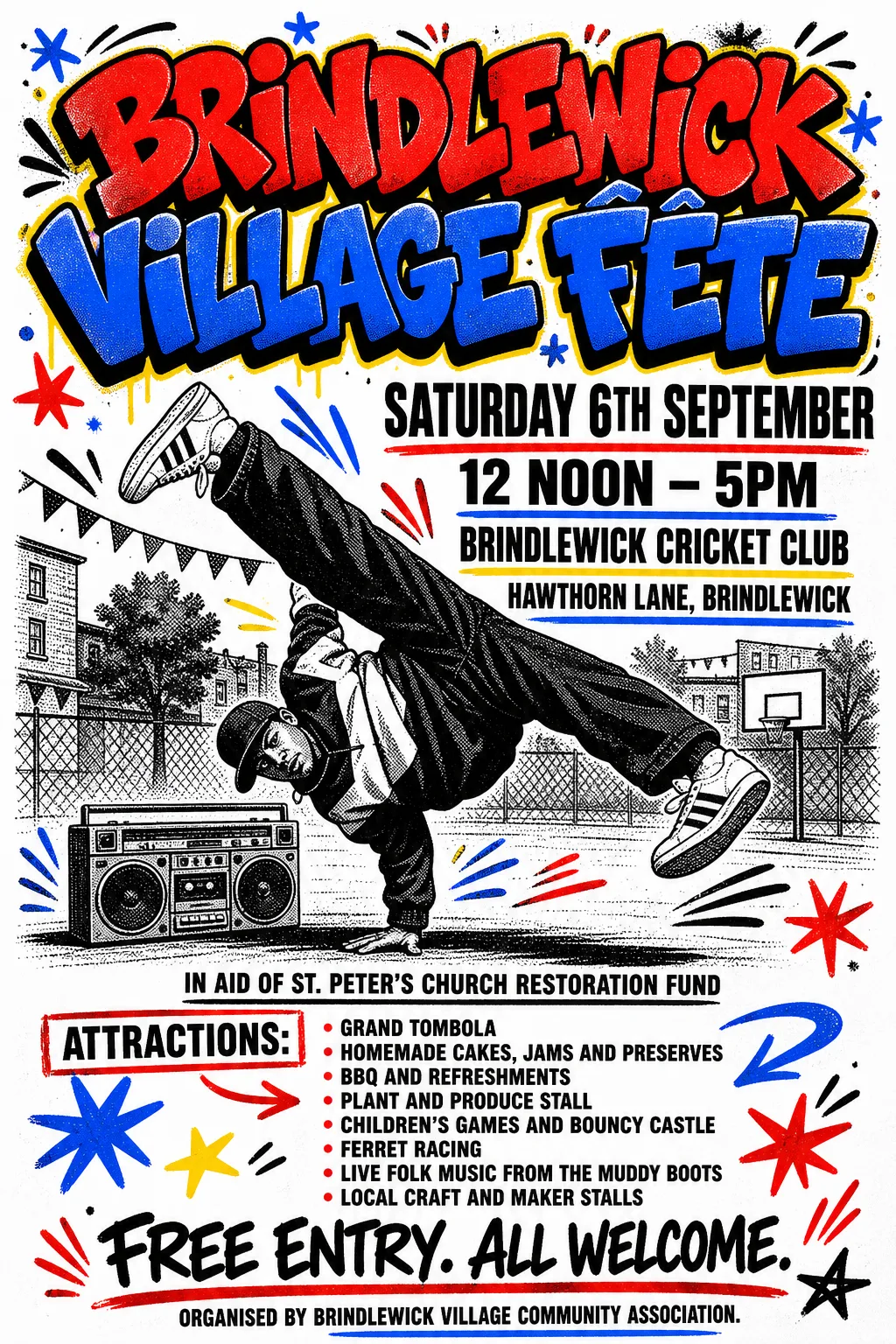
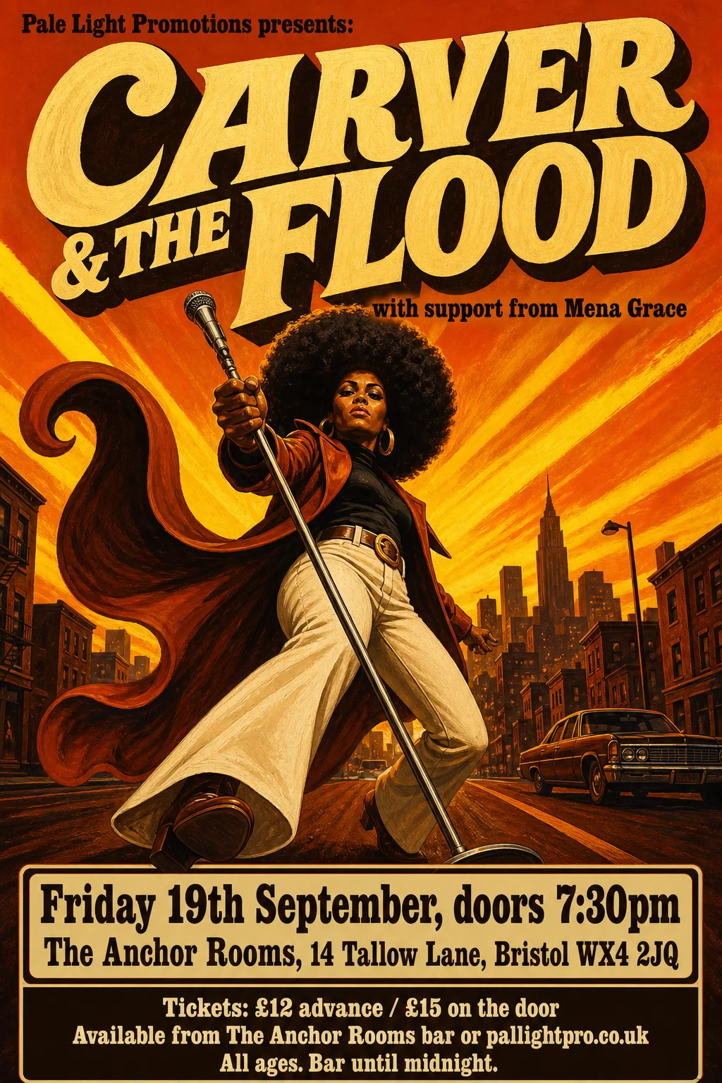
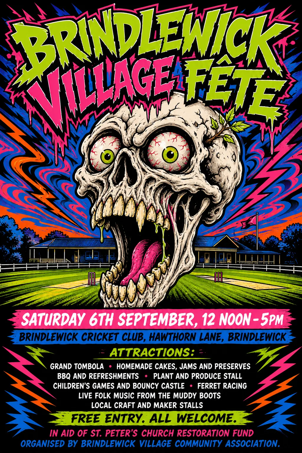
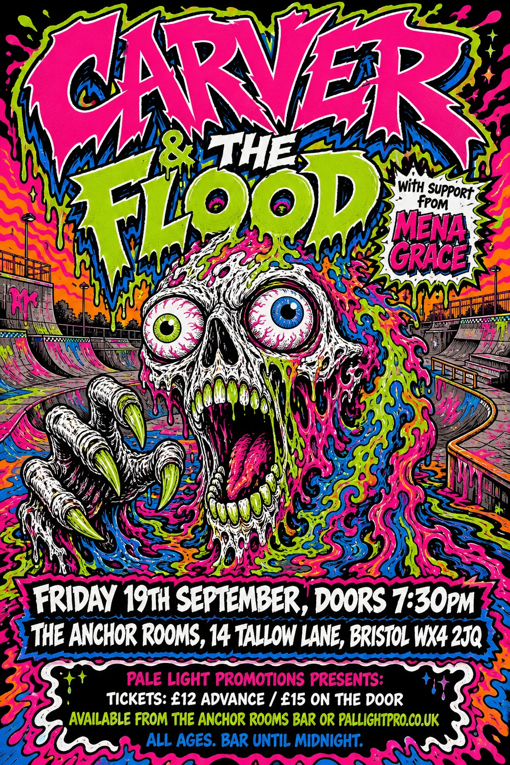
Font matches are better, but still not really good enough in many cases. One interesting fluke was that the two example events, between them, use an apostrophe and a circumflex. We also have "19th" with a superscript "th". This stress tests the system a bit more than we'd otherwise have done. Sometimes it succeeds, sometimes it doesn't.
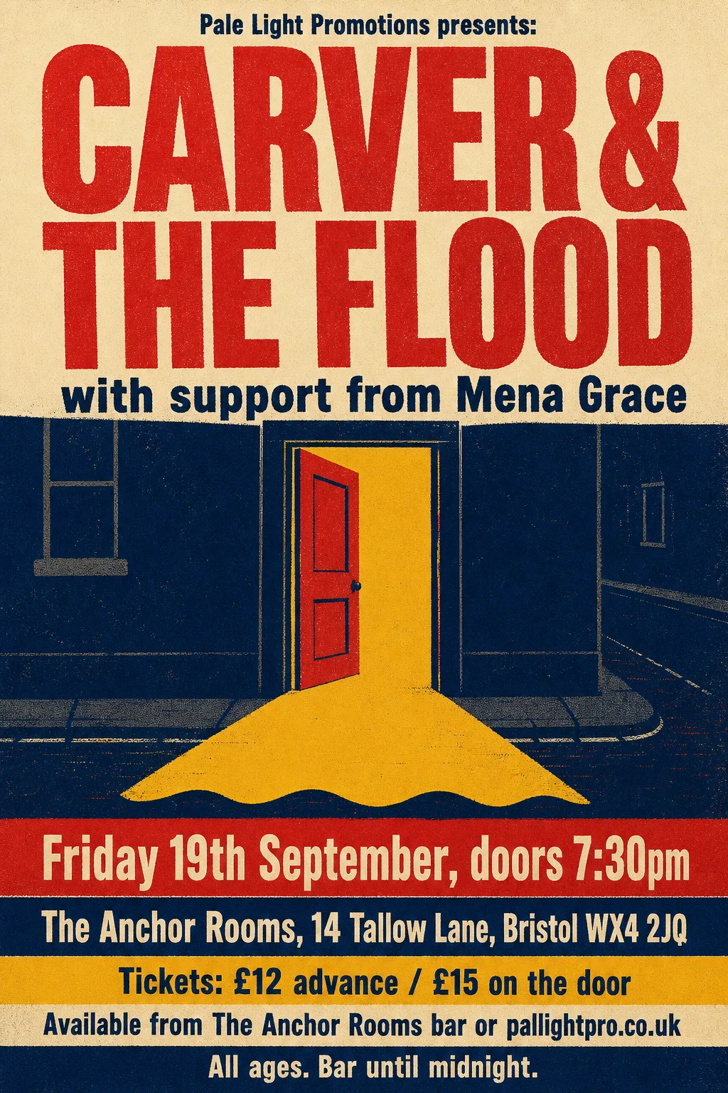
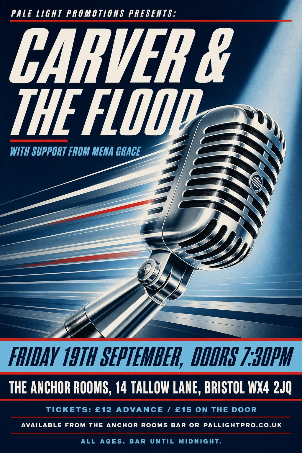 Original
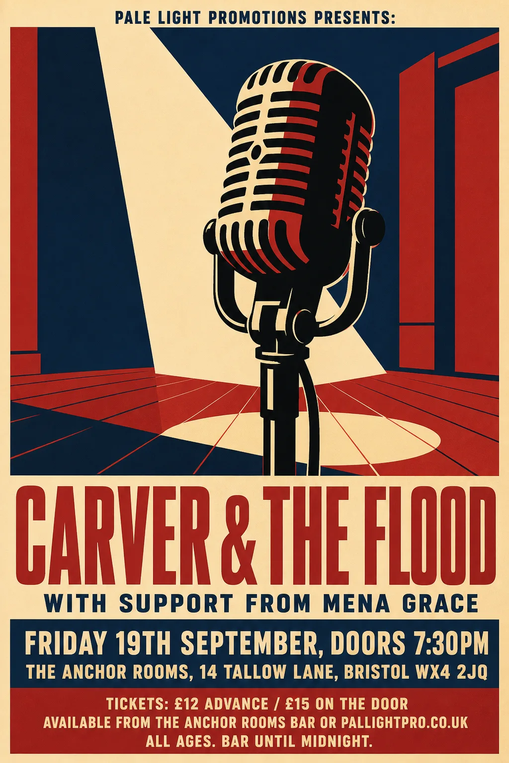
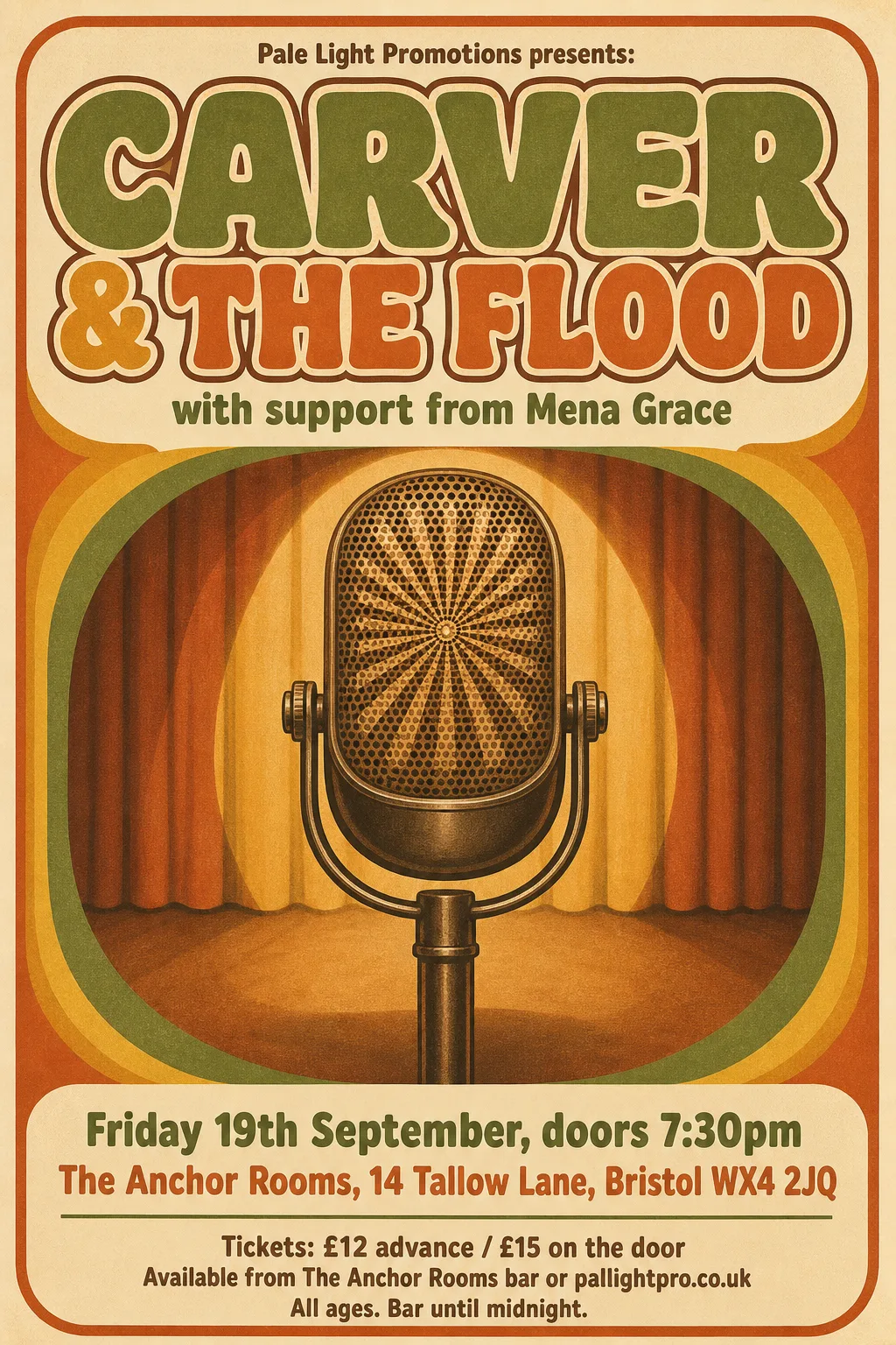
- Known fault: The red rule under the headline is nicked where THE was blanked, and a dark smudge is left by the microphone below FLOOD; the support line and date are the original's pixels. Fixable: blanking should repaint a rule or gradient along its direction rather than from the pixels around it.
- Kept as the original's pixels: “with support from Mena Grace” — fused with the illustration's speed lines
- Kept as the original's pixels: “Friday 19th September, doors 7:30pm” — set into the full-width striped band, which it touches
- Typefaces: Sofia Sans Extra Condensed 900 italic, Oswald 600, Share 700 italic, Oswald 700
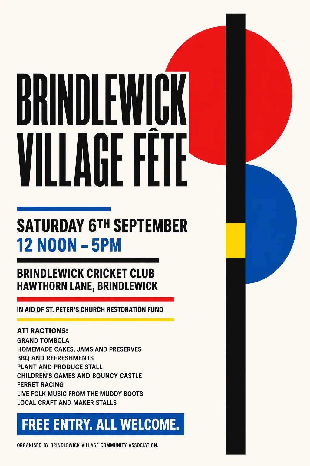 Original
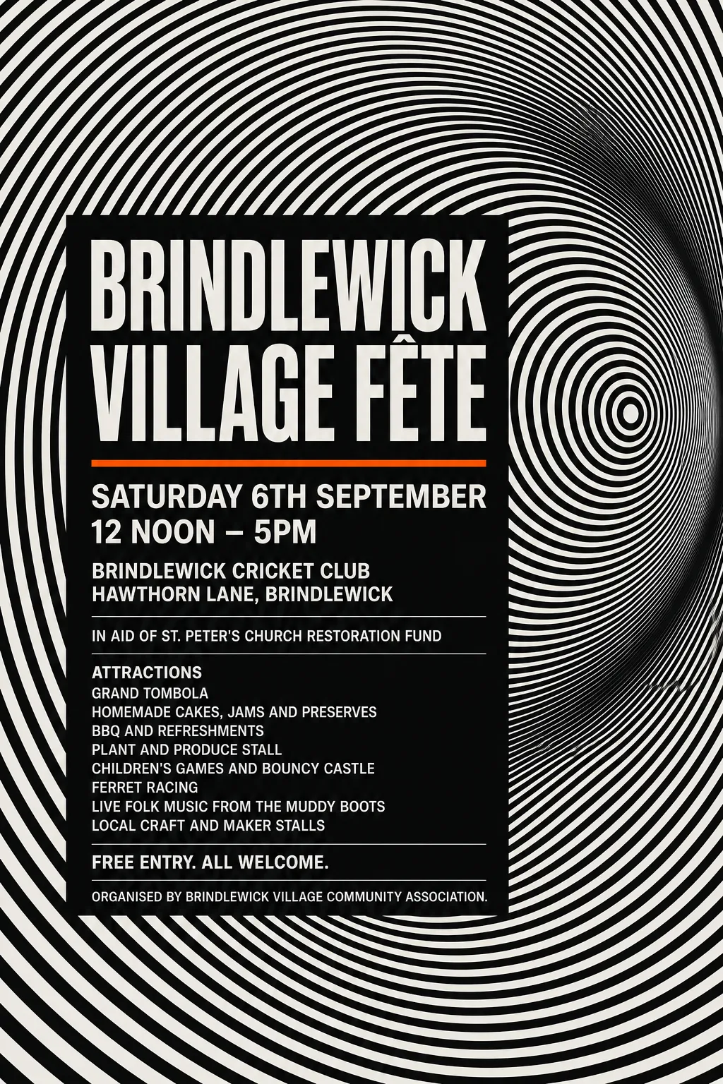
- Typefaces: League Gothic 400 wdth75, Instrument Sans 700 wdth75, Heebo 900
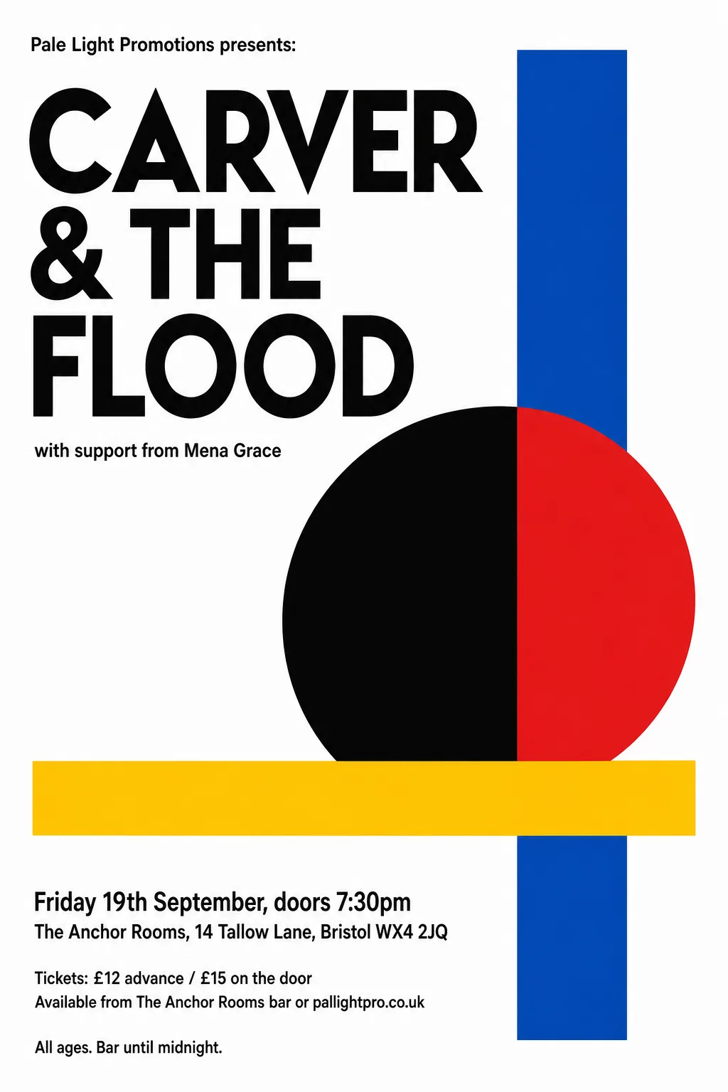 Original
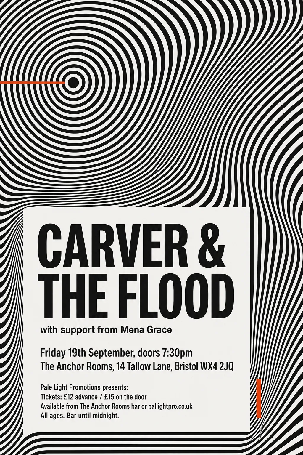
- Typefaces: Reddit Sans Condensed 700, Alatsi
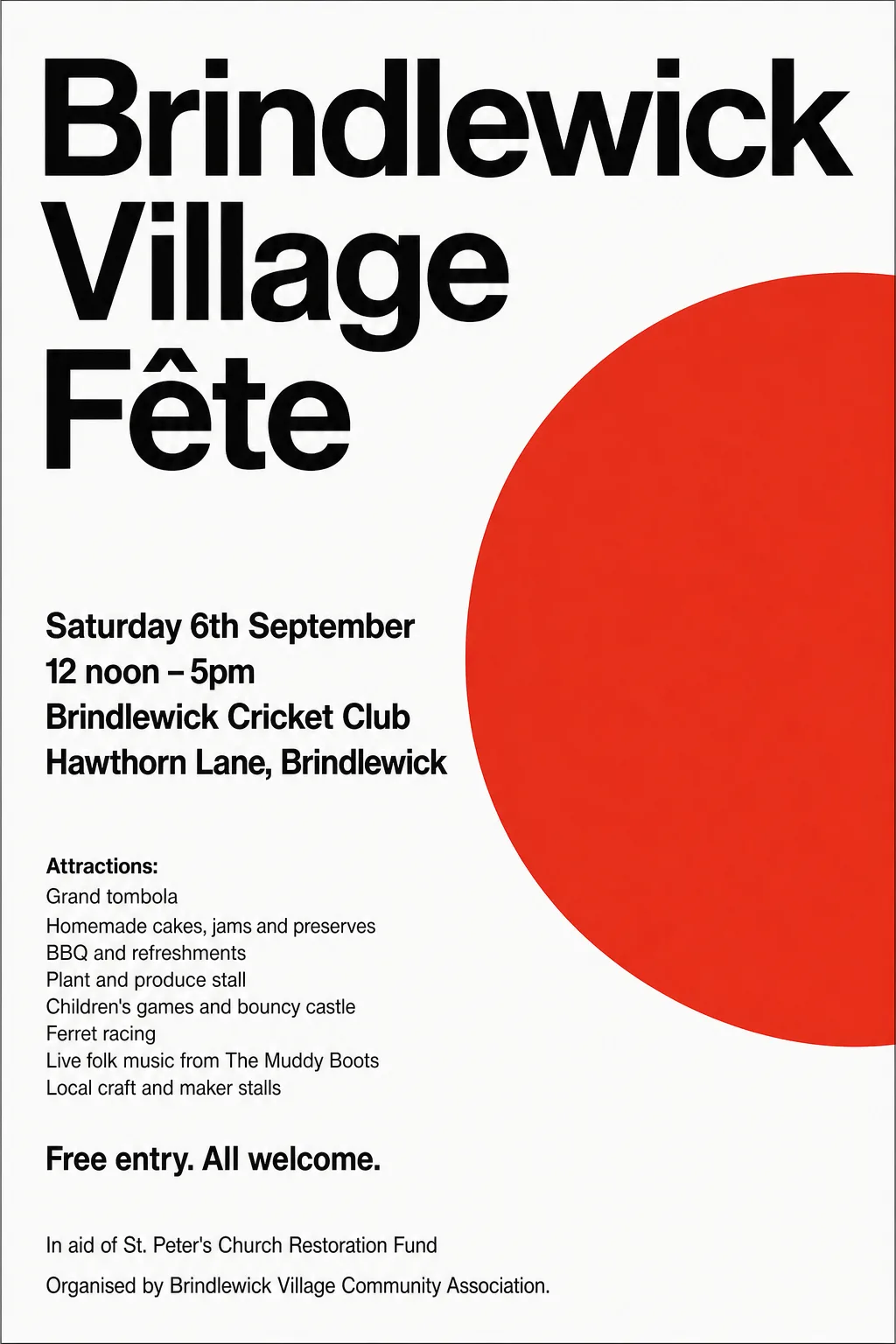 Original
- Artwork redrawn as vector shapes: no bitmap at all.
- Typefaces: Zalando Sans 600, Yantramanav 700, Overpass, Overpass 500
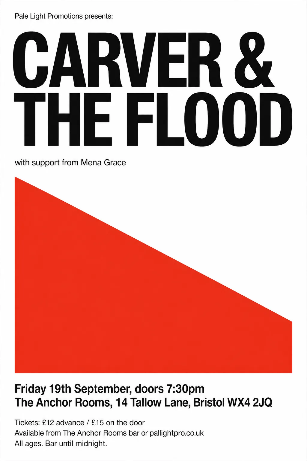 Original
- Typefaces: Zalando Sans, Pragati Narrow 700, Freeman
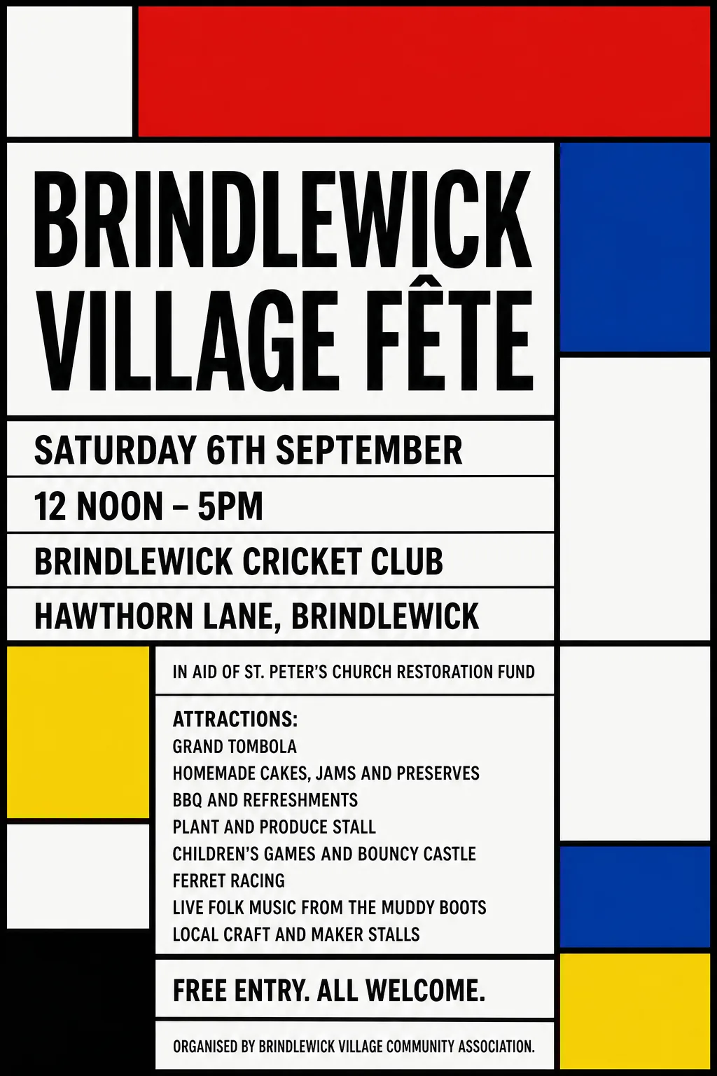 Original
- Typefaces: Antonio 700, Freeman
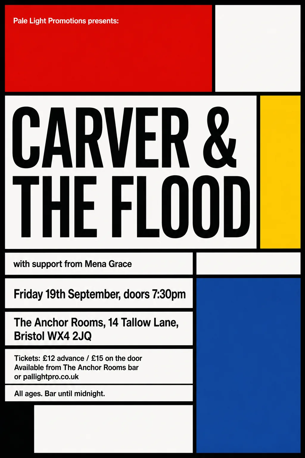 Original
- Typefaces: Cossette Texte 700, Antonio 700
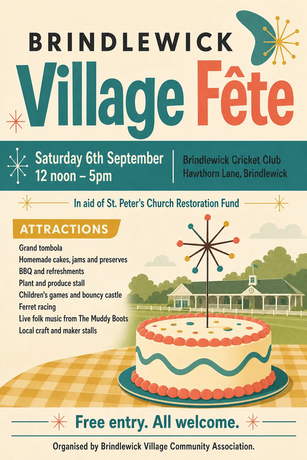 Original
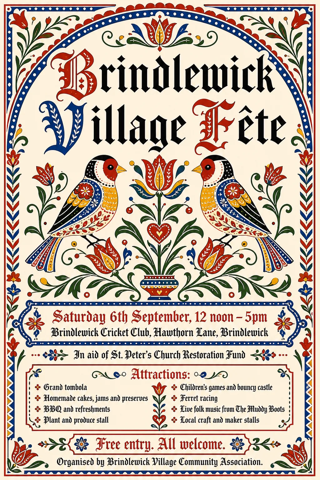
- Kept as the original's pixels: “Brindlewick Village Fête” — two-colour title whose Village band takes the g descender as cap height, so it sets too large and low
- Kept as the original's pixels: “Saturday 6th September, 12 noon – 5pm” — two rows merged into one band, set as one small line
- Typefaces: Archivo Narrow 500, Hind Mysuru 700, Archivo Narrow 700
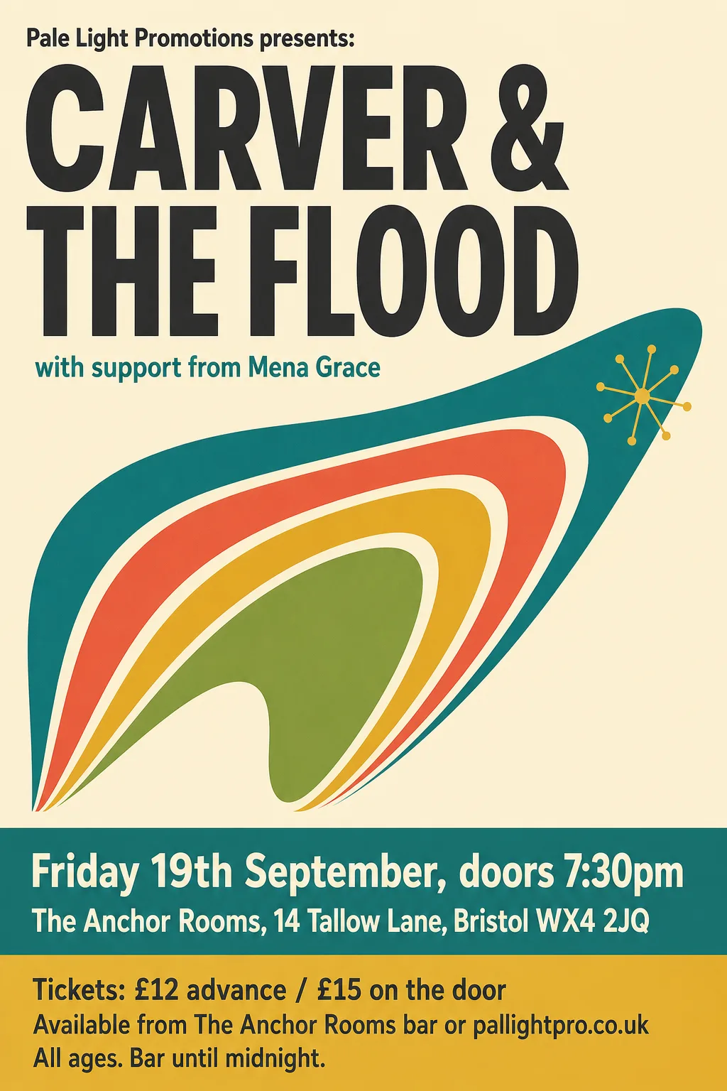 Original
- Typefaces: Radio Canada 700 wdth75, Sofia Sans Extra Condensed 800
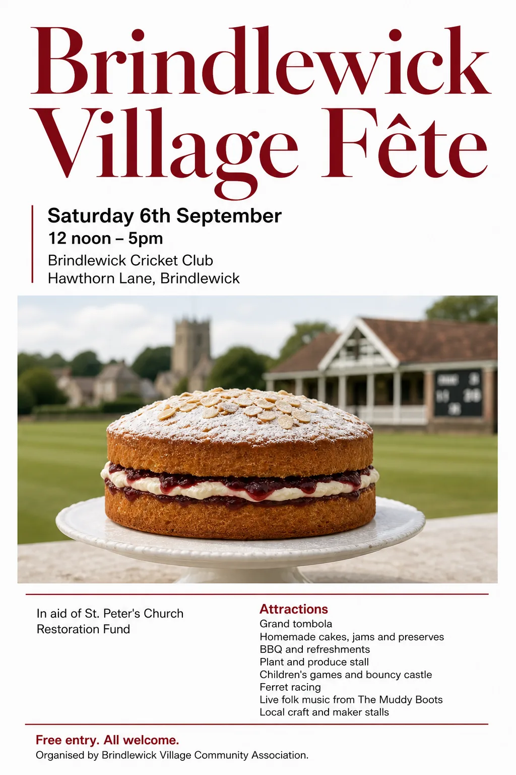 Original
- Typefaces: Newsreader 500, Inter 600, TikTok Sans, Inter Tight 600
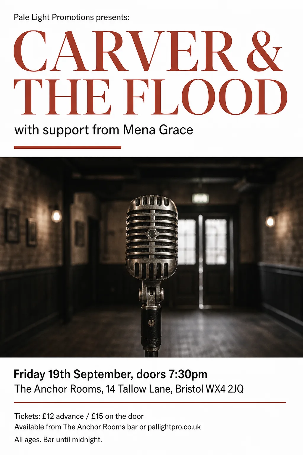 Original
- Typefaces: Vazirmatn, Newsreader 500
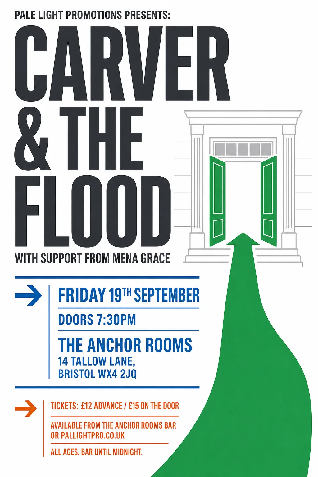 Original
- Typefaces: Oswald 600, Antonio 700
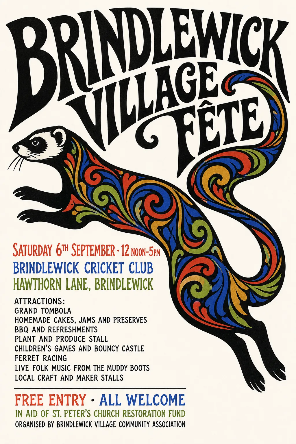 Original
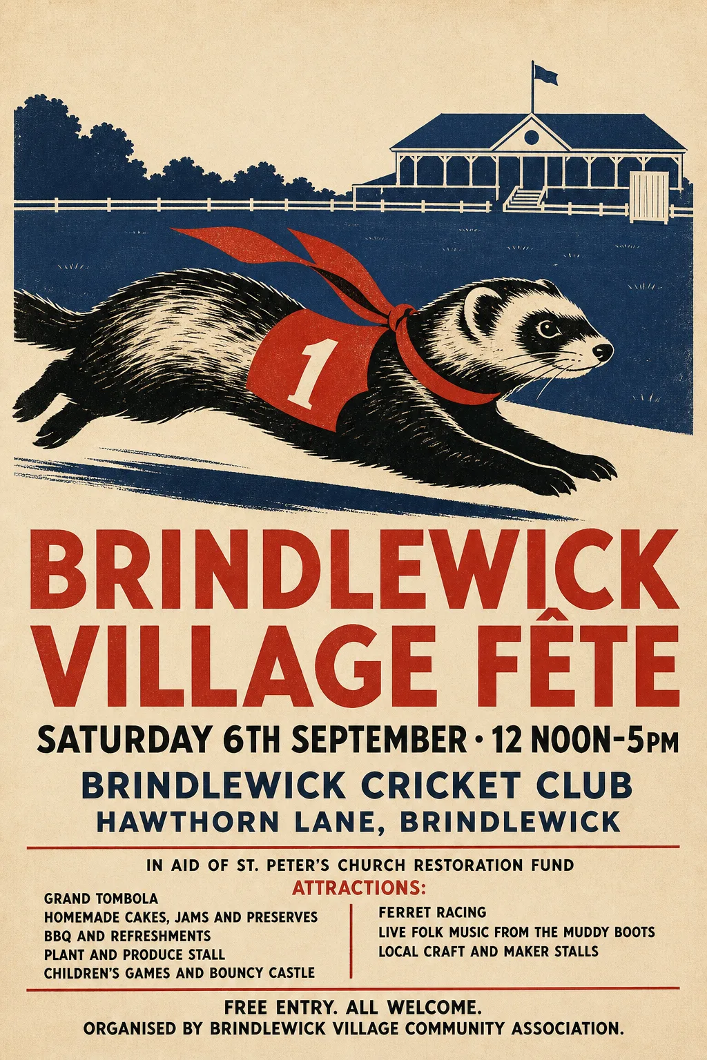
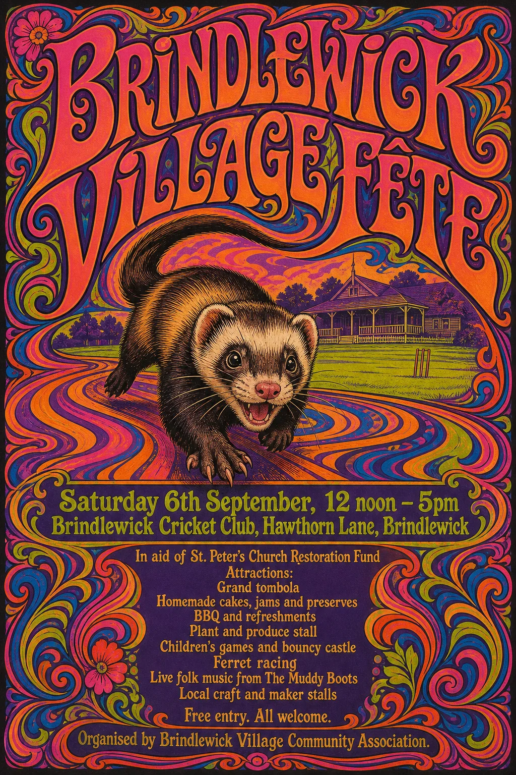
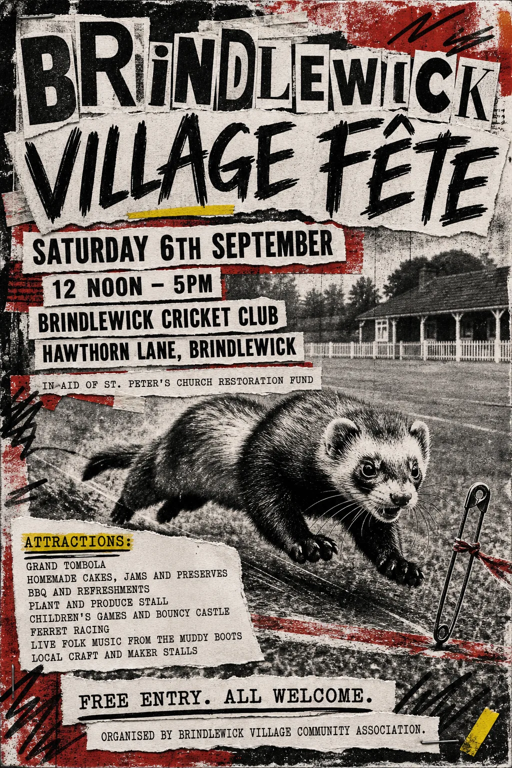
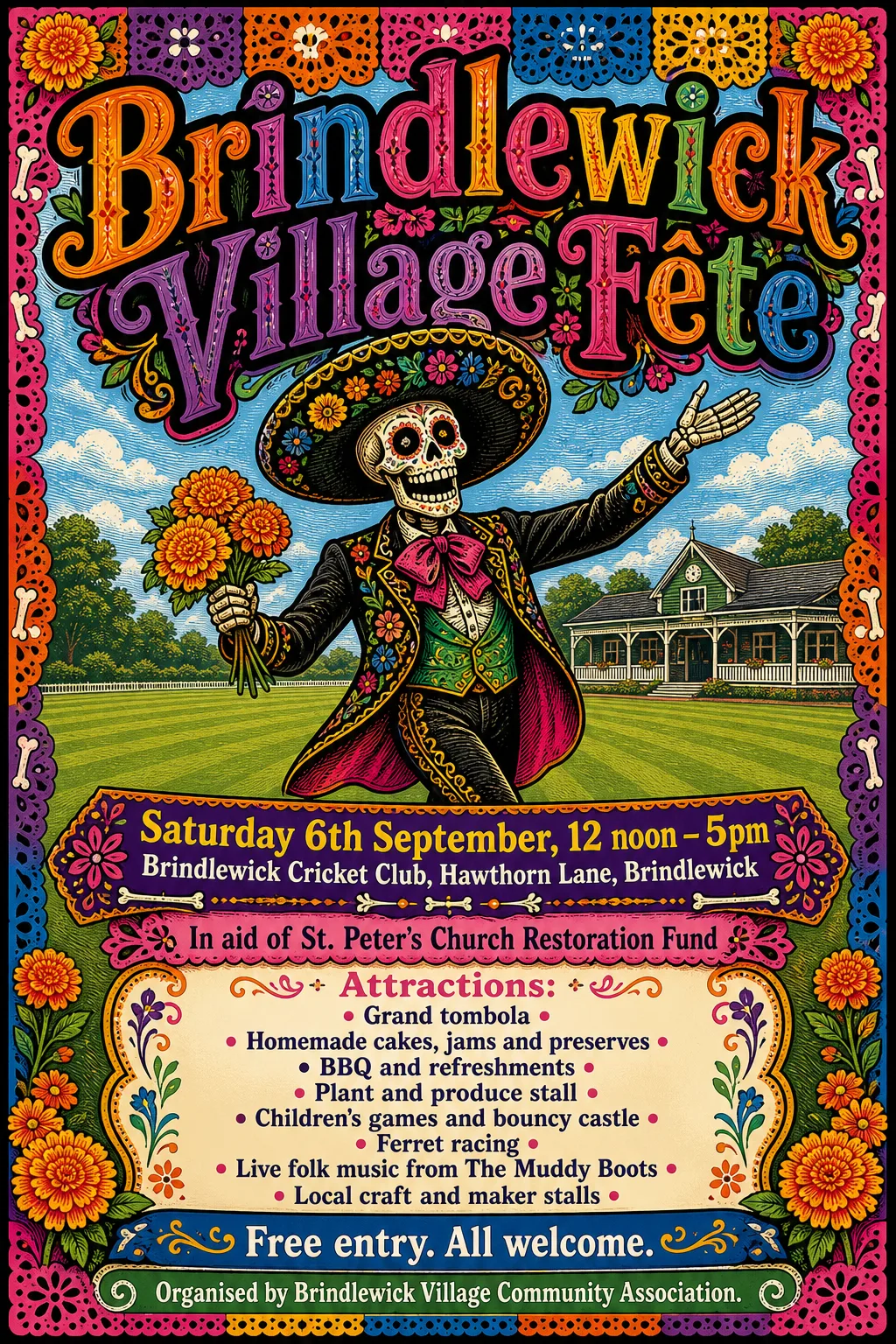
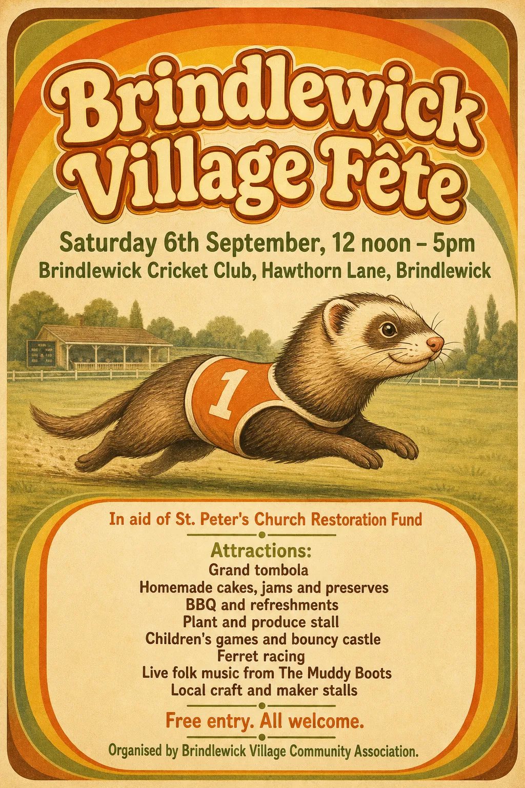
- Kept as the original's pixels: “Brindlewick Village Fête” — hand-lettered display type integrated into the illustration
- Kept as the original's pixels: “Brindlewick Cricket Club, Hawthorn Lane, Brindlewick” — its second row runs into the ferret's tail and cannot be separated from it
- Kept as the original's pixels: “In aid of St. Peter's Church Restoration Fund” — its last word touches the ferret's leg
- Typefaces: Oswald 500, Oswald
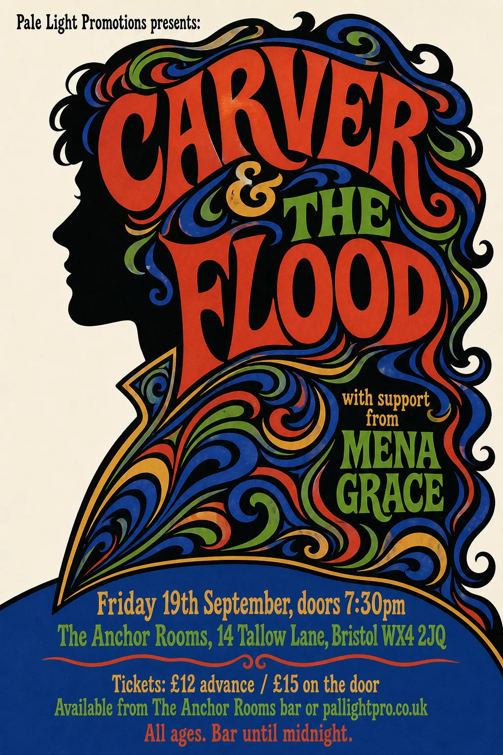 Original
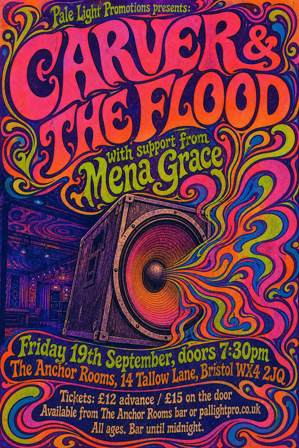
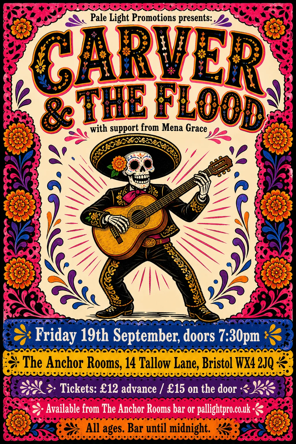
- Kept as the original's pixels: “CARVER & THE FLOOD / with support from Mena Grace” — psychedelic hand-drawn lettering woven into the illustration
- Typefaces: Imbue 600
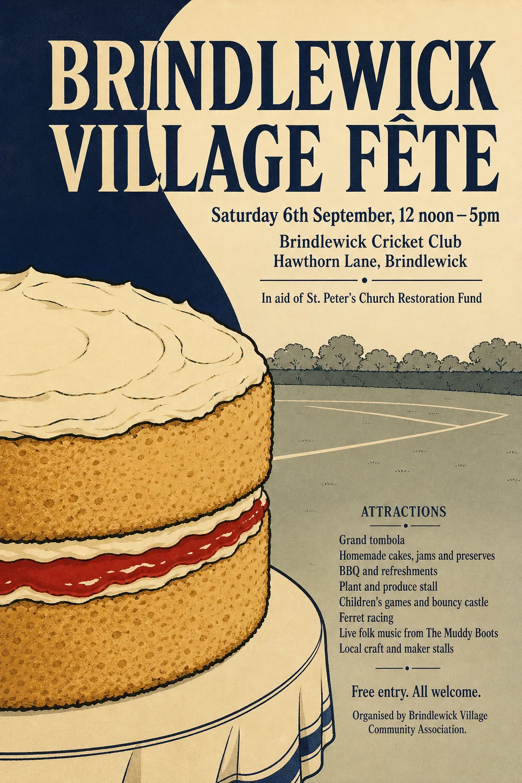 Original
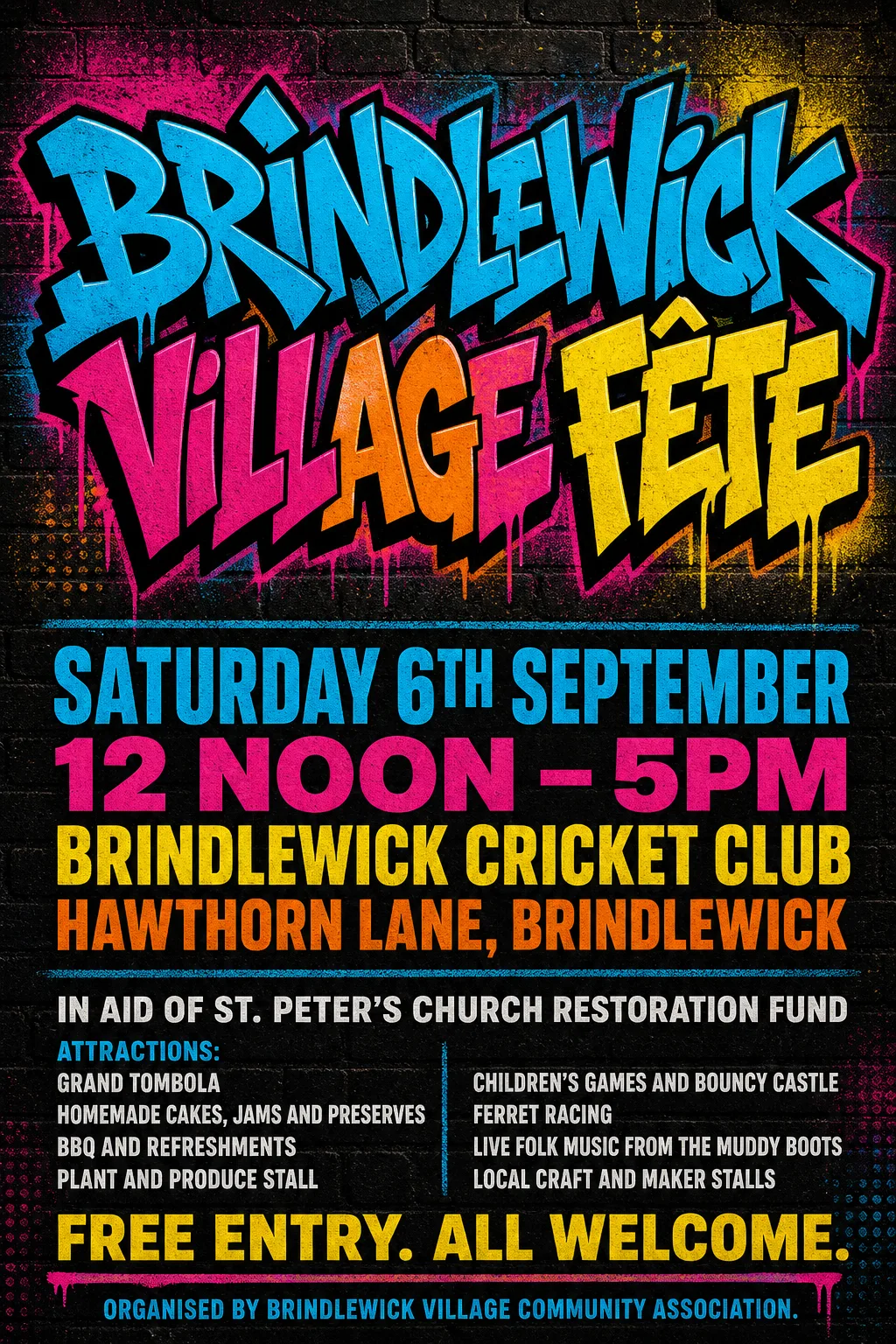
- Kept as the original's pixels: “Brindlewick Village Fête” — lettering changes colour where it crosses the navy wave
- Kept as the original's pixels: “In aid of St. Peter's Church Restoration Fund” — the band finder misses its first words beside the wave
- Typefaces: Yaldevi 600, Instrument Serif
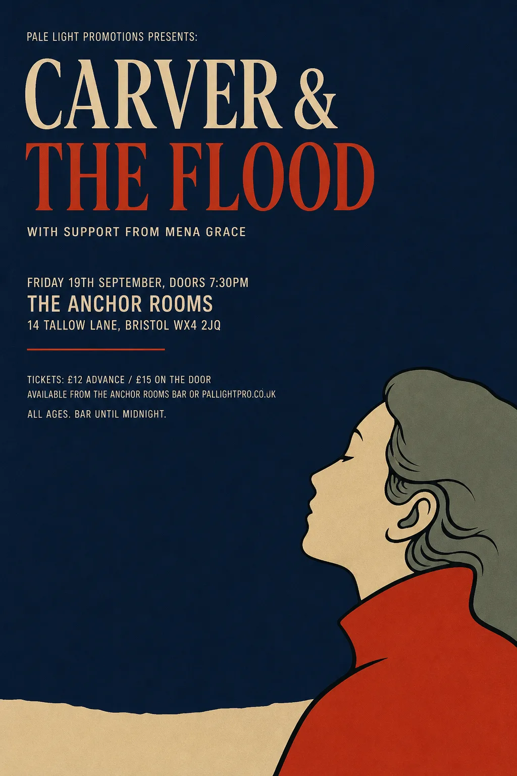 Original
- Kept as the original's pixels: “CARVER & THE FLOOD” — two-colour headline whose second line the band finder only half detects
- Typefaces: News Cycle 700, Bricolage Grotesque 400 wdth75
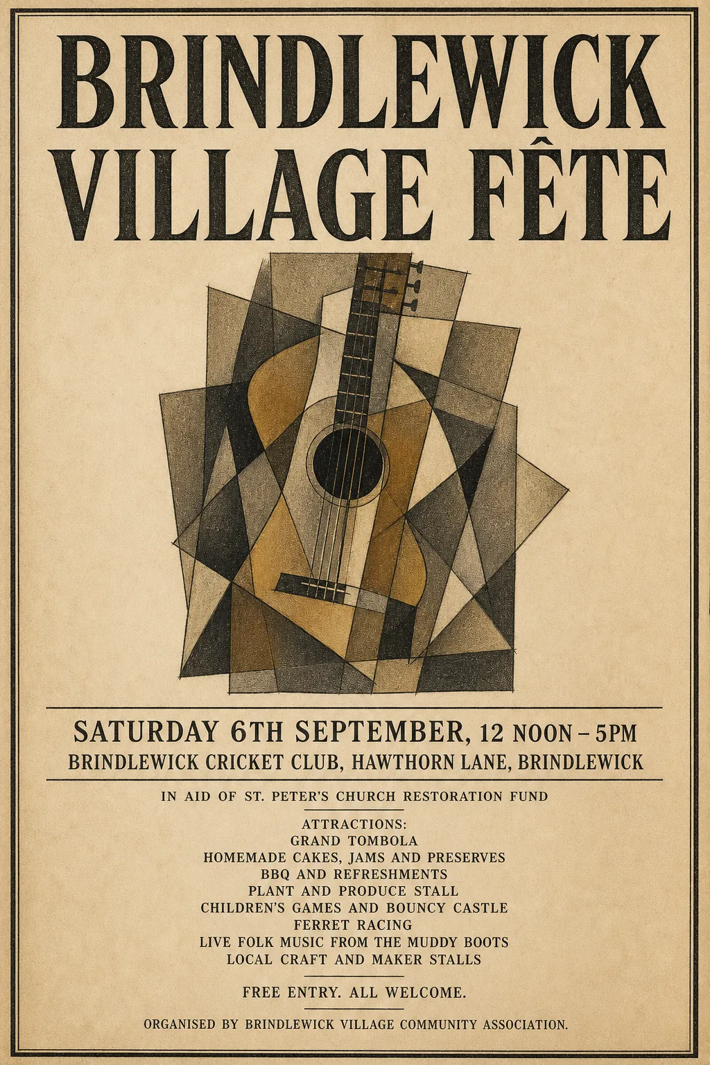 Original
- Kept as the original's pixels: “Brindlewick Village Fête” — condensed woodtype serif with worn letterpress texture; no open font matches
- Typefaces: Gupter 700, Gupter 500
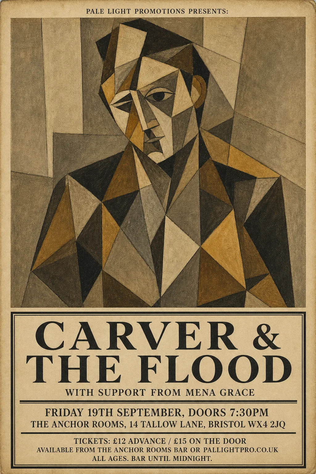 Original
- Typefaces: Frank Ruhl Libre 500, Wittgenstein 900
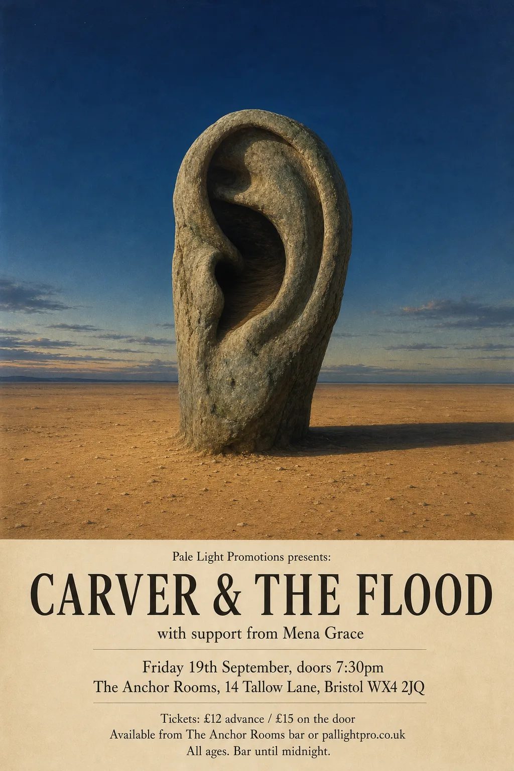 Original
- Typefaces: Gentium Plus, Instrument Serif
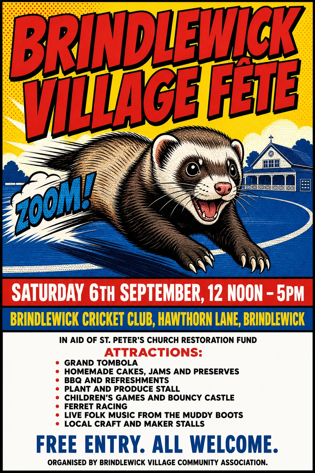 Original
- Kept as the original's pixels: “Brindlewick Village Fête” — comic lettering with a heavy outline and drop shadow, slanted
- Typefaces: Sofia Sans Extra Condensed 900, Geologica 900
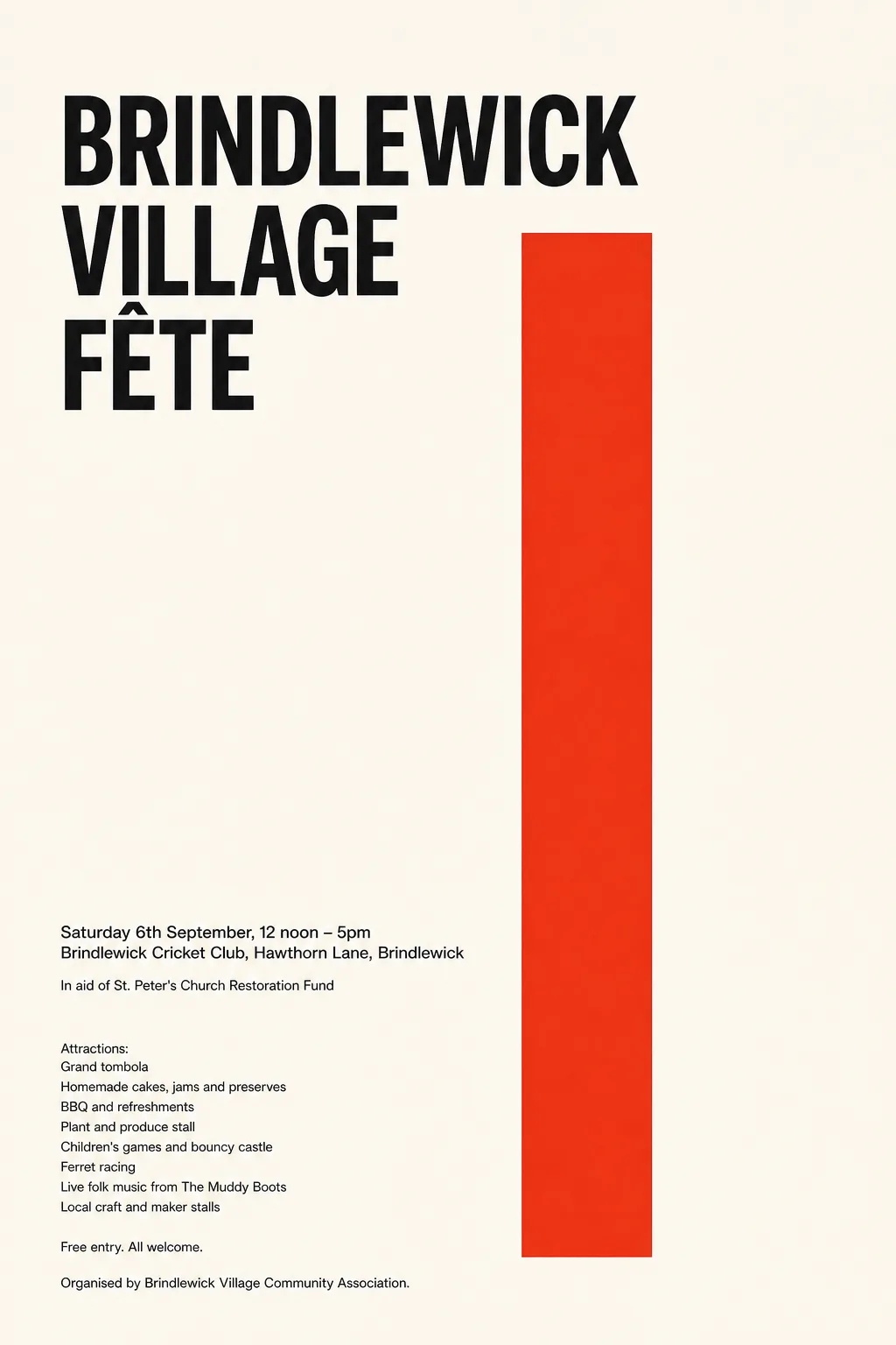 Original
- Typefaces: Sofia Sans Extra Condensed 800, Inter Tight 500
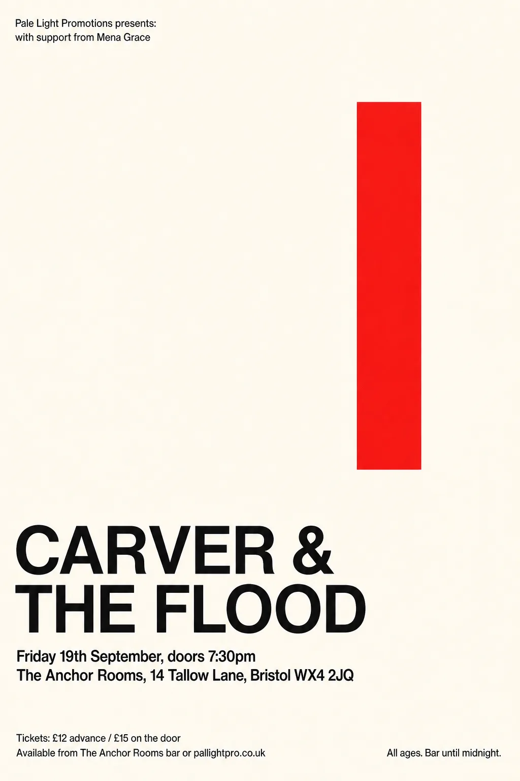 Original
- Typefaces: Overpass 600, Geist 600
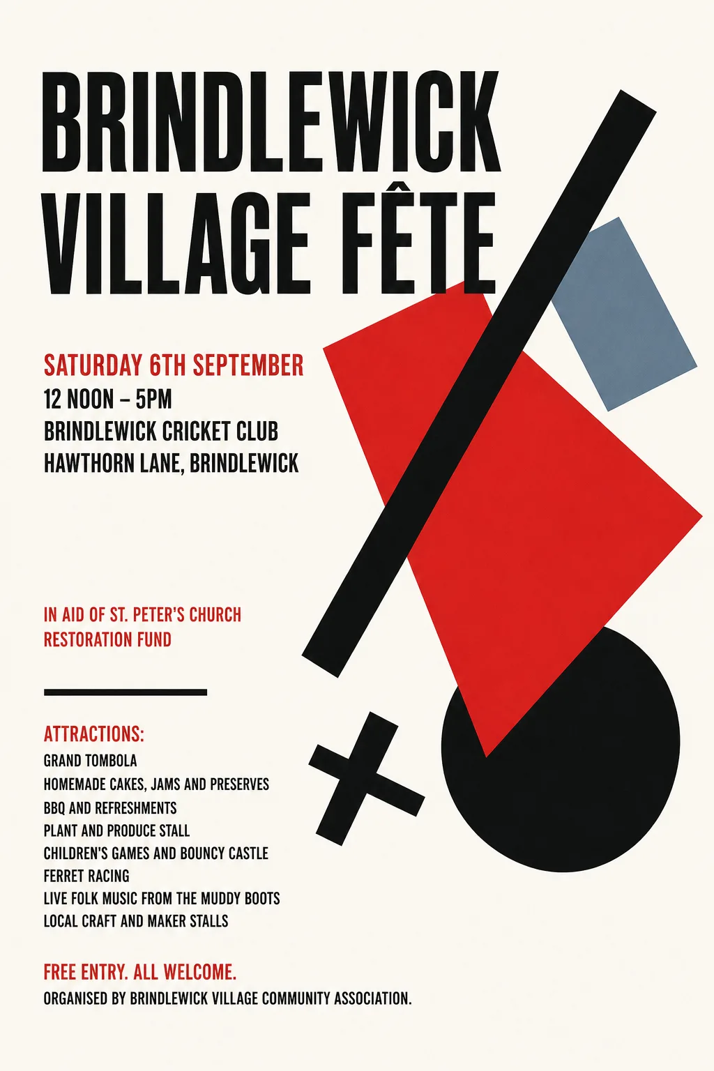 Original
- Typefaces: Anton, Bebas Neue
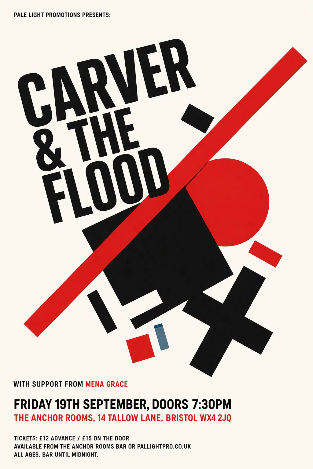 Original
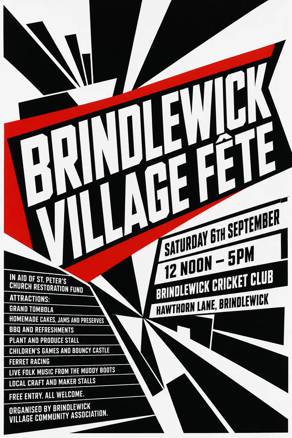
- Known fault: Where FLOOD crosses the red bar and the black square, the repainted edges are rough and a red fleck is left by the D. Fixable: repaint along the shapes' straight edges (knockout-style) where type crosses them.
- Some lines set on a 13.7° slant.
- Typefaces: Sofia Sans Condensed 700, Sofia Sans Condensed 800 italic, Sofia Sans Condensed 800
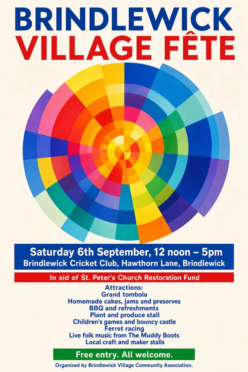 Original
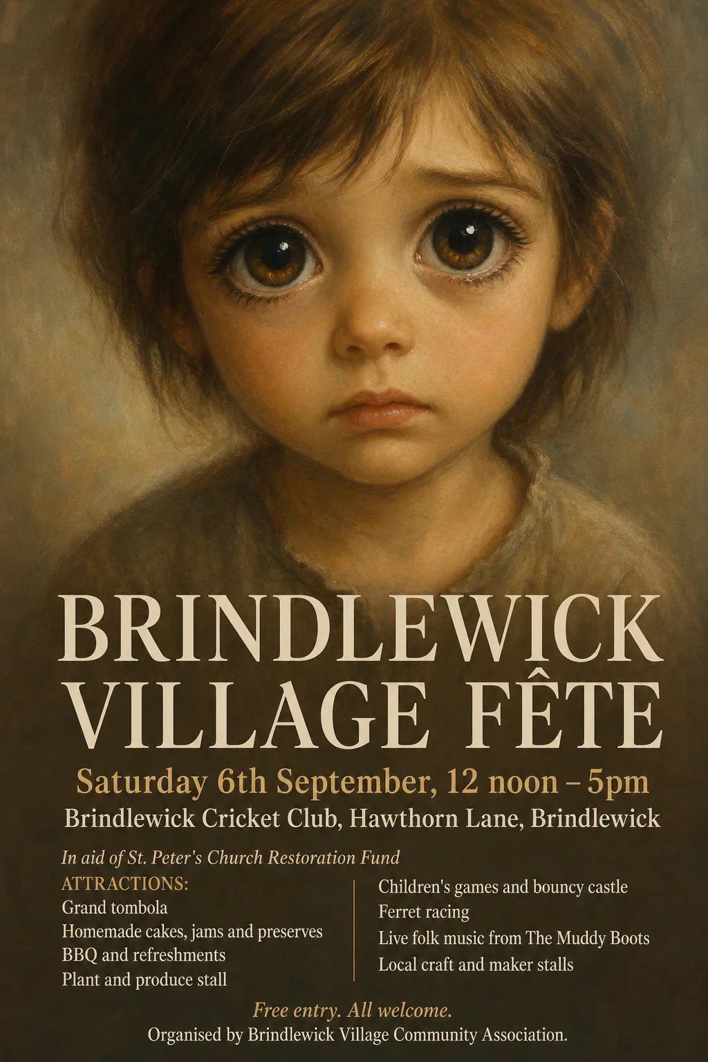
- Not reset: “In aid of St. Peter's Church Restoration Fund” (missing from the poster, or left in the artwork)
- Typefaces: Reddit Sans 800, Vazirmatn 800
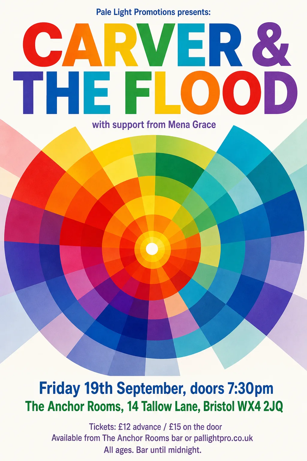 Original
- Kept as the original's pixels: “CARVER & THE FLOOD” — each letter a different colour
- Typefaces: Freeman, Francois One, Sofia Sans Condensed 500
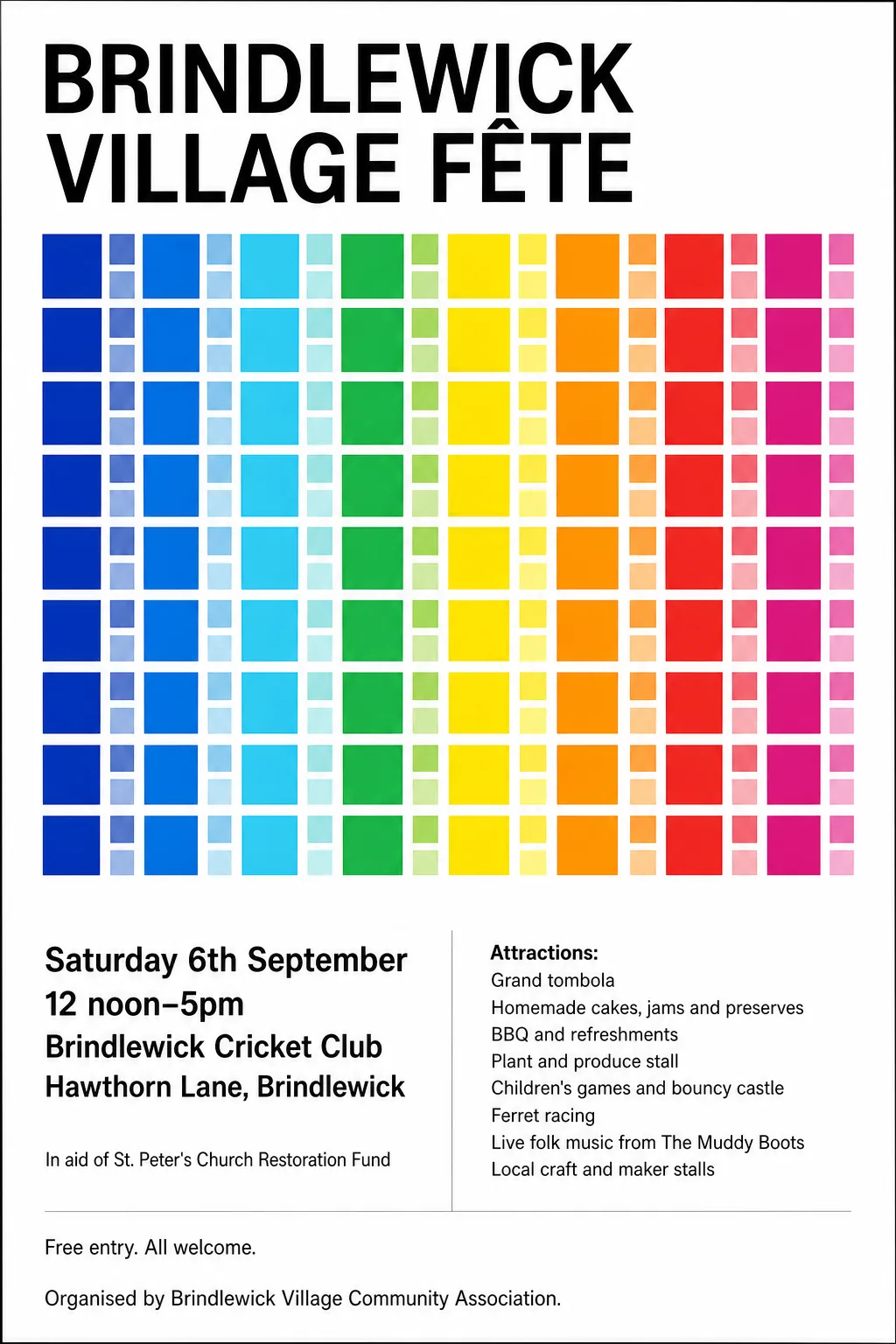 Original
- Typefaces: Inter Tight 700, Barlow 600, Sarabun
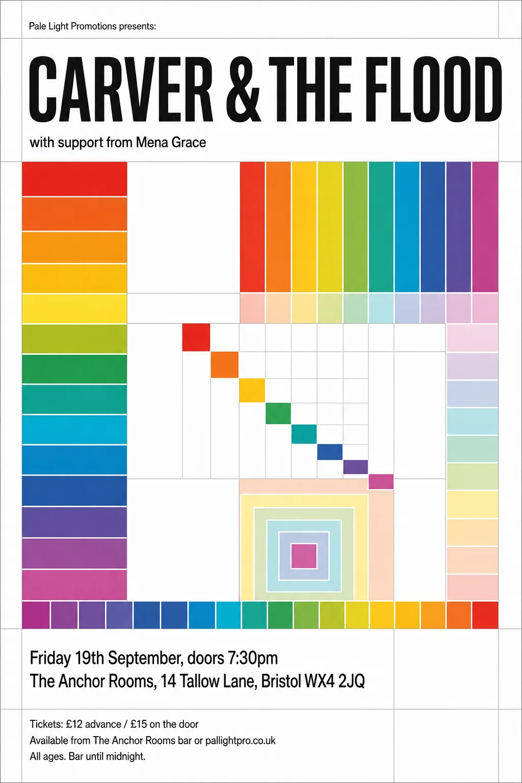 Original
- Typefaces: Encode Sans Condensed 500, Antonio 700
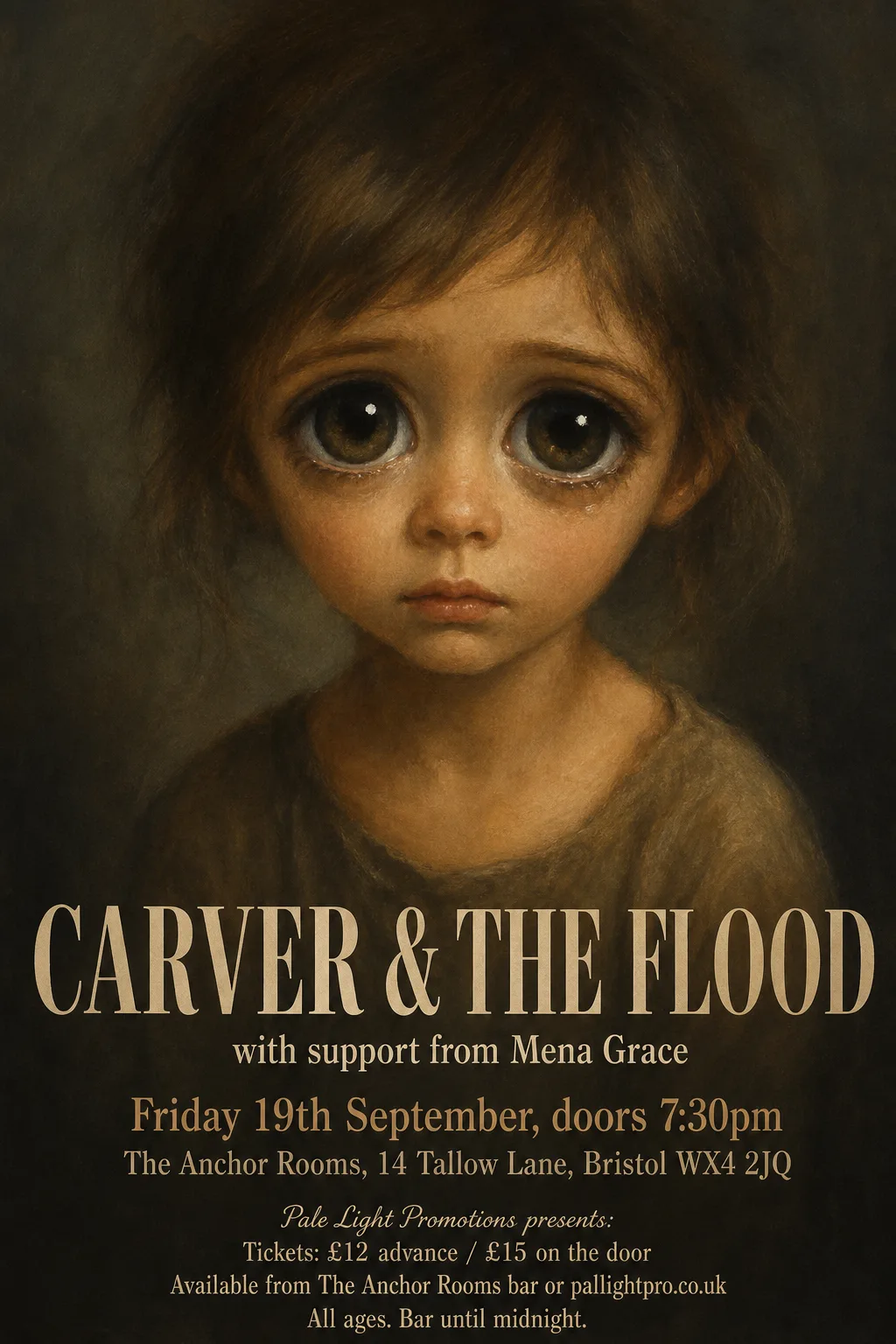 Original
- Kept as the original's pixels: “CARVER & THE FLOOD” — painted into the picture's dark ground
- Typefaces: Libre Caslon Text, Libre Caslon Text 400 italic
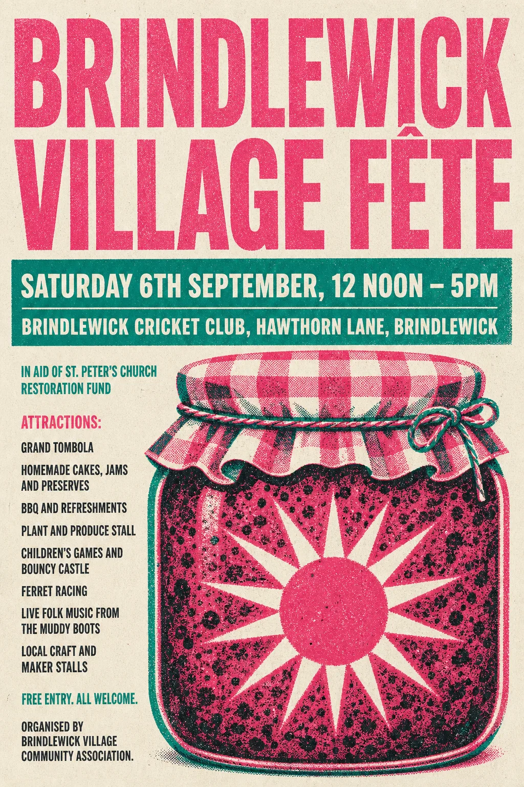 Original
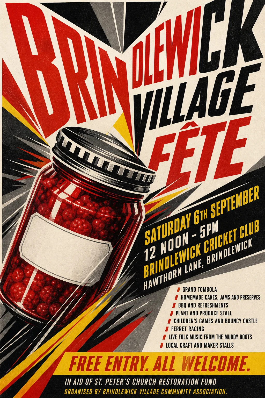
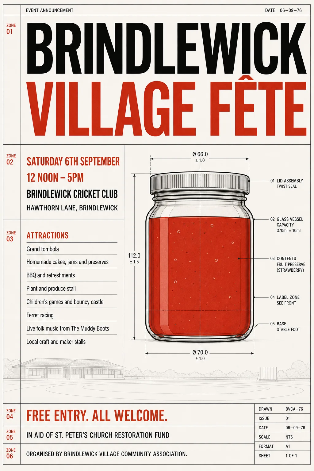
- Kept as the original's pixels: “Brindlewick Village Fête” — textured risograph print; the texture cannot be reset
- Kept as the original's pixels: “Organised by Brindlewick Village Community Association.” — its rows merge with the jar's base
- Typefaces: Anton, Oswald 600
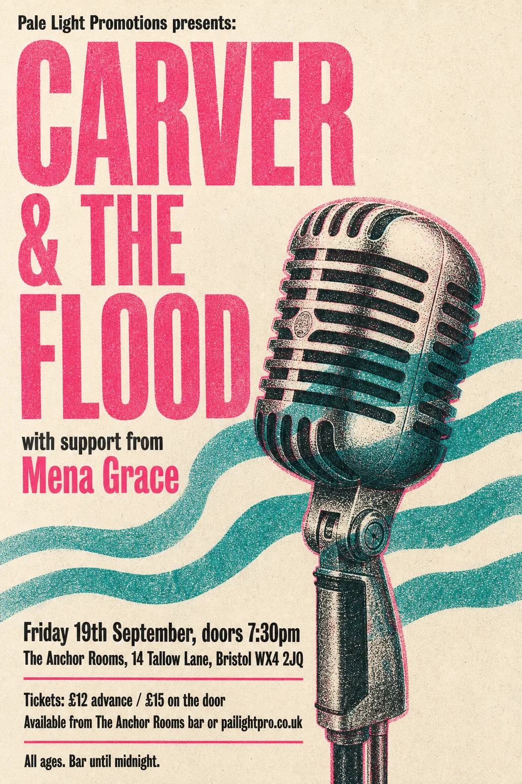 Original
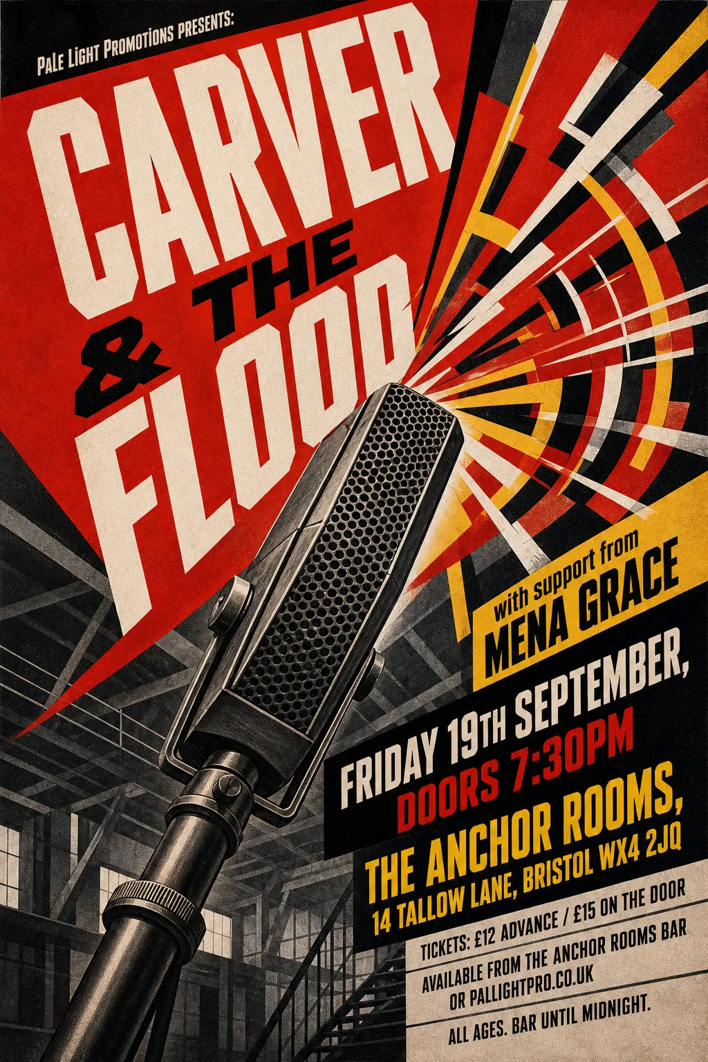
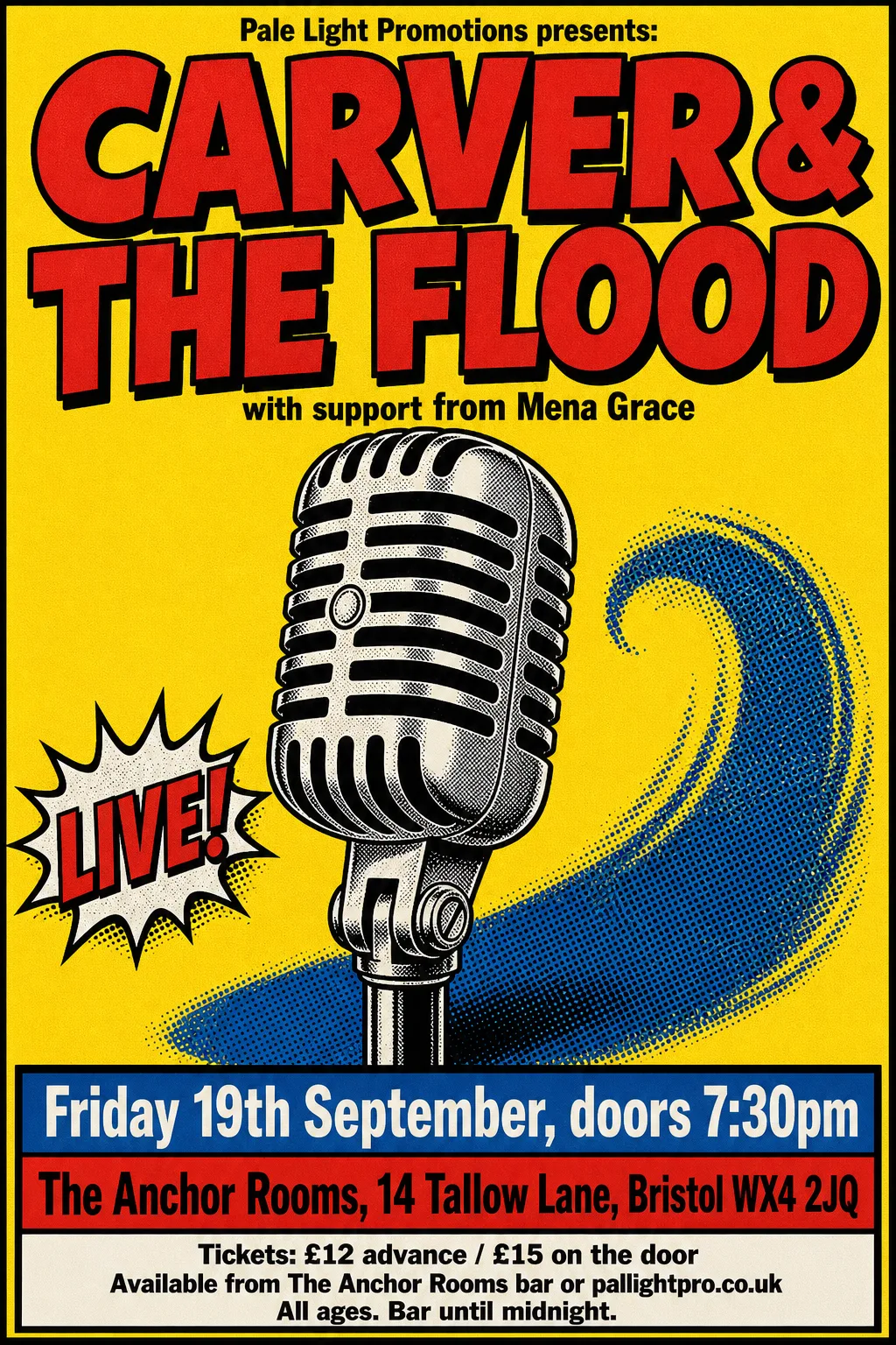
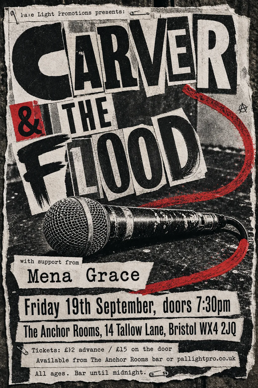
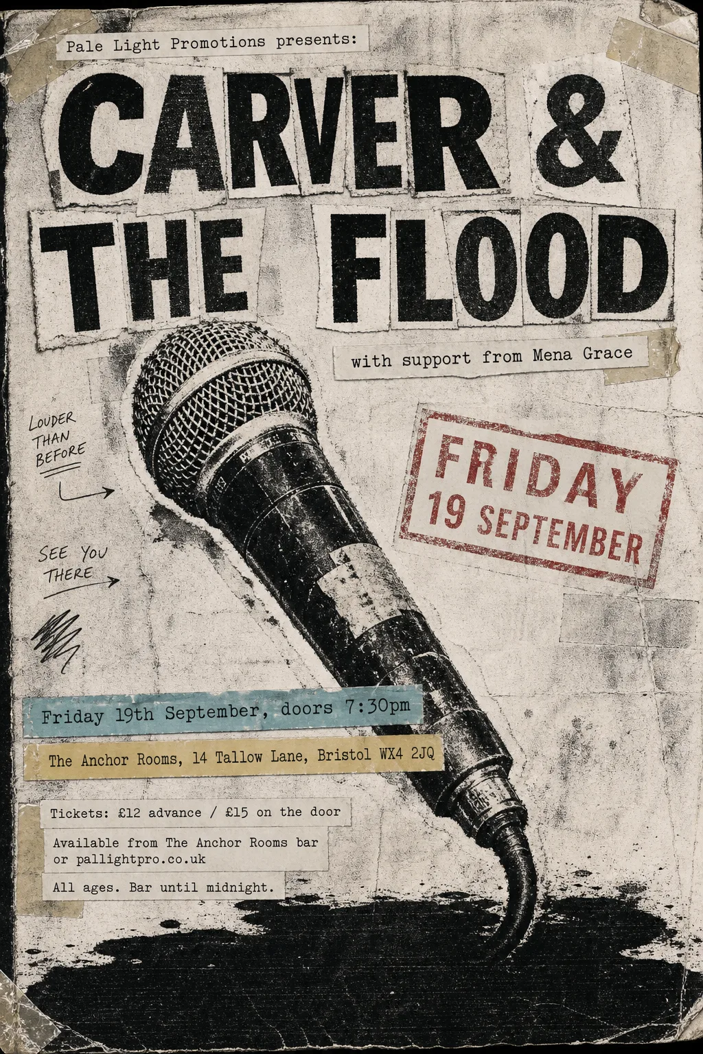
- Kept as the original's pixels: “CARVER & THE FLOOD” — printed over the microphone: a reset left a ghost R and scarred the mic
- Kept as the original's pixels: “with support from Mena Grace” — two sizes on one line, which the band finder takes as one band
- Typefaces: Oswald 700
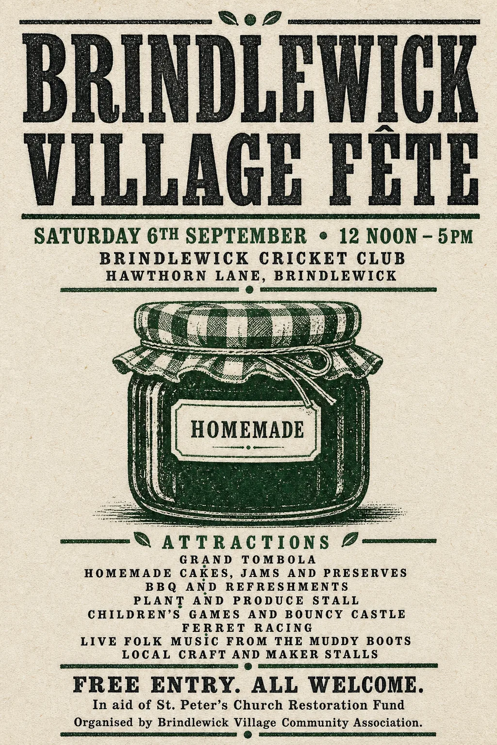 Original
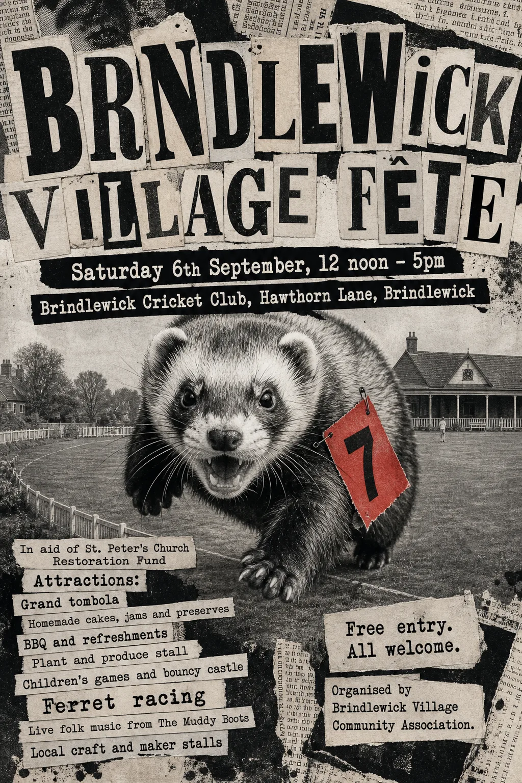
- Kept as the original's pixels: “Brindlewick Village Fête” — condensed woodtype slab with letterpress texture; no open font is a condensed slab
- Not reset: “Attractions:” (missing from the poster, or left in the artwork)
- Typefaces: Solway 800
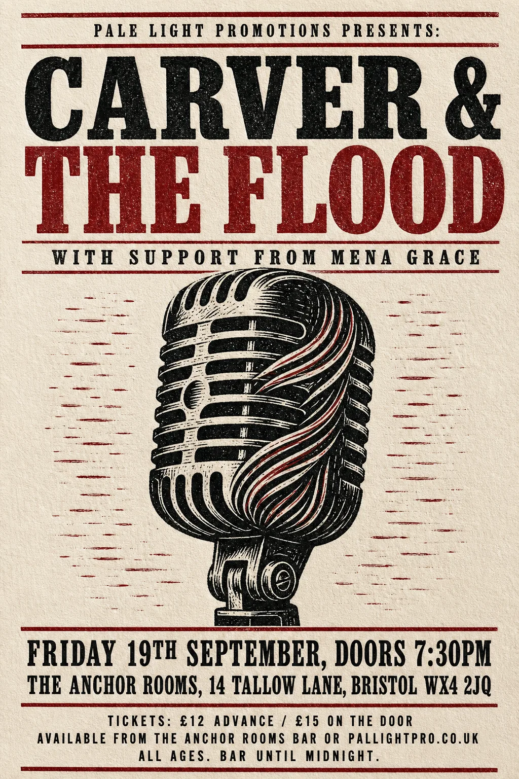 Original
- Kept as the original's pixels: “CARVER & THE FLOOD” — worn letterpress ink texture in two colours
- Typefaces: Imbue 600
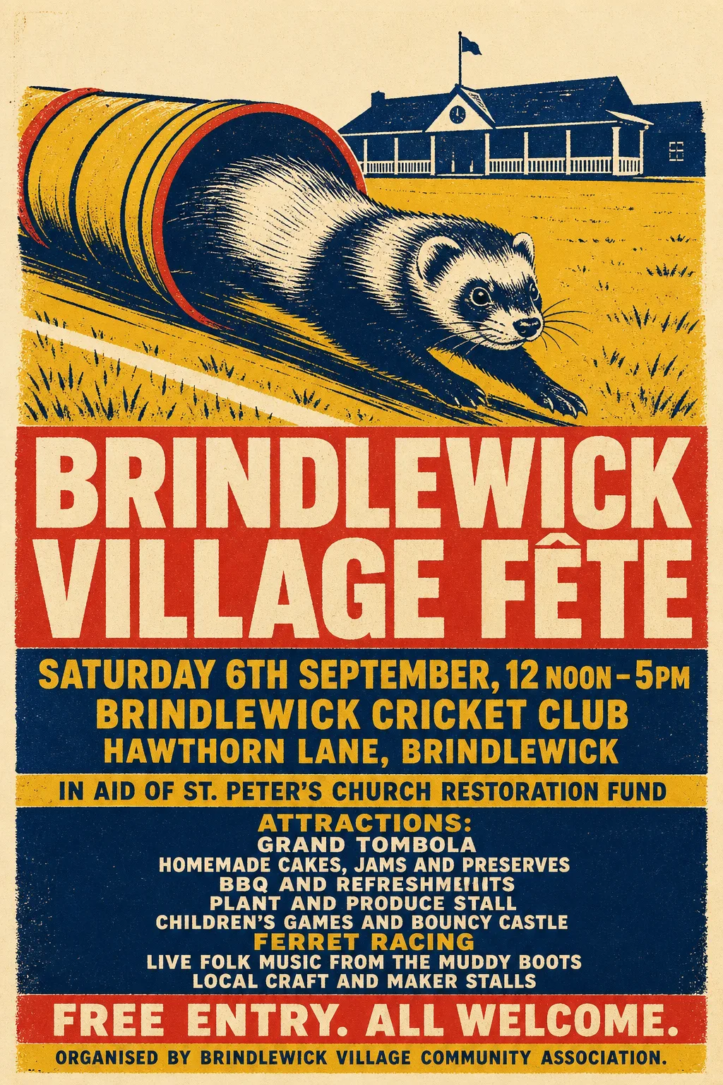 Original
- Kept as the original's pixels: “Brindlewick Village Fête” — screen-printed title on a textured panel that blanking damages
- Kept as the original's pixels: “Attractions: / Grand tombola / Homemade cakes, jams and preserves / BBQ and refreshments / Plant and produce stall / Children's games and bouncy castle / Ferret racing / Live folk music from The Muddy Boots / Local craft and maker stalls” — list set in two colours row by row; the band finder splits its rows into fragments
- Not reset: “In aid of St. Peter's Church Restoration Fund”, “Free entry. All welcome.”, “Organised by Brindlewick Village Community Association.” (missing from the poster, or left in the artwork)
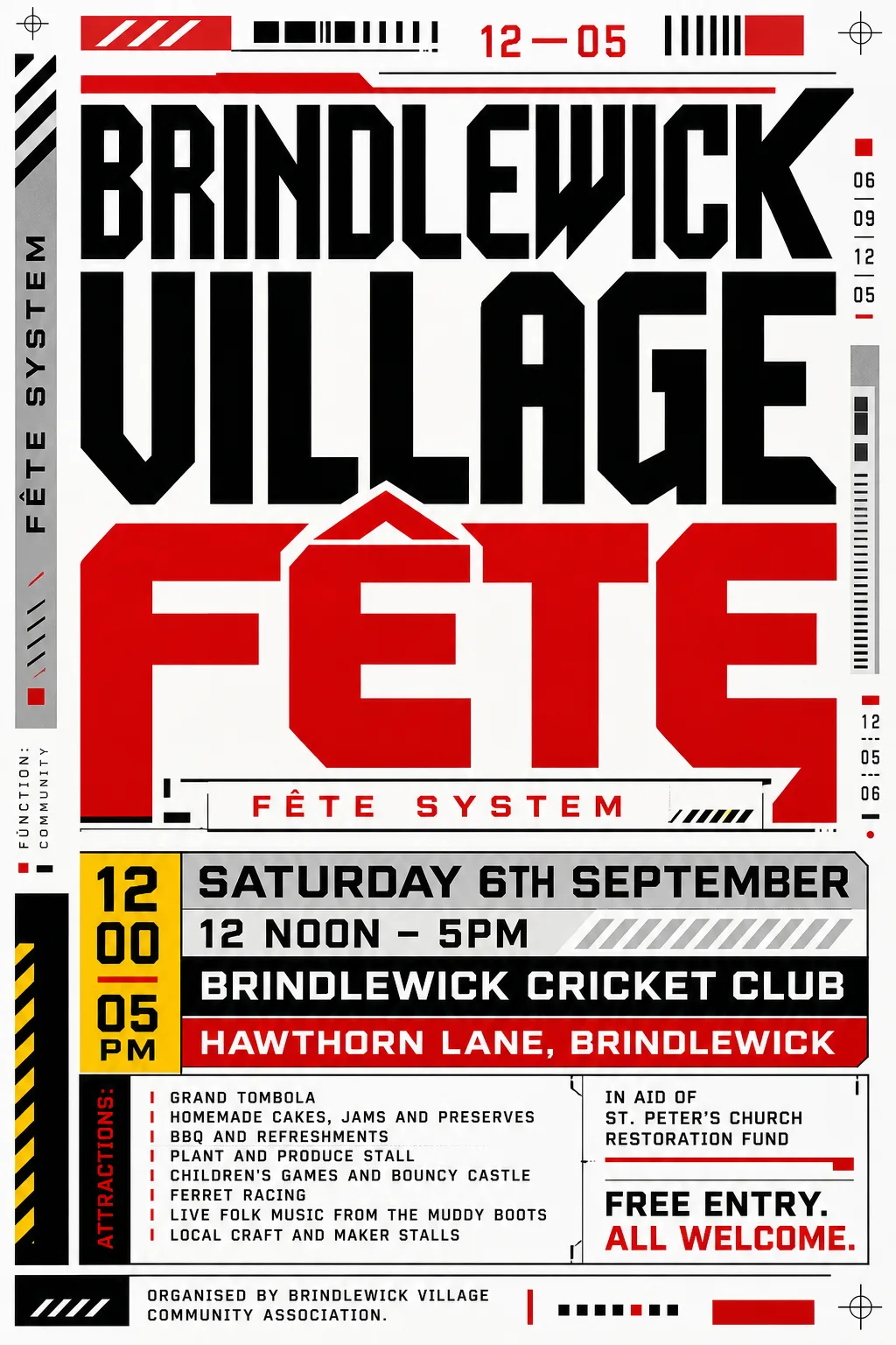
- Typefaces: Zalando Sans 900 wdth75
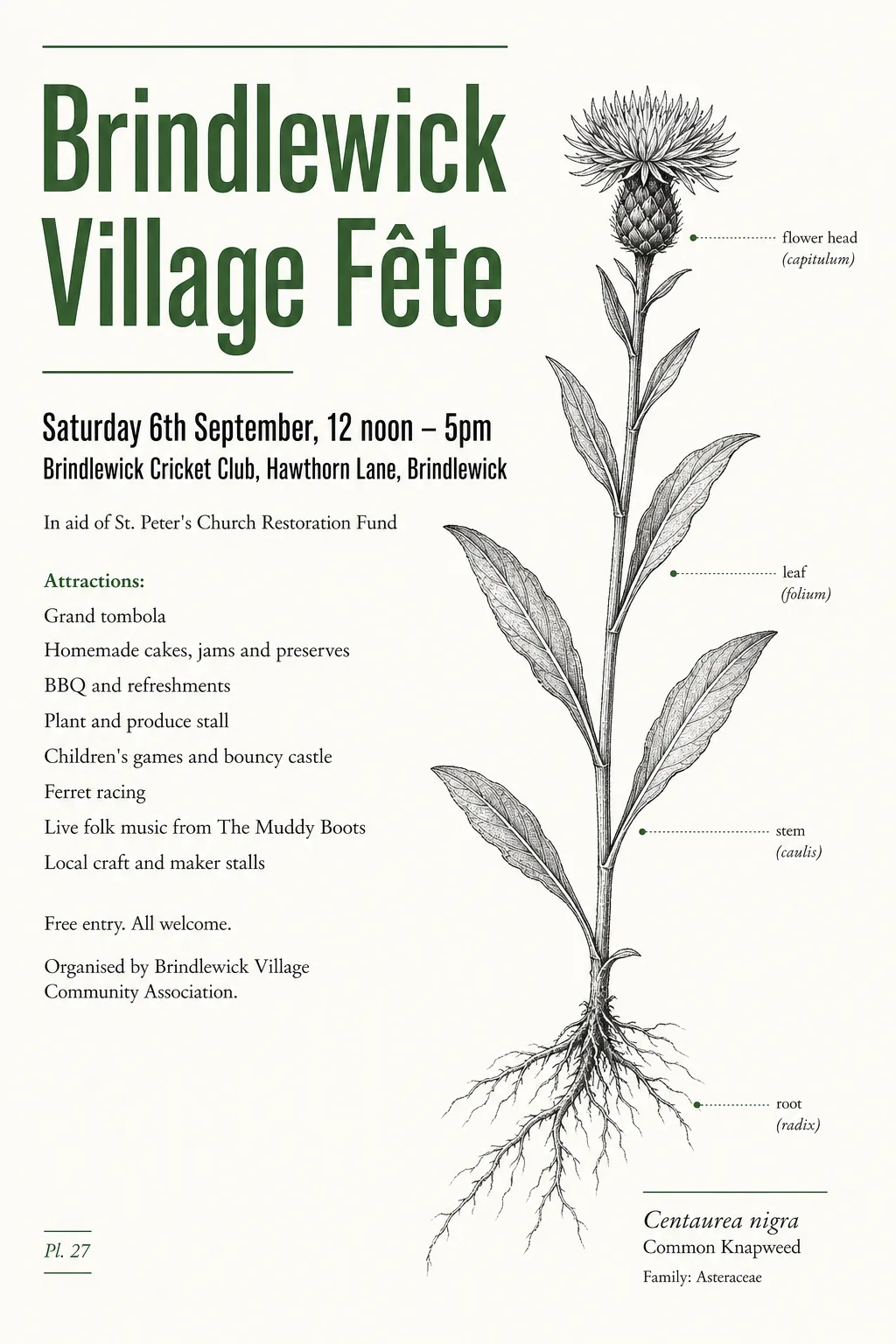 Original
- Typefaces: Antonio, Antonio 600, EB Garamond
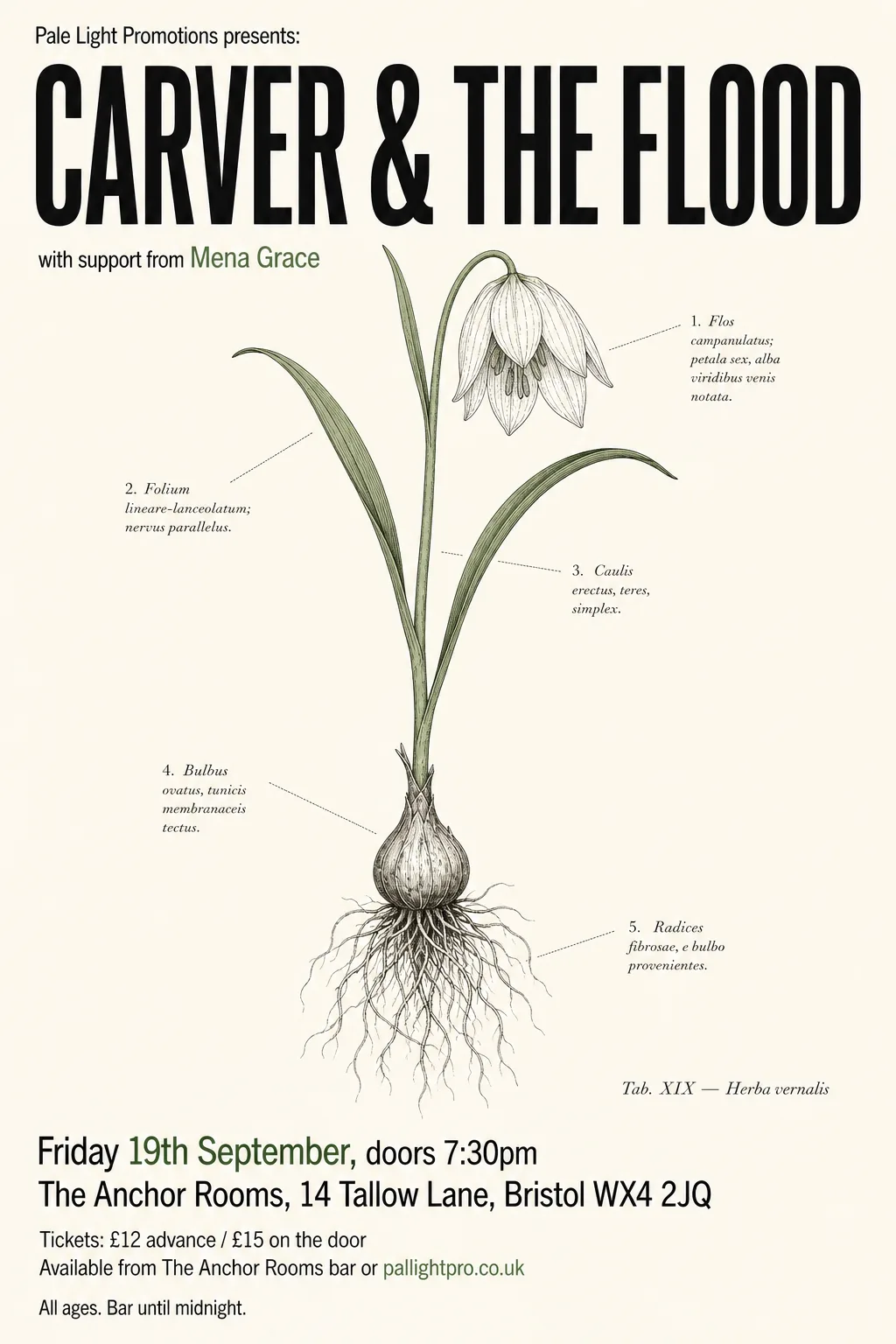 Original
- Typefaces: Cossette Texte, League Gothic 400 wdth75
 Original
- Typefaces: Sofia Sans Extra Condensed 800, Oswald 500
 Original
- Typefaces: Radio Canada 700 wdth75, Sofia Sans Extra Condensed 900
 Original
- Typefaces: Smooch Sans 800, Radio Canada 700 wdth75
 Original
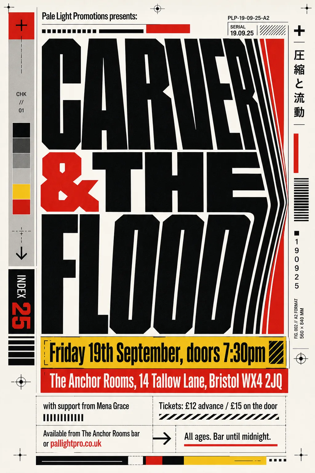
- Typefaces: Special Gothic 700 wdth75, Fira Sans Condensed, Saira 900 wdth50
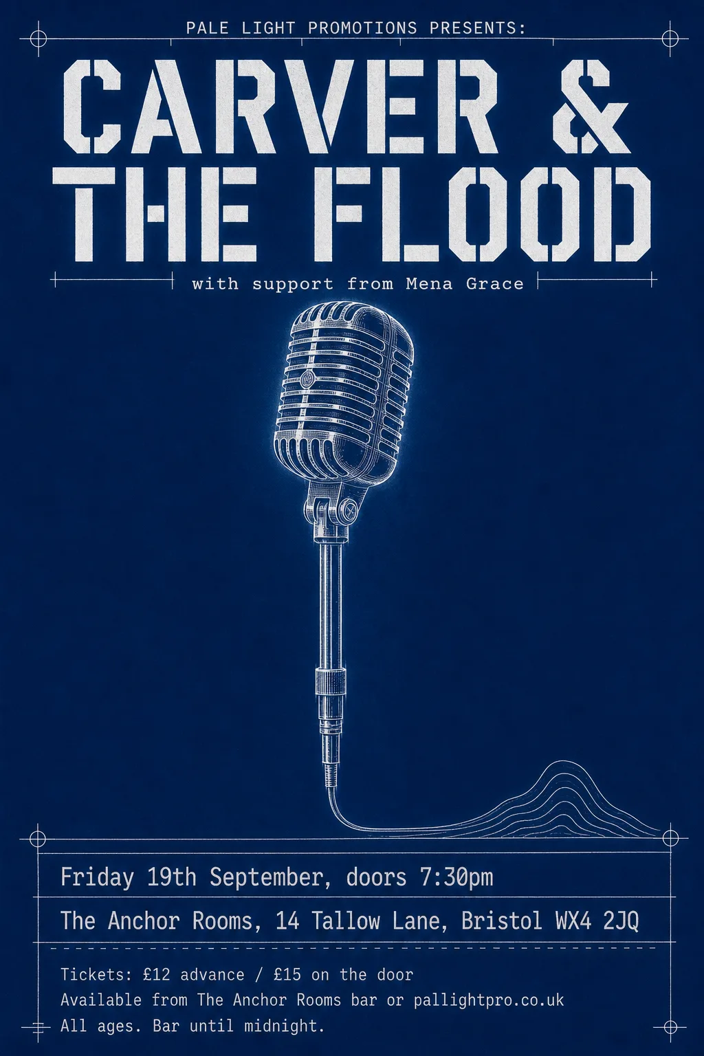 Original
- Not reset: “Tickets: £12 advance / £15 on the door”, “All ages. Bar until midnight.” (missing from the poster, or left in the artwork)
- Typefaces: Martian Mono 400 wdth75, Black Ops One
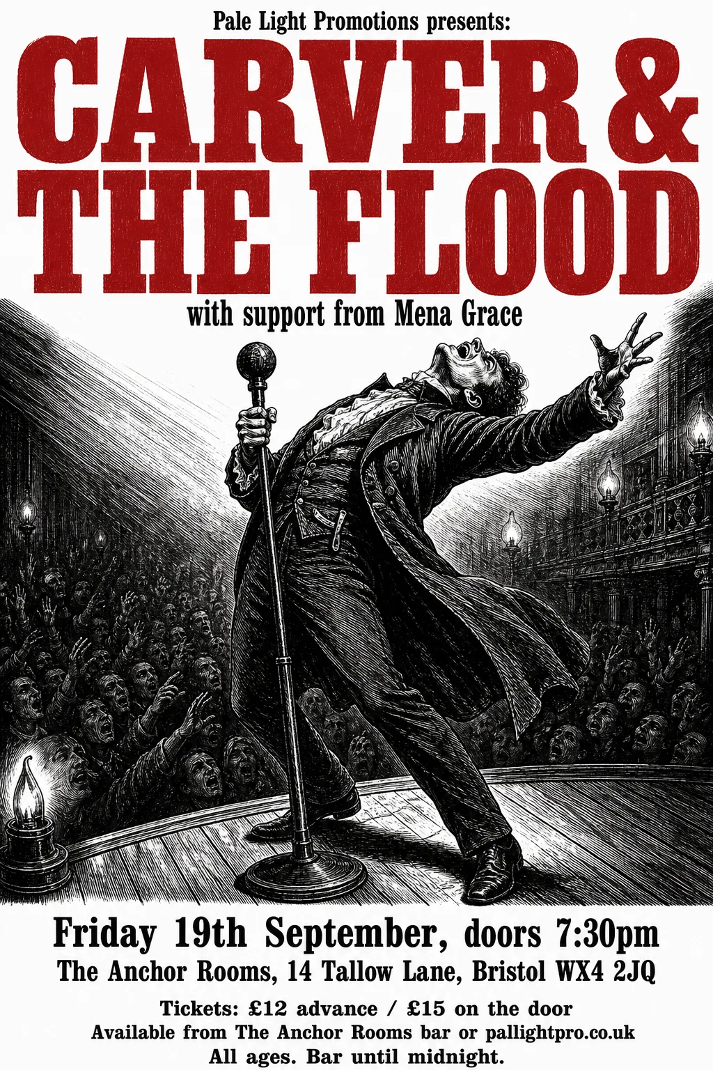 Original
- Kept as the original's pixels: “with support from Mena Grace” — set on the engraving's hatching, which blanking cannot repaint
- Typefaces: Imbue 900, Alfa Slab One
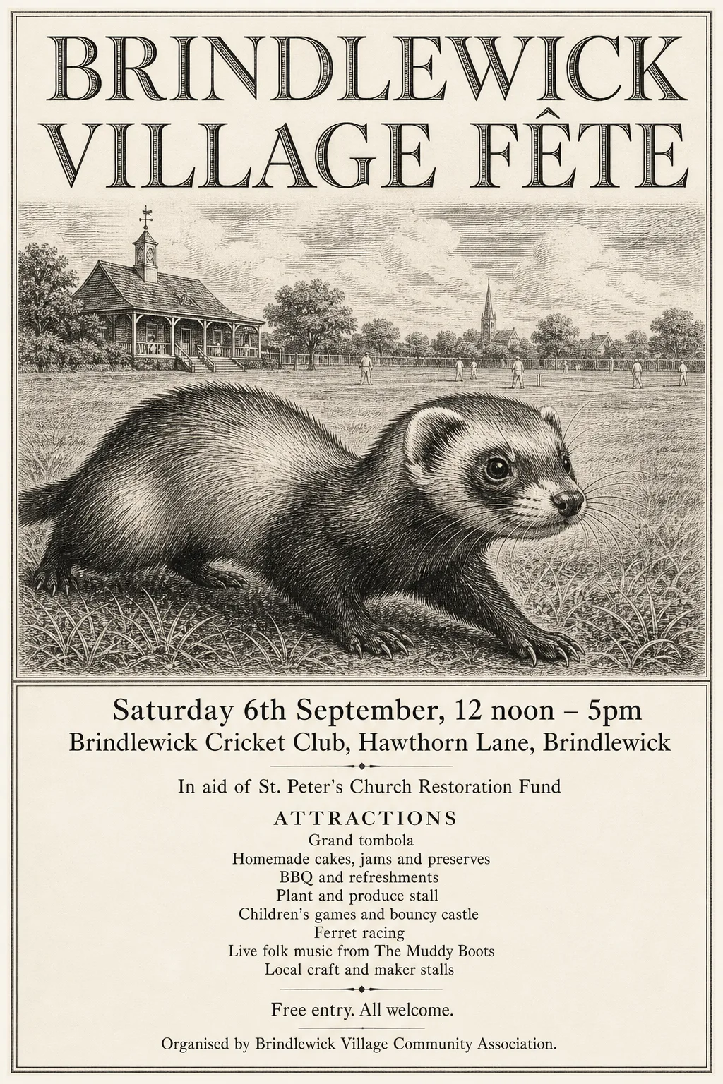 Original
- Kept as the original's pixels: “Brindlewick Village Fête” — engraved roman with hatched shading; no font matched its cut and weight
- Typefaces: Jomolhari, STIX Two Text
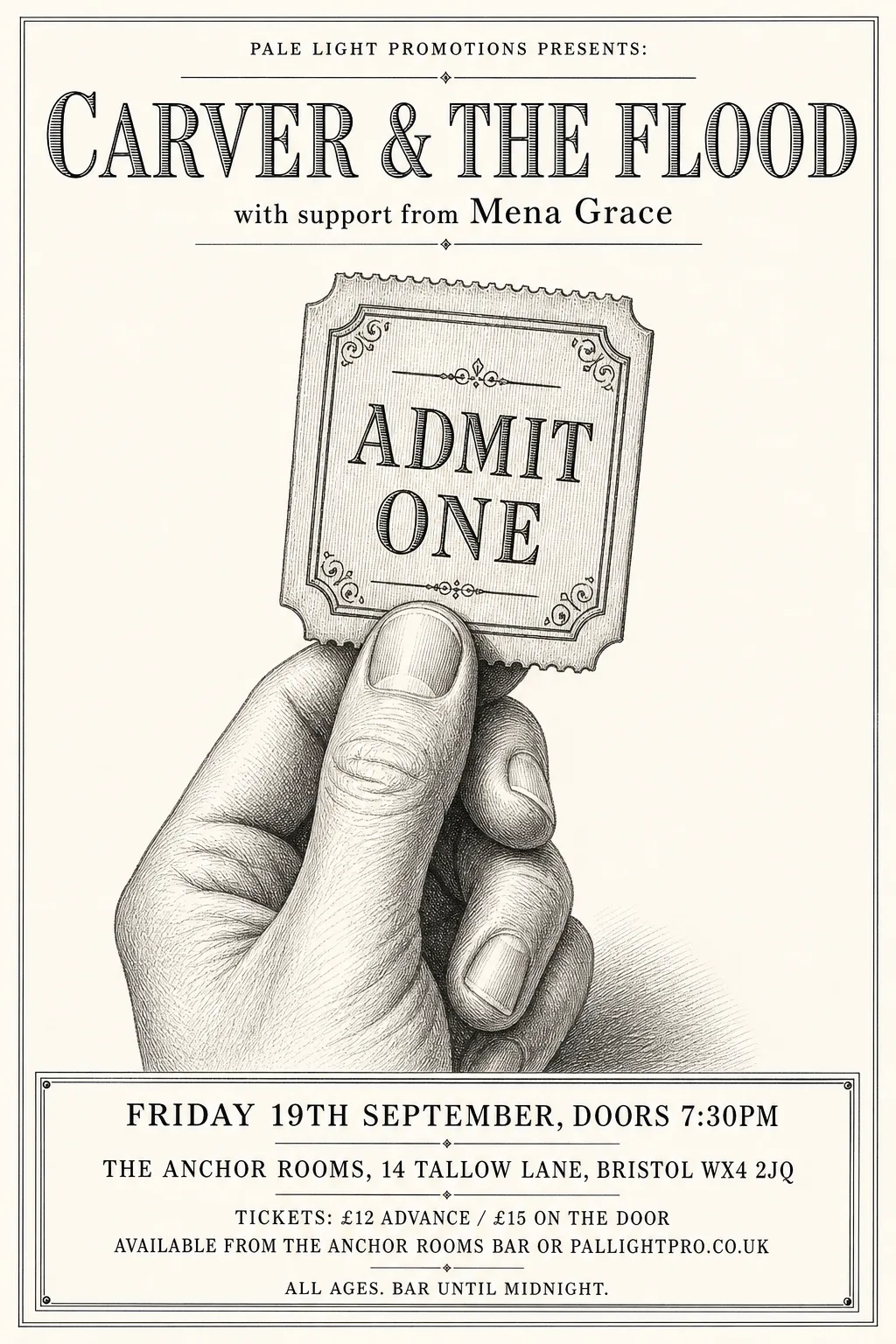 Original
- Kept as the original's pixels: “CARVER & THE FLOOD” — engraved inline lettering with hatched shading; no font matches its cut
- Typefaces: PT Serif, Namdhinggo
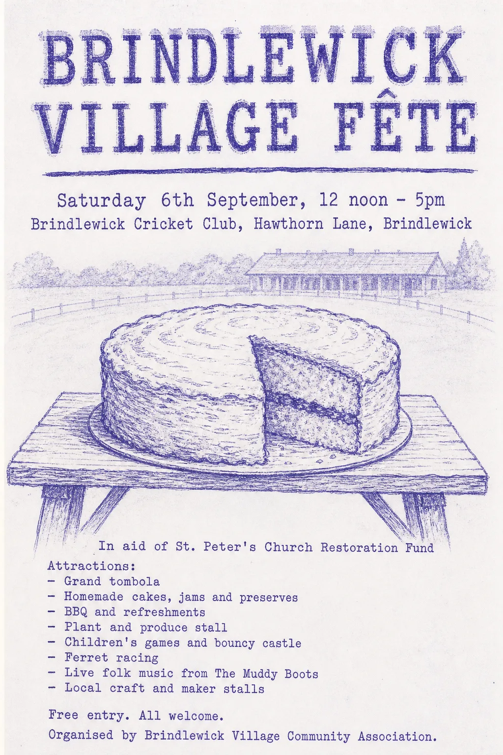 Original
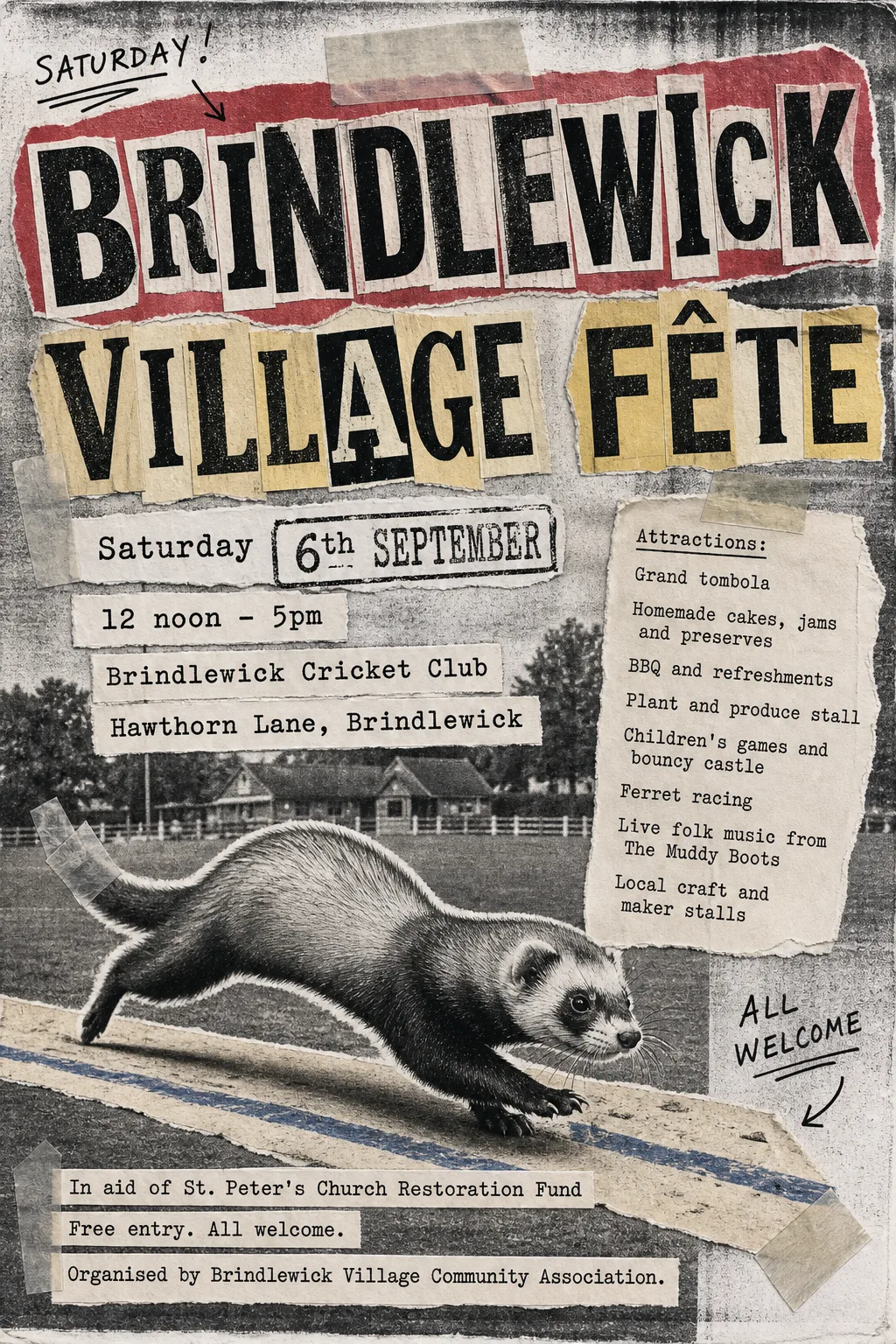
- Known fault: Live folk music is set in two pieces with a gap, and a ghost of 'stalls' overprints the last list item. Fixable: the band finder splits the line at the word gap; assigning it whole needs a band merge knob.
- Typefaces: Special Elite
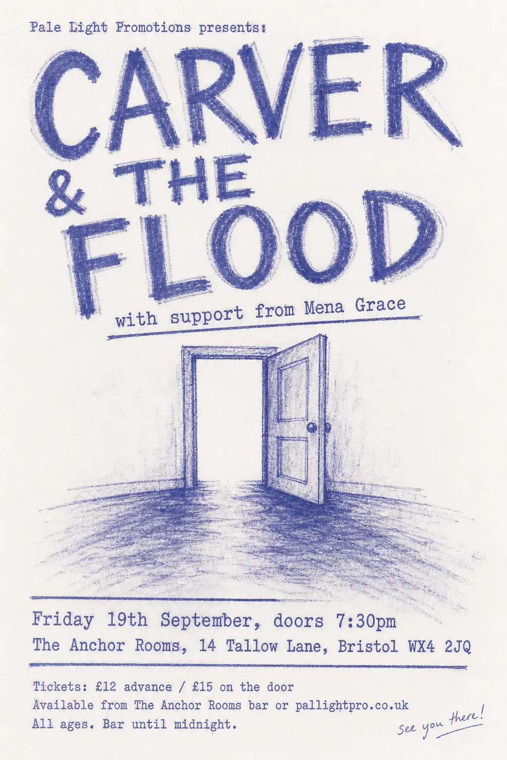 Original
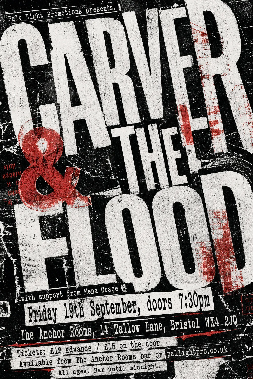
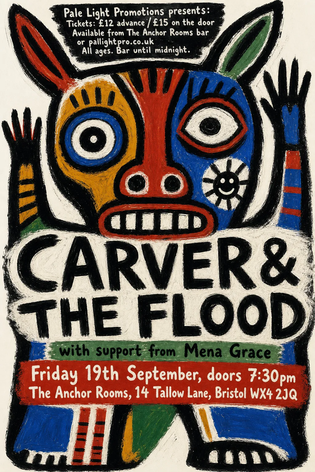
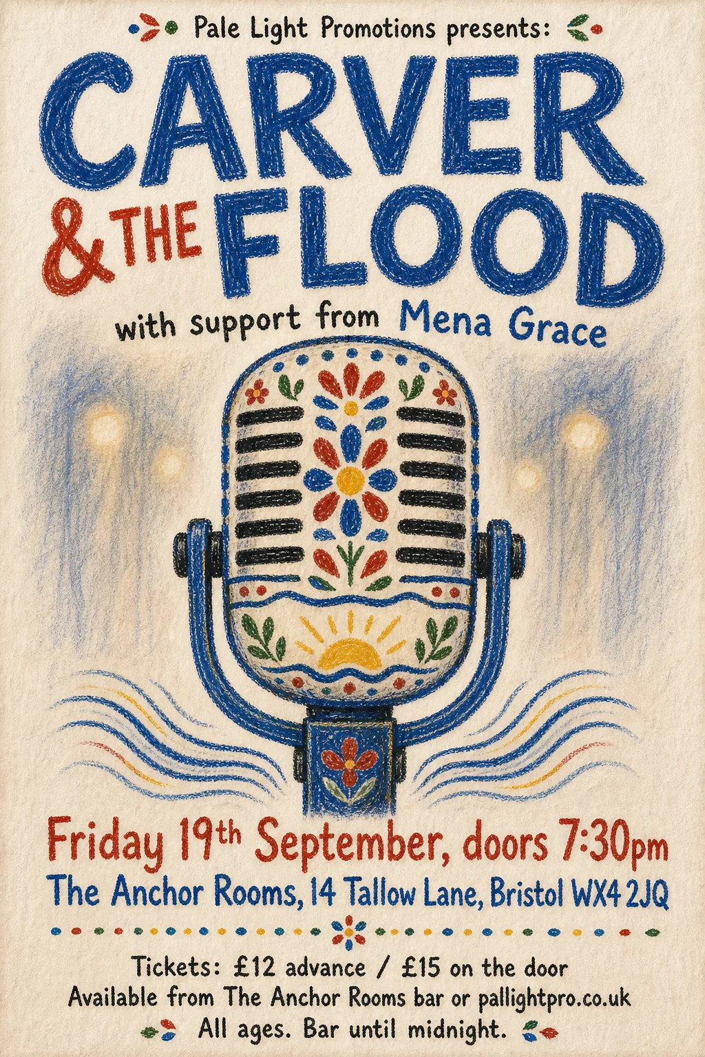
- Kept as the original's pixels: “CARVER & THE FLOOD / with support from Mena Grace” — hand-drawn crayon lettering
- Typefaces: Special Elite
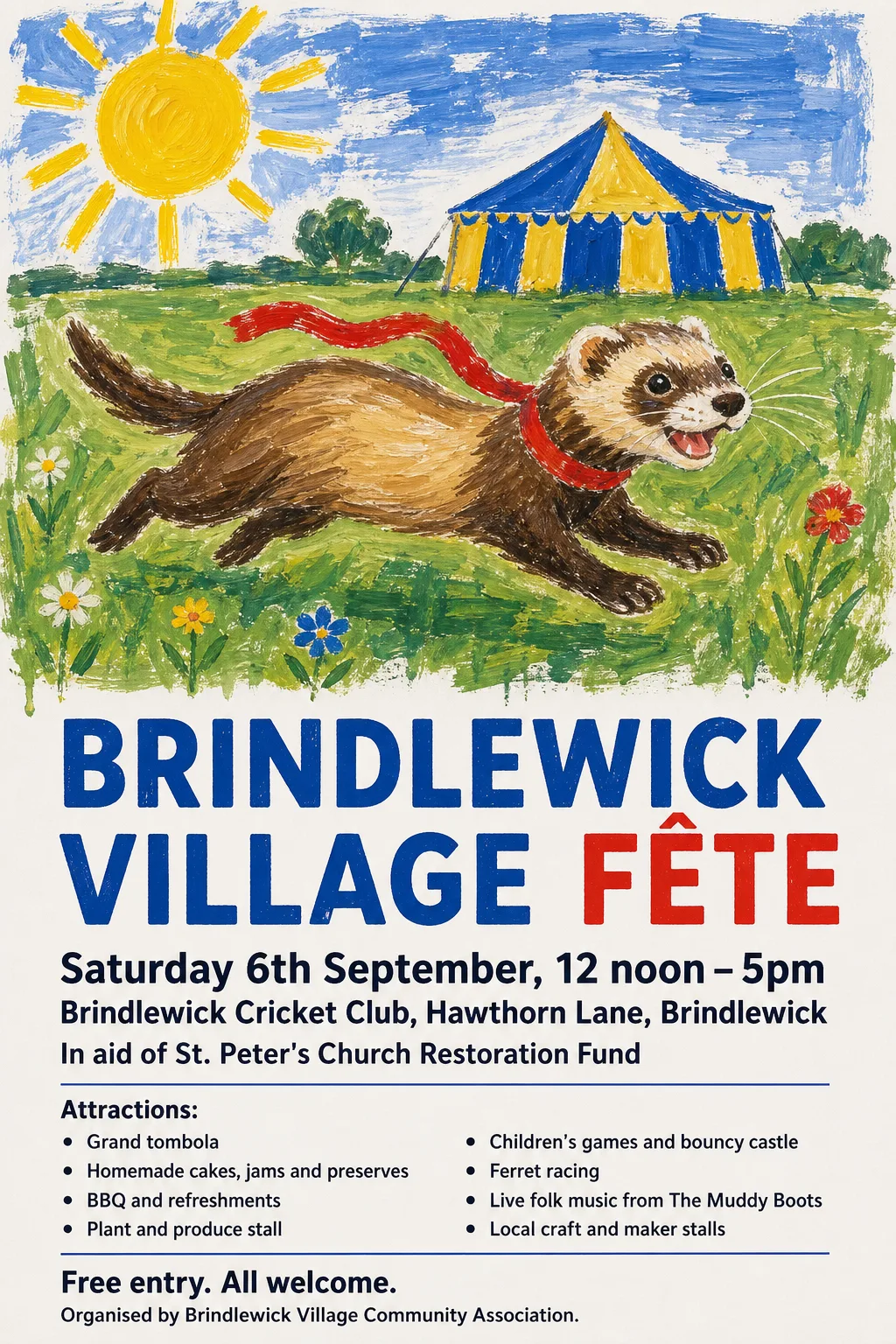 Original
- Typefaces: Reddit Sans Condensed 800, Vazirmatn 700, Hind Mysuru 600
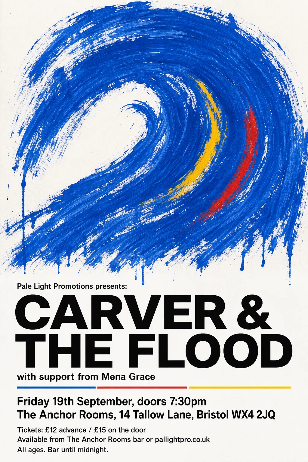 Original
- Typefaces: Vazirmatn 600, Hubot Sans 800
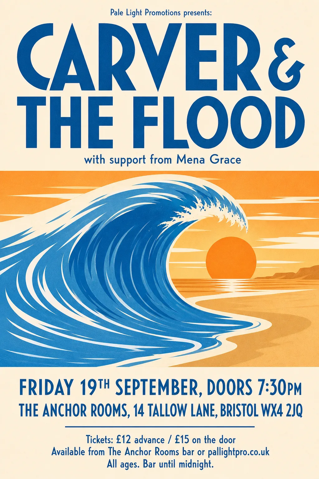 Original
- Kept as the original's pixels: “CARVER & THE FLOOD” — custom lettering whose flared V and round C are the design
- Typefaces: Voltaire, Beiruti 500, Sofia Sans Extra Condensed 600
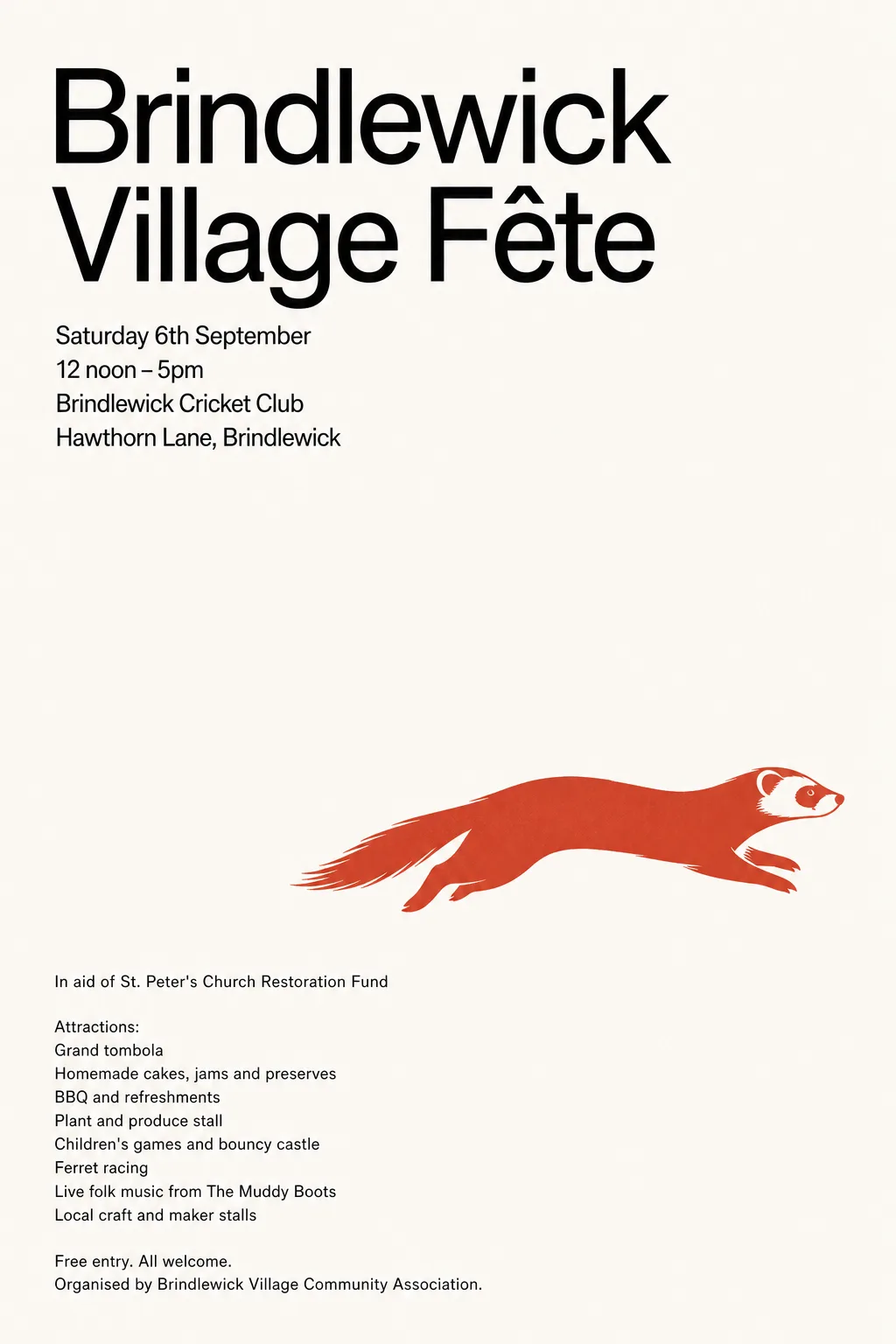 Original
- Typefaces: Vazirmatn, Inter Tight 500
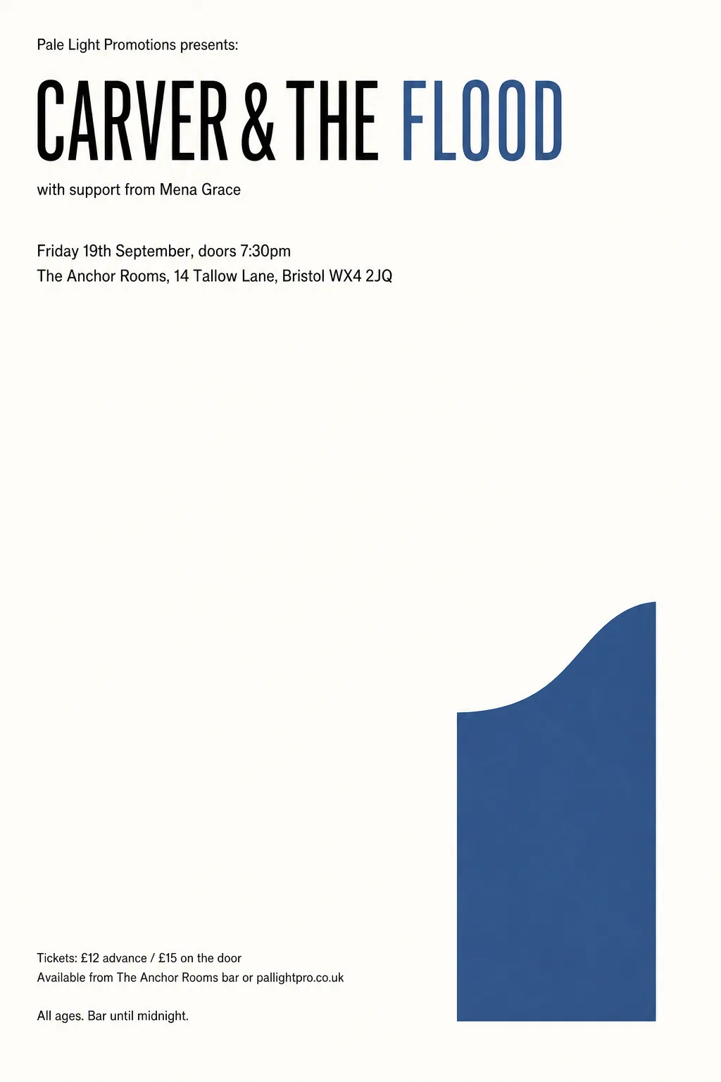 Original
- Typefaces: Cossette Texte, Antonio 300
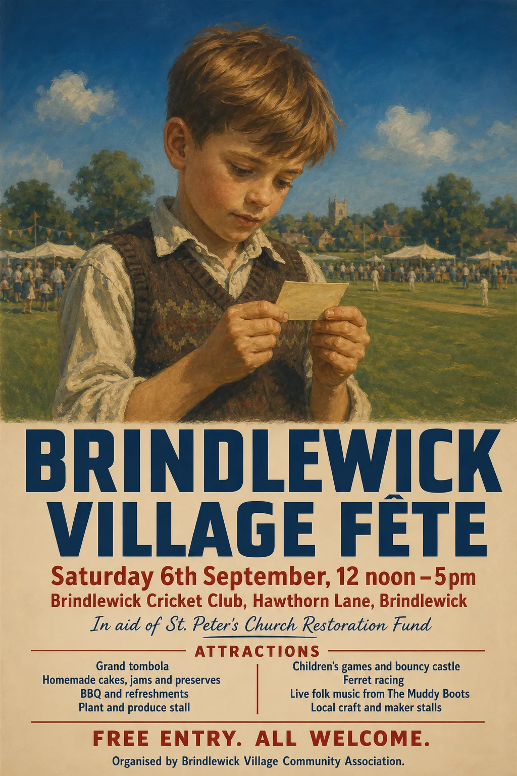 Original
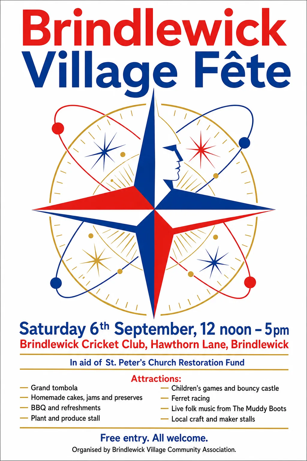
- Typefaces: Open Sans 800 wdth75, Radio Canada 700 wdth75, Encode Sans Condensed 800, Caramel
 Original
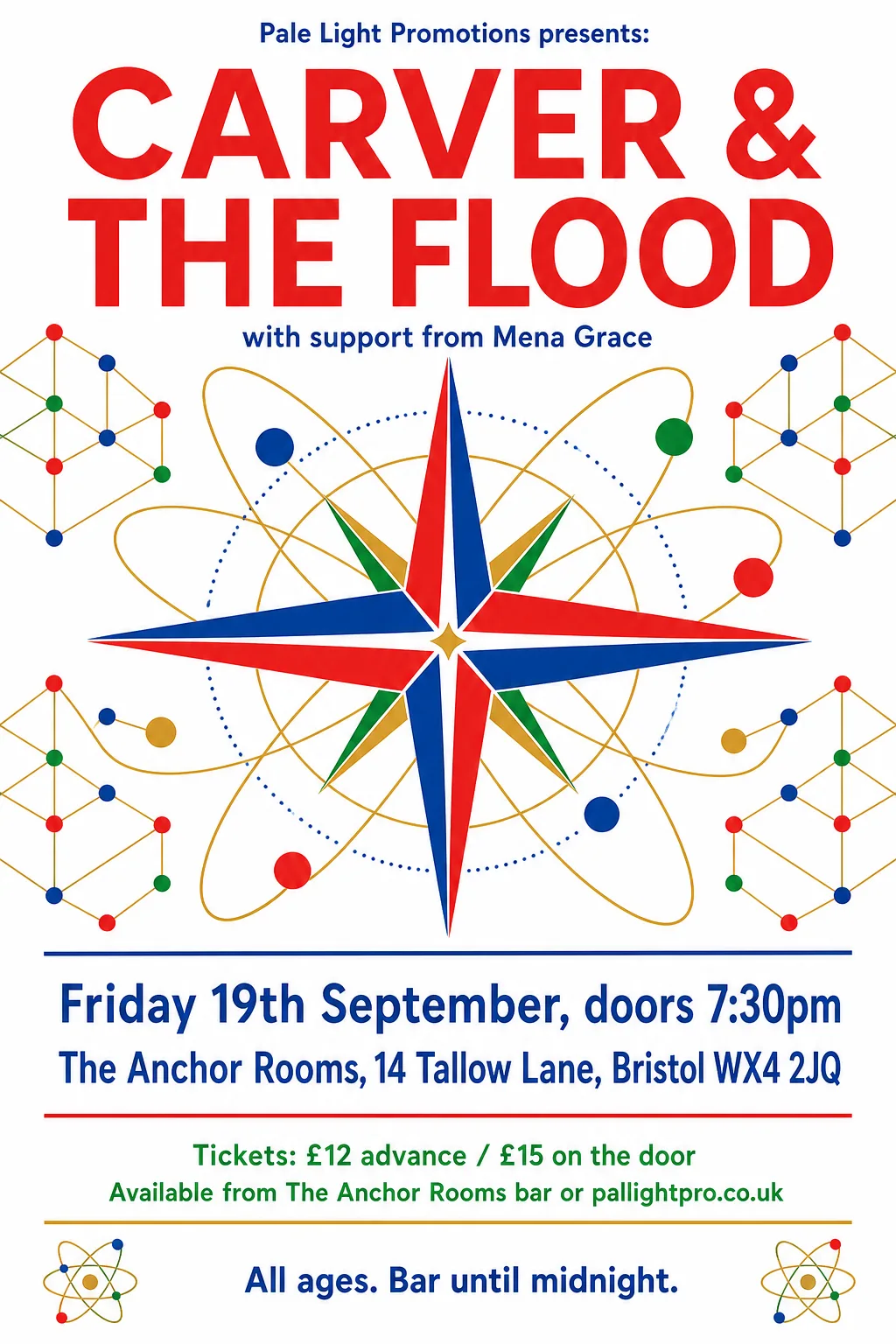
- Typefaces: Barlow Semi Condensed 700, Sofia Sans 900, Chivo 900
 Original
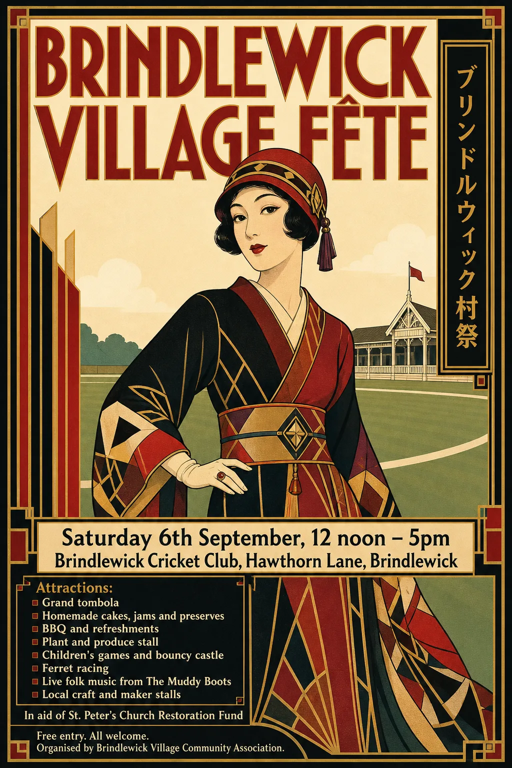
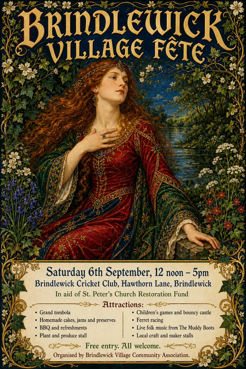
- Kept as the original's pixels: “Brindlewick Village Fête” — distinctive Taisho display lettering with custom letterforms
- Kept as the original's pixels: “Saturday 6th September, 12 noon – 5pm / Brindlewick Cricket Club, Hawthorn Lane, Brindlewick” — two tight rows: blanking the date erases the venue's i-dots, and the venue fragments
- Typefaces: Ancizar Serif 700, Rosario 700
 Original
- Typefaces: Inter 700, Gothic A1 800, Reddit Sans Condensed 700
 Original
- Typefaces: Barlow Semi Condensed 600, Mada 700
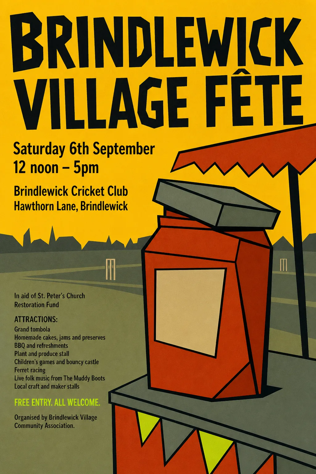 Original
- Kept as the original's pixels: “Brindlewick Village Fête” — hand-lettered title
- Typefaces: Sofia Sans Extra Condensed 700, Khand 600, Asap Condensed 500, Khand 500
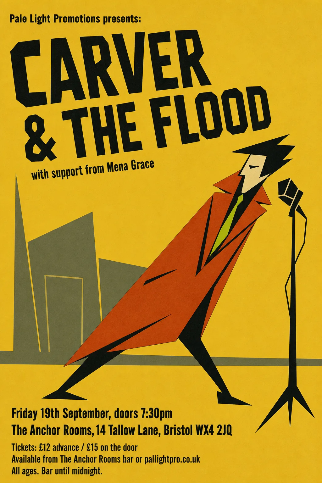 Original
- Kept as the original's pixels: “CARVER & THE FLOOD / with support from Mena Grace” — hand-cut animation-cel lettering, set on a rising slant
- Typefaces: Sofia Sans Extra Condensed 700
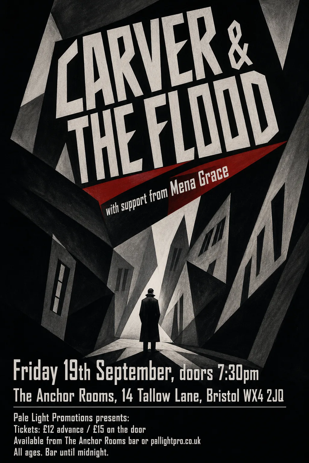 Original
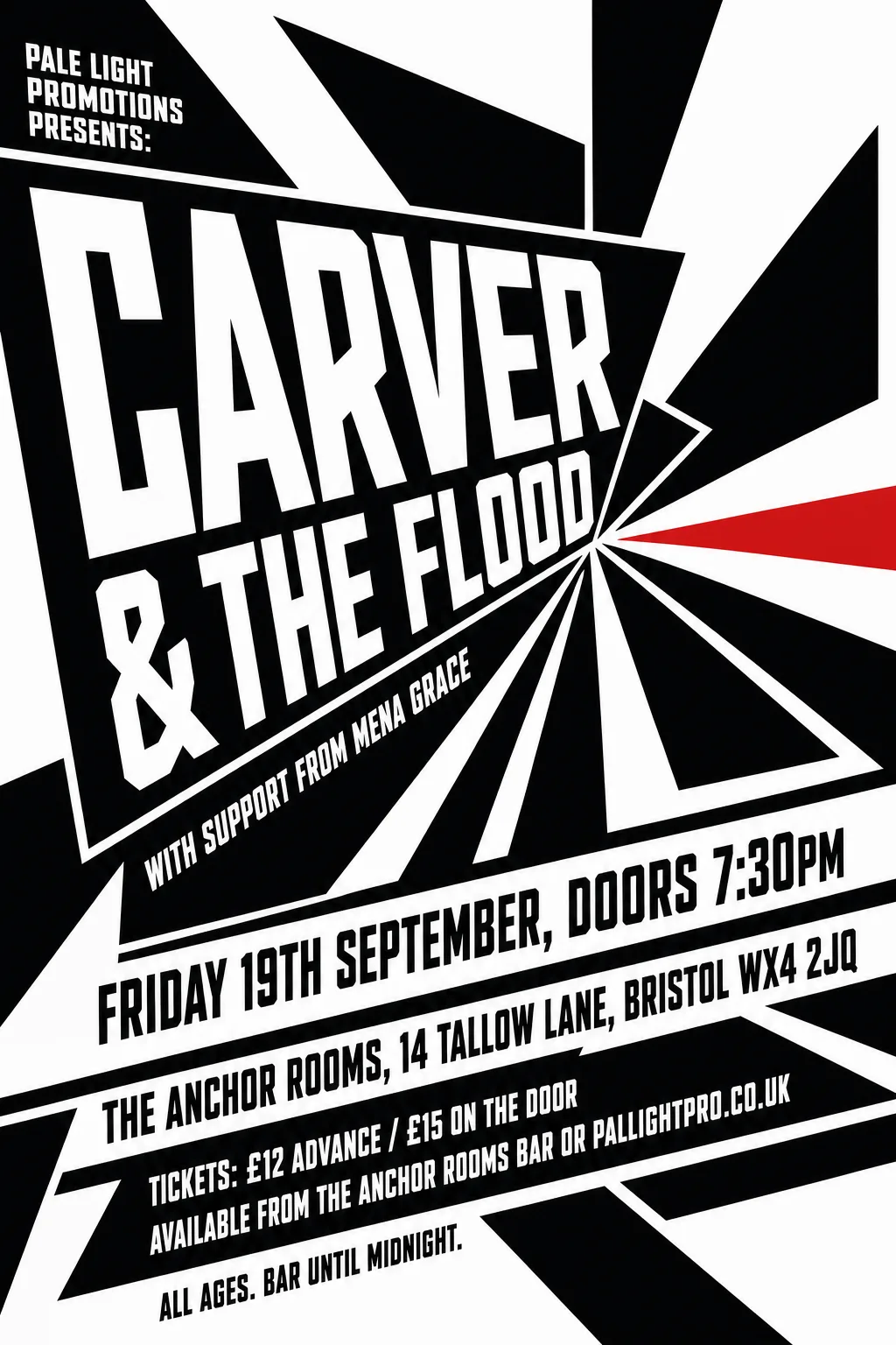
- Kept as the original's pixels: “CARVER & THE FLOOD / with support from Mena Grace” — hand-drawn angular lettering, warped to the composition's diagonals
- Typefaces: Teko
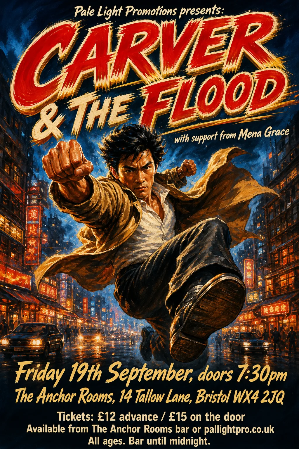 Original
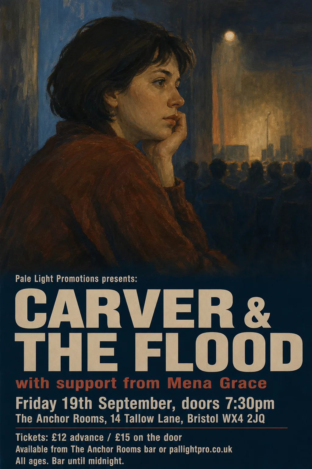
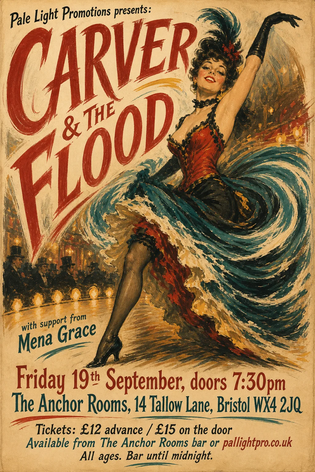
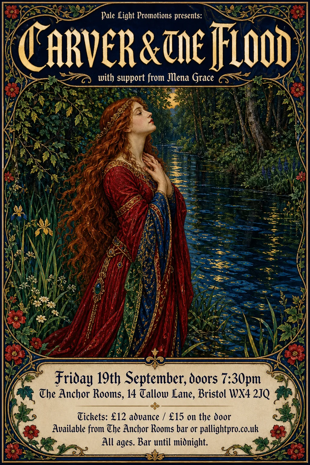
- Kept as the original's pixels: “Pale Light Promotions presents: / CARVER & THE FLOOD / with support from Mena Grace” — brush-painted title over a painted poster, with the small lines on the painting
- Kept as the original's pixels: “Friday 19th September, doors 7:30pm / The Anchor Rooms, 14 Tallow Lane, Bristol WX4 2JQ” — brush-italic display lettering
- Typefaces: Barlow Semi Condensed 700
 Original
- Typefaces: Sofia Sans Condensed 900, Chiron Hei HK 900, Radio Canada 700 wdth75
 Original
- Kept as the original's pixels: “Tickets: £12 advance / £15 on the door / Available from The Anchor Rooms bar or pallightpro.co.uk / All ages. Bar until midnight.” — cream type on a red panel breaks into specks the band finder cannot read
- Typefaces: Oswald 600, League Gothic 400 wdth75
 Original
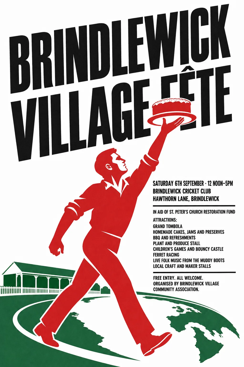
- Kept as the original's pixels: “Brindlewick Village Fête” — set on a rising slant, with the cake held up over its F
- Typefaces: League Gothic
 Original
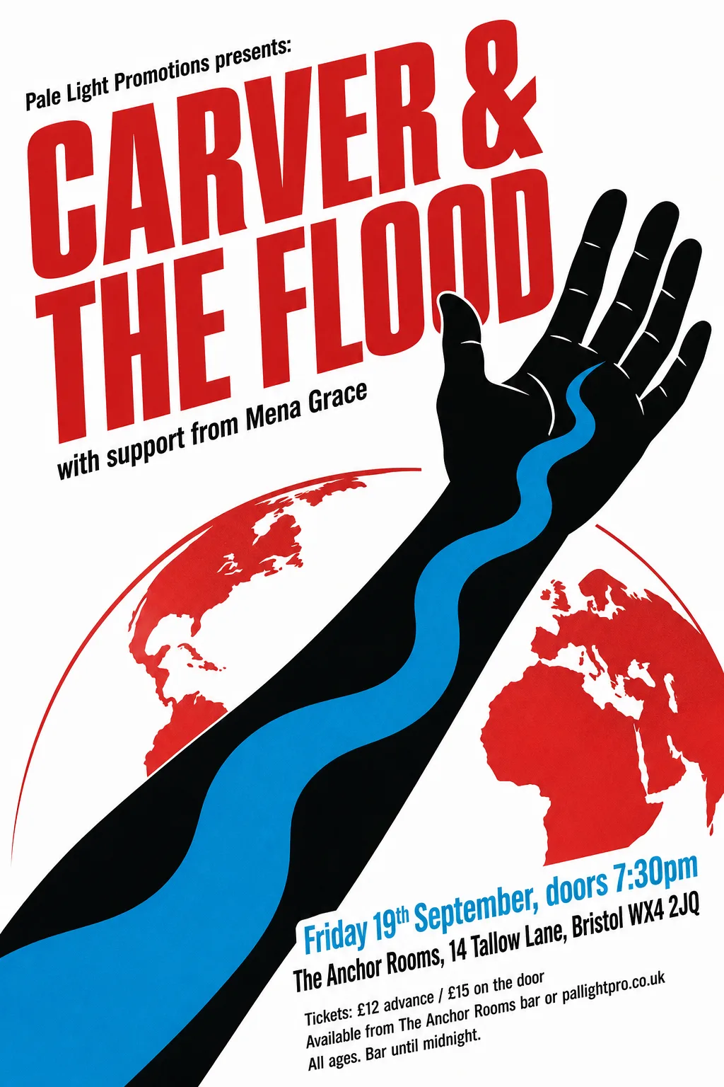
- Kept as the original's pixels: “Pale Light Promotions presents: / CARVER & THE FLOOD / with support from Mena Grace” — hand-drawn condensed lettering on a slant, overlapping the illustrated hand
- Some lines set on a 10.6° slant.
- Typefaces: Sofia Sans Extra Condensed 700 italic, Asap Condensed 500 italic
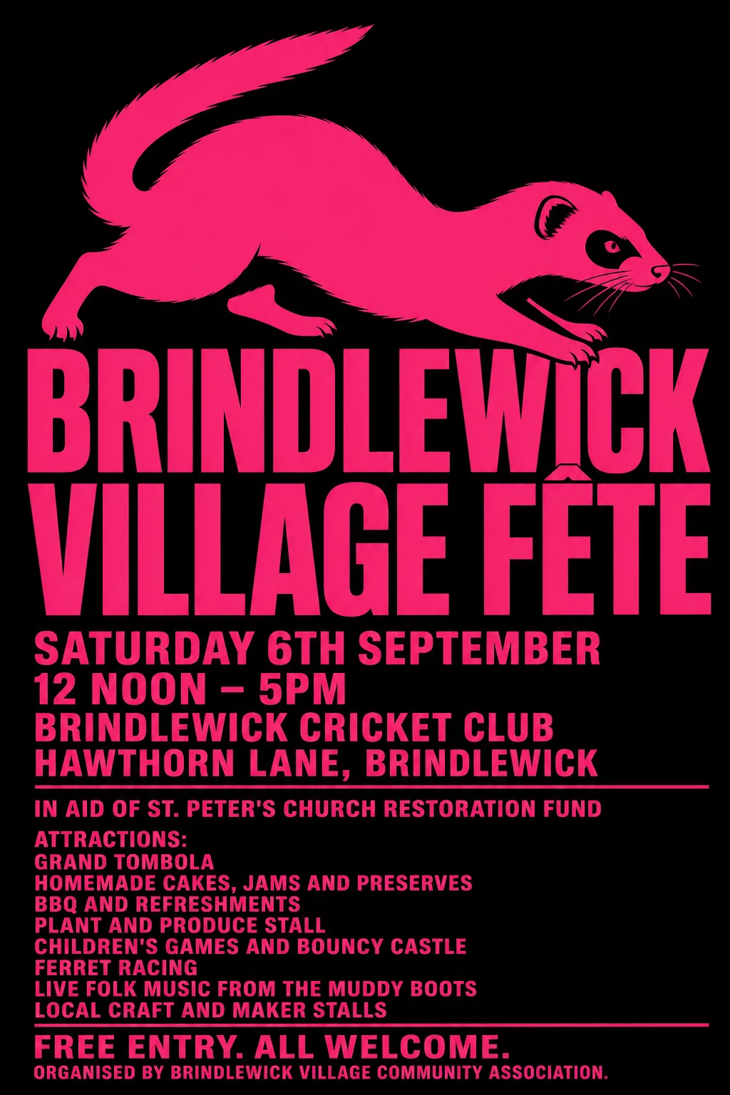 Original
- Known fault: Small pink fragments of the ferret's paws are left where they touch BRINDLEWICK, and a blot beside the K. Fixable: blanking should stop at the artwork's edge where its colour is the type's own colour.
- Typefaces: Zalando Sans 900 wdth75, Cairo 900, Anton
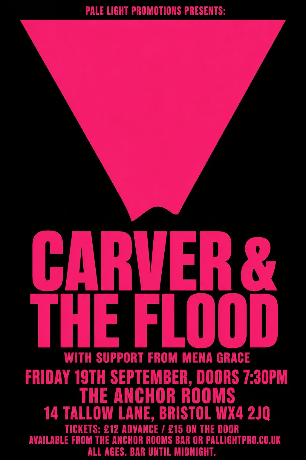 Original
- Typefaces: Oswald 700, Anton
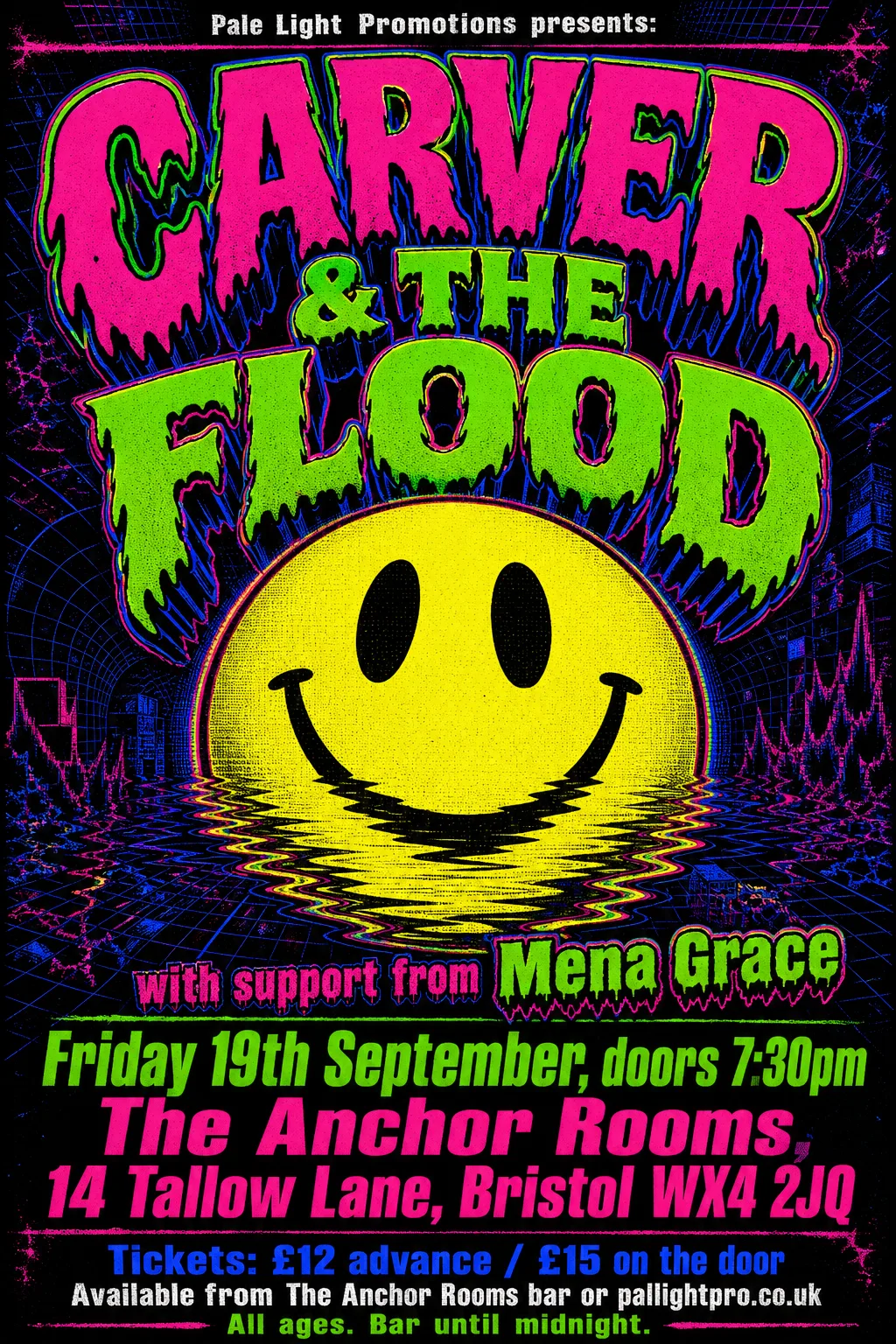 Original
- Kept as the original's pixels: “CARVER & THE FLOOD” — melting psychedelic lettering with outlines
- Not reset: “Pale Light Promotions presents:”, “with support from Mena Grace” (missing from the poster, or left in the artwork)
- Typefaces: Sofia Sans Semi Condensed 900 italic, Zalando Sans 900 wdth75, Sofia Sans 900 italic
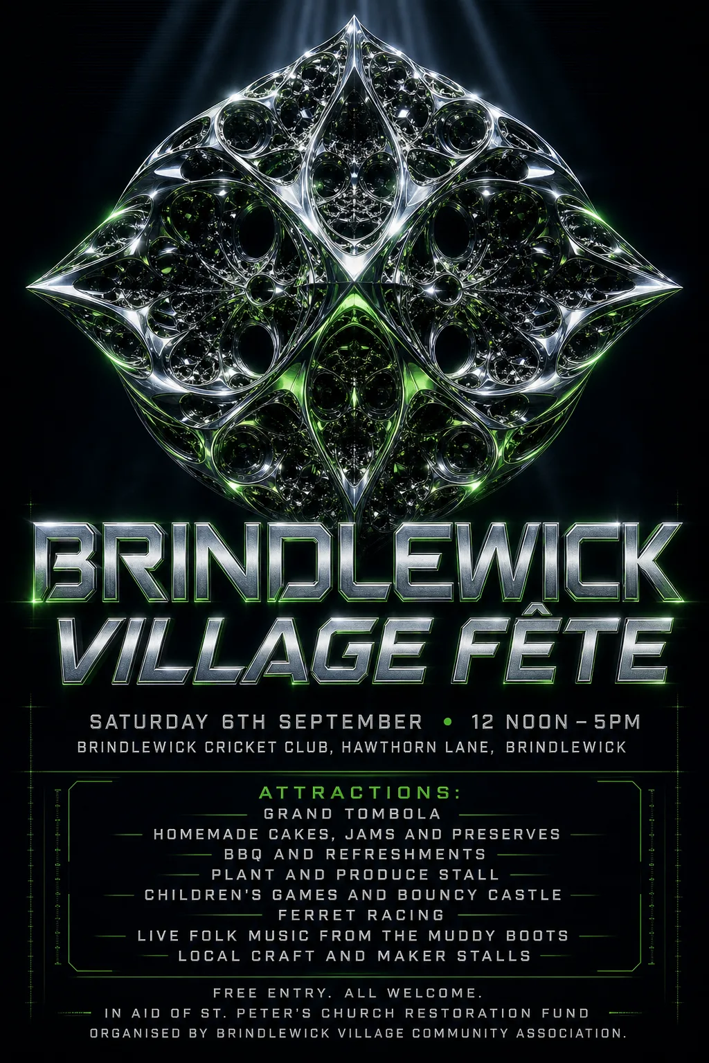 Original
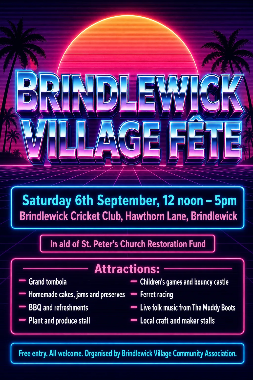
- Kept as the original's pixels: “Brindlewick Village Fête” — chrome futuristic display lettering
- Typefaces: Exo 2 500
 Original
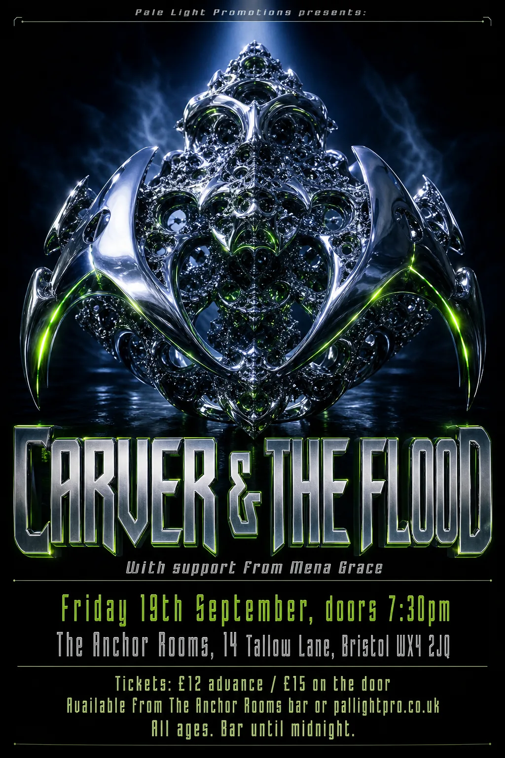
- Kept as the original's pixels: “CARVER & THE FLOOD” — chrome lettering with bevels and glow
- Typefaces: Anybody 800 italic, Cuprum 700 italic, Bahianita
 Original
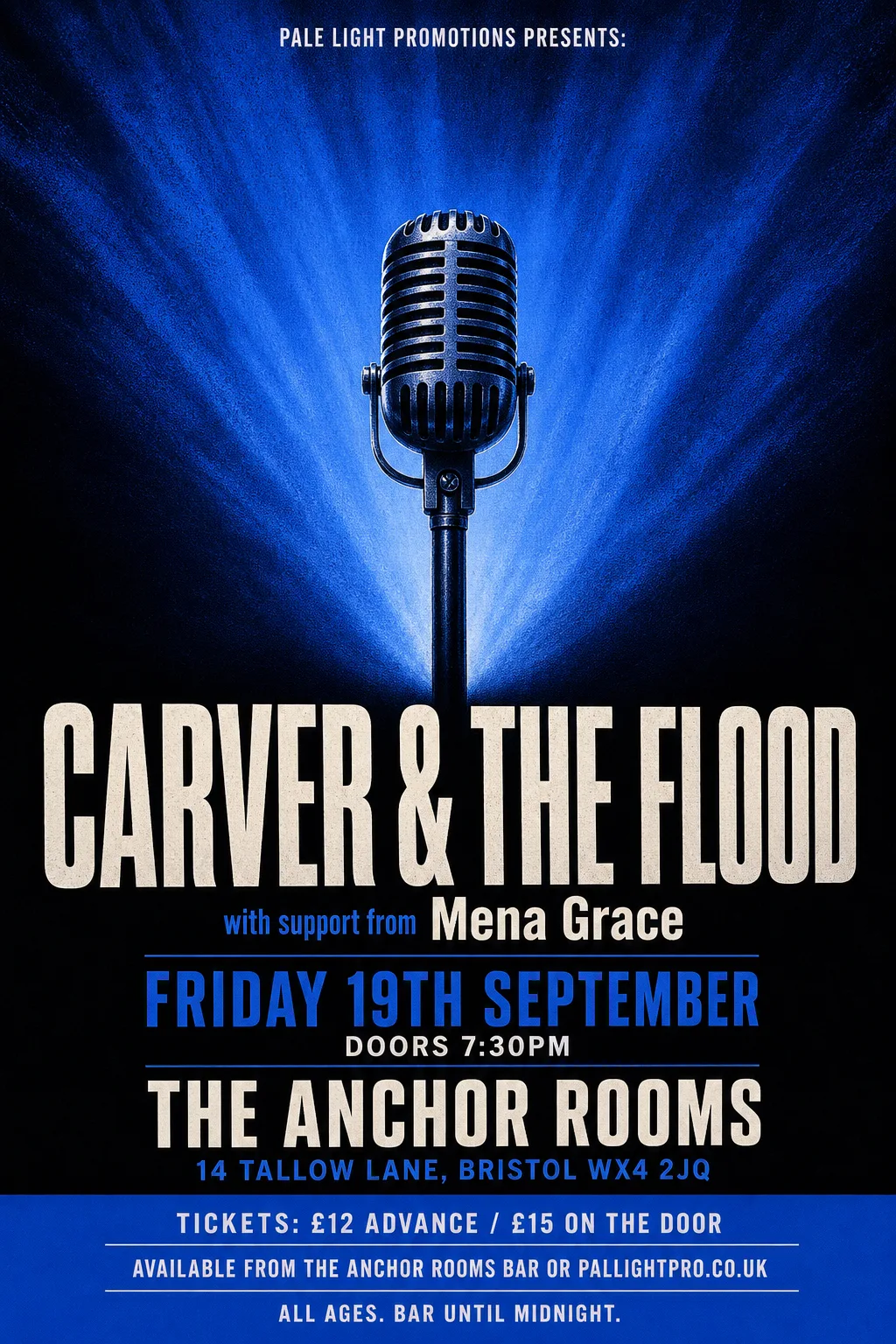
- Kept as the original's pixels: “CARVER & THE FLOOD” — set over light beams that cannot be repainted behind the letters
- Kept as the original's pixels: “with support from Mena Grace” — two sizes on one line, which the builder sets colliding
- Not reset: “Pale Light Promotions presents:” (missing from the poster, or left in the artwork)
- Typefaces: Oswald 600, Sofia Sans Extra Condensed 800
 Original
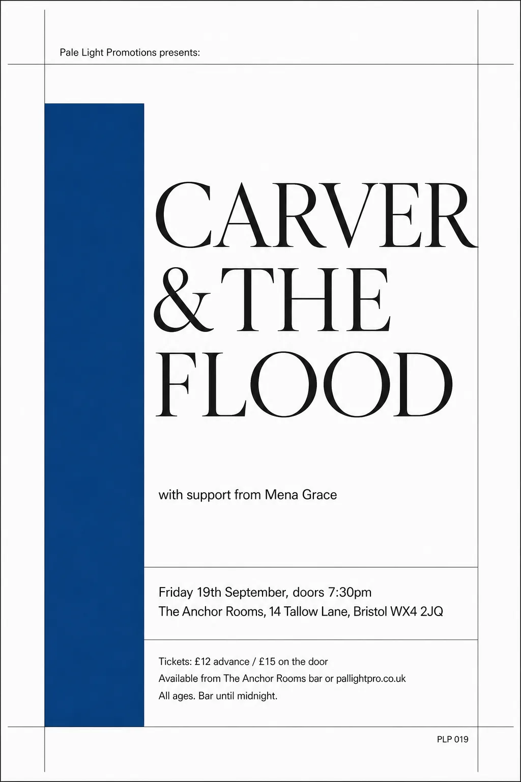
- Typefaces: Tai Heritage Pro, Gothic A1 600
 Original
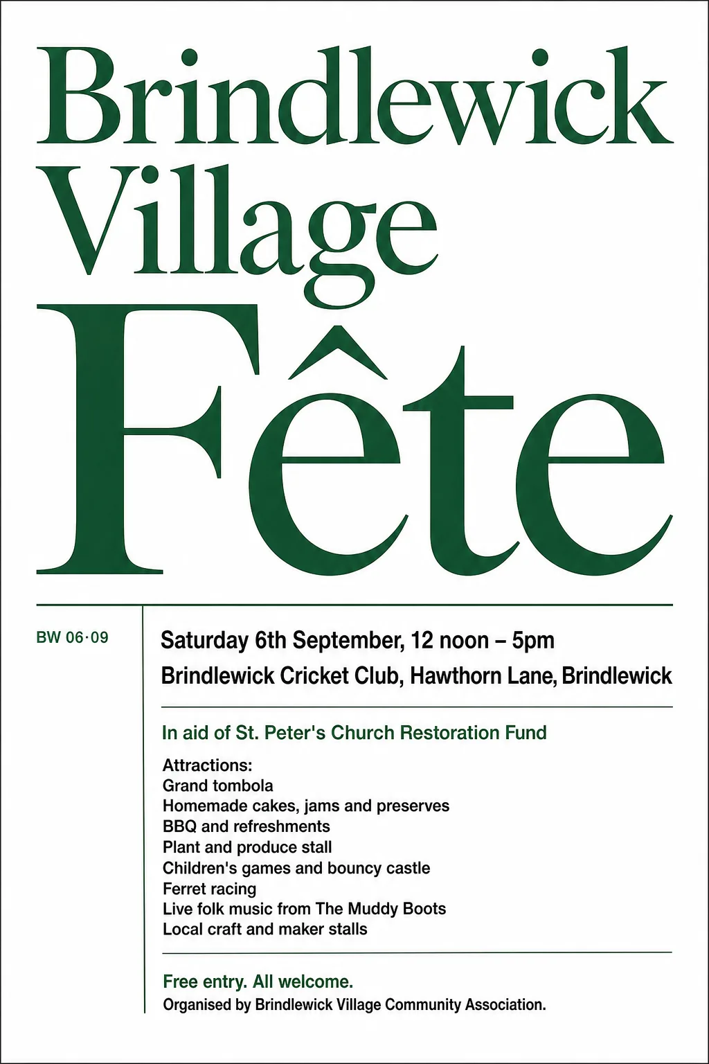
- Typefaces: Shanti, Libre Caslon Display
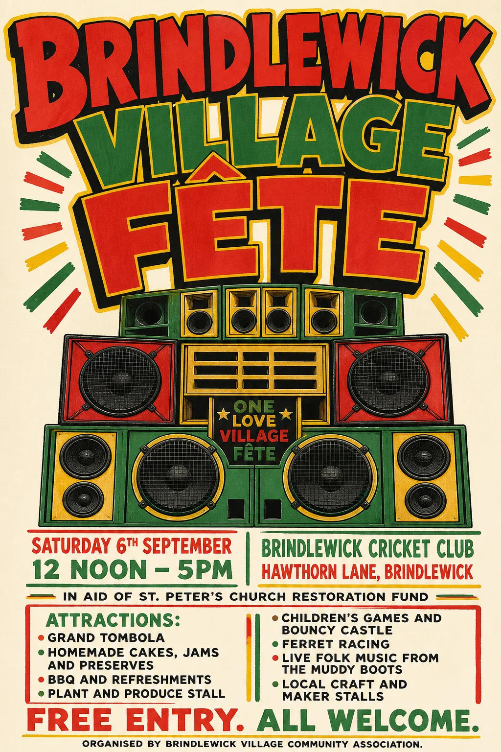 Original
- Kept as the original's pixels: “Brindlewick Village Fête” — painted, outlined lettering in three colours, bent to an arch
- Not reset: “Attractions:”, “Grand tombola”, “Homemade cakes, jams and preserves”, “BBQ and refreshments”, “Plant and produce stall”, “Children's games and bouncy castle”, “Ferret racing”, “Live folk music from The Muddy Boots”, “Local craft and maker stalls” (missing from the poster, or left in the artwork)
- Typefaces: Lexend 900, Oswald 600
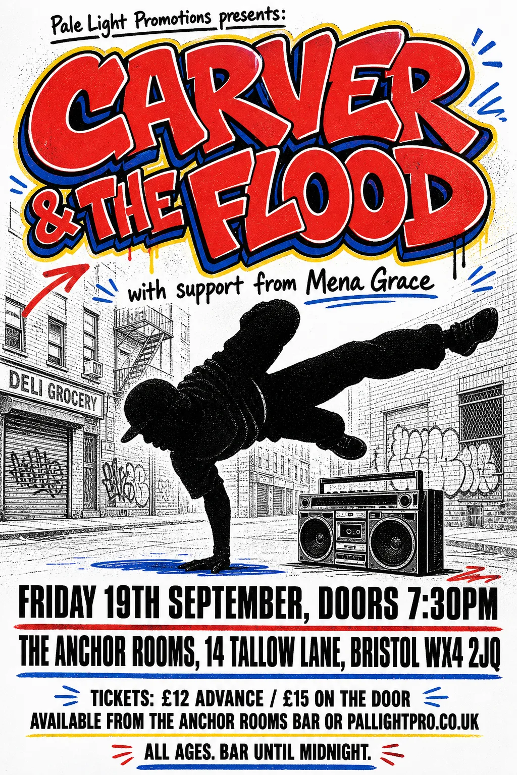 Original
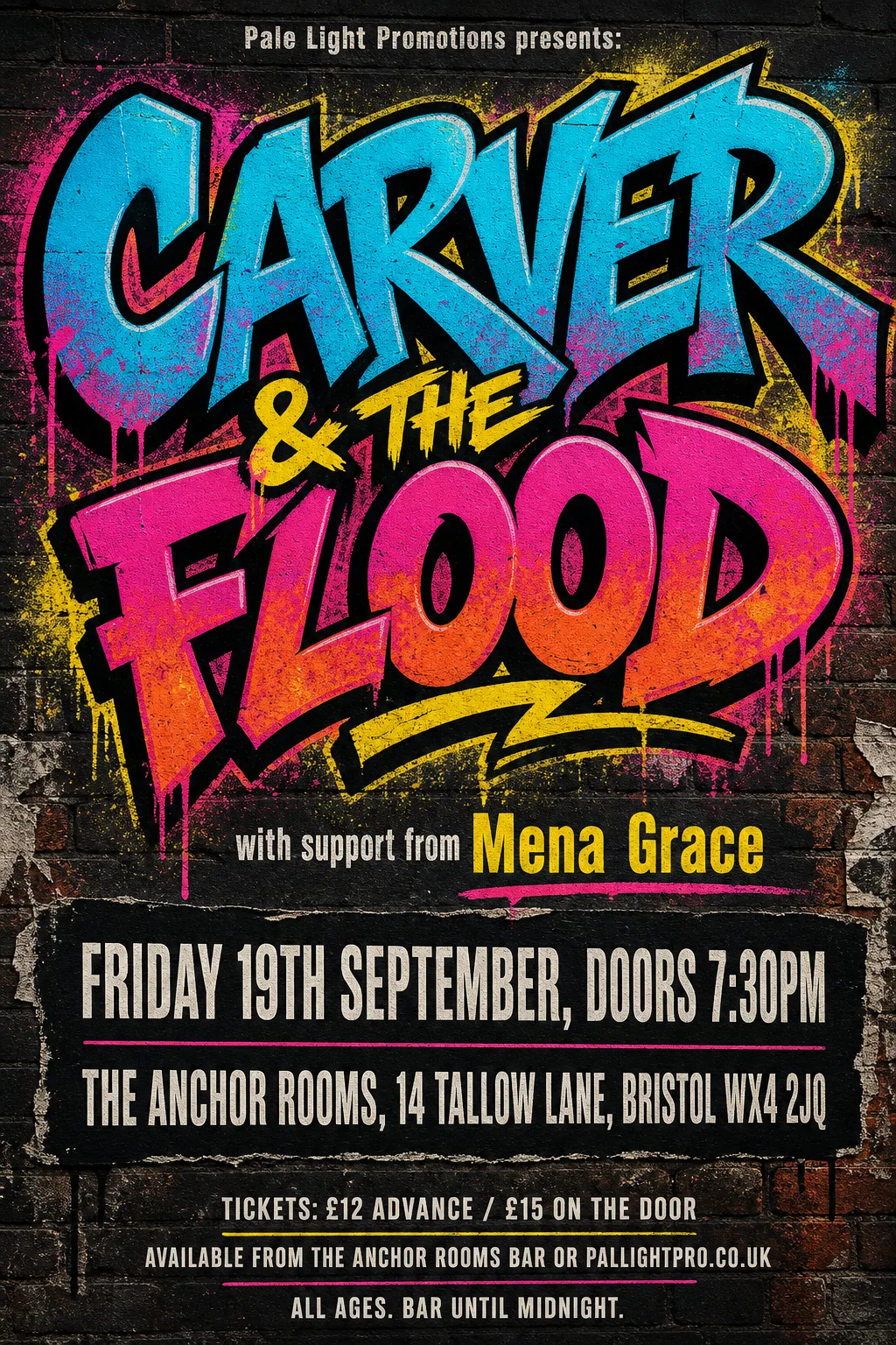
- Kept as the original's pixels: “CARVER & THE FLOOD” — graffiti lettering, outlined and overlapping
- Not reset: “Pale Light Promotions presents:”, “with support from Mena Grace” (missing from the poster, or left in the artwork)
- Typefaces: Saira 900 wdth50, League Gothic 400 wdth75, Science Gothic 400 wdth50
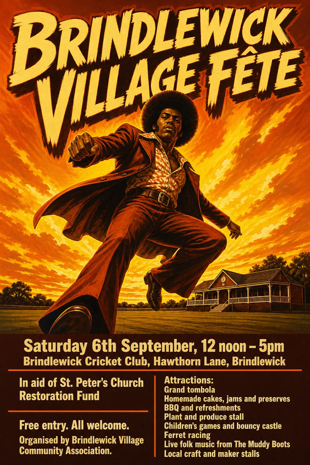 Original
- Kept as the original's pixels: “Brindlewick Village Fête” — painted, textured lettering with a drawn drop shadow
- Kept as the original's pixels: “Ferret racing / Live folk music from The Muddy Boots” — the band finder merges these with the left column
- Typefaces: Encode Sans Condensed 800, Bricolage Grotesque 800 wdth75
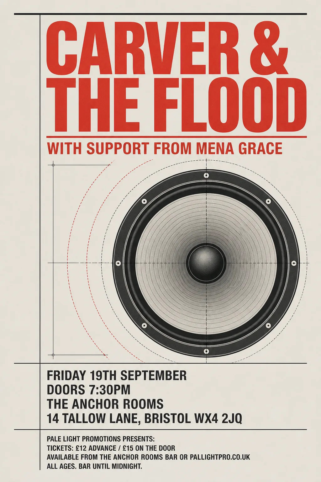 Original
- Typefaces: Alumni Sans 800, Barlow Semi Condensed 700
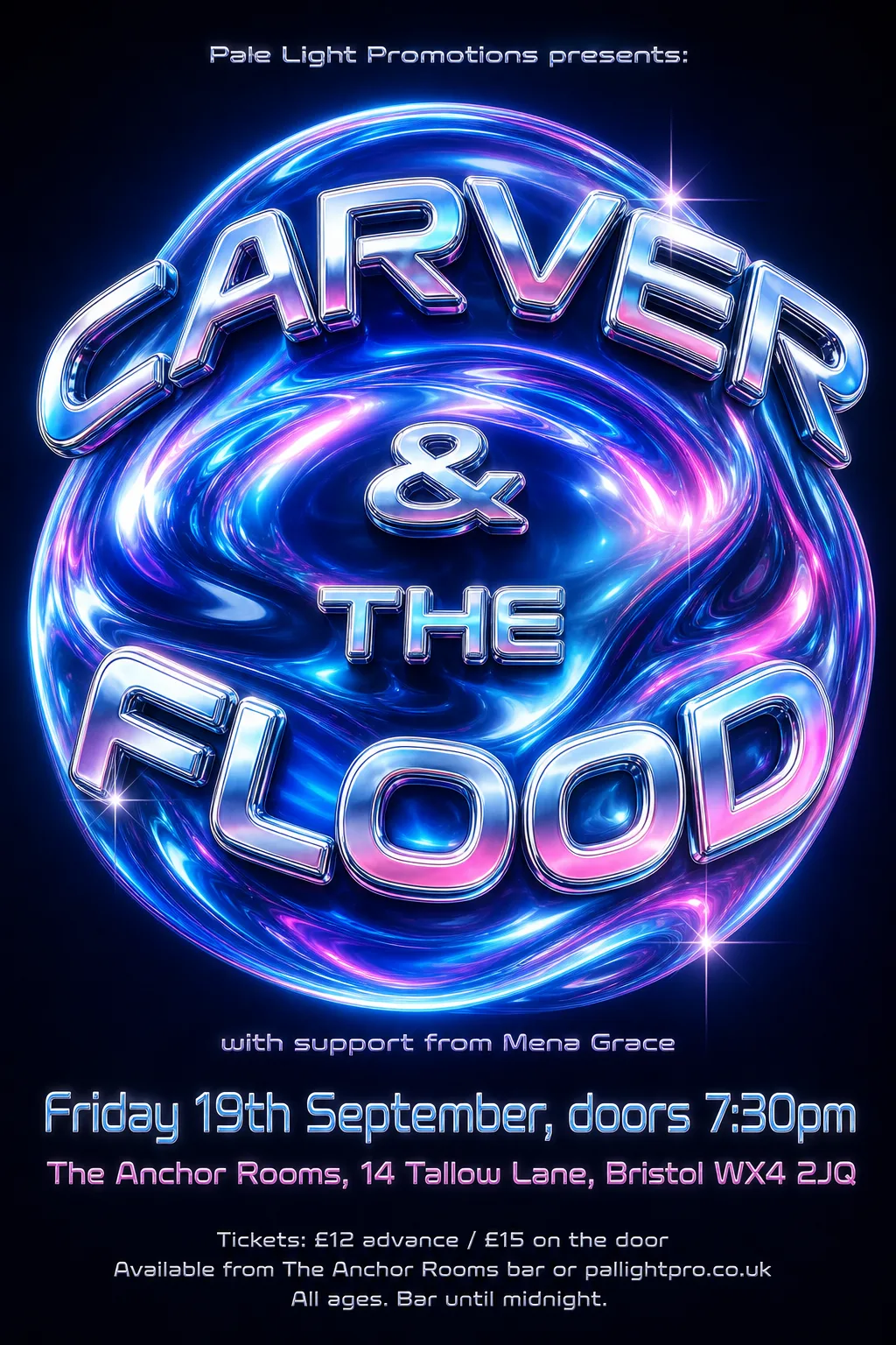 Original
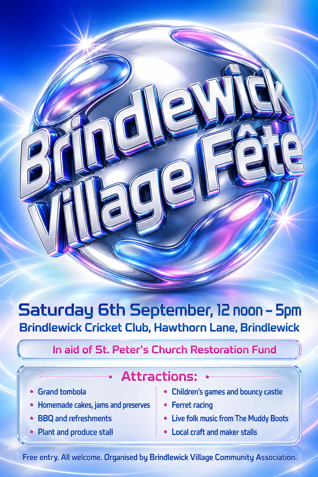
- Kept as the original's pixels: “CARVER & THE FLOOD” — chrome, gradient-filled inflated lettering on a glossy orb
- Kept as the original's pixels: “Pale Light Promotions presents:” — its last word runs into the orb's glow and is cut short
- Typefaces: Orbitron 500, Orbitron
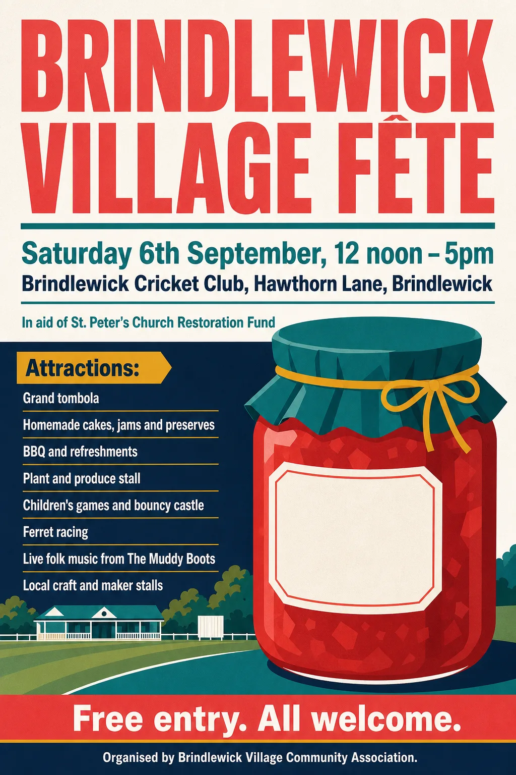 Original
- Not reset: “Attractions:”, “Local craft and maker stalls” (missing from the poster, or left in the artwork)
- Typefaces: Anton, Barlow Semi Condensed 700
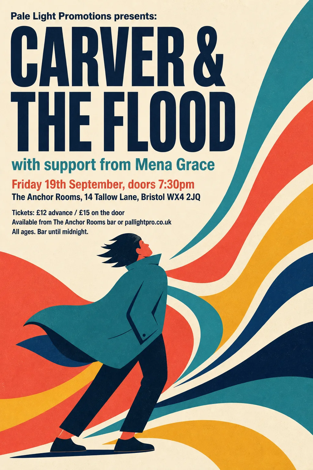 Original
- Typefaces: Barlow Semi Condensed 700, Antonio 700
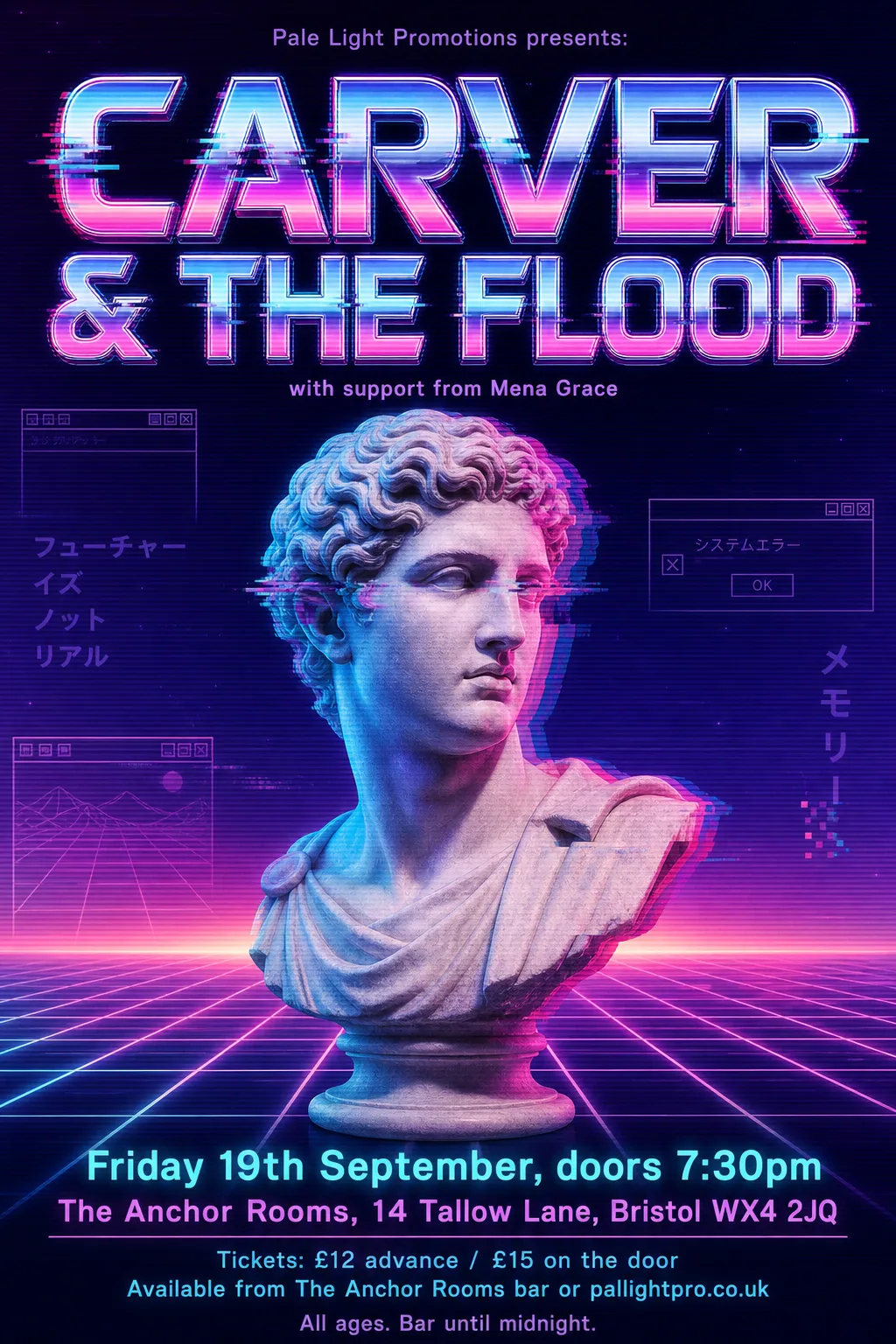 Original
- Kept as the original's pixels: “CARVER & THE FLOOD” — chrome, glitched display lettering
- Kept as the original's pixels: “Friday 19th September, doors 7:30pm / The Anchor Rooms, 14 Tallow Lane, Bristol WX4 2JQ” — on the glowing grid, where the band finder cannot find them
- Typefaces: Rubik
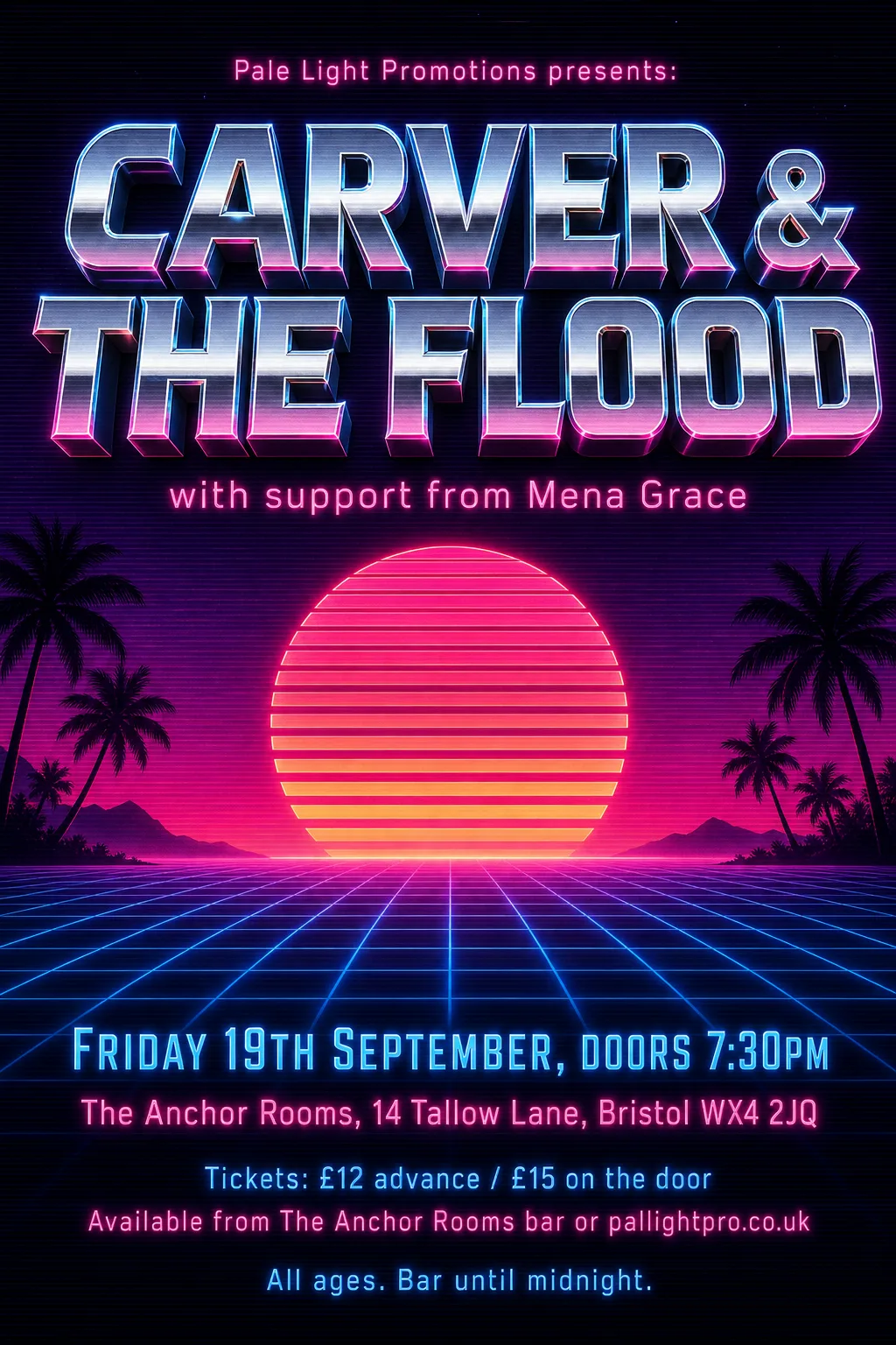 Original
- Kept as the original's pixels: “Pale Light Promotions presents:” — chrome-gradient script too fine for the band finder
- Kept as the original's pixels: “CARVER & THE FLOOD” — chrome, bevelled display lettering
- Kept as the original's pixels: “Friday 19th September, doors 7:30pm” — gradient-filled display lettering
- Kept as the original's pixels: “The Anchor Rooms, 14 Tallow Lane, Bristol WX4 2JQ” — its neon glow defeats measuring and blanking
- Kept as the original's pixels: “Available from The Anchor Rooms bar or pallightpro.co.uk” — breaks into fragments in the pink glow
- Kept as the original's pixels: “with support from Mena Grace” — its neon glow defeats measuring and blanking
- Typefaces: Rajdhani 500
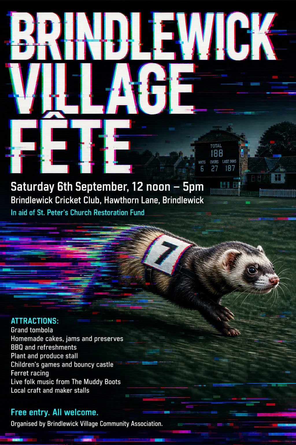 Original
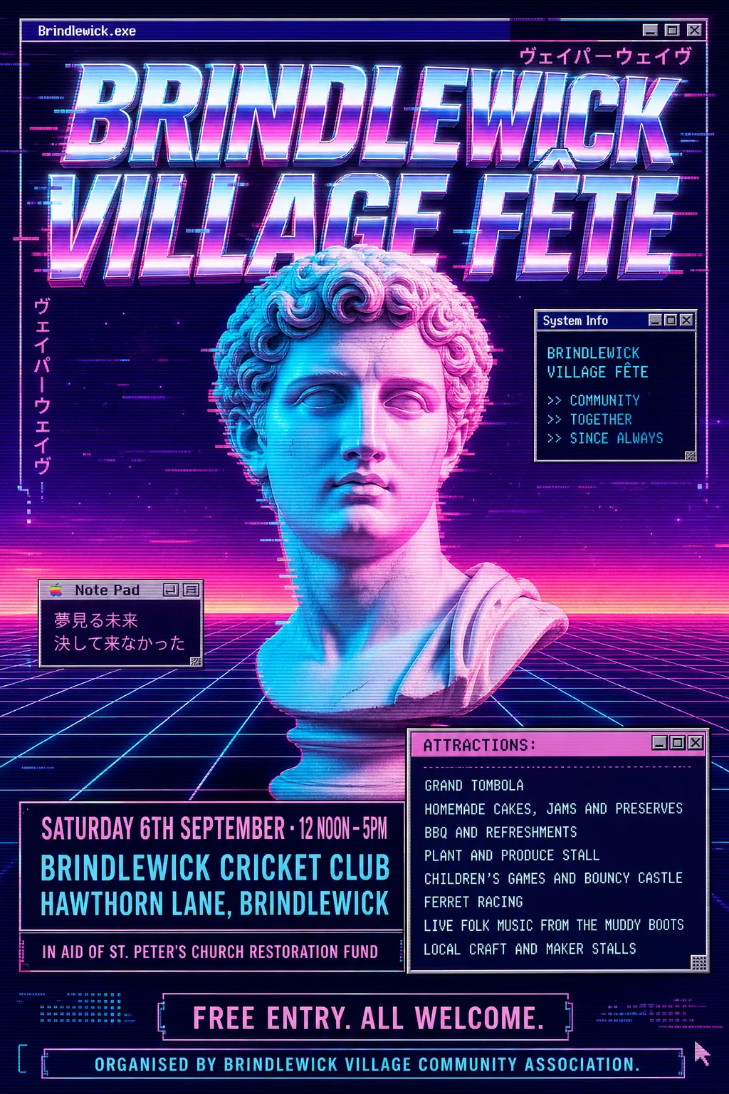
- Kept as the original's pixels: “Brindlewick Village Fête” — glitch effect: RGB-split, sliced and displaced letters
- Typefaces: Barlow Semi Condensed 500
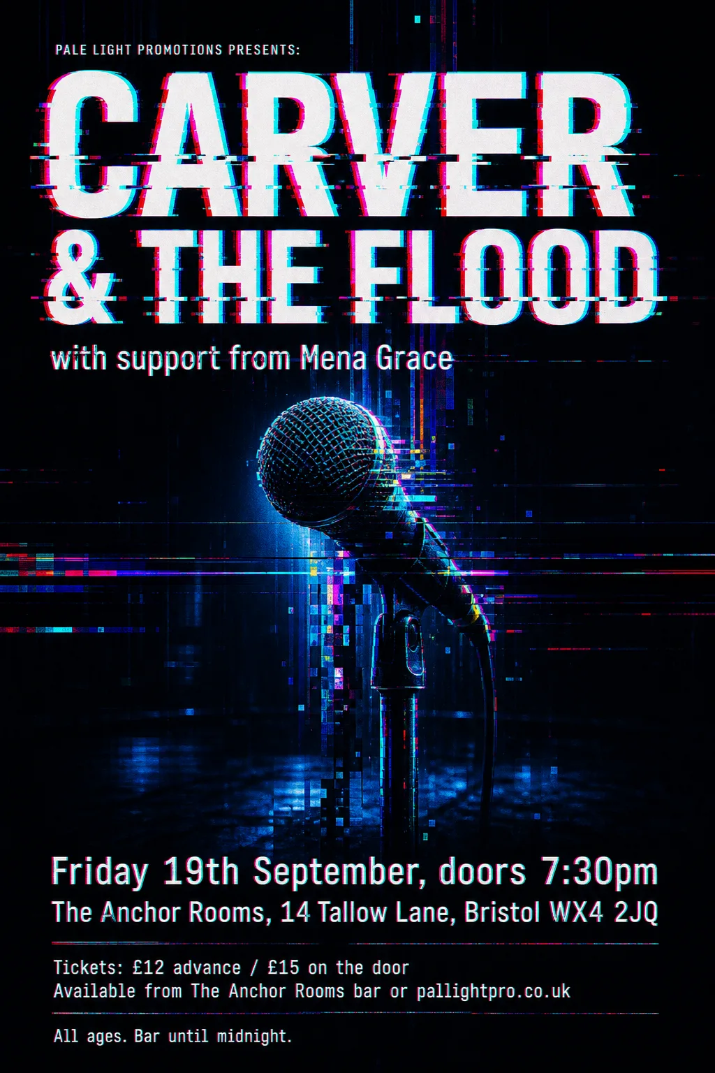 Original
- Kept as the original's pixels: “CARVER & THE FLOOD” — glitch effect: RGB-split, sliced and displaced letters
- Typefaces: Share Tech, Share Tech Mono400
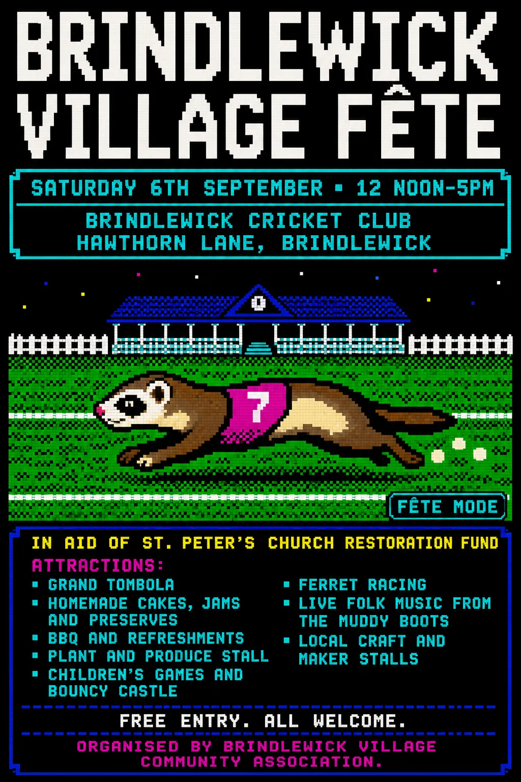 Original
- Typefaces: Jersey 20, Jersey 25
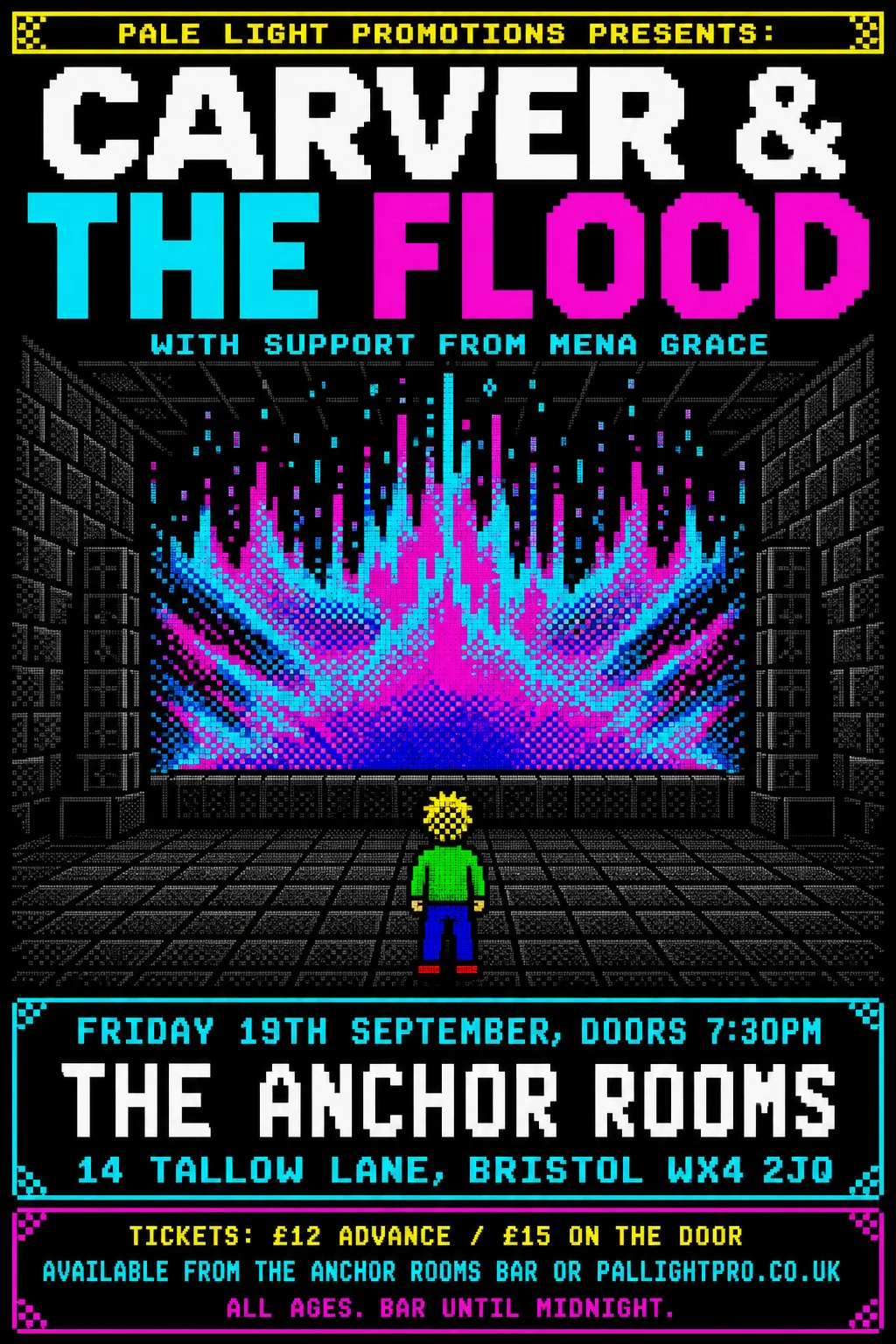 Original
- Kept as the original's pixels: “CARVER & THE FLOOD” — multicoloured pixel lettering
- Not reset: “All ages. Bar until midnight.” (missing from the poster, or left in the artwork)
- Typefaces: VT323
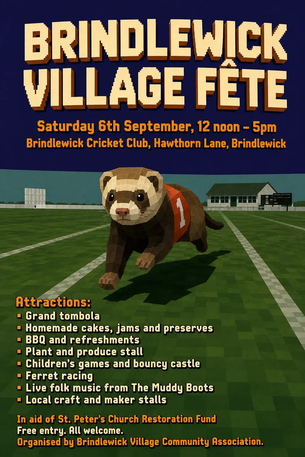 Original
- Kept as the original's pixels: “Brindlewick Village Fête” — 3D extruded lettering
- Typefaces: Concert One
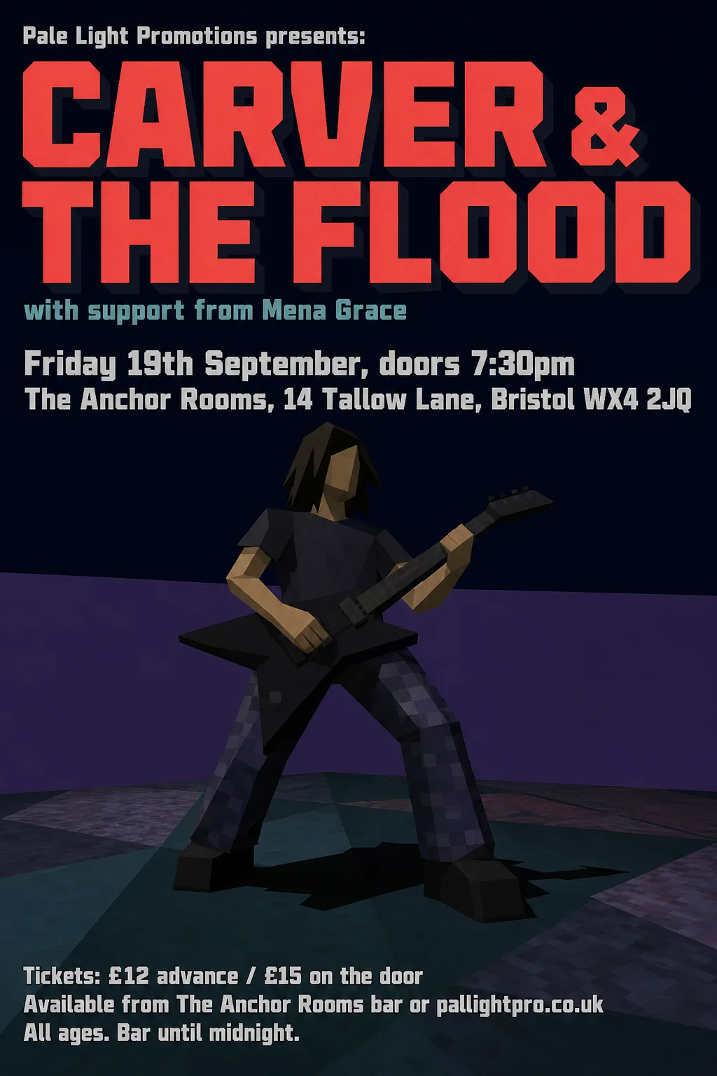 Original
- Typefaces: Exo 900, Tektur 900 wdth75
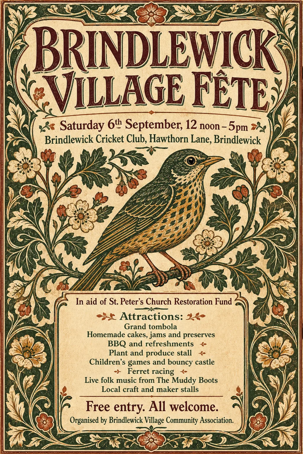 Original
 Original
 Original
 Original
 Original
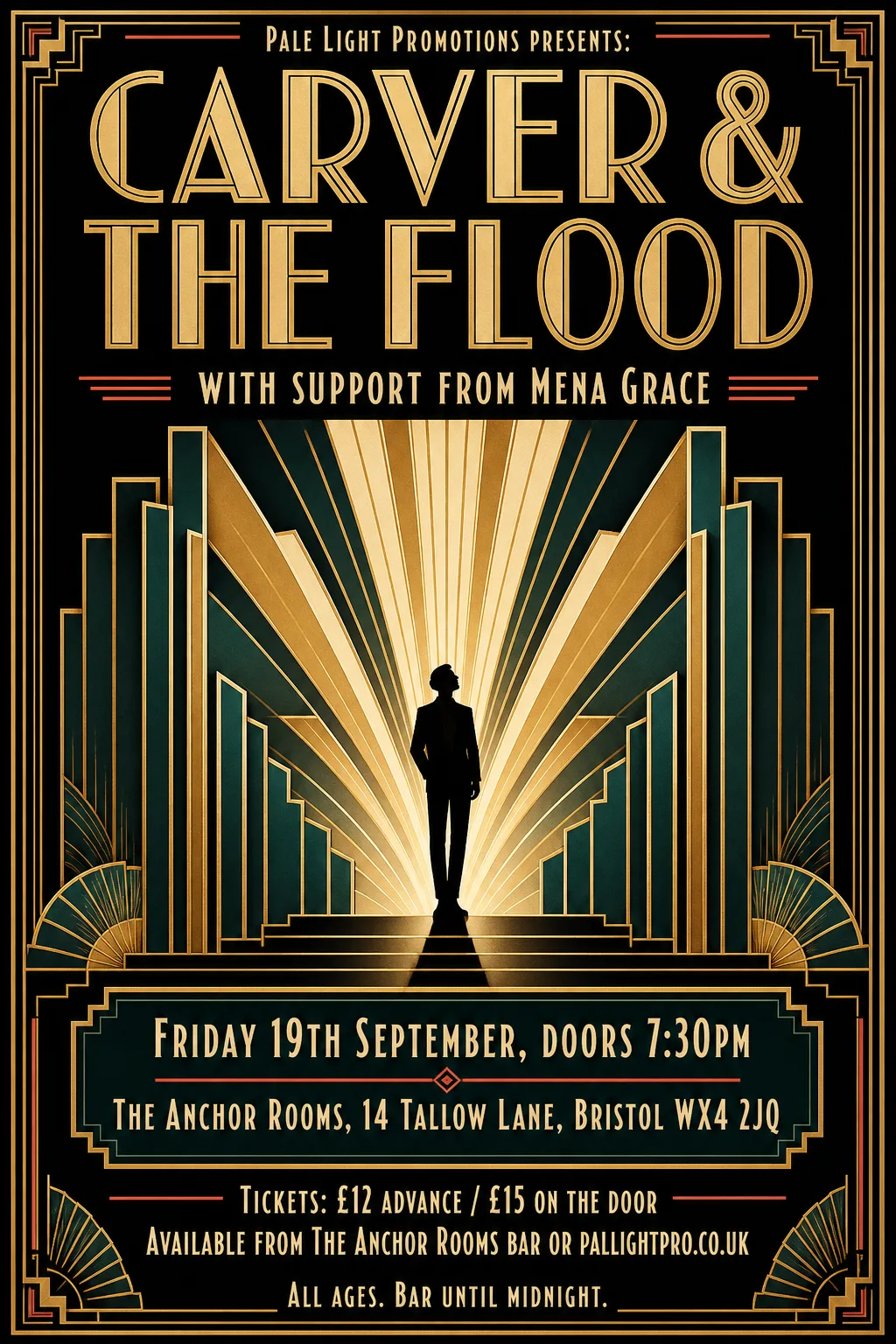 Original
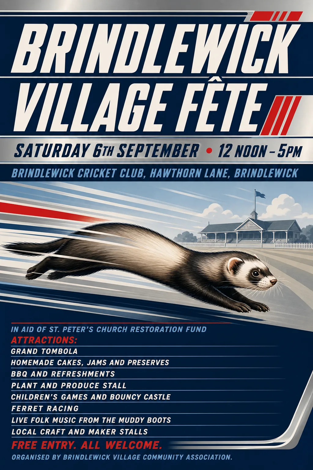 Original
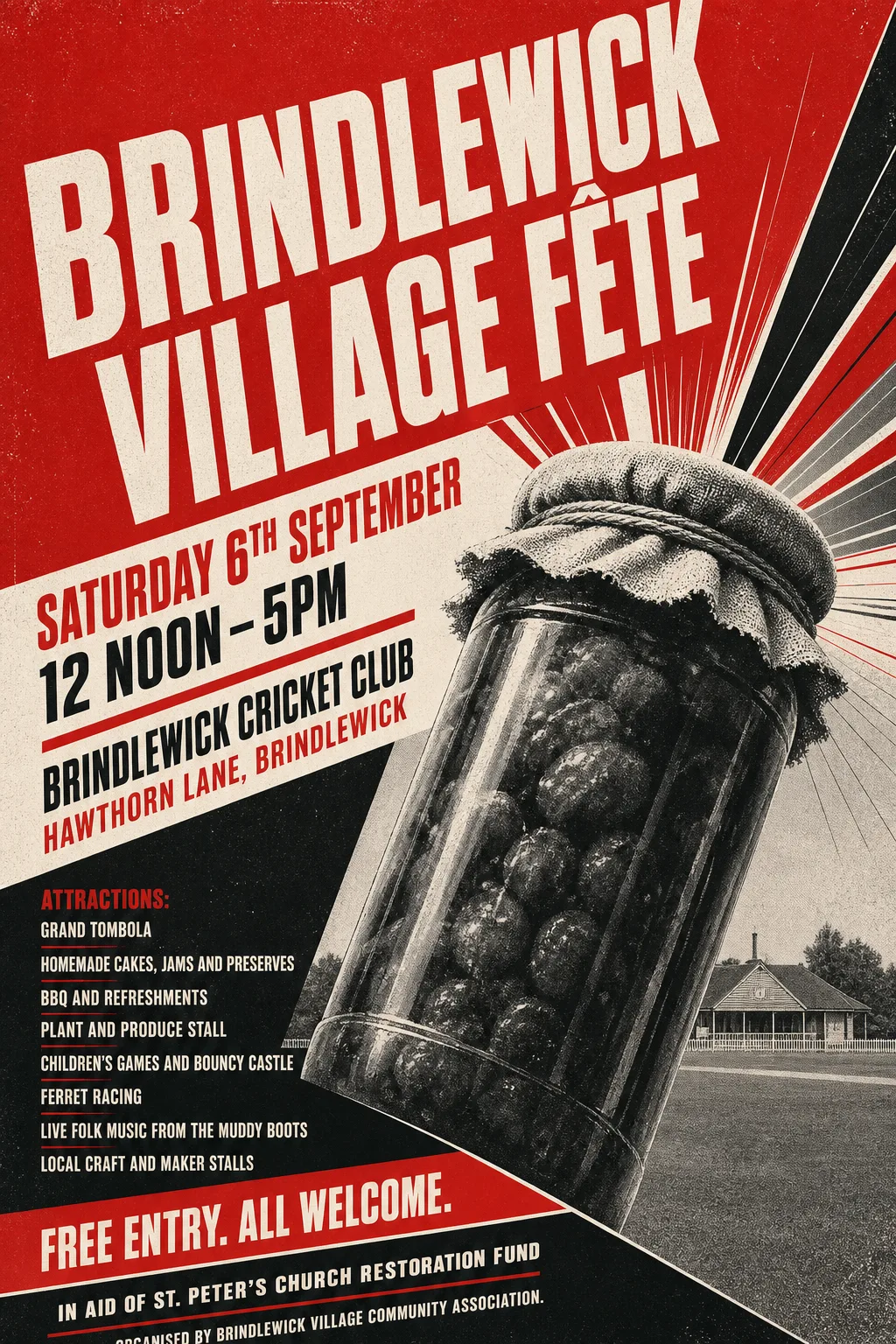 Original
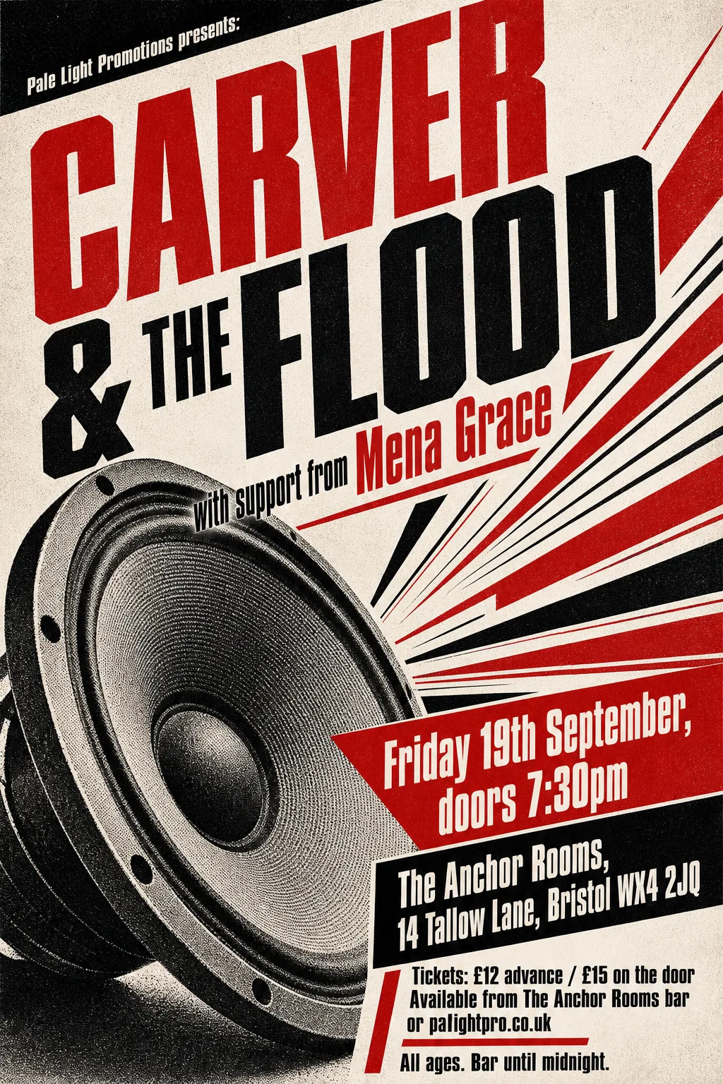 Original
 Original
 Original
 Original
 Original
 Original
 Original
 Original
 Original
 Original
 Original
 Original
 Original
 Original
 Original
 Original
 Original
 Original
 Original
 Original
 Original
 Original
 Original
 Original
 Original
 Original
 Original
 Original
 Original
 Original
 Original
 Original
 Original
 Original
 Original
 Original
 Original
 Original
 Original
 Original
 Original
 Original
 Original
 Original
 Original
 Original
 Original
 Original
 Original
 Original
 Original
 Original
 Original
 Original
 Original
 Original
 Original
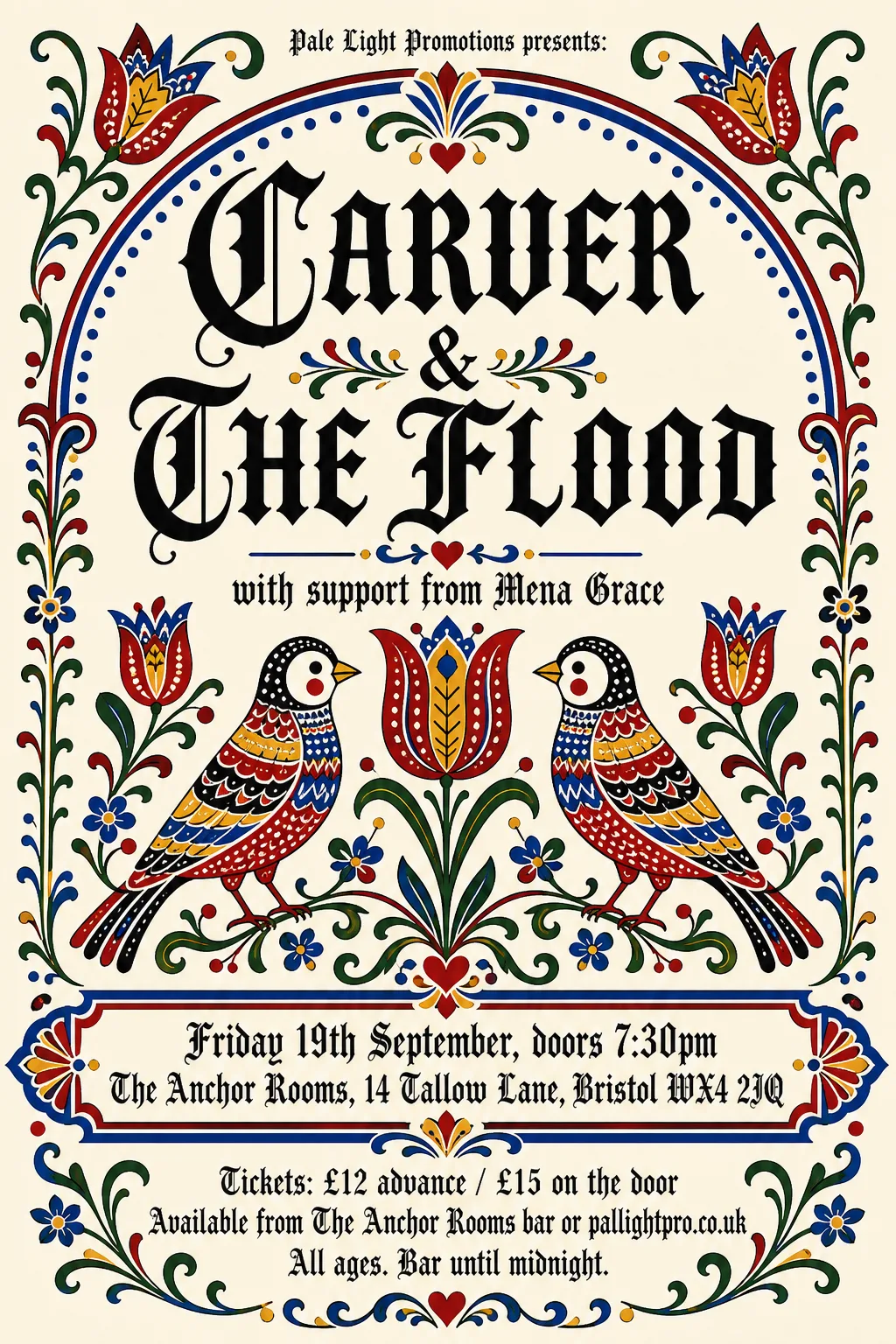 Original
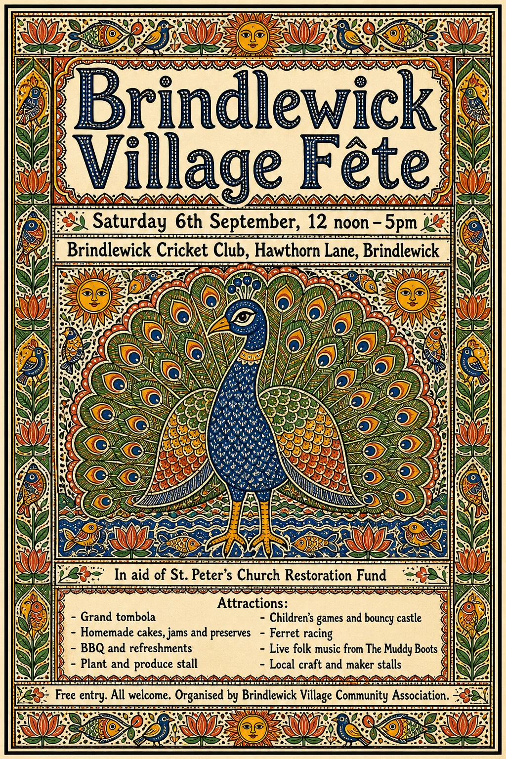 Original
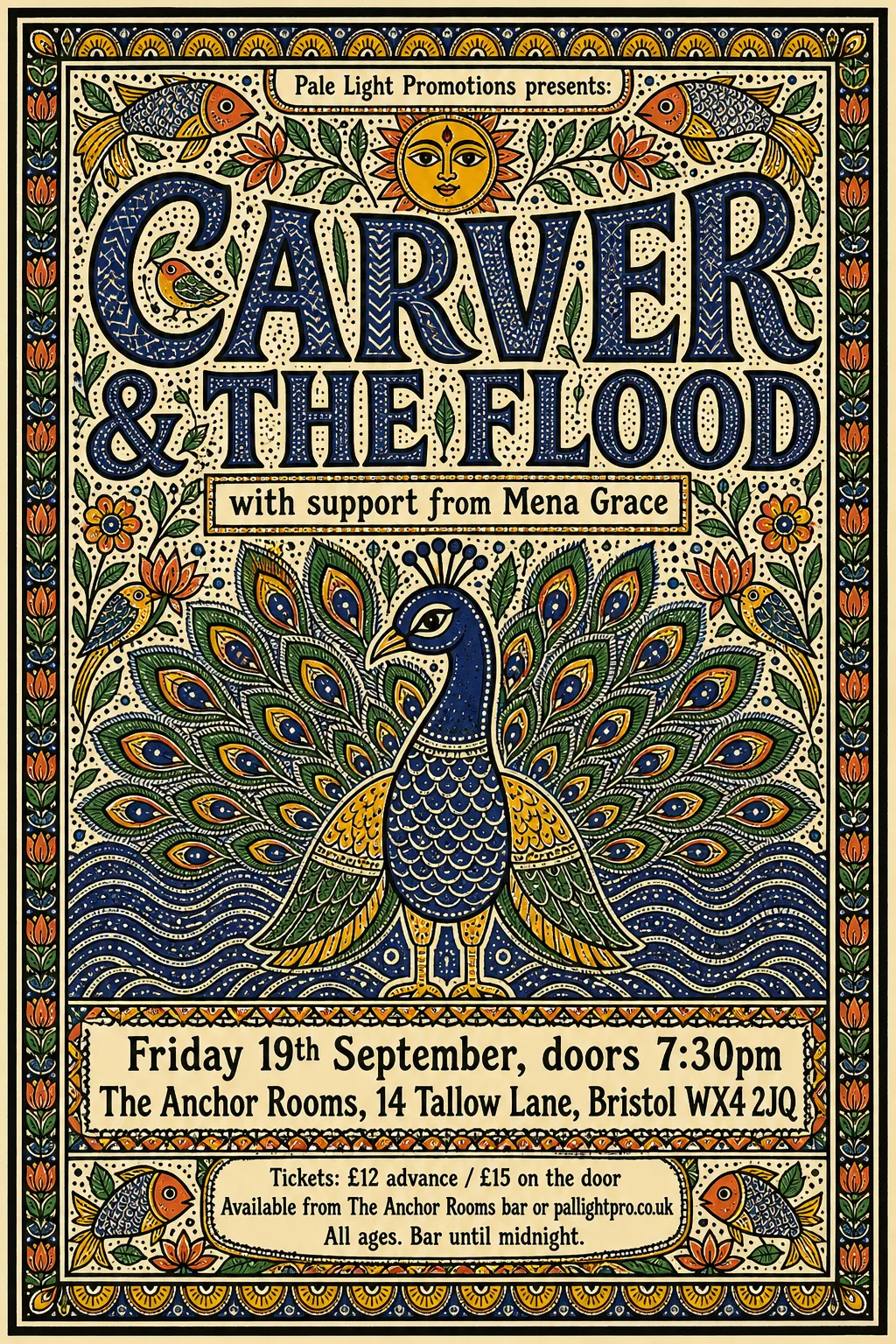 Original
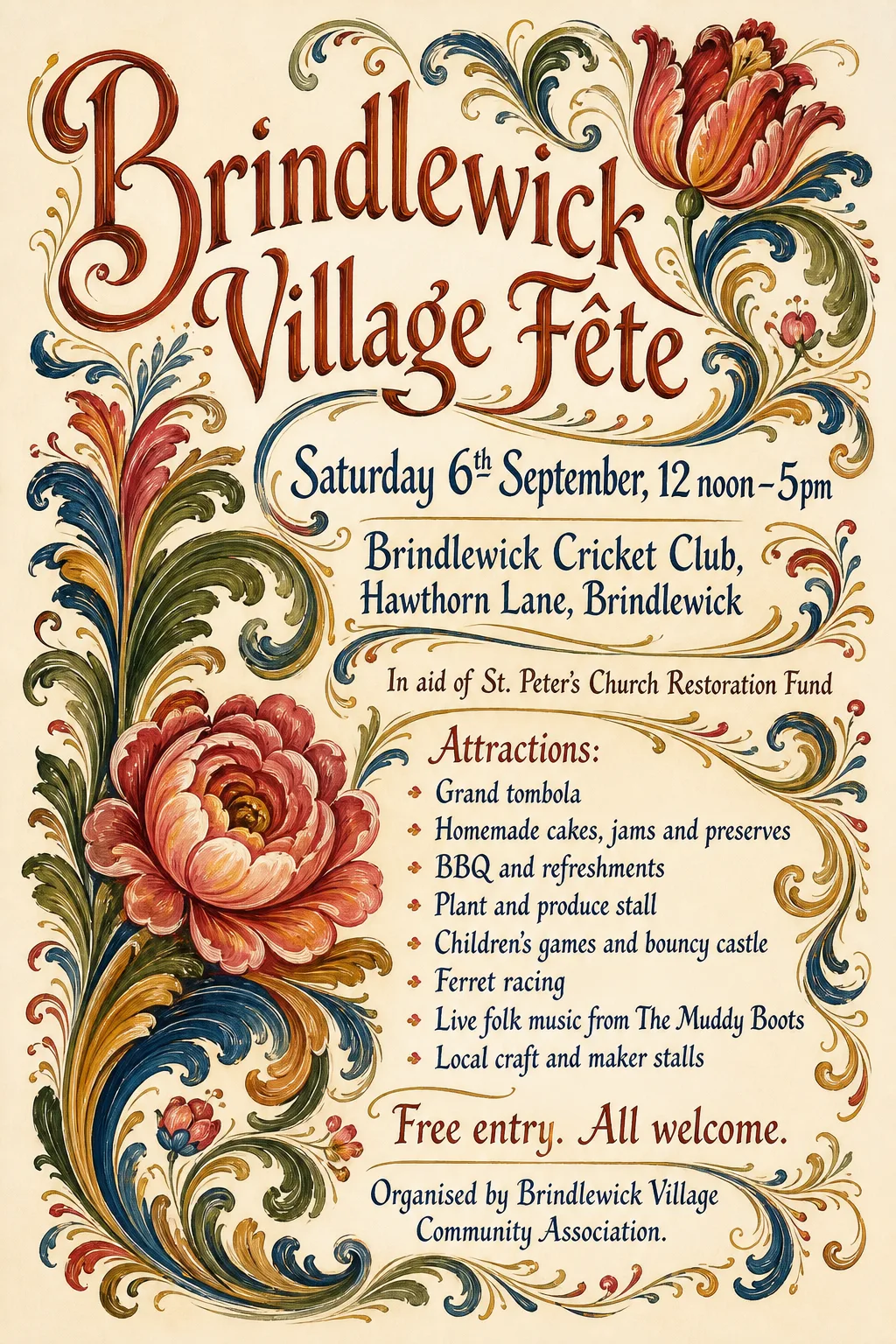 Original
 Original
 Original
 Original
 Original
 Original
 Original
 Original
 Original
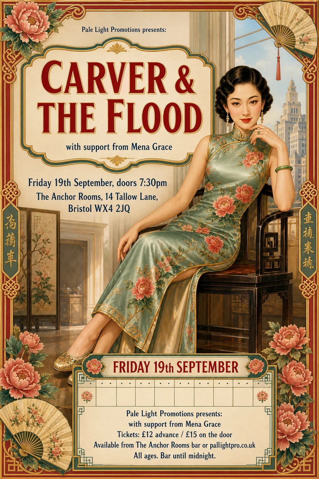 Original
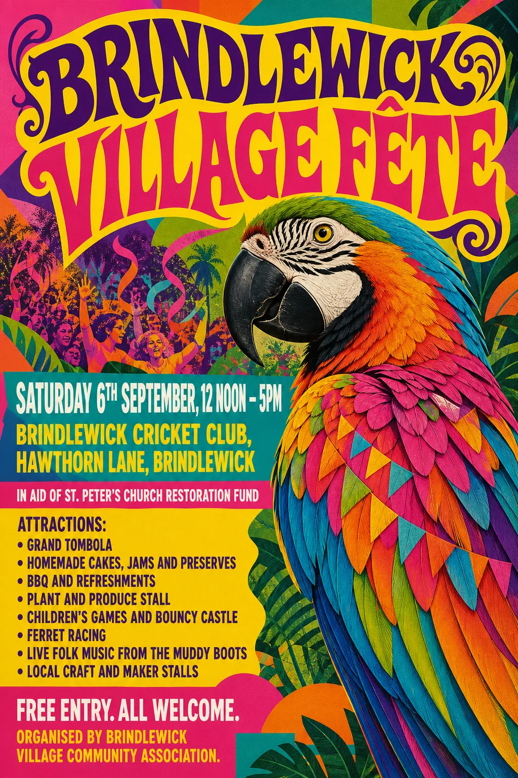 Original
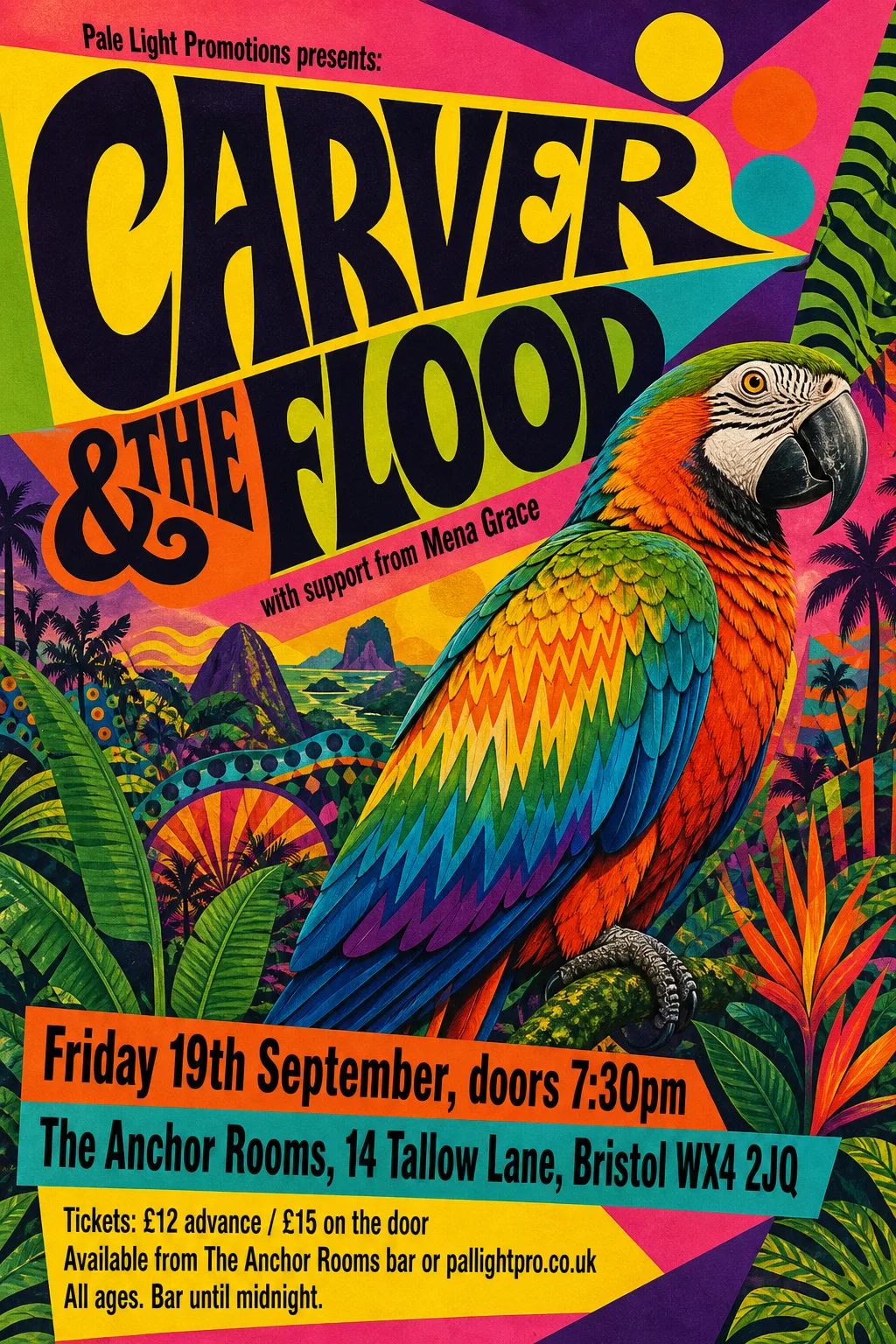 Original
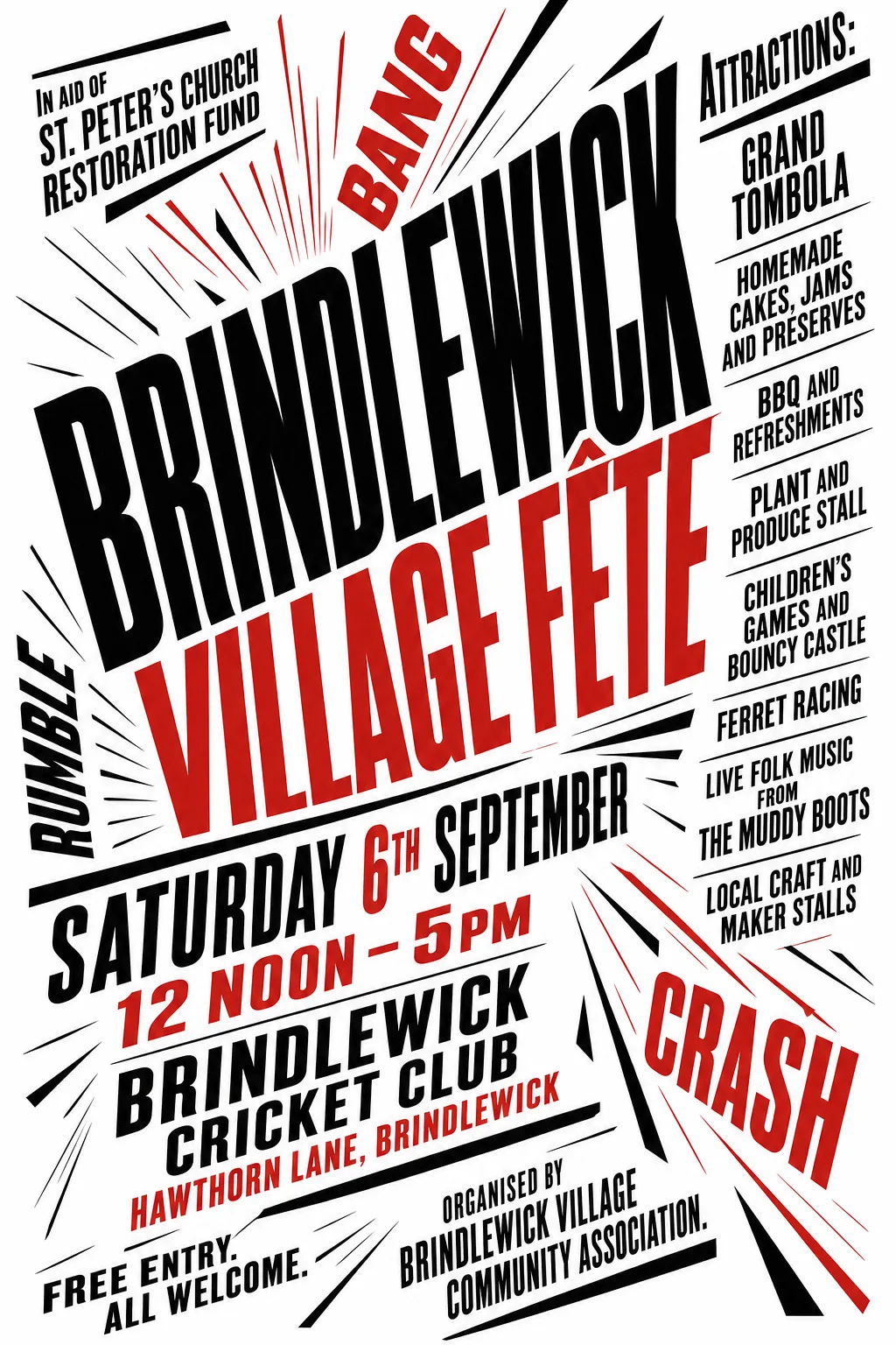 Original
 Original
 Original
 Original
 Original
 Original
 Original
 Original
 Original
 Original
 Original
 Original
 Original
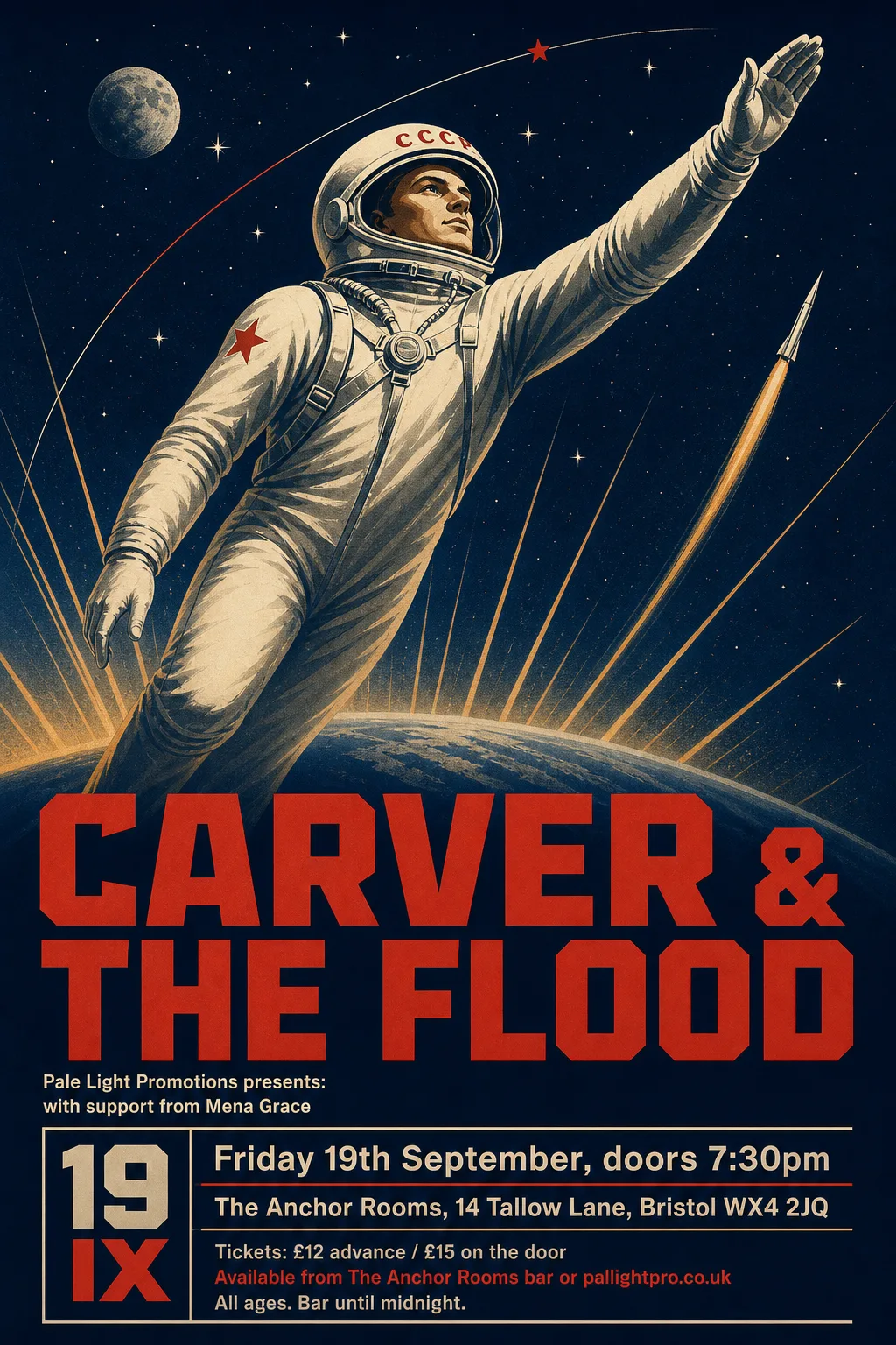 Original
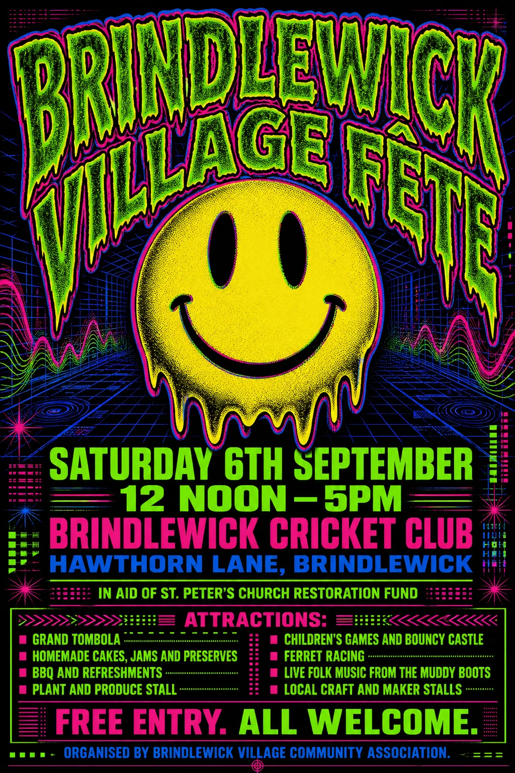 Original
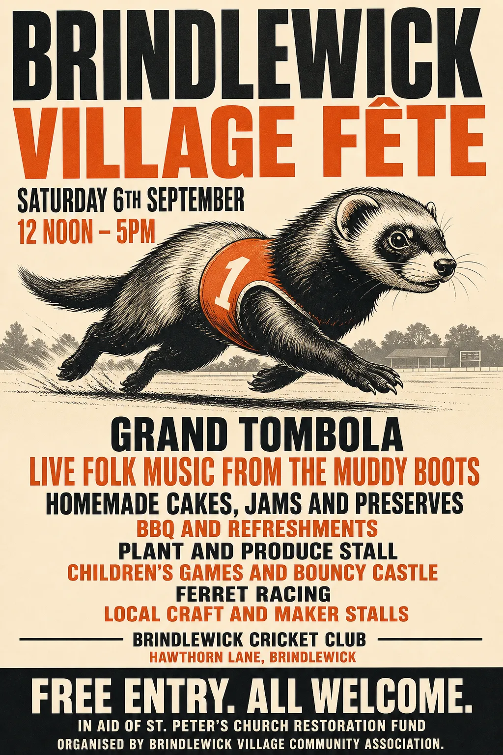 Original
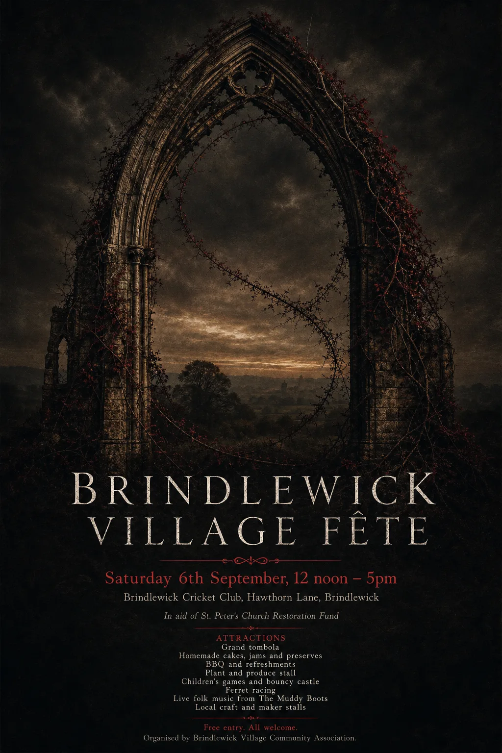 Original
 Original
 Original
 Original
 Original
 Original
 Original
 Original
 Original
 Original
 Original
 Original
 Original
 Original
 Original
 Original
 Original